
 Photos – Part 2")


Artistic Sepia / Colorizing Effect
In this Photoshop tutorial I\'m going to show you how to create a cool photo effect while you learn a thing or two about gradient masks, and a few stock Photoshop filters.Introduction
Let me remind you before we begin that I’m working on a 540×540 pixel file that’s at 72ppi, so if you’re applying this process to a higher resolution image you’ll want to increase the strength of the filters accordingly to get the desired effect. Let me also state the obvious and say that photo effects work better on some photos than others. As any good photographer will tell you, this sort of effect is very much determined by personal taste, and you should experiment with each of the settings to decide what looks best to you. Some of my coolest photos and photo effects have been created while experimenting with different filter and layer combinations.
(*note: You should have at least Photoshop CS2 for this tutorial as some of the filters used were not present in earlier versions.)
Step 1
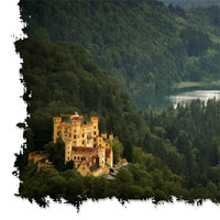
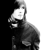
Here’s a lovely photo of a striking young man that I think will be perfect for this effect (although this particular photo effect can also work well on still life and landscape photos as well). A few factors that make this photo ideal are the nice lighting conditions and the lack of distraction in the background.

Step 2
The first few steps will serve to soften the details and smooth out the tones, but lets first duplicate the background layer by pressing Command-J (PC: Ctrl-J) so if we screw up we can just delete the copy and start over without effecting or original image. This also creates an easy way for us to compare the original to the final product.
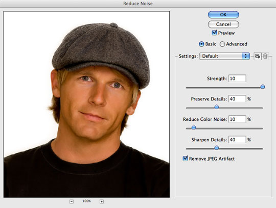
We’re going to use the Reduce Noise filter to do a preliminary smoothing of the working surface. Select Filter>Noise>Reduce Noise. All we’re asking this filter to do is to take out tiny variations in tone so use the settings below.
(*note: The Reduce Noise filter is relatively new to Photoshop, so if you’re using an older version and don’t have this in your Filters menu, don’t worry, you can skip this step and still end up with a nice effect.)
Step 3
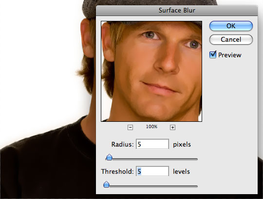
Now that we’ve reduced the small variations it’s time to do some real smoothing. Choose Filter>Blur>Surface Blur from the main menu and set both the radius and threshold to 5. This will add an almost painted look to the photo because the large areas of similar tone have been blended so well.
Step 4
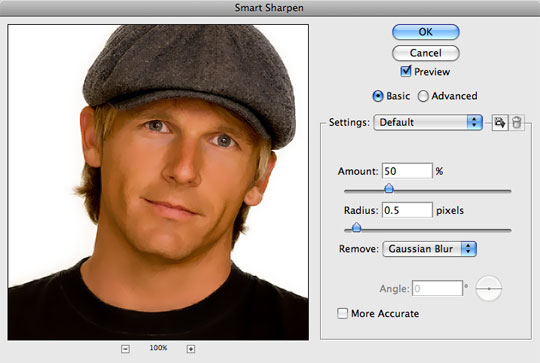
Now lets bring back a little bit of crispness by using a powerful addition to the Sharpen menu called Smart Sharpen. Choose Filter>Sharpen>Smart Sharpen and adjust the sliders until the areas of your photograph with the largest amount of contrast have crisp edges again (like the eyes and hair in my photograph).
If you want to see the difference these filters has made, simply turn the working layer on and off in the Layers palette by clicking on the little eye icon to the left of the layer’s thumbnail.
Step 5
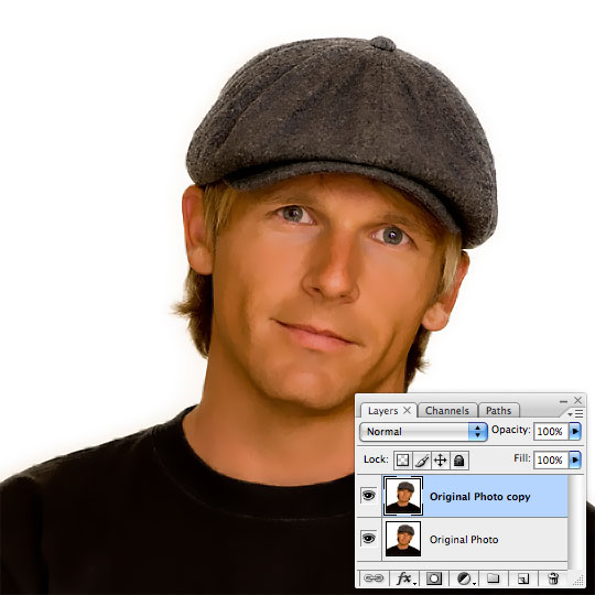
Here’s what my photo looks like so far. Notice that the skin has been smoothed extensively but there is still a significant level of sharpness in the image overall.
Step 6
Here comes the fun part where we create the color-shift that defines the look of this effect. First press the D key to reset the foreground and background colors to black and white respectively.
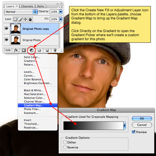
We’ll be using an Adjustment Layer, so click on the Create New Fill or Adjustment Layer icon at the bottom of the Layers palette (it’s the one that looks like a circle with one half black and the other white) and choose Gradient Map from the menu. When the dialog appears, click ON the gradient to open the Gradient Editor where we’ll create a custom gradient in the next step.
(*note: The Gradient Map adjustment layer does exactly what it says, it maps a gradient to the tonal range of the image.)
Step 7
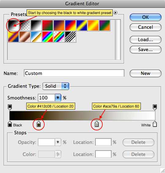
We’ll begin by selecting one of the Photoshop default gradients, in this case the one that goes from black to white (this is the first of the default gradients in the gradient picker).
Now that we’ve got the basics in place it’s time to look down to the bottom of the Gradient Editor. The black and white endpoints of the gradient have already been set so now we need to add a few custom markers in the middle to give us the desired effect.
Click anywhere just beneath the gradient to add a new point at that location (the color will be set by default to the exact color at that point in the existing gradient). With the new point added, click directly on the point to access it’s color and location options. Set the first point to #412C08 and change it’s location to 20% then add a second point to the right of the first and set the color to #ACA79A and it’s location to 60%. When you’re done click OK to set the gradient and then click OK on the original Gradient Map dialog to commit the adjustment layer to the document.
Step 8
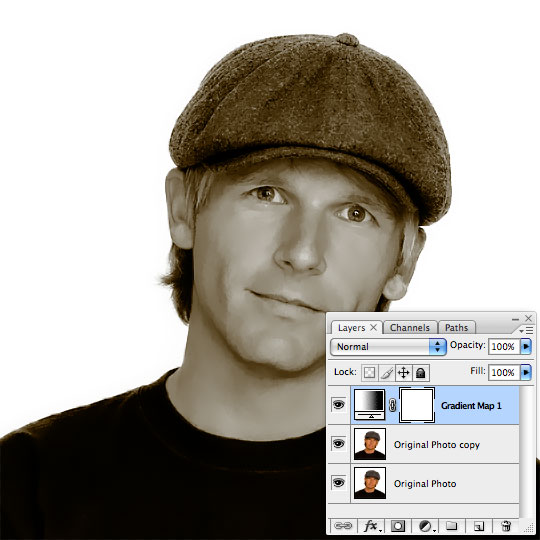
Things should now look like my example below. Notice that a new layer has been created above our working photo layer called Gradient Map 1. If at any time you wish to adjust the Gradient Map adjustment layer, simply double click on the layer’s icon to re-open the dialog exactly as you left it.
Step 9
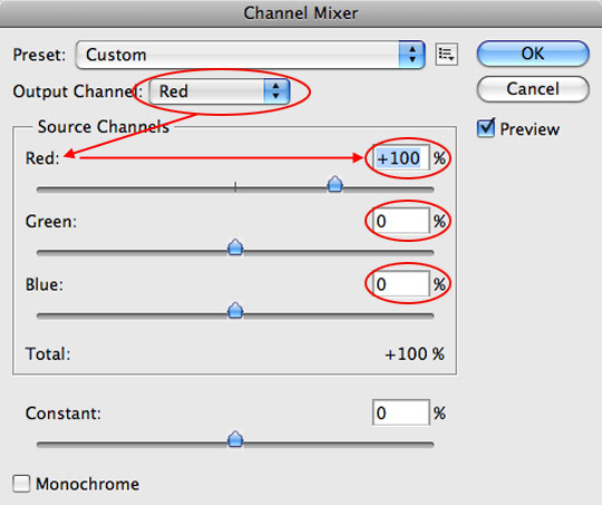
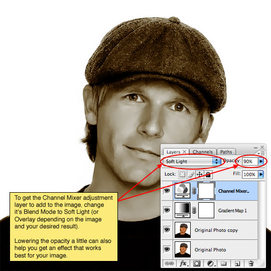
Next we’re going to add some punch to the tones with another Adjustment Layer, so just like in Step 6, click on the Create New Fill or Adjustment Layer icon at the bottom of the layers palette and this time choose Channel Mixer.
Normally the Channel Mixer is used to adjust color mixture on a per-channel basis (ie Red,Green & Blue). It’s quite useful, but we won’t be using it that way today. What I want you to do is go into EACH of the respective colors in the Output Channel drop down and give that color 100% and the other two channels in that color 0%… So in the Red output channel red would be set to 100% and Green and Blue both at 0%… do the same for the Green and Blue output channels and then click OK. If you do this correctly absolutely nothing in your image will have changed when you’re done.
Step 10
Lastly lets add one final Adjustment Layer to add a touch more contrast to the image. From the Adjustment Layer menu we’ve been using at the bottom of the Layers palette choose Curves this time. When the Curves dialog box appears choose Linear Contrast (RGB) from the Preset drop down menu at the top and click OK.
(*note: You should feel free to play with different presets as well as custom curves to create different effects.)
Step 11
Remember, each photo is different and what works perfectly with one set of instructions can look like crap on another, so don’t let yourself get tied to exact formulas and prescribed steps. Experiment with each setting and learn what each filter and adjustment layer does, that way you’re only limit is your own creativity. Something as small as rearranging the order of the adjustment layers in this exercise can make a substantial difference in your end result.
Oh, and if you really want to have some fun, play with the colors in the Gradient Map! The sky is the limit!
In my final image I lowered the opacity of the Gradient Map adjustment layer to around 80% to let a little of the original skin tone show through which added a bit of warmth to the composition.

Lesson Files + Additional Resources
Download the free .PSD file and other lesson files Right Here.
Tell Your Friends
More in Photo Effects

31 Responses to Artistic Sepia / Colorizing Effect
Paulo Sales
September 24th, 2008 at 12:08 pm
Nice work, clean, fine effect. Again and once more thank you Hero.
I will give it a try sooner!
Best regards from Lisbon
eyenou
September 24th, 2008 at 10:10 pm
Didn’t I see that handsome mug in a magazine recently?
SSV
September 25th, 2008 at 2:38 am
Another cool tutorial. You keep amazing me. Thanks hero!
Beckers
September 25th, 2008 at 9:39 am
What a hottie. Looks great.
Manuel Andrade
September 25th, 2008 at 1:15 pm
Very well explained, as always. Thx Mr Hero :)
I will try as soon as I get the new version of Photoshop.
Bset regards from Funchal – Madeira
Frank therrien
September 25th, 2008 at 3:04 pm
WOW !
I like graphic design and text effect, but photo effect is aslo really enriching and pretty nice.
Tanxx
Jesse
September 26th, 2008 at 5:16 am
I suppose it doesn’t hurt to revisit the basics every now and then. It’s helpful if you’re new to Photoshop, though…
Linda
September 26th, 2008 at 10:46 am
I found this really helpful. The question I have is where do I find the “color number” as you suggested? It may be a super basic – but I don’t know where it is listed.
HERO
September 26th, 2008 at 11:08 am
LINDA, That’s a great question and I’ll answer it here incase anyone else was stumped there. In Step 7 when you’re setting up your gradient once you’ve clicked beneath the gradient in the bottom of the dialog to create a new “stop” along the gradient, then you need to double click on the Color swatch in the box below to pull up the Color Picker, then you can enter the 6 digit RGB color code into the box at the bottom of the Color Picker to pick the exact color that I mention. Then just click OK, set the Location percentage listed and continue to set the second “stop” exactly the same way.
recosmic
September 27th, 2008 at 1:01 am
nice..new practice…
Lori Ann Cole
September 27th, 2008 at 11:34 pm
I’ve done gradient mapping before to colorize images, but the smoothing and sharpening steps at the beginning really make this technique special. Nice work!
RUGRLN
October 3rd, 2008 at 5:34 am
Just wanted to say the new design is fabulous! Great job man! Great stuff, keep it up!
BTW, are those coloured boxes on the side for changing the colour of site?!!?
Paulo Sales
October 3rd, 2008 at 4:59 pm
hero revolution…great change !
HERO
October 3rd, 2008 at 7:46 pm
Thanks PAULO. I’m so glad you approve!
Dawit
October 14th, 2008 at 3:26 pm
WOW! I love this effect. To be honest I don’t know why I have never commented. I have been to your site quite a lot recently and I have learned a lot from your GREAT tutorials. I love this one as much as I loved your other tutorials!! Great Job Hero and I look forward for more of your tutorials! Dawit from Gondar, Ethiopia!
?ó¬®?ó¬§?ó‚Ä¢?ó¬ê?ó‚Äù ?ó?æ?ó¬©?ó?ì?ó‚Ñ¢?ó?æ?ó‚Äù
October 29th, 2008 at 9:37 am
This looks great. I’ll use it on some of my family photos
max
October 30th, 2008 at 8:46 am
nice effect
Curetonian
November 5th, 2008 at 2:11 am
Great work as always
Cheers from Australia
HERO
November 11th, 2008 at 4:32 pm
Thanks CURETONIAN… and G’Day!
j.
November 16th, 2008 at 2:17 am
This is a striking young man – and oddly familiar. This is great work! Hope Mrs. Hero is fabulous too.
Tracey
February 5th, 2009 at 9:13 am
Once again, a well-presented tutorial. Thanks for providing such clear instruction!
vamsi
March 29th, 2009 at 2:13 am
WoW !!
Pamela Reitmeier
April 27th, 2009 at 7:25 pm
This is actually my first tut with you. I wanted to thank you for helping me look younger :-)
It turned ok but photo quality to begin with was low.
You have a follower in me…from an ex-So Cal surfer. San Onofre, Huntington and Manhattan Bch.
Cheers…Pam
Kristina
July 20th, 2009 at 11:37 am
wow this is cool…i don’t understand how u reset the foreground colors to black and white with D in step 6 tho..what is D supposed to do? Is it a shortcut for something?
HERO
July 20th, 2009 at 3:15 pm
KRISTINA, Pressing the D key is keyboard shortcut to reset the foreground/background colors to black and white.
Az
September 30th, 2009 at 1:37 pm
You’re very good at this!…that last step adds a real touch of class and makes it look oh so pro. Thanks for everything on this site!
Arman
October 22nd, 2009 at 2:37 pm
Amazing Tutorial Hero… I really appreciate the way u explain in detail.
I look forward to more such tutorials on people. As I am a ppl photographer.
Namaste from Inda.
Arman
October 22nd, 2009 at 2:39 pm
Your comment is awaiting moderation.
Amazing Tutorial Hero… I really appreciate the way u explain in detail.
I look forward to more such tutorials on people. As I am a ppl photographer.
Namaste from India.
FotoArteUruguay
March 19th, 2010 at 10:31 am
Nice tutorial. Had to skip step 4 as my latest P.S is in spanish and couldn’t manage to translate or find correctly: Sharpen>Smart Sharpen. Oh well, end result was great amyway.
Chau for now,
Miriam
July 17th, 2010 at 9:22 am
I do wedding photography and you have no idea how applying this helped me. I even added it as an action to my actions list. Thanks a million for this great effort. Blessings…
aniket
February 11th, 2011 at 12:55 pm
wow.. it will surely help me to build my portfolio :)