
 Photos – Part 1")

Levi And Style Copper Rivet
In this Photoshop tutorial we will be creating a Levis style copper rivet while learning a little bit about creating compound bevel Layer Styles. I'm sure there are probably some cool digital scrapbooking ideas this can be used with, or perhaps a website concept with a denim theme.Step 1
I’m using the denim background we created in the Frayed Denim Patch With Stitches tutorial to give the project a little context.
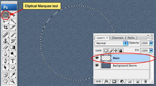
Lets dive right in and create a new layer which I’ll rename Main by double clicking on the layer name in the Layers palette. (*note: If your layers palette isn’t visible simply choose Window>Layers from the main menu.)
Choose the Elliptical Marquee tool from the Tools bar and while holding the Shift key to constrain the selection to a perfect circle, click and drag a nice large selection onto the stage. For this tutorial we will be creating the object on a large scale with the intention to scale it down for practical usage. This will allow us to see all the details as we work. If you’re curious… and I know you are, my circle is 260×260 pixels.
Step 2
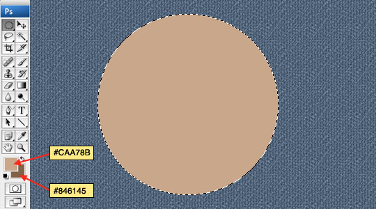
In the tools palette change the foreground and background colors to #caa78b and #846145 respectively and then press Option-Delete (PC: Alt-Backspace) to fill the circular selection with the lighter foreground color.
Step 3
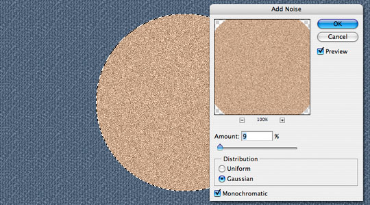
With the selection still active choose Filter>Noise>Add Noise from the main menu and use the settings as 9%, Gaussian and Monochromatic. The Noise filter gives us our beginning copper tone variations and uses both the foreground and background color swatches to create it’s effect, which is why it was important to set them correctly in Step 2.
Step 4
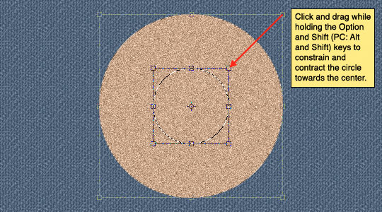
Because our circular selection is still active, lets go ahead and cut a nice hole from the center using the current selection as our starting point. Choose Select>Transform Selection from the main menu to bring up the transform controls around the selection. While holding the Option and Shift (PC: Alt and Shift) keys to constrain the circle and transform towards the center, grab one of the corner points and drag it towards the center. This will be the space we’ll cut out in the center of the rivet.
Step 5
Once the selection is reduced to your liking click Return (PC: Enter) to commit the transformation, then press Delete (PC: Backspace) to remove the area inside the circle. Press Command-D (PC:Ctrl-D) to deselect.

Step 6
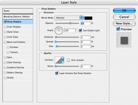
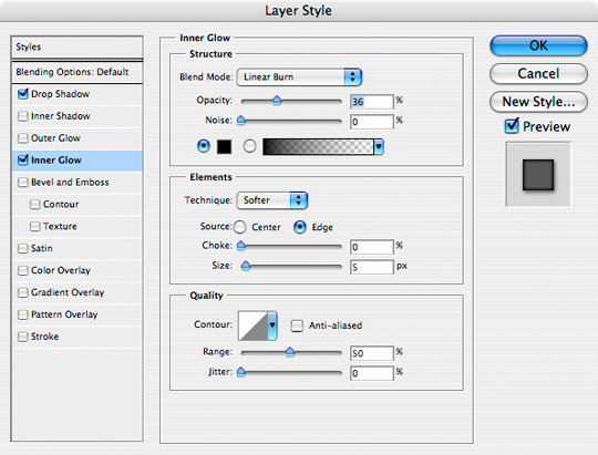
Now we’re going to add a series of Layer styles to the Main layer to create depth, contrast and better tone. Be sure to go through each setting carefully. I’ll explain anything that’s not obvious in the next few steps. Go ahead and double click to the right of the layer name in the Layers palette to bring up the Layer Styles dialog box. (*note: You can also access the layer style dialog box through the main menu by choosing Layer>Layer Style>Blending Options or by clicking on any of the distinct layer styles in the menu that follows.)
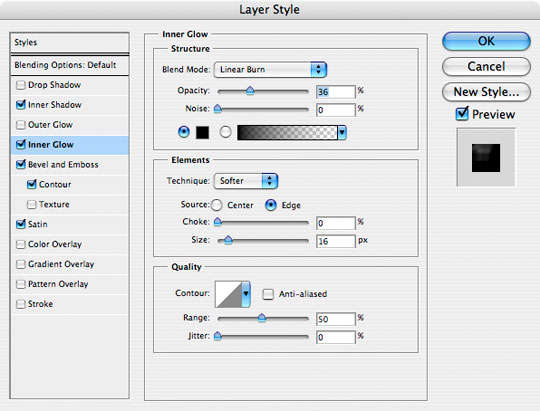
We will first add a nice little Drop Shadow followed by an Inner Glow. Notice in the Inner Glow settings however that I’ve changed the color to black and the blend mode to Linear Burn. This allows us to darken the entire inside edge quite effectively.
When you finish with these two Layer Styles, move on to the next step without closing the Layer Styles dialog.
Step 7
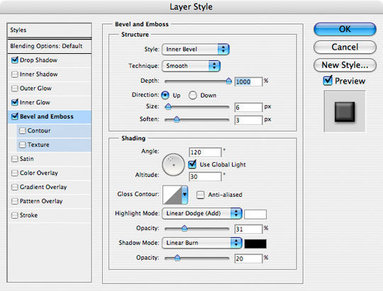
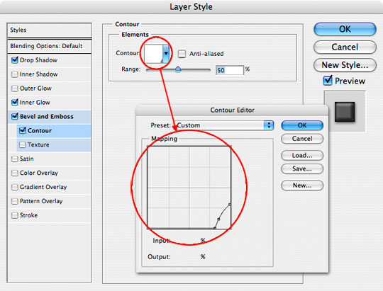
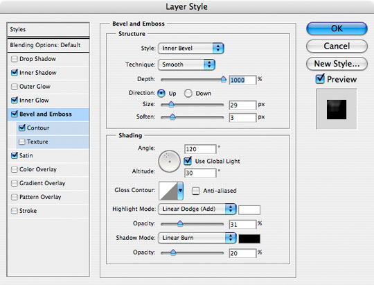
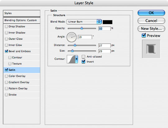
Next we’ll add some depth with the Bevel and Emboss layer style as shown below. Things get tricky when we get to the second part of this step… Click on the Contour option below Bevel and Emboss. Here we will be dictating exactly what sort of edge contour the Bevel will be adhering to.
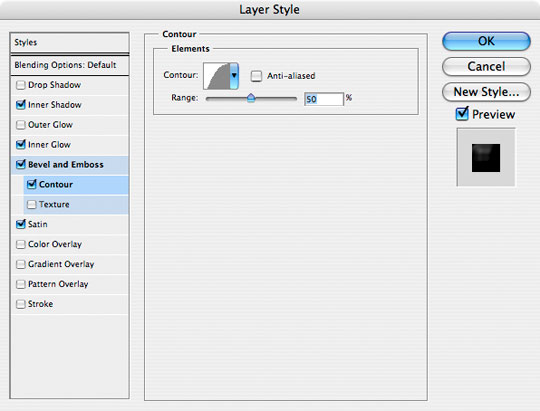
Click on the Contour preview window (which is probably set to a straight 45° line) and by clicking and dragging points along the line modify it to resemble the one shown in the second image below. (*note: If there’s ever a point you want to remove from the curve, simply click and drag it out of the editing window to make it disappear.)
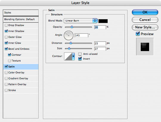
Step 8
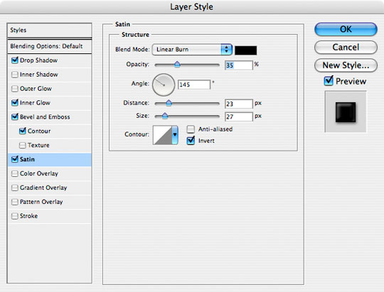
Lastly lets add some Satin to add a nice darkened ring to the interior of the rivet. When you’re finished here, go ahead and click OK to commit the layer style and return to the document.
Step 9
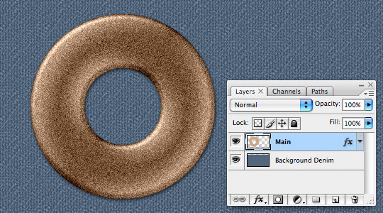
If you followed the directions carefully your image should now resemble the one you see below. If not, go back to Step 6 give ‘er another try.
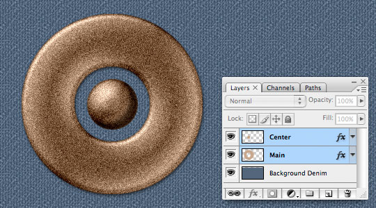
Step 10
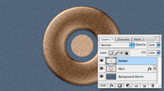
Next lets create the middle of the rivet, the round little ball that sits in the center. Create a new layer called Center and with the Elliptical Marquee tool create a circular selection right in the center of the existing doughnut (mine is 73x73px). Fill it with foreground color and add noise just like we did in Steps 2 and 3 then press Command-D (PC: Ctrl-D) to deselect.
Step 11
Now lets add a whole bunch of Layer Styles just like we did before (except these are a little different so pay attention). We won’t use a Drop Shadow this time, but an Inner Shadow instead, and a few of the other styles have been modified as well including the Contour for the Bevel and Emboss so pay close attention because I’m going to throw them all at you at once this time!
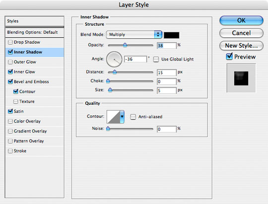
Step 12
Here’s what you should have so far.
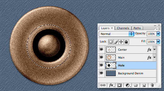
Step 13
In the layers palette click down to the Background layer and add a new layer above it called Hole. Normally I’d get into more tonal detail in this area, but because these rivets are going to end up so tiny when we shrink them to actual size, lets just create a circular selection with the Elliptical Marquee tool and fill it with black. Press the D key to reset the foreground color to black, make your selection and then fill it by pressing Option-Delete (PC: Alt-Backspace).
Press Command-D (PC: Ctrl-D) to deselect when you’re done.
Step 14
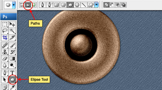
Click on the Center layer and add a new layer above it called Text (which will now be our top layer).
Switch to the Custom Shapes tool in the tools palette and choose the Ellipse tool from the fly out menu (or from the options menu that appears at the top of Photoshop when you select the Custom Shape tool). Make sure that the icon for Paths is selected because now we’re going to place a circular path for our type to follow.
Step 15
Click and drag a path onto the stage in roughly the same size as the one I’ve made below, remember to hold the Shift key to constrain the circle. If you need to move the path once you’ve drawn it out to size, simply hold down the Command (PC: Ctrl) key to change the cursor temporarily to the Path Selection tool (a black arrow) with which you can grab and drag your new path to a spot that looks right.
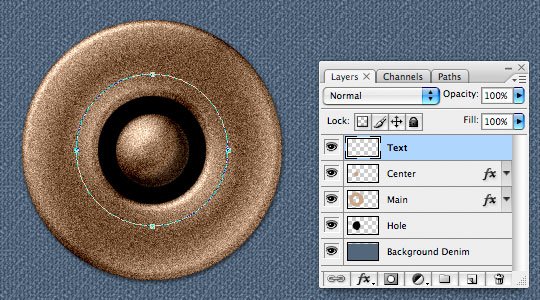
Step 16
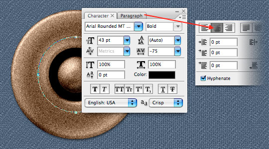
With the path laid out it’s time to switch to the Text tool by pressing the T key. I’m using the font Arial Rounded MT which is basically a bold Arial font with the corners rounded off but any nice bold font of your choosing will be fine. If your Character palette isn’t visible, you can open it by clicking Window>Character from the main menu. The important part here however is to click over to the Paragraph tab and choose the Centered Text option.
Step 17
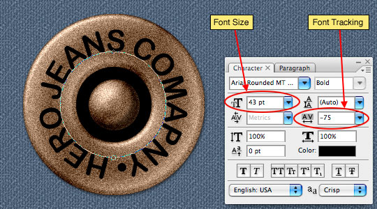
When you hold the text tool over the top center anchor point of the path we created in step 15 you will notice that the standard Text cursor changes to the Type On Path cursor (basically adding a little wavy line at the bottom of the cursor icon), this is how you know that the text tool recognizes that you wish to type on the path. Go ahead and click and type your text.
When your text is complete, use the Font Size and Font Tracking features to adjust the text to your liking.
Step 18
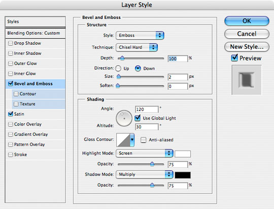
Lower the Fill opacity of the Text layer in the layers palette to 0% (which will momentarily make the text invisible), then add the following two layer styles to give the text some depth and texture.
Step 19
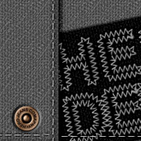
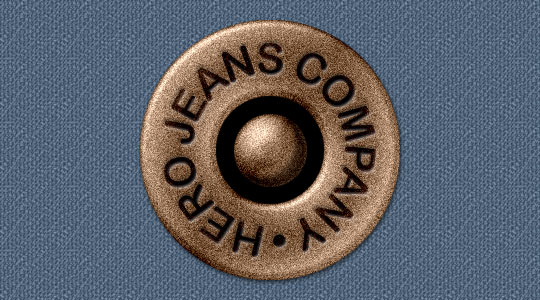
Your final rivet should look like this. Lets move on to the final image now and put the rivet in context.
Step 20
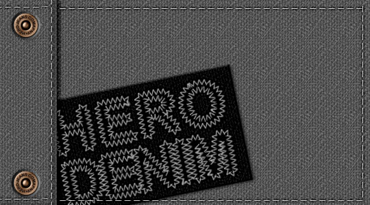
I selected all 4 layers containing the rivet components and pressed Command-E (PC: Ctrl-E) to merge them together, then invoking the Free Transform command by pressing Command-T (PC: Ctrl-T) I sized the rivet to my liking. Add a little color shift, some basic stitching and SHAZAM! the final result!
Lesson Files + Additional Resources
Download the free .PSD file and other lesson files Right Here.
Tell Your Friends
More in Graphic Design


32 Responses to Levi And Style Copper Rivet
Paulo Sales
April 22nd, 2008 at 4:39 pm
once again original stuff…5*****
Eloy
April 22nd, 2008 at 5:13 pm
amazing hero, awesome tut!!!:P
seeing this, i wait anxious tut that i request you.:P:P
Erika
April 22nd, 2008 at 5:37 pm
Oh, this is too cute. I would’ve never thought of that!
Frosty Web Designs
April 22nd, 2008 at 9:54 pm
Thats awesome. So maybe I will ‘create’ my own denim jean.
Paulo Sales
April 23rd, 2008 at 12:23 am
another 5***** tut…
original stuff , best original photoshop spot in these days…
congrats once more!
Paulo Sales
April 23rd, 2008 at 4:01 pm
5*****
naveed ahmad
April 23rd, 2008 at 7:37 pm
WOW !!!!! nice and tight stuff mate keep it coming and thanks for sharing your skills and ideas with us :)
hntr
April 23rd, 2008 at 8:24 pm
awesome hero!!!! thanx, youre the best
fox.yuri
April 24th, 2008 at 10:26 am
awesome nice work
Camelia
April 24th, 2008 at 6:29 pm
Hi
Very nice graphics!
Slip
May 4th, 2008 at 11:08 am
Wonderful tut :)
Could you please make a tutorial on how to create the stitched text shown in the last image, would really help me :)
Cheers
steel O.
May 15th, 2008 at 8:46 am
Wow, Very nice post !
I have just one question : what is the name of the “sewn” font used in this tutorial ?
HERO
May 15th, 2008 at 10:02 am
Steel O,
Thanks for the comment. The font that’s sewn into the final image is actually just Helvetica. I converted the text to paths and then stroked the path with a custom zig zag stitch I made. Hope that helps. Perhaps I need to write a tutorial on that stitching style?
steel O.
May 15th, 2008 at 10:50 am
Ok, thanks for the tips ^^
ecrabb
May 16th, 2008 at 10:41 pm
Yet another very cool tutorial from the Hero. But… what’s a “COMAPANY”?
;-)
sc
HERO
May 16th, 2008 at 11:26 pm
Ecrabb,
LMAO! Good catch! I was just checkin’ to see if you were paying attention! :)
Now I think its so funny I’m not gonna change it!
tct2
May 19th, 2008 at 12:38 pm
AHA! So you did use a custom brush for that stitching. I always try and take your tuts at least as far as you do with your final pic (emphasis on “try”), but that stitching really stumped me! I finally managed to get the look by creating and upside-down ‘V’-shaped brush and stroking the font. I still can’t get the buttons on my button-front fly jeans to look right, though. You make it all seem so easy!
smartguy
June 5th, 2008 at 6:59 am
I have created the same type of cloth texture a few months back, the only thing i am curious is how you have created that “Hero Denim Stitching” and also your jean button is simply super nice tutorial.
SANDRA LOFARO
October 25th, 2008 at 6:50 pm
I WOULD LIKE TO KNOW HOW YOU GOT THE “HERO DENIM” IN THE BRUSH OUTLINE. I LOVE YOUR TUTORIALS BUT I CAN’T SEEM TO STROKE THE PATH FOR THE LETTERS.
AS ALWAYS THE TUTORIALS ARE AWESOME!!!!
SANDRA LOFARO
October 28th, 2008 at 3:06 pm
I GOT IT AND THANKS AGAIN. I LOVE DOING YOUR TUTORIALS, THEY ARE A CHALLENGE AND MUCH FUN!!!!
HERO
October 30th, 2008 at 11:45 am
SANDRA,
I created the text layer with the Text tool (obviously), then Control-Click (PC: Right-Click) on the text and choose Convert To Work Path. This will create a path from the outline of the letters which you can then stroke with a brush. If you need help on that last part, check out my Text In Stitches tutorial.
Travis
October 30th, 2008 at 2:26 pm
Hey..this the best tutorial i’ve ever seen
sankar
November 9th, 2008 at 1:34 am
stunning steps which expands my vision
Sindre
December 8th, 2008 at 10:38 am
I have lived in an illusion that my Photoshop skills was reasonable good – until I went through some of your excellent tutorials! Thanks a lot for sharing your knowledge with us novices.
Paulo (Brasil)
December 15th, 2008 at 8:23 am
Paranb?ɬ©ns voc?ɬ™s s?ɬ£o realmente
fantasticos, sem coment?ɬ°rios pela
criatividade e qualidade dos trabalhos
Parabens
Mardian A>T>Y
April 15th, 2009 at 5:23 am
another great tuts… this site is really great
Teri
May 25th, 2009 at 3:42 pm
INCREDIBLE TUTORIAL…….thank you so much. This was so much fun to learn and do. Again, thank you.
Carolina
October 7th, 2009 at 8:42 am
You are awesome!!
evilkitty75
November 22nd, 2009 at 10:35 am
omgosh i showed this to my pal the 1s i just made n he accused me of stealin pics of rivits LOL so i did it again thx 2 u n hes now sittin with his jaw firmly on the floor HAHA THX!!!!
Sylvia Arnett
April 3rd, 2010 at 7:16 pm
Trying to make the Levi & style copper rivet. Step 15. I have tried several times to make the text follow the circular path I created, but the text cursor never changes as you describe and the text comes out just regular horizontal. Do you have any ideas what I am doing wrong?
Martina Fenner
August 10th, 2010 at 4:30 am
Thank you Hero for your really amazing work! I started with Photosop a few month ago and your tutorials have been a great help to me. A lot to learn and I appreciate your way to teach it!
emily
February 22nd, 2011 at 4:18 pm
thank you again so much! You’re my Photoshop Hero :-)!!