


The Double Matte Effect
Often times as Photoshop users, both beginner and advanced, we get so used to using a tool in a certain way that we often overlook it's possibilities. I had a recent request for a tutorial on creating a digital "matte" effect so I decided to tackle the idea using a set of layer styles which could be saved and reused easily.Introduction
This tutorial is geared towards the beginning Photoshop user, so feel free to skip through the hand holding if you know what you’re doing.
Step 1
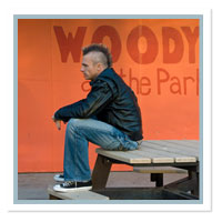
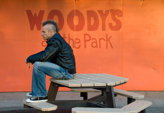
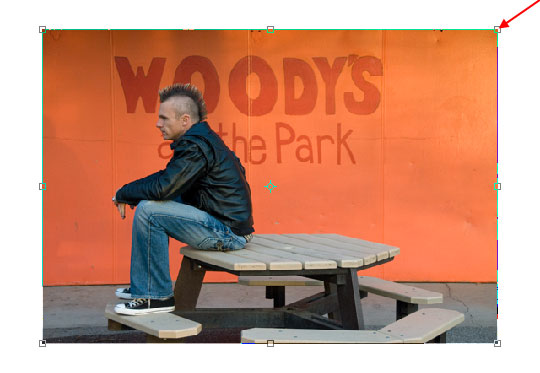
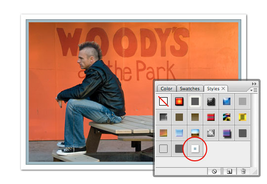
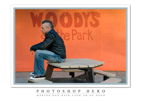
The first step is to obviously choose a photo to work with. Mrs. HERO took this photo of me during my infamous hair crisis of 2007. The year I began with a head of golden locks past my shoulders and ended completely bald. Not to mention the 6 stages of stupid in between. And of course, all of that directly relates to the tutorial, so I hope you’re taking notes.
Step 2
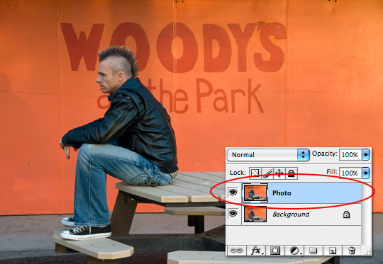
Lets start by pressing Command-J (PC: Ctrl-J) to duplicate the Background layer. Double click on the layer’s name in the Layers palette and rename it Photo.
(*note: If your layers palette isn’t visible, you can open it from the main menu via Windows>Layers.)
Step 3
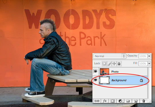
Now we are going to fill the Background layer with white. Click on the Background layer in the Layers palette to select it then press the D key to reset the foreground and background colors in the Tools palette to black and white respectively. Now simply press Command-Delete (PC: Ctrl-Backspace) to fill the layer with the layer with white.
(*note: If your tools palette isn’t visible, you can open it from the main menu via Windows>Tools.)
Step 4
Click back to the Photo layer in the Layers palette and lets shrink the photo so that we have room to work. Invoke the Free Transform tool by pressing Command-T (PC: Ctrl-T) and while holding your Shift key to constrain the proportions, click and drag one of the corners towards the center of the image. You may also try holding the Shift and Option (PC: Shift and Alt) keys at the same time which will drag all the corners in at the same time and keep the photo centered.
When the photo is resized to your liking press Return (PC: Enter) key to commit the transformation.
Step 5
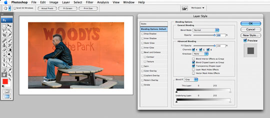
Next we’re going to add a series of Layer Styles to the Photo layer to achieve our desired effect. I’m going to talk about each of these individually from step to step, but you need to keep the Layer Styles dialog box open until we get to the end of Step #XXXXX.
Double click with your mouse to the right of the Photo layer’s name in the Layers palette to open the Layer Style dialog. (*note: This can also be done by Control-Clicking (PC: Right-Click) on the layer and choosing Blending Options. It’s a good idea to move the dialog box to a spot where you can see your photo clearly.
Step 6
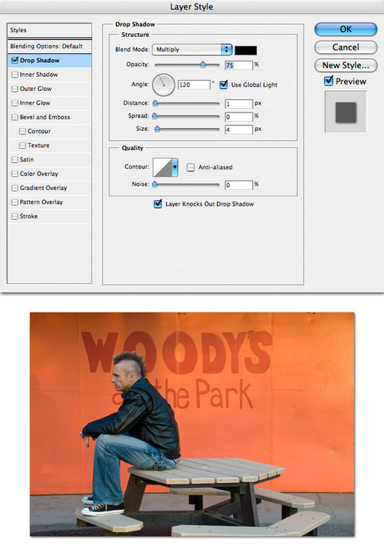
Lets first add a Drop Shadow with the following settings by choosing the Drop Shadow style from the top of the Styles list. I used the following settings, but again, based on your image size you will want to adjust these visually to your liking.
Step 7
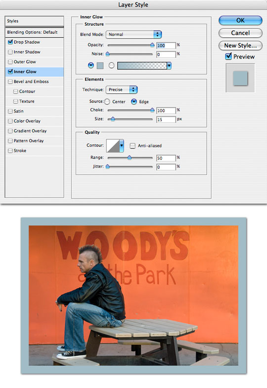
Our inner matte will be created using the Inner Glow layer style, so choose the Inner Glow style from the Styles list to reveal it’s options. Typically this layer style is used to apply a soft glow to the inside edge of an object, but by changing the Blend Mode to Normal and the Opacity to 100% we begin to create a more solid effect. Change the Technique to Precise and the Choke to 100% to really get things right.
I chose a size of 15 pixels, but again, based on your photo size you may want to add more. And finally I clicked on the color swatch to open the Color Picker, then by moving the mouse over my image (which changed the cursor to the Eye Dropper / Color Picker tool) I clicked on a nice light blue in my jeans and clicked OK.
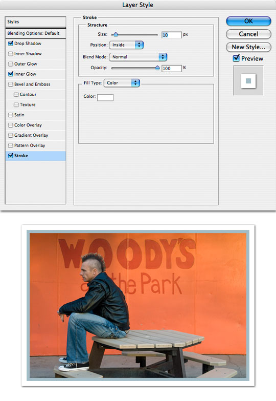
Step 8
Now lets create the outer matte. Click the Stroke style from the bottom of the list on the left hand side of the Layer Style palette to reveal it’s options. A stroke is an outline that can be applied to your layer. The default position for this style is Outside, but it yields a rounded edge outline that’s not conducive to what we are doing, so switch it to Inside instead. For my example a 10 pixel stroke looks good but depending on the size of your photo you’ll want to adjust it accordingly.
Here also you click on the color swatch at the bottom it will open the Color Picker from which you can choose any color of the rainbow for your outline. In this case I chose white.
Step 9
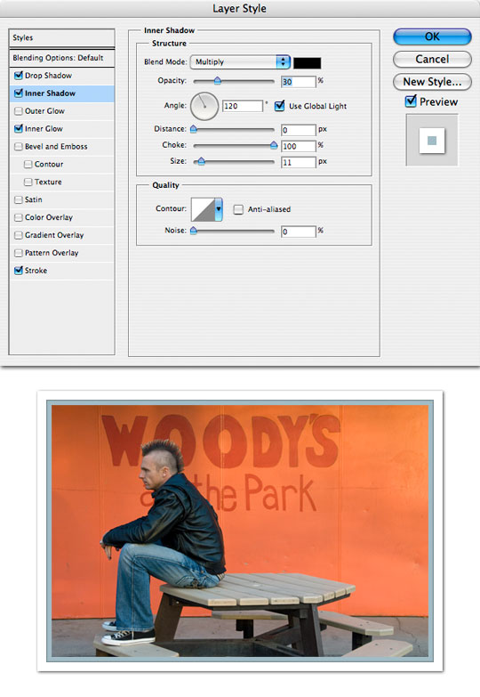
Lastly, I thought it would be nice if I could figure out a way to place a tiny shadow under the white matte we just created with our Stroke style. To do this choose Inner Shadow from the Style list and apply the following settings.
The Choke set at 100% means there’s no gradient, it’s a hard edge. The size of 11 pixels is just 1 pixel larger than my 10 pixel Stroke, so only a single pixel of this style shows through. I lowered the opacity to a point where I felt like it looked more like a shadow than an extra layer.
Step 10
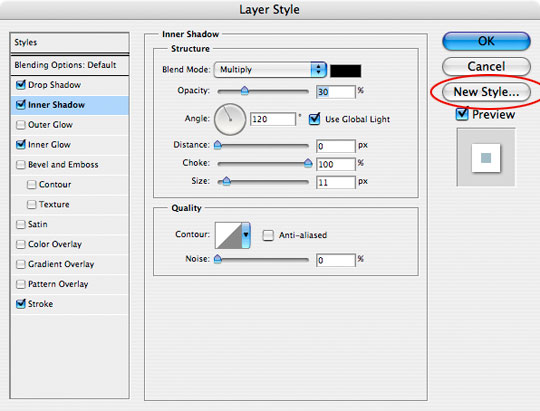
With our effect now complete lets save it as a Style that we can use again later.
At the upper right hand corner of the Layer Styles dialog box there is a button called New Style. Click it and give your style a name, make sure that the Include Layer Effects box is checked. We didn’t use any Layer Blending Options, so you can leave that box unchecked this time and simply click OK.
Now you can go ahead and click OK in the Layer Styles dialog box. This will commit your layer style to your layer and close the dialog box.
Step 11
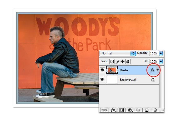
You will now notice that the Photo layer contains a Layer Styles icon indicating that styles have been applied to it. You can double click on this icon at any time to view and change all the styles we just applied.
Step 12
You should also notice that in the Styles palette, which can be accessed via Window>Styles, that the last style in the palette is the one we just created.
Now any time you want to apply this same style to a different image, all you have to do is open your Styles palette and choose it from the list!
Step 13
And a little text for a nice final image. Great work!
Lesson Files + Additional Resources
Download the free .PSD file and other lesson files Right Here.
Tell Your Friends
More in Graphic Design


19 Responses to The Double Matte Effect
Jonathan
March 15th, 2008 at 12:39 pm
First off, I love the site and tutorials, great stuff!
This is off subject, but what software do you use to design your site? I am redesign/upgrading my site right now and I have a design I’m working on in Photoshop. Is there a good way to transfer this to Dreamweaver or other software to make it functional, or should I use something other than Photoshop? Thanks in advance for any response.
Jonathan
HERO
March 15th, 2008 at 1:01 pm
Jonathan,
Thanks for the comment and the compliments. I’m glad you like what you see. I’ll post my response here in the off chance that anyone else is wondering the same thing.
I always design in Photoshop, as do most (if not all) of the other designers I know. I’ll build the entire graphic concept directly in Photoshop first, keeping all my layers, layer styles, masks etc. because it makes it a snap to go back and create or modify graphics for the same site quickly and correctly.
I build my sites using a combination of Dreamweaver and raw hand coding. I’ve been doing this since before Dreamweaver had all the fancy stuff it has now and I still like to have that direct contact with the code.
I hope that helps.
Reuben
March 15th, 2008 at 6:20 pm
amazing tips… makes me wanna quit my studies and take up digital photography. The things you can do is just amazing.
Anyway, keep up the good work!
PS: I can’t actually quit my studies… :p
Walter
March 15th, 2008 at 7:02 pm
Probably the best PS tutorial site I’ve ever come across. I just wish there were more! Do you have a book or another website so I can see more of your work? Or do you specifically recommend any PS tutorial books or software?
Walter
March 15th, 2008 at 7:03 pm
Another question, how did you design your site title and the ornate background?! I think that’s the most fantastic work I’ve seen on the site yet!
koxl
March 15th, 2008 at 7:49 pm
Please, do make a FAVICON!
That Guy
March 15th, 2008 at 11:12 pm
Thanks for the tutorial. I agree with Walter a tutorial on your vintage leaf site header would be excellent.
Cheers,
That Guy
Brian Lang
March 17th, 2008 at 9:40 am
Hey, I love your tips!
I do have a minor nitpick though. I’m reading your site’s RSS feed via Google Reader and I get your whole article that way. Do you think you could use a summary for your RSS feed instead of the whole article?
Keep up the great work!
HERO
March 17th, 2008 at 3:05 pm
Brian,
Thanks for the comment. I’m glad you found the site. I was actually feeding a “summary only” RSS but had so many people email me complaining about it and asking me to switch to a “full article” feed that I switched.
I’m in the process of a site re-design and I think I’ll probably set up two RSS feeds, one for each preference. Until then I’m afraid you’ll have to see the full feed, or just check back here for updates.
dubaibilly
March 18th, 2008 at 10:36 am
Hi PH, I had a go at this one today – it’s great – what a super effect – I do macro photographs of flowers and blow them up to 75cm x 75cm canvasses – I might try this with one but print it that size on paper to see how it works out. Just one question – (and I feel a bit thick having to ask it) – I can’t reproduce the line between the two lines of text, how did you do that?
Cheers
dubaibilly
dubaibilly
March 18th, 2008 at 10:38 am
Y’see, all I need to do is ask and then I figure it out – I just used the pen tool and did it with that. duh!
HERO
March 18th, 2008 at 11:19 am
Dubaibilly,
I actually used the Single Row Marquee tool that is found in the Rectangular Marquee tool fly-out menu. It produces a selection that is a single pixel horizontal line.
dubaibilly
March 19th, 2008 at 7:47 am
Haven’t worked that one out yet Hero, but I will. In the meantime I have posted an attempt at this technique on my blog here. If you have time to take a look I would very much appreciate a comment on my application of the technique (which, I’m please to say I did from memory!
Cheers
DB
HERO
March 19th, 2008 at 8:44 am
DubaiBilly,
Great adaptation of the technique. The purple matte really makes the orchid pop!
Ron Crowder Sr
May 3rd, 2008 at 4:59 pm
Thanks for sharing tutorials. Nice site with great Info
berky93
May 11th, 2008 at 3:17 pm
you’ve helped me so much with your tutorials! I got photoshop not knowing where anything even was, having used the GIMP for a while, but now I see the true potential of this, keep up the good work.
Marilyn
May 12th, 2008 at 12:56 pm
You might consider one more embellishment. I select the background white layer, then apply the Texturizer filter. I like the sandstone texture to make the paper look rough, like regular matt paper is.
HERO
May 12th, 2008 at 1:57 pm
Marilyn,
Thanks for the comment and suggestion, adding the texture is a great final touch!
Mardian A>T>Y
May 29th, 2009 at 11:54 pm
nice tutorial, very good, as for finishing touch, i prefer to leave it to the artist at work. u have done a wonderful job!