


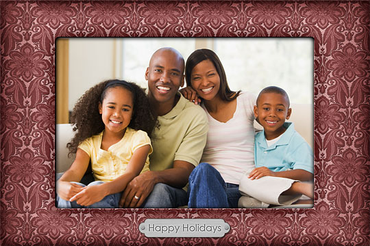
Festive Photo Frame with Embossed Texture
In this Photoshop tutorial I'll show you a cool technique for adding dimension to a background pattern as well as how to change and adjust the colors of an existing image to suit your needs all rolled inside a cool photo frame idea.Step 1
(*note: In this lesson I will be moving at a decent pace and there won’t be a lot of hand-holding on this one. Noobs, jump in at your own risk.)
I came up with this process while creating a holiday photo card for Mrs. Hero and thought you all would get a kick out of it (and hopefully be able to find a practical application for the technique in your own work too).
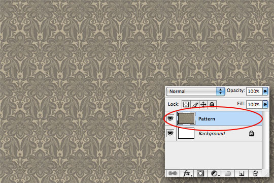
Because the original was made for a 4×6 photo card, lets just stick with that theme. If you’re going to follow along at home, open a new Photoshop document that’s 4×6 inches at 300ppi. And the first thing we’ll do is add the background texture which I’ve lovingly prepared in both a .jpg version which you can just download here or as a pre made repeating pattern as a .pat file in the .zip download at the end of the lesson. If you use the .jpg version, you can manually tile it across your background and then merge all the layers into a single pattern layer. If you’re using the .pat file, just create a new layer above the background and fill it with the pattern (once you’ve loaded it into your patterns picker).
Throughout the tutorial I’ll be insetting my layers palette into the frame. (*note: I’ve obviously had to shrink my actual image to fit the space inside the tutorial, so I’ll add a zoomed area when needed.)
Step 2
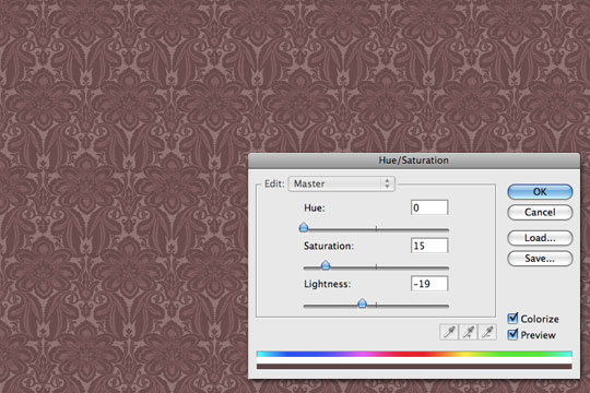
Since the color of this background pattern isn’t all that festive lets go ahead and implement phase 1 of the our color shift. Open up a new Hue / Saturation adjustment layer by clicking on the Create New Adjustment Layer icon at the bottom of the Layers palette (it’s the half black – half white circle), set the Hue to 0, the Saturation to 15 and the Lightness at around -19. Make sure the Colorize checkbox is checked and click OK. I always like to make these sorts of adjustments as Adjustment layers incase I need to tweak them later.
Step 3
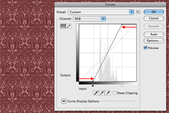
The second step of the color shift is next, again with an adjustment layer. This time, we’ll use curves to increase the contrast and vibrancy of the pattern. Add a Curves adjustment layer, dragging both the white and black endpoints toward the center as shown below.
Step 4
In order to create the 3D edges of the texture we need a way to define the edges. If you’ve got the time, feel free to trace every little line on your own, but if you’re like me, you’d probably prefer a little shortcut right? … yeah, I knew it, you big slacker!
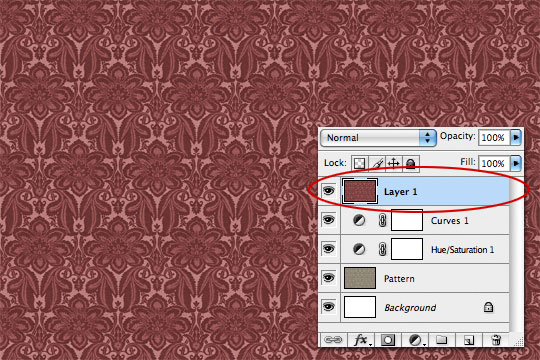
Ok, lets start by creating a new layer at the top of the document, press Command-A (PC: Ctrl-A) to Select All, then copy everything at once by either choosing Edit>Copy Merged, or by using the keyboard shortcut Command-Shift-C (PC: Ctrl-Shift-C). Then just past it all onto the new layer by pressing Command-V (PC: Ctrl-V). Yeah, I know YOU all know these shortcuts, but I’ll mention them incase a few determined noobs might have made it this far. Oh, and I know that one of you clowns will inevitably make some comment about why I didn’t just use the Apply Image function here… so let me just say I do it this way because it’s faster, the end result is the same and I can do it with a few quick strokes of the keyboard.
You’ll notice nothing visible has changed, but that the entire adjusted pattern is now living on your new layer. No need to name it because we’ll just delete it in a minute.
Step 5
Now that we’ve got the merged layer onto a new layer lets go to work on it. First lets desaturate the layer by pressing Command-Shift-U (PC: Ctrl-Shift-U).
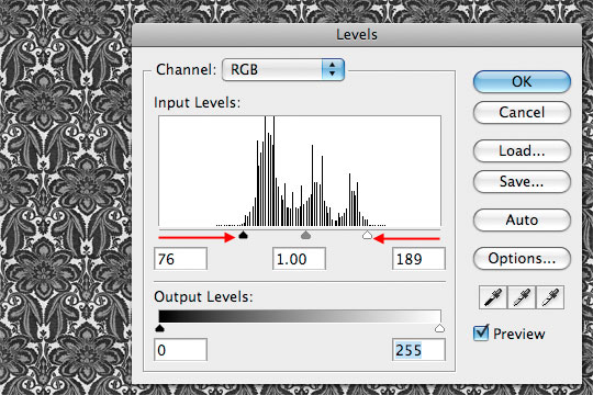
With the layer desaturated we want to get it as close to just black and white as possible, which we’ll do in two steps. We’ll start with Levels, so press Command-L (PC: Ctrl-L) to bring up the Levels dialog box and then drag the black and white point markers towards the middle until they are at their respective edges of the histogram as shown below.
Step 6
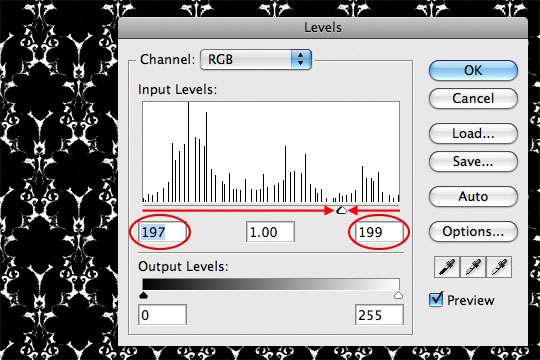
To complete the isolation of the blacks and whites we’ll use the Levels function a second time by pressing Command-L (PC: Ctrl-L) and this time we’ll drag the sliders together. The idea here is to drag the white (right) slider to the left until the whites are pure white, then pull the black (left) slider to it. If you simply enter the numbers I’ve entered below the histogram, you’ll get my exact result without having to do your own guesswork.
Step 7
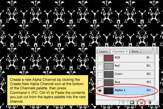
Now all we need to do is isolate just the black, and for this I love using Channels. First, select the entire canvas by pressing Command-A (PC: Ctrl-A), then Cut everything from this layer by pressing Command-X (PC: Ctrl-X).
Switch over to the Channels palette (which should be a tab inside your Layers palette, but if not, simply choose Window>Channels from the Main Menu to access it). Create a new channel by clicking the Create New Alpha Channel icon at the bottom of the Channels palette (it looks like a page with it’s corner turned back). Then simply Paste the layer content we just Cut by pressing Command-V (PC: Ctrl-V).
Step 8
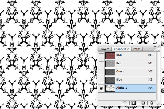
Invert the contents of the Channel by pressing Command-I (PC: Ctrl-I), this will essentially swap the black and white areas. Now lets select the contents of this Channel (the now white bits) by holding the Command (PC: Ctrl) key and clicking on the thumbnail for this Channel in the Channels Palette.
Step 9
Now that we’ve got the selection made, click on the RGB channel to switch back to the standard Channel configuration and then switch back to the Layers palette where the layer we just Cut from should still be the active layer.
Press the D key to reset the foreground color to black, then simply fill the selection with it by pressing Option-Delete (PC: Alt-Backspace). You can now deselect by pressing Command-D (PC: Ctrl-D), and while we’re here, lets go ahead and rename this layer 3D. Yes, the whole thing should now look like crap, but don’t worry, we’ll fix that in the next step.
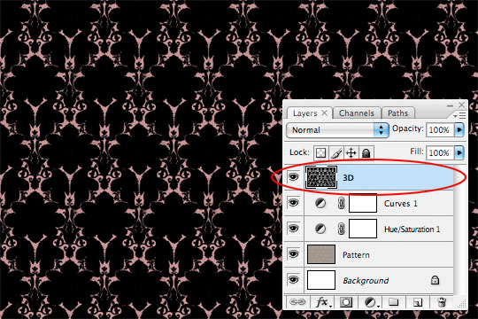
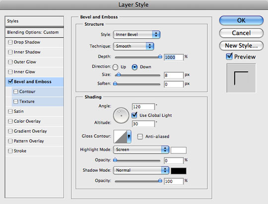
Step 10
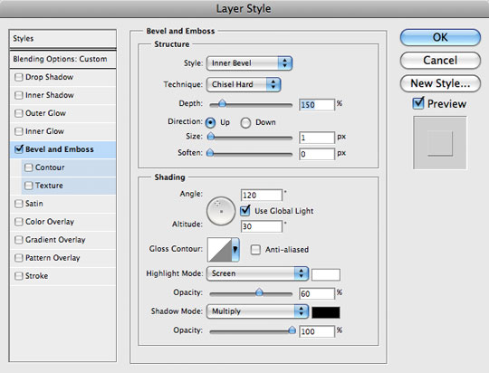
For the 3D effect to work, we’ll first lower the layer’s Fill to 0% in the Layers palette, then add the following Bevel and Emboss Layer Style by Command-Clicking (PC: Right-Clicking) on the layer in the Layers palette and choosing Blending Options from the menu. Now just select Bevel and Emboss from the list at the left and enter the following settings.
Step 11
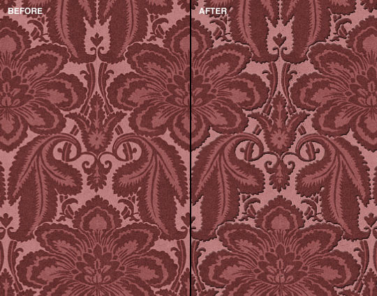
Because we lowered the layer’s Fill to 0%, the effects can be added to a layer without any of its actual pixels being visible, allowing us to overlay the Bevel and Emboss layer style onto our pattern as shown below in the before and after versions of the effect.
Step 12
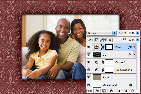
Now it’s time to add our photo. I’ll use this lovely family I found at iStockPhoto.com. If you’re using CS3 or higher you can Place the image as a smart object by choosing File>Place from the Main menu, but in the interest of backward compatibility lets just say that you’re going to open your photo in Photoshop, select the photo by pressing Command-A (PC: Ctrl-A), copy the photo by pressing Command-C (PC: Ctrl-C), and then switch back to your working document where you’ll Paste the photo into the file by pressing Command-V (PC: Ctrl-V). At the point feel free to close the photo file.
If you’re photo is too large, this would be the time to resize it using Free Transform. Simply press Command-T (PC: Ctrl-T) to invoke the Free Transform tool and then click and drag the corners of the photo while holding down the Shift key to constrain the photo’s proportions. When your transformation is complete, hit the Return (PC: Enter) key to commit it and rename the layer Photo.

Step 13
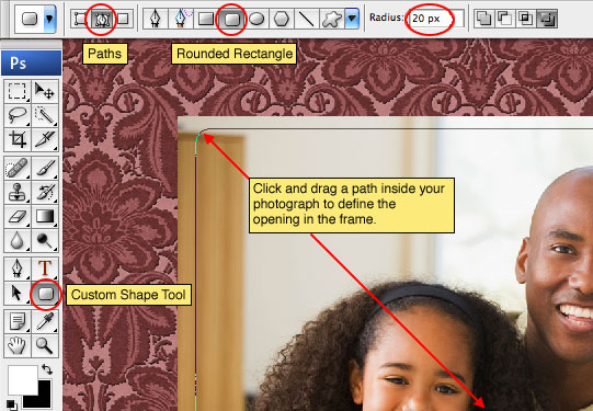
Since we’re going for a photo frame effect, I think it’d be nice to round the corners of the image a little. For this we’ll use the Rounded Rectangle tool to create a path, then we’ll convert the path to a selection and add a layer mask.
Begin by grabbing the Custom Shape tool by pressing the U key, make sure the Rounded Rectangle option is selected from the Options bar across the top of Photoshop and that the Paths option is selected as well. Set the corner radius to 20px and click and drag a rounded rectangular path where the photo area of the frame should live (this should be the size of your newly resized photo or a touch smaller).
Step 14
Next we’ll convert the path to a selection by pressing Command-Return (PC: Ctrl-Enter). You’ll know it’s been converted to a selection because the thin line of the path will now appear as the "marching ants" of an active selection.
Now that we’ve got the selection made, just click on the Add Layer Mask icon (it’s the one that looks like a black circle inside a white rectangle) at the bottom of the Layers palette to convert the selection to a layer mask.
Step 15
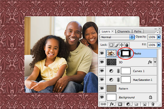
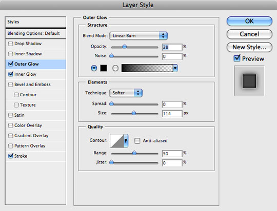
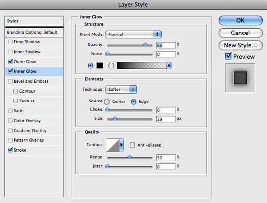
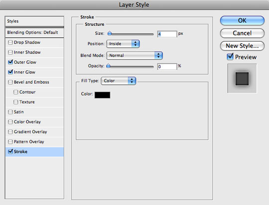
Lets now add some Layer Styles to the Photo layer that will really start to bring things together. Let me explain what we’ll be doing.
Outer Glow: By changing the color to black and the blend mode to Linear Burn we can add a dark shadow around the perimeter of the photo opening which will give the frame depth.
Inner Glow: We’ll also change the color of the Inner Glow to black and the blend mode to Normal. This will give shading around the inner perimeter of the photo.
Stroke: A 4px Stroke set to 0% Opacity ads the inner lip to the opening.
Double Click on the Photo layer to bring up the Layer Styles dialog box (Or Command-Click (PC: Right-Click) on the layer and choose Blending Options), and add the following three layer styles. Be careful to check each and every setting as many have been changed from the default values.
Step 16
If you followed along successfully, your file should be looking like the one below… if not, then get yourself back to Step 15 and do it again!
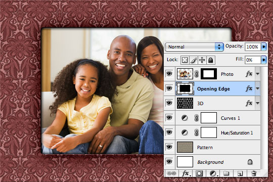
Step 17
Lets add just a little more dimension to the photo opening. Create a new layer below the Photo layer and call it Opening Edge. Load the layer mask of the Photo layer as a selection by holding down the Command (PC: Ctrl) key and clicking on the layer mask.
Make sure your new Opening Edge layer is the active layer in the Layers palette and then fill the selection with any color your little heart desires… except purple of course. Then simply lower the layer’s Fill to 0% and add the following Bevel and Emboss Layer Style.
Step 18
Again, if you followed along successfully, your file should resemble mine. Notice the depth that was added to the top and left edges of the photo opening.
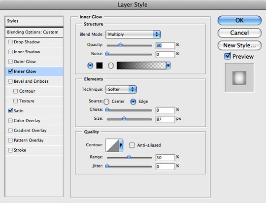
Step 19
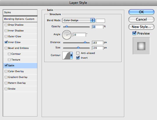
Lets add one more of these invisible layers with layer styles right above the Pattern layer called Frame Effects. Fill the entire layer with foreground color by pressing Command-A (PC: Ctrl-A) to Select All, and then by pressing Option-Delete (PC: Alt-Backspace) to fill the selection with color. Press Command-D (PC: Ctrl-D) to deselect, drop the Fill to 0% and add the following Inner Glow (set to black again) to add depth to the outside edge of the frame, followed by a Satin effect in white to add highlights.
Step 20
Which will bring us to to our finished product. I hope you’ve had a little fun and were able to learn something along the way about using Channels to isolate tone and create selections, and how you can use layers with a 0% Fill opacity to add Layer Styles in situations where such effects wouldn’t be possible otherwise.
I added a little metal plate to the front of the frame which of course isn’t covered in this lesson but since it’s become a tradition for me to mess with you by throwing in polishing elements without an explanation, I figured I’d keep with tradition here as well.
Lesson Files + Additional Resources
Download the free .PSD file and other lesson files Right Here.
Tell Your Friends
More in Graphic Design


26 Responses to Festive Photo Frame with Embossed Texture
Paulo Sales
December 15th, 2008 at 4:07 pm
pattern master !
thkz
Nice Christmas to you, Hero.
HERO
December 15th, 2008 at 4:15 pm
Thanks PAULO!
Nokadota
December 15th, 2008 at 5:45 pm
This is pretty cool. I haven’t seen other tuts like this yet. This will be excellent for next week’s pictures. =D
Chris
December 15th, 2008 at 6:23 pm
great tutorial!! Lovely family as well! Happy Holidays and thank you for taking the time to show how to do all these fabulous techniques!!
Dilirum
December 15th, 2008 at 10:57 pm
Pretty slick! Thanks for sharing another great tut!
Matthieu
December 16th, 2008 at 12:24 pm
Nice work !!!!
Bohol
December 16th, 2008 at 10:19 pm
as always, the techniques presented here are very useful. not only in this kind of output but in a number of ways.
merry christmas to you!
Palomino
December 17th, 2008 at 4:16 am
Nice tut :) Cgz with opening Hero store.
Merry Christmas, Hero!
Kalynn
December 17th, 2008 at 11:32 pm
great tut! I followed it and even figured out how to add the metal plate, complete with the studs and text, on the bottom. Thanks for sharing this! Merry Christmas, Hero!
Sindre
December 19th, 2008 at 9:30 am
I don’t know if HERO is a nickname or your given name, but in either case, it’s appropriate. Merry Christmas to you!
BJ Adkins
December 23rd, 2008 at 1:45 am
Great tutorial. I really enjoyed it and learned a bit about patterns etc that I didn’t know which is always wonderful by itself. Thank You.
RUGRLN
December 23rd, 2008 at 3:36 am
Nice one…!
Manuel Andrade
December 24th, 2008 at 8:23 am
Nice tut,Hero… great idea! Thank you!
Merry Christmas to you & your family!
Page Gardens
December 24th, 2008 at 6:57 pm
Beautiful stuff!
liebe
February 27th, 2009 at 7:10 am
Sie haben eine sch??ne Seite!
manoj acharya
April 8th, 2009 at 8:04 am
hi…very good
c.l indoria
April 15th, 2009 at 5:25 am
nice designs weldone
Syaiful Zein
July 28th, 2009 at 2:29 am
Wow…it’s very nice desihn. And i wanna try it for my family picts. Thanks for the great idea.
Hector
November 3rd, 2009 at 7:11 pm
This is an exellent tutorial.now i can use to apply in diferents patterns .
Thanks a lot.
Hector from Agentina
Fran
November 16th, 2009 at 7:37 pm
very nice. Thank you so much
Fran
November 18th, 2009 at 8:22 pm
encore very pleased with this frame
Kathy
April 28th, 2010 at 7:54 pm
What if I wanted to make a card bigger than 4×6? Can I increase the dpi so I can printn an 8×10?
Thank you!
HERO
April 29th, 2010 at 3:51 am
KATHY, Yes, you could simply do an Image > Image Size, but it would be better to create the file from scratch at 8×10 at 300dpi so that it’s the right aspect ratio and as clean as possible. And of course, layer styles will need adjusting if you go that route as well.
iGeekz
September 20th, 2010 at 12:07 pm
Excelenet!
tripti
October 1st, 2010 at 2:32 am
amazing , beautiful
bonifacio Ferndinand
January 20th, 2011 at 5:22 pm
Maravilloso! wonderfull.. I made my self starting in “0” and I get a great file with this tutorial.. thanks thanks and many thanks