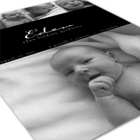
Contemporary Baby Announcement
In this tutorial I will show you how to create a contemporary baby announcement using a few simple clipping masks and some carefully placed guides.Step 1
The idea here was to use 5 photos of this little crumb snatcher to create a simple yet elegant baby announcement for a friend to send out to all her friends and family. She decided to print the announcements at home and gave me her desired size, which was 4.25×5.5 inches. At 300ppi this makes a document 1275×1650. If you’re following along at home, go ahead and create your document now.
Press the D key to reset the foreground and background colors in your Tools palette, then press Option-Delete (PC: Option-Backspace) to fill the Background layer with black.
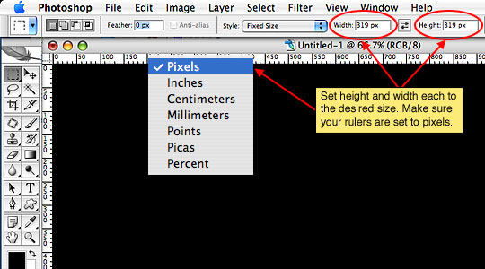
I’ve decided I want 4 photos placed in equal sized squares across the top of the invitation, so lets do a little math to figure out the sizes. 1275 pixels wide divided by 4 gives us 318.75 … but lets just call it 319. What this means is that each square along the top will need to be 319×319 pixels. To make this easy, grab the Rectangular Marquee tool from the Tools palette (or just press the M key). In the options bar across the top of the screen choose Fixed Size from the Style drop-down menu, then enter your width and height as 319 px. Remember the "px" after your numbers.
(*note: by default the increments in the width and height fields are the same as the increments set in your rulers, press Command-R (PC: Ctrl-R) to pull up the rulers, and if they’re not set to pixels, right click on the ruler and choose pixels.)
Step 2
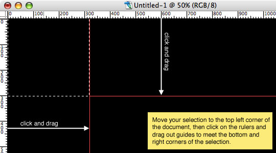
Now that we have our Rectangular Marquee tool set to the exact size we want, click on the upper left corner of the stage and set the first square selection. If the selection isn’t exactly in the upper left corner simply drag it up and left until it snaps to the document edges.
Place guides at the bottom and left of the selection by clicking on the left side ruler and dragging a guide to the right until it snaps to the right side of your selection, then do the same from the top ruler to the bottom of your selection.
Step 3
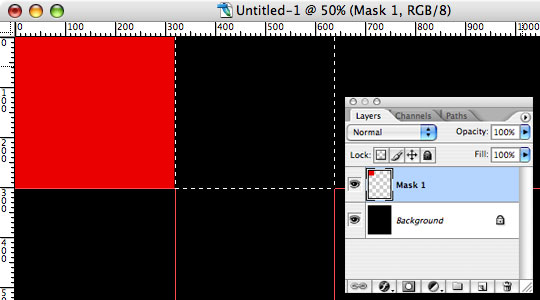
Click on the foreground color in the layers palette and change the color to something other than black (to make it visible against the background layer I chose red). Create a new layer in the layers palette by clicking on the new layer icon at the bottom of the palette. (*note: it’s just to the left of the little trash can icon and looks like a piece of paper with one corner folded back.) The new layer will be named "Layer 1" by default, but to keep our file organized lets double click on the layers name to rename it "Mask 1"
Now fill the selection with your newly selected foreground color by pressing Command-Delete (PC: Ctrl-Backspace).
Good job! Lets make the other 3 squares in exactly the same fashion.
With your cursor inside the selection (*note: the cursor will change to an arrow with a selection attached) click and drag the selection to the right until it snaps into place in the second position. You’ll only need to drag a single guide to the right side, then repeat. (note: You don’t need to do a 4th guide because you’ll be at the end of the document.)
Step 4
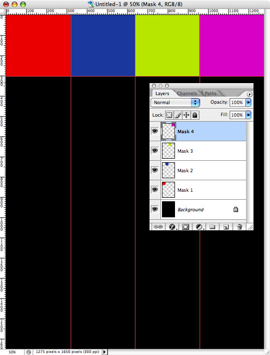
Create a new layer, name it and fill it with color, then repeat the process until all 4 squares are filled. It may help you to fill each new square with a different color to be able to tell them apart rather than creating a big red bar across the top of the document. These squares will act as Clipping masks later in the exercise so their color doesn’t matter at all.
When all 4 squares are finished, press Command-D (PC: Ctrl-D) to deselect.
Step 5
It is good Photoshop practice to name each layer properly and although this file won’t have a huge number of layers it’s a good practice to get into, plus I will be referencing layers by name later.
In the layers palette click back to the layer named "Mask 1" and then open the first baby photo you’d like to use.
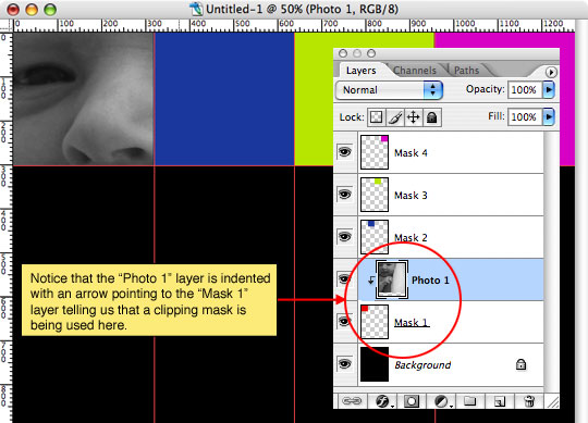
With the baby photo open, click and drag the photo into the working document. It will likely be far too big for the little square, but don’t worry, we’ll deal with that in a moment. First lets rename this new layer "Photo 1" (See how Mask 1 and Photo 1 are named alike). Great! Now lets use our "Mask 1" layer as a clipping mask. Right click (Mac: Ctrl-Click) on the "Photo 1" layer and select Create Clipping Mask from the menu. You will notice that the "Photo 1" layer is now indented in the layers palette with a little arrow pointing down to the "Mask 1" layer. Now all we see is the area of the photo that overlaps our mask.
(*note: You can also create a clipping mask by holding down the Option (PC: Alt) key and clicking your mouse on the divider line between the layers you wish to link. You will notice that your cursor will change to two overlapping circles.)
Step 6
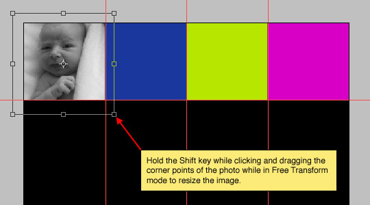
Now that our photo is clipped to its mask we can resize it to fit the space visually. The nice thing about using a layer mask rather than resizing and cropping the photo is that we always have the option of moving the photo within the mask area at any time, or adding a different photo in it’s place with very little effort.
Press Command-T (PC: Ctrl-T) to invoke the Free Transform tool. You will notice that there are now bounding lines around your photo and small boxes present at all corners and in the middle of each side. These boxes are your transform controls. (*note: Sometimes the canvas area is too small to show the edges of the photo and the associated transform controls, if this happens simply press Command-0 (PC: Ctrl-0 … that’s a ZERO) to resize the document to show all the transform controls.) Be sure you hold down the shift key to constrain the photo as you click and drag the corners towards the center until the photo fits the way you’d like it to.
Step 7
When the photo is sized to your liking simply press the Return (PC: Enter) key to commit the transform.
Now repeat step 6 for the other 3 masks adding new photos, creating clipping masks and free transforming the photos to fit.
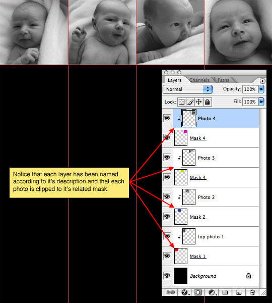
Step 8
We’ve got one more image to place, this one will be the large image at the bottom of the invitation. You could choose to draw out a guide and create a mask for this one as well, but since it’s not really going to make any difference in this application I’ll pass and just place it where I want it.
Be sure that your top layer is selected. If you’re following our naming scheme that would be the "Photo 4" layer.
Open the last photo and click and drag it into the document. Rename this layer "Photo Main" and use the Free Transform tool just like we did in the previous steps to size and place the image. This placement is a judgment call on your part, but be sure to leave a nice wide strip of black for the text we will insert in the next step.
(*note: At this point you can hide your guides by pressing Command-H (PC: Ctrl-H). You can bring them back with the same keyboard shortcut if needed)
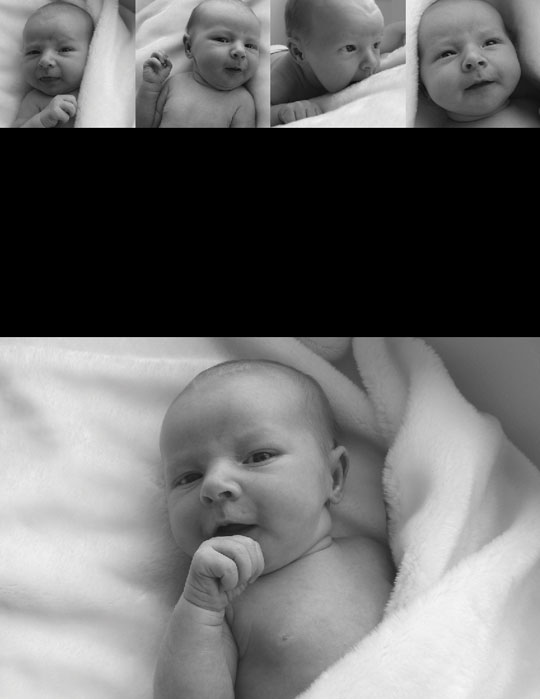
Step 9
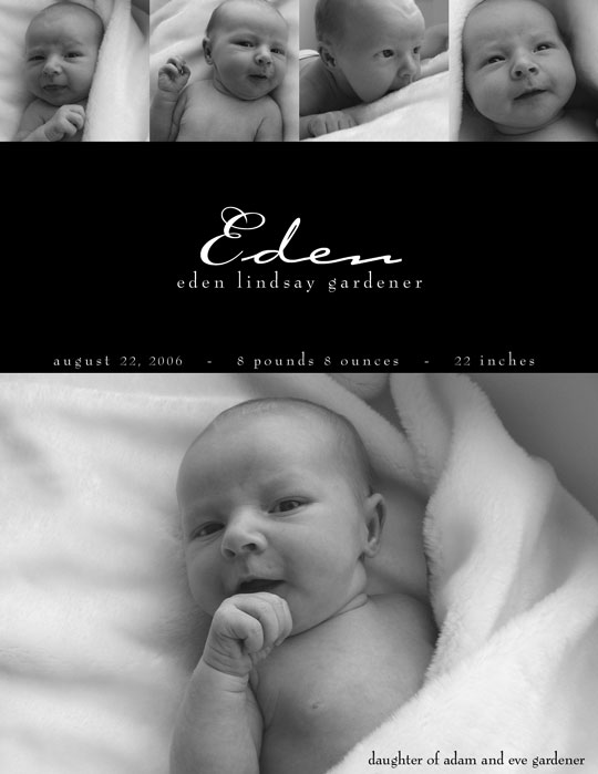
Finally using the Text tool from the Tools palette type, format and place your text as you see fit. As a rule of good design I would recommend limiting your font usage to 2 fonts like the final image below. You can download the .PSD file for this exercise at the end of the lesson to take a look at how I laid out the text in my document.
(*note: The Text tool can be easily accessed by simply pressing the T key.)
Lesson Files + Additional Resources
Download the free .PSD file and other lesson files Right Here.






15 Responses to Contemporary Baby Announcement
dilirum
March 16th, 2008 at 2:11 am
Very Inspirational ,,, I love the effect.
Dedra
March 20th, 2008 at 6:13 am
Hero,
Thanks for the great tutorial. I have one question. I know it’s something I did, but I can’t seem to diagnose it… When choose Create Clipping Mask on one (and only one of the pics, there’s the rub) the pic indeed clips, but it also goes darker. I looked at the Layer Style and everything appears to be default. Any suggestions? Thanks again for the awesome tutorial.
HERO
March 20th, 2008 at 6:59 am
Dedra,
When you use a clipping mask, the properties of the bottom layer are inherited by the top layer, so you might want to check the opacity of the layer you’re clipping to (or if you’ve applied any style to the lower layer, those styles are also passed up to the clipped layer.)
Hope that helps!
Dedra
March 30th, 2008 at 11:53 am
Epiphany! Yes, that solved it. Thank you very much. I am very happy with the results (that are linked to in this comment). I have many more workflow issues to tackle, but gaping hole in my understanding now has a tiny little rope bridge across it. . Thanks!
HERO
March 30th, 2008 at 6:06 pm
Dedra,
As always, I’m stoked to be able to help!
Jessica
May 6th, 2008 at 4:36 pm
What fonts were used in this announcement?
HERO
May 6th, 2008 at 5:29 pm
Jessica,
The fonts used here are Bernhard Modern and Bickham Script. If you download the .PSD file at the end of the lesson and click on the Text layers your Characters Palette will tell you what the fonts are and if you have them or not. If you don’t, check DaFont.com, they’ll usually have them available for free download.
Keukii
January 7th, 2009 at 12:57 am
awesome!!
I just looking for this tutorial.. I need to make my son’s album when he was a baby. Thanks a bunch Hero! :))
Julie
February 25th, 2009 at 6:19 pm
I’ve been searching for how to do this for AGES, and have finally found instructions that are clear! Thank you soooo much!
michelle p
June 26th, 2009 at 3:01 pm
wow thanks so much i never thought that i can even make something like this but it turn out great. your instructions was easy to follow ur the best thanks a millon do u have any more tutorials if yes let me know love to see more
Nina Johansen
July 21st, 2009 at 5:20 am
Hi im just starting photoshop and want to thank you for this tut. I´ve had a lot of problem whit size my picture right with chop /free transform. Clipping mask is the answer!! you are a good teacher. Hope for more tut from you!! thanks from Copenhagen in Denmark
Barbara Shepherd
October 13th, 2010 at 3:06 am
I have Photoshop Elements 7 but I can’t get the rulers to turn on…when I go under view the rulers are not accessible…grayed out.
HERO
October 13th, 2010 at 2:28 pm
BARBARA, That is a mystery indeed. I can’t imagine why you wouldn’t be able to turn the rulers on. Occasionally having more than one layer selected can cause tools to be grayed out, but I’d suspect it’s more likely some sort of bit depth or pixel aspect issue. Try opening a brand new document and see if they’re accessible there. You might also try using the Keyboard Shortcut Command-R (PC: Ctrl-R) and see if that works.
Shannon
January 31st, 2011 at 3:06 pm
I just stumbled across your site today, and I LOVE it. I used this tutorial today, to make my daughters 2nd birthday invites! They are amazing. Thanks for making such a user friendly and fun tutorial!
Eazee72
October 10th, 2011 at 8:11 pm
Then sky is just the beginning, amazing your tutorial will really help me alot. Thank a bunch.