


Adobe Photoshop CS3 Style Icons
In this tutorial I will show you how to create the Adobe CS3 style icons using some basic gradients and layer styles.Step 1
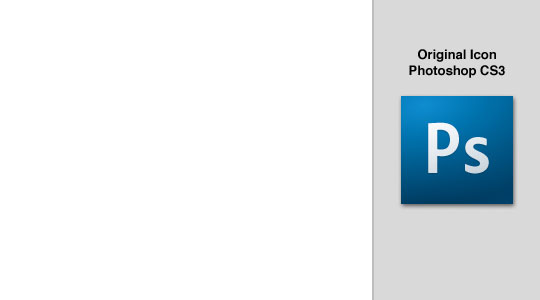
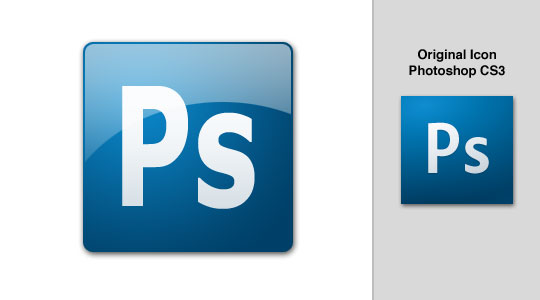
When I want to create an effect that already exists I always like to have a piece of reference material to work with. In this case I’ve taken a screen shot of the Photoshop CS3 icon and placed it in the file to look at while I work.
Step 2
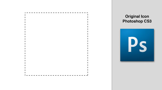
Create a new layer by clicking the New Layer icon at the bottom of the layers palette and name it "Background Square" then select the Rectangular Marquee tool by pressing the M key and drag out a nice square for the icon’s background. (*note: By holding the Shift key while you drag you can constrain your selection to a perfect square.) My square is 210×210 pixels.
Step 3
Press the D key to reset the foreground and background colors to black and white, then fill the selection with black by pressing Option-Delete (PC: Alt-Backspace).
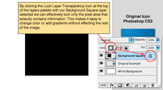
Deselect by pressing Command-D (PC: Ctrl-D) and lock the layers transparency by clicking the Lock Layer Transparency button at the top of the layers palette.
Step 4
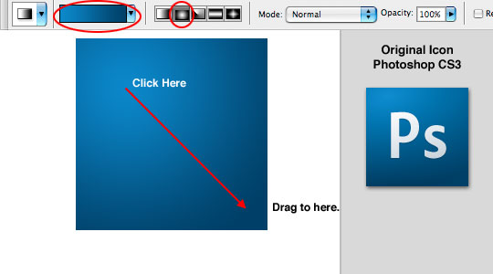
Lets go ahead and setup for the blue background gradient by changing the foreground color to #0b88cb and the background color to #004068.
Press the G key to choose the Gradient tool, then from the options bar across the top choose Foreground to Background from the color picker and Radial Gradient for the gradient type. Now simply click a spot in the upper left hand corner of the box and drag at a 45 degree angle toward the bottom left corner to create a gradient that looks similar to the example.
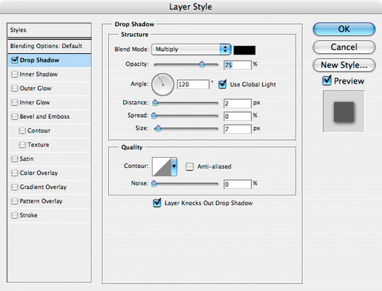
Step 5
Now we’ll add a drop shadow to the layer by Right-Clicking (Mac: Control-Click) on the layer and choose Blending Options. Click on the Drop Shadow link in the left column and add the following settings then click OK.
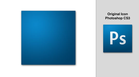
Step 6
Your file should now look something like the one below.
Step 7
Press the T key to call up the Text tool and lets go ahead and add our text with the following settings.
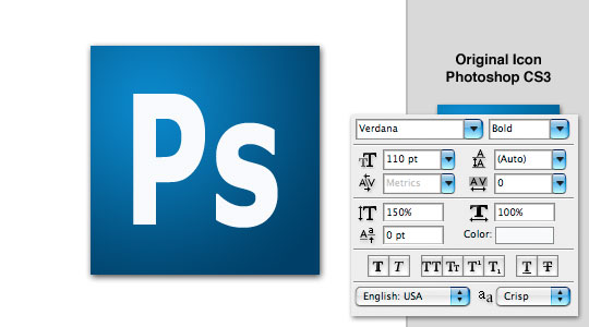
Step 8
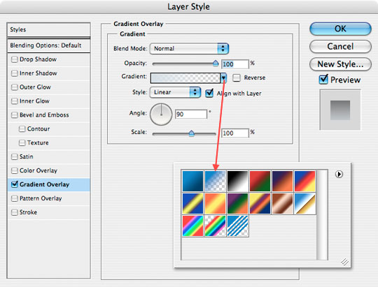
The text also has a slight gradient but instead of using the gradient tool directly we are going to use the layer style called Gradient Overlay as shown below.
Before I called up the Layer Styles dialog box though, I changed my foreground color to #d6dfe5 so that it would already be there for the layer style application.
Step 9
Technically now we are finished as far as a correctly built PS3 icon. I thought for my icon I’d add a Web2.0 style gradient and rounded corners to add a nice little touch which you will find in the .PSD file available for download at the bottom of the lesson.
Step 10
Try all the variations or make up your own and enjoy!
Lesson Files + Additional Resources
Download the free .PSD file and other lesson files Right Here.
Tell Your Friends
More in Graphic Design


20 Responses to Adobe Photoshop CS3 Style Icons
Mark
March 14th, 2008 at 11:32 pm
A promising tutorial ruined by ending too abrubtly. Id have liked to have seen instructions for the rounded corners and a “how to” to get the web 2.0 style curved gradient.
HERO
March 15th, 2008 at 5:03 am
Mark,
This tutorial was built to show how to create the stock Adobe Icon, but if you read step #10 you’d see that my source .PSD file does contain the rounded corners and Web 2.0 effect. So if you want to know how it was done, it’s as easy as downloading the .PSD file at the end of the lesson.
I hope that helps.
Jason
May 8th, 2008 at 6:54 am
Hi, I am a Photoshop newbie, so please bear with me. I too am having troubler with the rounded corners and the Web 2.0 Gradient. I have downloaded your psd files (btw, thank you very much for providing them) but I am lost.
I was able to drag your highlight layer to my doc and use it with no problem. Although, I am clueless as to how I can duplicate the process. Furthermore, the rounded corners elude me. Can you help me? Should I look to another of your tutorials?
Thanks for your site. I really enjoy what you are doing.
Jason
Playful_cyanide
June 15th, 2008 at 6:30 pm
Hello. I am also just getting used to Photoshop. So I have the same question as Jason. Should I look to another tutorial? Thank you,
Floris
July 6th, 2008 at 12:34 pm
Hehehe, thanks for the rounded corners technique! Take a look at what I did to your logo (I nibbled on it for a bit):
http://florisporro.com/img/nibbledPS.jpg
sLIVER
July 18th, 2008 at 6:46 pm
I really like this little tutorial. I also would have too liked to see the rounded corners and the highlight effect creation.
Append!…(or make a chronicle!)
?ß‚Äò?æ
July 26th, 2008 at 8:04 pm
well done that’s really good,clearly tutorial. thank you.
Johan
September 9th, 2008 at 11:41 am
Hi, I think the tutorial is awesome but how do i get Psd file into photoshop? Plz help me
HERO
September 9th, 2008 at 12:34 pm
JOHAN,
Save the file to your desktop (or somewhere you’ll remember), navigate to the file and unzip it using a program like WinZip or Stuffit to expand the contents of the .zip file, then just open Photoshop and choose File>Open then navigate to the unzipped folder and choose the .psd file.
Lauren
October 3rd, 2008 at 12:32 pm
Wonderful! Thanks!
Chris
November 2nd, 2008 at 2:31 pm
Excellent. I know there “could’ve been more” – but what you had was exactly what I needed. Thanks.
Max
November 4th, 2008 at 3:50 pm
Well done!
Though the original font is Myriad Pro.
but nvm. looks good anyway!
William
January 29th, 2009 at 11:01 pm
Great!!! thank you!!
anon
April 9th, 2009 at 2:44 pm
great great great
ilearned much from you
keep up the good work
bzizit
November 7th, 2009 at 5:50 pm
thanks :)
PhotoshopAddict
April 4th, 2010 at 6:23 am
Jason and Playful_cyanide,
I was able to make something similar to the tutorial poster’s final outcome without having to download all of those files. What I did was, first I took the eyedropper to select the darker color in the gradient and used it for a stroke of 3 pixels. The way I got the highlight is by creating a new layer, loading a selection of the square with the gradient, (control+click or command+click)and using the elliptical marquee tool. While pressing and holding the alt or option key, make a selection. If you use this strategy, you’ll notice that your selection is only inside the square selection made previously. Now fill the selection with white, (ffffff) and turn that layer’s opacity down to 20 percent. It will be looking like it should.
cinevin
May 4th, 2010 at 2:55 pm
thank you… good work..
Gavin
May 12th, 2010 at 7:52 am
Really appreciated that I’m considering redesign of my icon following your tutorials, thanks!
DJ Ben
December 29th, 2010 at 12:25 am
Legend, thank you! I have been searching how to do my favicon icon for ages. I knew it wasn’t going to be too difficult, I just needed a head start.
thanks PSH
Design Stu
October 1st, 2011 at 7:11 am
Nice tutorial. Great, easy results.
Thanks for sharing