
 Photos – Part 1")

Website Navigation I
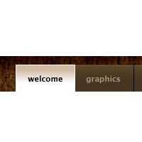
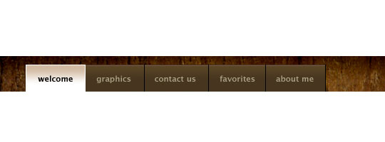
Since I added the LittleLines.com website to my Featured Sites list, I've had a few of you ask for a lesson on creating a similar website navigation concept in Photoshop, so In this tutorial I'll show you how to create a clean navigation layout based on the LittleLines site.Step 1
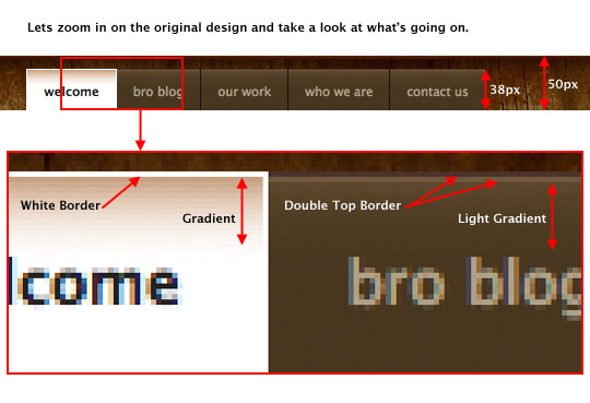
I’ve said it before and I’ll say it again… One of the best ways to learn and grow in Photoshop is to deconstruct and attempt to recreate designs that inspire you. So in that spirit, lets jump in and take a closer look at the LittleLines.com navigation to see what we can learn about how they initially created their lovely little nav bar.
Notice all the details in the expanded view below, the borders, gradients, sizes and colors. In instances like this, the zoom tool can be your best friend.
Step 2
Lets jump right in and open a new Photoshop document. For illustration purposes I’ll make my document 540x200px at 72ppi, but obviously if you were creating a website concept you’d want to have a document size large enough to design the whole site rather than just the navigation.
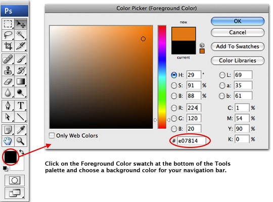
For the moment, lets ignore the wooden background texture and set a solid color for the background of the navigation. Click on the Foreground swatch at the bottom of the Tools palette to open the Color Picker, then pick a complimentary color for the background. I chose a nice orange color #e07814.
Step 3
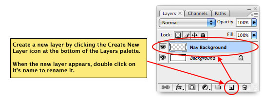
Create a new layer by clicking on the Create New Layer icon at the bottom of the Layers palette. When the new layer appears double click on the layer’s name to rename it Nav Background. From now on when I tell you to Create a New Layer and give it a name, this is what you’ll do.
(*note: If the Layers palette isn’t visible, bring it up by choosing Window>Layers from the main menu.)
Step 4
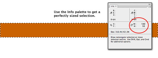
Now lets create a selection by pressing the M key to switch to the Rectangular Marquee tool. As we know from the closer look from Step 1, the navigation background measures 50px in height. I like to keep the Info palette visible so I can see the exact dimensions of my selections (Window>Info from the Main menu), this way as I click and drag my selection I can watch the sizing and always get the selection I’m after on the first try.
Once your selection is created, simply press Option-Delete (PC: Alt-Backspace) to fill the selection with your newly selected foreground color. With your selection filled with color, deselect by pressing Command-D (PC: Ctrl-D).
(*note: You can also use the Fixed Size option in the Marquee Options bar at the top of Photoshop to create a perfectly sized selection, but I find that using the Info palette is quicker.)
Step 5
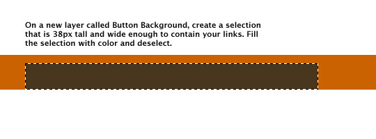
Now lets set the stage for our buttons. Create a new layer called Button Background, set your foreground color to #47361f, and create a selection above the Nav Background that’s 38px in height and sufficiently wide to accommodate the buttons you wish to create (*note: you can always narrow the area if it’s too wide to begin with). Fill the selection with the new foreground color by pressing Option-Delete (PC: Alt-Delete) and deselect by pressing Command-D (PC: Ctrl-D).
Step 6
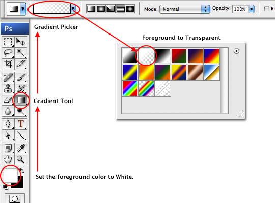
Now lets add a light gradient to the Button Background. Create a new layer called White Gradient and set your foreground color to white by either using the Color Picker as we’ve done before, or simply by pressing the D key to reset the foreground and background colors to black and white respectively and then by pressing the X key to switch white to the foreground.
Switch to the Gradient tool by pressing the G key, and choose the Foreground to Transparent swatch from the Gradient picker in the Gradient Options bar at the top of Photoshop.
Step 7
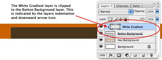
Before we apply the gradient, lets create a Clipping Mask from the White Gradient layer to the Button Background layer by Control-Clicking (PC: Right-Clicking) on the White Gradient layer in the Layers palette and choosing Create Clipping Mask from the menu. This will make it so that only the pixels from the White Gradient layer that overlap the Button Background layer will be visible. You will know a clipping mask has been created because the layer will indented with a small arrow pointing to the layer it is clipped to.
(*note: An easy way to create a clipping mask between two layers is to hold down the Option (PC: Alt) key and then moving your cursor to the line between the two layers in the Layers palette, at which time the cursor will change to what looks like two overlapping circles. When the cursor changes, simply click your mouse to create the clipping mask.)
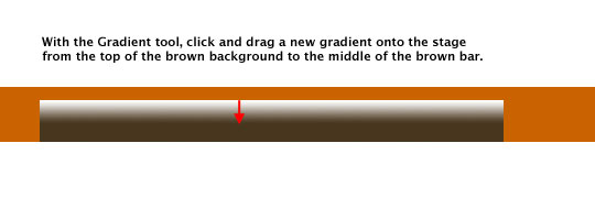
Step 8
With the layers clipped together we can go ahead and add the gradient. To do this, simply click and drag downward with the Gradient tool from the top of the brown button background area to about 50% of the distance from the top to the bottom.
(*note: Holding down the Shift key while you click and drag your gradient will constrain it to a completely vertical line.)
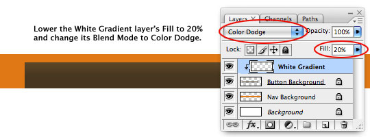
Step 9
Obviously the effect of our newly created gradient is much too strong, so lets go over to the Layers palette and lower the White Gradient layer’s Fill to 20% and change it’s Blend Mode to Color Dodge.
Step 10
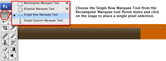
Next, lets create the double border at the top of the brown buttons. Create a new layer called Double Border and set your foreground and background colors to #644239 and #866d53 respectively.
Locate the Rectangular Marquee tool at the top of the Tools palette and Click and Hold your mouse on it to reveal it’s fly-out-menu. Choose the Single Row Marquee Tool from the list and click on the stage at the top of the brown button background to create a single pixel horizontal selection on the stage. Don’t worry if your placement isn’t perfect, you can always move the border up or down once we’re done creating it.
Step 11
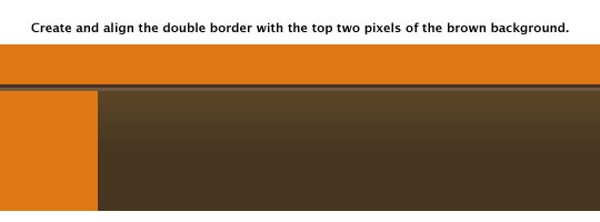
With your single pixel line selection made, press Option-Delete (PC: Alt-Backspace) to fill the selection with the foreground color we set in the last step. Press the Down Arrow key on your keyboard once to move the selection down one pixel, then fill the selection with your new background color by pressing Command-Delete (PC: Ctrl-Backspace). Now you can deselect by pressing Command-D (PC: Ctrl-D).
If your lines aren’t in the right place, switch to the Move tool by pressing the V key and then move it up or down with your mouse (or the arrow keys) until it’s covering the top two pixels of the brown button background. I’ve zoomed in below so you can see exactly how things should be shaping up.
Step 12
The last thing we need to do is add our Double Border layer to the clipping mask we’ve already created down to the Button Background layer, so just like we did before, Control-Click (PC: Right-Click) on the Double Border layer in the Layers palette and choose Create Clipping Mask from the menu.
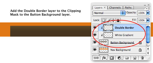
Step 13
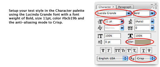
With the background now complete, switch to the Type tool by pressing the T key and lets prepare the font and style. The LittleLines website uses the Lucida Grande font which is an Apple system font found native on the OSX operating system, but Windows users, don’t fret, just read on. We’ll setup our type by first making sure the Character Palette is visible (if it isn’t, choose Window>Character from the Main menu).
Windows Users: The Lucida Grande font was Apple exclusive until the release of the Safari browser for PC in which Apple included both the Lucida Grande and Lucida Grande Bold fonts. Since this is an Apple font, I can’t give it away in my lesson download, but if you want this font, you can download and install the Windows version of the Safari browser from the Apple’s website and then navigate to the Program Files > Safari > Safari.resources folder where you’ll find both the standard and bold versions of the font. You can then drag those files to the Windows Font Manager in the Control panel to install them. (*note: You may have to restart Photoshop to refresh it’s font list.)
From the font drop-down menu at the top left of the Character palette find the Lucida Grande font and select it, if for some reason your computer doesn’t have Lucida Grande installed, you can use a similar sans-serif font like Verdana, Arial or Helvetica to achieve a very similar effect. Set the font weight to Bold, the size to 11pt, the color to #bcb19b and the anti-aliasing style at the bottom of the palette to Crisp.
Step 14
Click onto the stage to start a new text instance and type out your links. When mocking up a site like this I use spaces to separate the links and in this case I used 9 spaces between each link item. When you’ve finished your text, click on the little Check Mark icon in the Text Tool options bar at the top of Photoshop (or simply hit the Enter key). You’ll notice that a new Text layer has been created for you in the Layers palette.
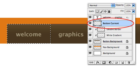
Step 15
With the Text layer still selected in the Layers palette, hold down the Command (PC: Ctrl) key and click the Add New Layer icon at the bottom of the Layers palette. This will add a new layer below the current layer. Name this new layer Button Current.
Press the M key to switch to the Rectangular Marquee tool (*make sure you switch it back to the Rectangular Marquee tool from the flyout-menu if it’s still set to the Single Row Marquee tool that we used to create the horizontal lines) and create a rectangular selection from the upper left corner to the center between the first two buttons as shown below.
Step 16
Press the D key to reset your foreground and background colors to black and white respectively, then simply fill the selection with white by pressing Command-Delete (PC: Ctrl-Backspace). You can no deselect by pressing Command-D (PC: Ctrl-D)

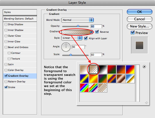
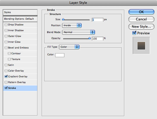
Step 17
Next we’ll use Layer Styles to add the gradient and outline to the Button Current layer, but first, click on your foreground color swatch in the Tools palette and change the color to #c8a282.
Open the Layer Styles dialog box by Control-Clicking (PC: Right-Clicking) on the Button Current layer in the Layers palette and choosing Blending Options from the menu. Then set the following Layer Styles, being careful to check each setting with the ones below. Notice that in the Gradient Overlay style options area, when you click on the Gradient Picker, the foreground to transparent swatch is using the foreground color you just set. This way we avoid having to create a custom gradient with that color.
(*note: If your gradient doesn’t seem to be positioned where you like it, you can simply click and drag it on the stage to the position you want.)
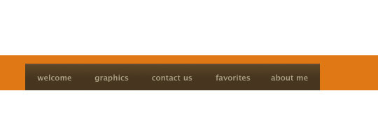
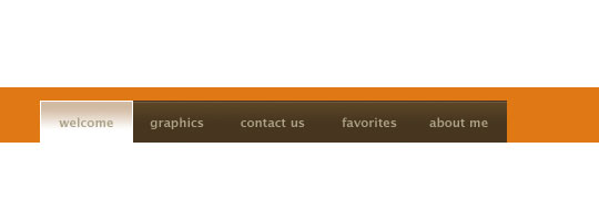
Step 18
If you did everything right, your menu should now look like the one below.
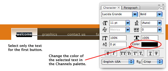
Step 19
The current button on the LittleLines site has black text on the current state, so lets switch to our Text layer, press the T key to activate the Type tool, select the text of the first button and change the color to black by changing the color of the selected text in the Character palette.
Step 20
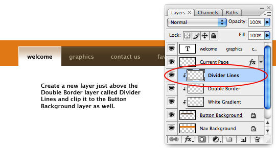
The final step in the button preparation is to add the black divider line between the remaining buttons. Click on the Double Border layer and then create a new layer above it called Divider Lines. Create a Clipping Mask for the the Divider Lines layer by Control-Clicking (PC: Right-Clicking) the new layer and choosing Create Clipping Mask from the menu. There should now be 3 layers clipped to the Button Background layer as shown below.
Step 21
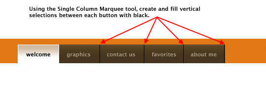
To create the black lines, lets press the D key to reset the foreground color to black, then from the Rectangular Marquee tool fly-out menu choose the Single Column Marquee tool which will make 1 pixel vertical selections.
From the original example we can see that the little black vertical dividers are only placed at the left border of each button, so click on the stage between the second two buttons to create a single pixel selection, nudge it left or right with your arrow keys if the placement isn’t perfect, then fill the selection with black by pressing Option-Delete (PC: Alt-Delete). Continue this process until you’ve divided your remaining buttons and don’t forget the one at the far right edge of the last button. Press Command-D (PC: Ctrl-D) to deselect when you’re done.
Step 22
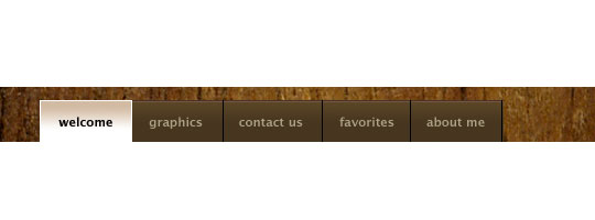
For those of you who wish to go the distance and add the wood texture to the background, I’ll explain that here as well (since I know I’ll get 50 emails about it if I don’t!).
First, you’ll need to find a wood texture you’d like to use, I think the defcon-x site is one of the best places for these sorts of textures and they’ve got a wide variety of high-resolution wood textures to choose from. I’ll use this texture incase you want to follow along at home. Command-Click (PC: Right-Click) on the image and choose Copy Image, then return to your Photoshop document.
Click on the Nav Background layer to select it (It’s the one with the orange stripe on it), then simply press Command-V (PC: Ctrl-V) to paste the copied texture into the document. A new layer will automatically be created which I will rename Wood. The wood texture now fills the entire document, so lets clip it to the Nav Background layer by Control-Clicking (PC: Right-Clicking) on the new Wood layer and choosing Create Clipping Mask from the menu just like we’ve done before.
(*note: If you feel like you’re not seeing enough of the wood grain because of the high resolution, you can always use the Free Transform tool to shrink the texture to a size the suits you.)
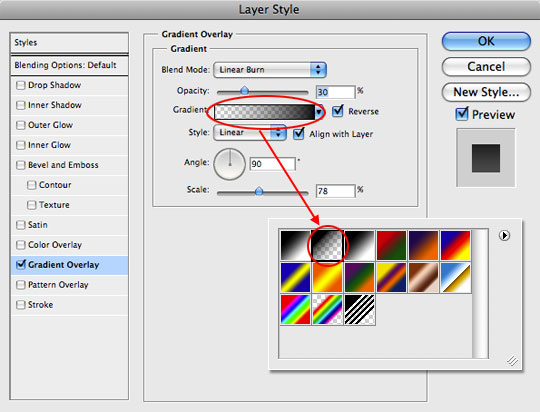
Step 23
The final order of business will be to add a slight black to transparent Gradient Overlay layer style to the Nav Background layer, so Control-Click (PC: Right-Click) on the Nav Background layer and choose Blending Options from the menu, then set the following Gradient Overlay Layer Style.
Step 24
And that’s it folks, your navigation is complete. I hope you learned a little something along the way!
Lesson Files + Additional Resources
Download the free .PSD file and other lesson files Right Here.
Tell Your Friends
More in Graphic Design


28 Responses to Website Navigation I
Blast Balastik
January 2nd, 2009 at 8:45 pm
This going to help me a lot.
Thank you.
moih60
January 3rd, 2009 at 6:19 am
thanx very much .great work and i like that finish
bodhi
January 3rd, 2009 at 6:44 am
Thanks Hero.
Ottaviano
January 3rd, 2009 at 10:15 am
Great tutorial, really well written. Looking forward to more of the same.
chovy
January 3rd, 2009 at 2:32 pm
Great addition with the background tile and gradient.
Dhane
January 3rd, 2009 at 4:21 pm
Thanks for the tut. Now I have something new to add to my arsenal.
liko
January 3rd, 2009 at 11:35 pm
so simple tools can create so nice work :)
rimanere
January 5th, 2009 at 2:16 pm
I found your tutorials great for a newbie to photoshop like me.
Thank you
Victor
January 11th, 2009 at 7:37 pm
Hero,
Awesome tuts, could have never done this without your help.
Thanks, Victor
Dhru
February 6th, 2009 at 4:36 am
Its a very nice tutorial.. But i dont know how to make this navigation bar to work in my web site.. I mean if i click on “graphics” tab, it should change its color like “welcome” tab..???
HERO
February 6th, 2009 at 8:12 am
DHRU, In theory if you were to build this out for a website, the tabs should change based on the current page as you suggest… but I just write Photoshop tutorials here, so you’ll need to do some HTML/CSS learning on your own.
Ruben
February 13th, 2009 at 9:40 am
You are my.. emh… Hero :P.. Nice tut! When is number II comming? And what is it gonna do? Is it an extension to this tut or a complete new navigation?
(L)u
BlAcKjAcK
February 15th, 2009 at 6:30 pm
I really love this web-site, every single tutorial has helped me become better and more familiar with Photoshop, thanks a lot!
Rob
February 18th, 2009 at 2:23 pm
DHRU, check out the below link about positioning navigation with CSS for websites! I think you’ll find it pretty helpful.
http://css.maxdesign.com.au/listamatic/
What you can do, is assign the float property to your navigation container to position this left or right. I also use “block” for the ” #nav ul li ” property and then set a width and height for that. That turns each list item into a block. You can also use inline which basically lines each link right up next to each other. I don’t typically use inline.
Ok, well, I don’t want to confuse you even more. It takes some time to learn CSS. Hang in there and you’ll understand it. P.S. INSTALL FIREBUG! It will be your best friend!! Seriously! Every web designer SHOULD have firebug installed without a question!
-Rob
http://css.maxdesign.com.au/listamatic/
HERO
February 18th, 2009 at 3:32 pm
I’ll second ROB’s Firebug comment. Seriously, if you’re designing without it you’re missing out on a fantastic tool!
Pat Jennings
March 3rd, 2009 at 5:11 pm
Thanks Hero, nice tutorial showing you don’t have to be too fancy in Photoshop to get a good effect.
beroes
March 13th, 2009 at 8:55 am
Thank you Hero, it is very useful for me :)
Cihan Aksu
March 23rd, 2009 at 6:33 am
This is really nice.Also i like psd files:) Thanks dude.
Mr Web Design
April 14th, 2009 at 8:42 pm
Helps build on those UI skills. Thanks!
Oyunlar
July 5th, 2009 at 10:08 pm
Thank you Hero nice work
arvind
July 15th, 2009 at 11:10 pm
thanks dear
good perfomans in photoshope effect
thanks again
arvind parmar
thomas
April 8th, 2010 at 12:44 pm
very good, easy to follow tutorial.
thank you!
Marta
April 29th, 2010 at 10:28 am
Dear HERO,
I am new at Photoshop and graphic design. Your tutorials helped me a lot. They are very easy to follow. Thanks a lot for sharing.
roblesrt
May 28th, 2010 at 12:03 am
Thanks for the very detailed instruction. I love it. A tutorial on converting this to XHTML+CSS would complete it.
david
May 28th, 2010 at 10:57 pm
I used a similar navigation setup much like this one. Excellent work.
S.M.Karthick
June 22nd, 2010 at 3:20 am
Awesome Tutorial Hero..!! Good Job..!!
Looking for lot more tutorials..!!
Turkey
January 22nd, 2011 at 8:43 am
very good, easy to follow tutorial.
thank you!
paullocezar
June 17th, 2011 at 9:40 am
Show design, very cool! Sensational effect.
hug
PC.