


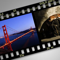
Hero Header Part II
Welcome back for Part II! In this episode we are going to explore the techniques used in building the aged paper background, borders and grungy star used in the current PSHERO header.Introduction
A little disclosure about today’s lesson before we get started:
Often times as a designer I spend hours playing around with different styles, brushes and techniques until I finally settle on a result that my eye is happy with (which was definitely the case when designing this header). In contrast, when I design and write tutorials, I decide on a clear goal for the project from the beginning and carefully document each step in the creation process so I can teach you how to get the exact same result. Having never intended to do a tutorial about this site header however, much of what I did while trying to get the "perfect" look was never written down… So what I’m trying to say is that our final result here may be slightly different than the one you see on the website. But I promise to get as close as I possibly can.
I want to also point out that because of the number of steps involved in this tutorial, there will be quite a bit less hand holding than Part I. But by now you should understand how to create layers, layer styles, clipping masks, change the foreground and background colors and switch between tools. (*note: I’ll still be giving out all the keyboard shortcuts etc, but when I say "create a new layer and call it Frank" you should know what to do.)
So open up the background file we built in Step 1 and lets get rolling!
Step 1
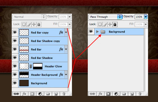
Lets start with a simple organization step. Since we’ve gone through all that work to build the background and we’re clearly going to leave all that alone now, lets select all our layers by clicking on the top layer in the Layers palette, hold down the Shift key and click on the bottom layer (this will select all the layers). Then simply press Command-G (PC: Ctrl-G) to create a Group. Now all those layers will be placed in a folder called Group 1. I renamed my group Background.
Step 2
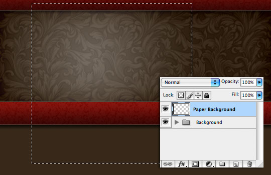
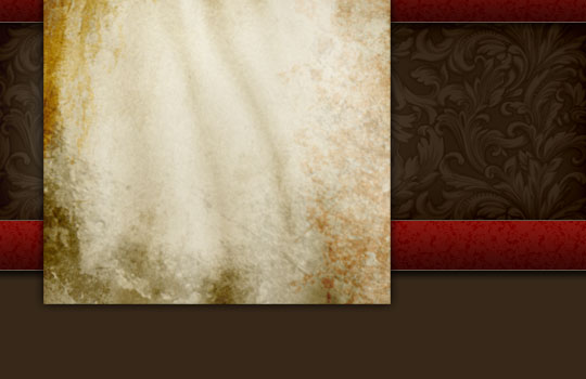
Press the Create A New layer button at the bottom of the Layers palette to create a new layer above (outside) the group we just created. Call this layer Paper Background.
Set the foreground color to #e7dfc7 and the background color to #c4b899. With the Rectangular Marquee tool (keyboard shortcut – M), create a selection that measures 320px x 320px. Remember that you can constrain your selection by holding down the Shift key.
Step 3
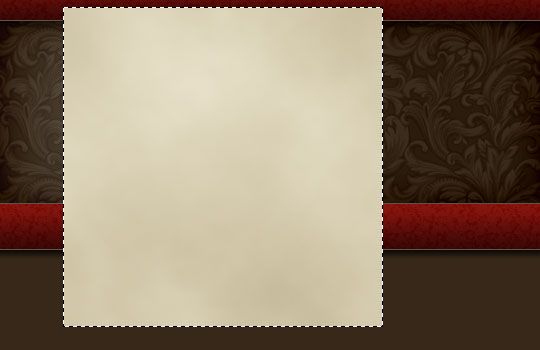
We can create a really nice inconsistent blend of the foreground and background filters with the Clouds filter. Choose Filter>Render>Clouds from the main menu. The Clouds filter uses the foreground and background colors to render a cloud like effect. Thank you HERO for stating the obvious.
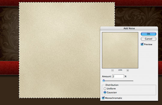
Step 4
Now we’re going to add even more inconsistency to the old paper by choosing Filter>Noise>Add Noise from the main menu. Use a setting of 2px, choose Gaussian and make sure that Monochromatic is checked, then click OK.
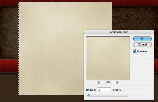
Step 5
Because the Noise filter always produces a little more abrupt effect that I like, I’m now going to apply a very slight blur. Choose Filter>Blur>Gaussian Blur from the main menu. Use a setting of .5 (0.5) and click OK.
It’s now ok to deselect by pressing Command-D (PC: Ctrl-D).
Step 6
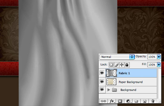
Now I wanted to add a slightly wavy feel to the paper, we’re not actually going to warp the paper, we just want to give it a little bit of that sort of feel.
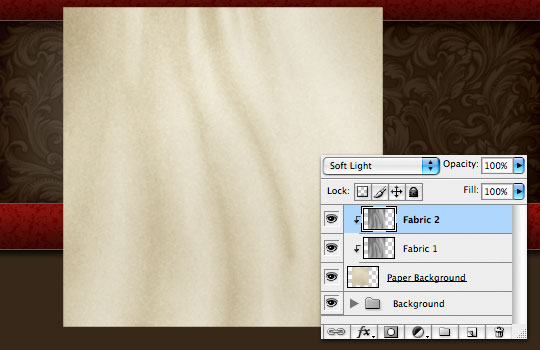
I searched the term "fabric" in the dollar bin at iStockPhoto and found a nice piece of cloth with some slight waves in it. I simply clicked and drug the fabric image into my file (which created a new layer I named Fabric 1). I removed the cloth’s coloring by choosing Image>Adjustments>Desaturate from the main menu. The color removal will allow us to use a blend mode change in Step 7 without adding any color tints to the paper.
(*note: if your cloth swatch is the wrong size, press Command-T (PC: Ctrl-T) to invoke the Free Transform tool and resize accordingly.)
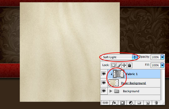
Step 7
Change the Blend Mode to Soft Light and create a Clipping Mask to the Paper Background layer. We’re going to be clipping every layer that relates to the Paper Background, so get used to it now!
(*note: An easy way to create a clipping mask is to place your cursor between the layers you want to clip, then hold down the Option (PC: Alt) key until you see the cursor switch to an arrow with two overlapping circles next to it, click on the line between the layers to clip them together.)
Step 8
I didn’t feel like the effect of the fabric was heavy enough in this case, so I duplicated my Fabric 1 layer by pressing Command-J (PC: Ctrl-J). I called this layer Fabric 2 and added a Clipping Mask to it as well. This doubles the result of the Soft Light blend mode and makes the effect stronger.
Step 9
Here’s where things start to get a little tricky. I’m going to import and explain the next few layers from my original site concept file.
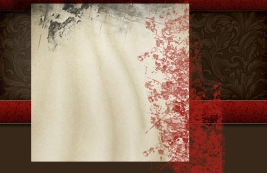
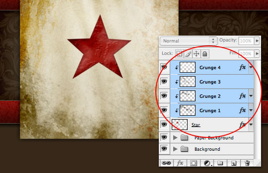
Create a new layer and call it Grunge 1. Press the B key to switch to the Brush tool and using a combination of Grunge brushes (which are included in the lesson download at the end of the tutorial), paint in some grunge.
Don’t ask me why I used black and red on the same layer. I’m retarded. If you want to use different colors, do yourself a favor and create separate layers! But here’s what things looked like before I changed the blend mode and added the clipping mask in the next step.
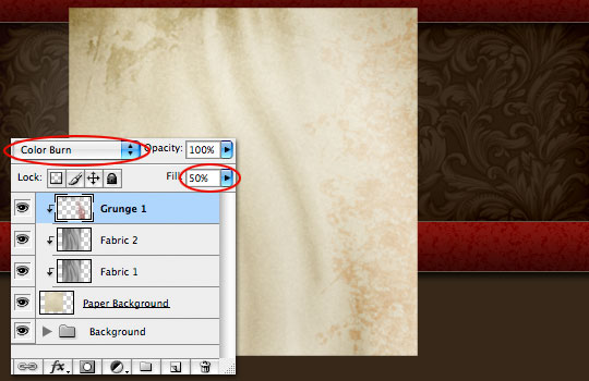
Step 10
Change the layer blend mode to Color Burn, lower the layer’s Fill opacity to 50% and add the ol’ Clipping Mask. Notice the difference in tone that the red and black colors create against the background.
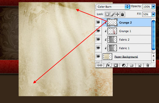
Step 11
Lets add a new layer called Grunge 2, choose a different Grunge brush and paint some more grunge into the scene. Again we’re going to change the Blend Mode to Color Burn and the Fill opacity to 50%.
Adding effects on top of effects gives depth to the file and adds an element of complexity to the final product that couldn’t have been produced if we’d tried to do this all on one layer.
Step 12
While still on the Grunge 2 layer, add a Drop Shadow layer style as shown below. This will increase the strength of the grunge while softening the edges.
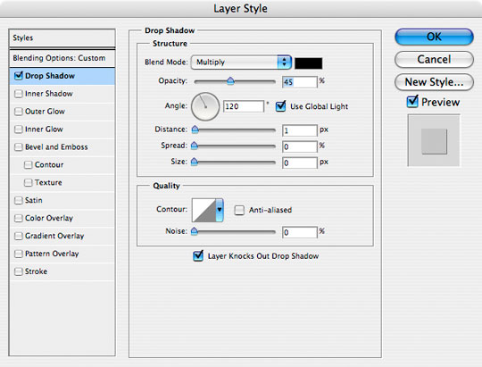
Step 13
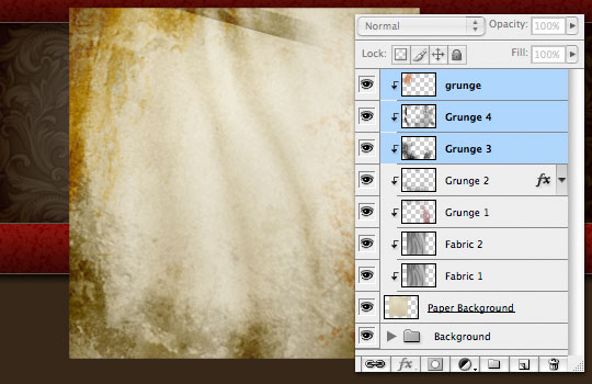
Continue adding Grunge layers until your satisfied. I’ve added 2 more black grunge layers and 1 more red one. I also varied the Fill opacity in these layers from 20-35%. If you’re curious about how these look by themselves you can download my .PSD file at the end of the lesson.
Step 14
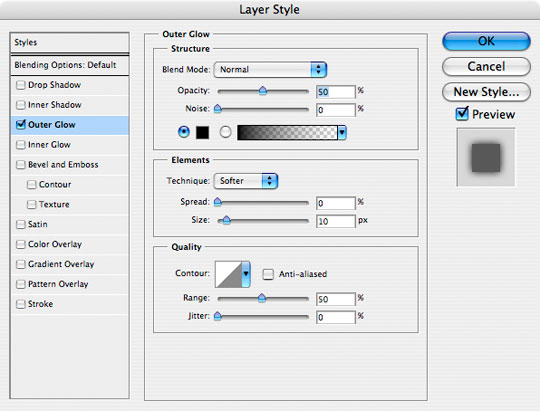
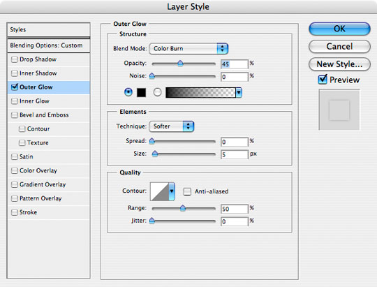
To finish up this section lets add some nice shading around the edges of our background. Choose the Paper Background layer in the Layers palette and add the following Outer Glow layer style.
Notice that by changing the color of the glow to black and the Blend Mode to normal we can turn the outer glow effect into an outer shadow instead. The nice thing about using the Outer Glow instead of the Drop Shadow however is that by using the glow method the shadow comes from every side.
Step 15
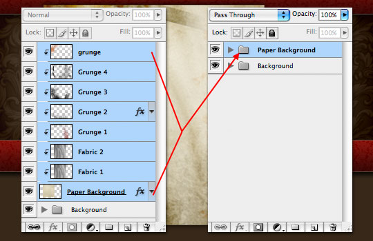
Partly because I’m Obsessive Compulsive and partly because I want to be able to show you my entire Layers palette from time to time, I’m going to grab all the files that comprise the Paper Background and group them together (just like in Step 1) by pressing Command-G (PC: Ctrl-G).
Step 16
With all those layers now contained in the Paper Background group folder, I can move them all at once by simply selecting the folder. So go ahead and move the paper into it’s place in the upper left corner.
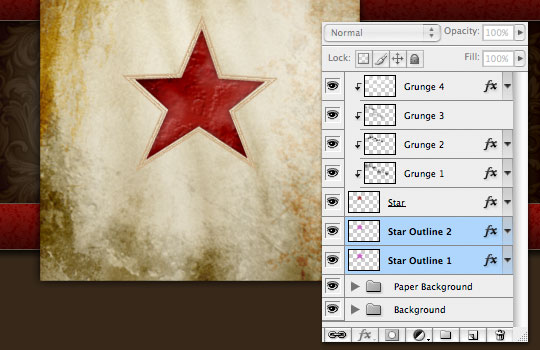
Step 17
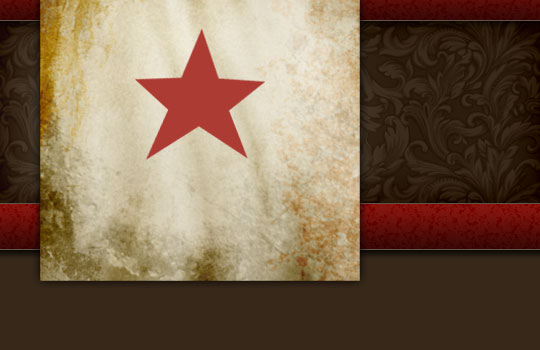
Create a new layer and call it Star. This is where I’m going to place the PSHERO logo star. You can use any solid shape you desire, but for the sake of the tutorial you may want to use a star from the Custom Shapes dialog. The color I’m using for my star is #ac3b33.
Step 18
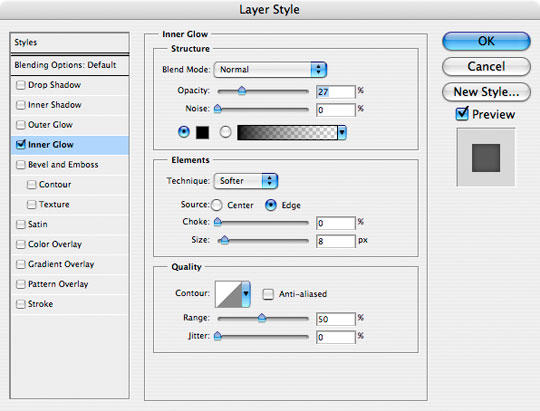
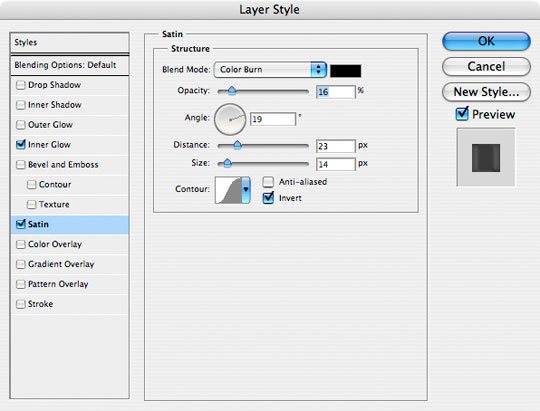
Add the following two Layer Styles to the Star layer. Notice that we’re again using a glow style in black to create the nice darkened inner edges for the star. The Satin style will add a neat little silky variation to the middle of the star.
Step 19
And here’s what the star looks like with the layer styles applied. Pretty nice right?

Step 20
Here’s where we’re going to speed things up a bit because I think you’ve got the hang of what we’re doing. I’d highly recommend downloading the lesson files at the bottom of the tutorial so you can examine each layer in detail.
Above the Star layer I’m going to add 4 layers of grunge, just like we did to the Paper Background. Each Grunge layer will be clipped to the Star layer. Two of the Grunge layers will have a blend mode of Normal and two will be Color Burn, all with varying opacity settings. I’ve also added a tiny Bevel and Emboss layer style to two of the Grunge layers to give that "old stucco" type look.
Step 21
It’s time to add some outlines around our Star layer.
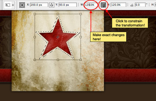
Create a new layer below the Star layer and call it Star Outline 1. (*note: If you select the Star layer and hold down the Command (PC: Ctrl) key when clicking the New Layer icon at the bottom of the layers palette, it will add a new layer below instead of above.)
Ok, now pay close attention here!
With the new layer selected, hold down the Command (PC: Ctrl) key and click on the Star layer’s thumbnail in the layers palette to load the star as a selection. Increase the size of the selection by choosing Select>Transform Selection from the main menu. When the Transform controls appear use the bar across the top to expand and constrain the selection’s transformation (see below). I expanded my selection by 120%. Don’t forget to click the Constrain icon between the height and width controls.
Once the selection is expanded, press Return (PC: Enter) to commit the transform. Now simply fill the layer with color and deselect. Any color is fine because we’ll be hiding it anyway.
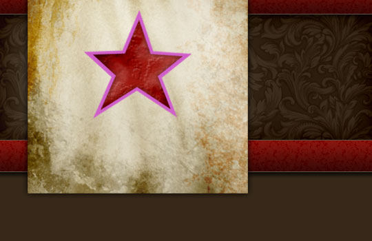
Step 22
Here’s what you should end up with. I chose to fill my selection with purple for illustrative purposes only… because obviously you should never use this color in real life unless you’re an 8 year old girl.
Step 23
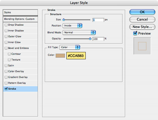
In the layers palette drop the Fill opacity to 0% and then add the following Stroke layer style.
Step 24
To create the second outline repeat the process on a new layer but this time only transform/expand the selection by 110%, then add the same layer style.
Here’s my star with both layers built.
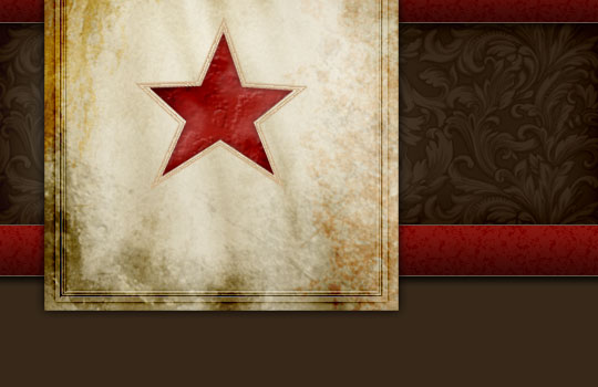
Step 25
The last detail we want to add is the borders around the outside of the square.
Create a new layer and place at the very top of all the layers in the Layers palette and name it Outlines. Next, create a new 300px square selection (anywhere) on the stage and fill it with any color.
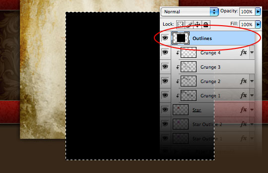
Step 26
Now lets shrink the selection 4 pixels by choosing Select>Modify>Contract from the main menu. Set the number of pixels to 4 and click OK.
Delete the area inside the selection by pressing Delete (PC: Backspace).
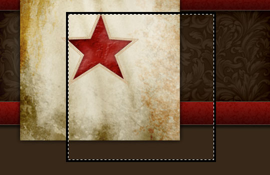
Step 27
Contract the selection again, this time by 2 pixels and fill the selection with color. Contract 1 pixel and Delete. Contract 1 pixel and Fill. Contract 1 pixel and Delete. Deselect.
Your borders should now look like mine with one thick outer border and two thin inner ones.

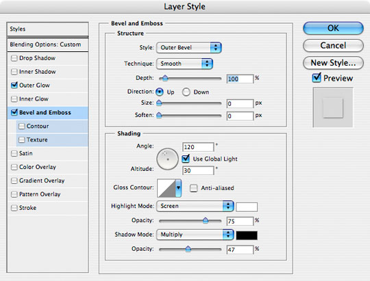
Step 28
Add an Outer Glow (again using black) and a Bevel and Emboss layer style as shown below.
Step 29
Drop the layer’s Fill opacity to 0%. and then, using the Move tool (keyboard shortcut V), move the borders into position over the Paper Background.
(*note: To keep things organized, you may want to drag the Outlines layer to the top of the Paper Background layer group.)
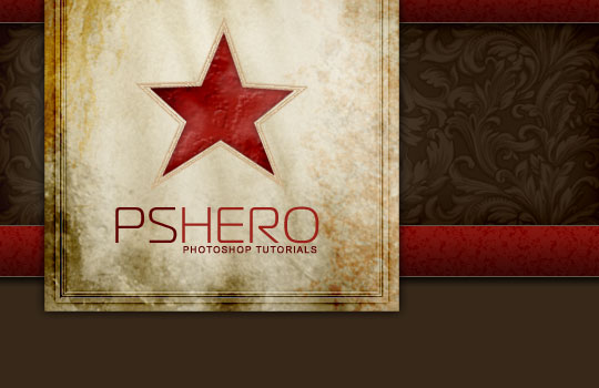
Step 30
SHAZAM!! Now all that’s left is to add the logo text! I hope you’ve learned something.
Along with the .PSD file I’ve included a series of Grunge Brushes for your enjoyment in the download below.
Lesson Files + Additional Resources
Download the free .PSD file and other lesson files Right Here.
Tell Your Friends
More in Graphic Design


56 Responses to Hero Header Part II
Andrew Lechlak
January 16th, 2010 at 8:26 pm
Well done here!
JD Teal
March 7th, 2010 at 1:10 am
Thanks for this great tutorial! I am so happy with my own version of it. Your time and energy sharing this is GREATLY appreciated.
Cheers
ntagas
October 1st, 2010 at 5:24 am
Thank you very nice tutorial. I make a flyer with grundge style and the tut helps me.
batoru
October 29th, 2010 at 5:34 pm
Thank you! I’ve learned a lot of things after I followed your tutorials regarding graphic design. All the best!
Liquid
January 6th, 2011 at 9:41 am
why are you so awesome man.
web design
February 21st, 2011 at 6:58 am
Nice work ,great tutorial.Thanks