
Simple Web2.0 Navigation Bar
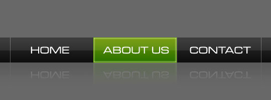
In this Photoshop tutorial I will demonstrate how easy it is to create a Web 2.0 style navigation bar with just a few selections and layer styles.Step 1
Lets start our project by clicking on the Foreground color at the bottom of the Tools bar and choosing a nice gray color, I chose #686868. Now simply press Option-Delete (PC: Alt-Backspace) to fill the stage with our chosen foreground color.
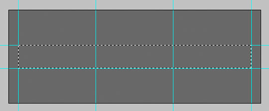
When creating any type of site or navigation layout I think it is important to lay down a few guides to make the job easier. In this case my navigation bar is going to be 50 pixels tall, and I’m going to make each of my 3 buttons 166 pixels wide. So hit Command-R (PC: Ctrl-R) to show your Rulers, then drag and drop from the horizontal rulers until you’ve defined your space.
(*note: Often times I will use a fixed-size Rectangular Marquee selection and simply drag the guides until they snap to the edges of the selection, this way sizes are exact.)
Step 2
With the guides drawn, create a new layer by clicking the New Layer icon at the bottom of the Layers palette or by using the keyboard shortcut Command-Option-Shift-N (PC: Ctrl-Alt-Shift-N) (*note: if you leave the Option/Alt out of that keyboard shortcut Photoshop will pop-up the new-layer window and allow you to name the layer before creating it.)
Rename the layer "Navigation Background" by double clicking on the layer name in the Layers palette.
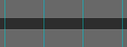
Choose the Rectangular Marquee tool by pressing M and drag out the rectangle where the navigation will live. Choose a new Foreground color just like we did in step 1 by clicking on the Foreground color swatch at the bottom of the Tools bar and pick a dark gray color like #2c2c2c. Now simply fill the selection by pressing Command-Delete (PC: Ctrl-Backspace) and deselect with Command-D (PC: Ctrl-D).
Step 3
Right click (Mac: Control-Click) on the new "Navigation Background" layer and choose Blending Options. When the Layer Styles dialog box pops up, choose Gradient Overlay from the list at the left to bring up the Gradient Overlay options. Set the options like the ones below then continue to Step 4 without clicking OK to set the gradient colors.

Step 4
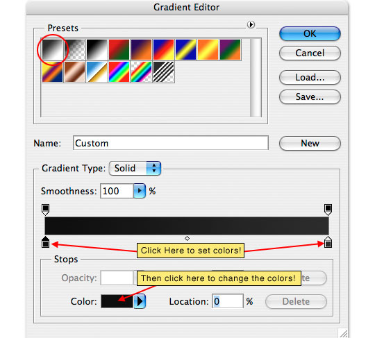
When the Gradient Editor pops up, first choose the foreground to background gradient which should be the first option at the top. Then click on the beginning markers at the bottom of the gradient at the bottom, first set the left color to #0e0e0e then the right to #2c2c2c. When you’re done click OK and the OK to commit the Layer Style.
Step 5
Things should now be looking like the example below, with a subtle gradient from bottom to top of the navigation bar.

Step 6
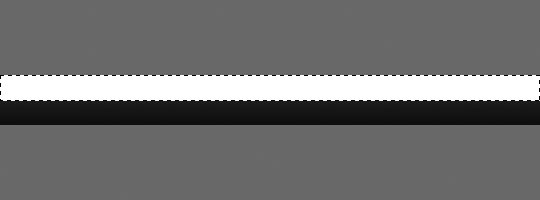
Create a new layer and call it "Highlight", then with the Rectangular Marquee tool drag a selection that covers the top half of the navigation bar. Press D to reset the foreground and background colors to black and white, then press Command-Delete (PC: Ctrl-Backspace) to fill the area with the white background color.
Step 7
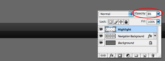
In the Layers palette, drop the Opacity to 8% for this new "Highlights" layer, then press Command-D (PC: Ctrl-D) to deselect.
Step 8
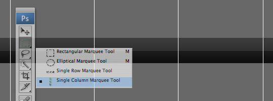
Create a new layer and call it "Dividers", then by holding down your mouse on the Rectangular Marquee tool in the Tools bar, choose the 1 Pixel Vertical Marquee tool, click on the stage where the button divider guides are and fill them with white. We want the "Dividers" layer to actually sit below the "Highlight" layer, so simply click and drag it in the Layers palette.
Step 9
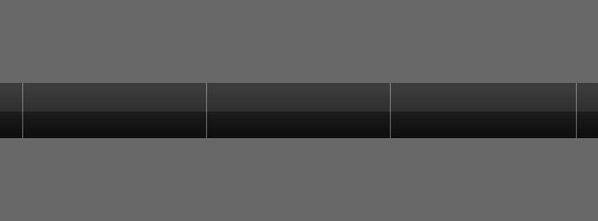
Obviously we need to remove the excess divider lines outside of the navigation area. You can do this one of two ways, either by selecting the areas with the Rectangular Marquee tool and then pressing Delete, or to get exact the first time do the following.
Hold down the Command key (PC: Ctrl) and click on the layer thumbnail of the "Navigation Background" layer. This will select the pixels on that layer without switching away from our active "Dividers" layer. Then simply press Command-Shift-I (PC: Ctrl-Shift-I) to invert the selection and press Delete to remove the excess lines. Then Command-D (PC: Ctrl-D) to deselect.
Lower the opacity of the "Dividers" layer to around 30%.
Step 10
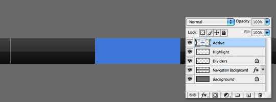
Now that the navigation bar is shaping up lets create a new layer above the "Dividers" layer (but below the "Highlights" layer). We’ll call this layer "Active" because it is where our active button will live.
Using the Rectangular Marquee tool, drag a selection between two of the divider lines and fill it with any color. I chose blue to make it easy to see. (*note: I’ve hidden my guides by pressing Command-H (PC: Ctrl-H) but making these selections is much easier if they are turned on.)
Step 11
It doesn’t matter what color we made this button because we are going to use Layer Styles to change the color anyway. Right Click (Mac: Command-Click) on the layer and choose Blending Options. When the layer styles dialog opens up, enter the following layer styles.


Step 12
And there you go. Add some navigation text, maybe a little reflection… a header… as always, have fun!
Lesson Files + Additional Resources
Download the free .PSD file and other lesson files Right Here.







16 Responses to Simple Web2.0 Navigation Bar
Merrell
March 14th, 2008 at 6:57 am
this PSD file is missing! But it’s simple enough I should be able to do this quickly on my own. Nice work, PSHero!
HERO
March 14th, 2008 at 7:30 am
Sorry about that Merell, the .PSD is working now.
Christian
March 15th, 2008 at 5:44 am
Hi HERO, your site is super cool, and the tutorials are super clear! Well done.
Just to be precise, I noticed that you didn’t close the parenthesis in the note section of Step 1… ;)
Ciao ciao!
Christian
HERO
March 15th, 2008 at 6:05 am
And I thought I was the one with OCD!
Thanks for the comment AND the correction Christian! I patted myself on the back and then fixed my mistake. :D
nick7er
March 22nd, 2008 at 4:08 pm
PSHero,
This site is awesome! The design is fantastic (keep it)! The tutorials I have read so far are really clear and easy to follow, and the effects that they teach are great!
Finally I have found a site dedicated to creating photoshop tutorials with a passion!
Now I know where I’m coming for Photoshop tutorials!
ph15h
May 22nd, 2008 at 4:40 pm
This is very nice… I wish I knew how to implement this into actual HTML and Javascript though… What settings do you use for the Reflections (And what nice font is that.)?
HERO
May 22nd, 2008 at 6:31 pm
PH15H,
The font here is called Microgramma, it’s not a free font, but well worth the money if you’re into this design style. As far as the HTML implementation, you could use a simple CSS background swap. No Javascript required.
Poolopow
June 23rd, 2008 at 9:07 am
It looks so pro ! Thanks
?ß‚Äò?æ
July 26th, 2008 at 10:06 pm
I like your tutorial very much ,very clearly.well done.
Ray
October 31st, 2008 at 12:07 am
so easy! Thanks!
Ronny
November 16th, 2008 at 12:14 am
I like your guestbook. Check out my page. JsackRackModoGhost
sankar
December 22nd, 2008 at 2:23 pm
i like your style of making this one my dear dude
jesse
May 10th, 2009 at 2:31 pm
thank you so much. I used most of your tutorials to created my company’s site. Love ya.
Dipak
August 11th, 2009 at 5:00 am
Fantastic tutorials, Thank you so much for sharing. Would love to see one on how you managed to get you twitter updates to appear on your site. I am re-designing my site at the moment.
HERO
August 14th, 2009 at 9:39 am
DIPAK, I’m glad you’re enjoying the tutorials. The twitter box is created by a WordPress plugin called twitter-tools. If you’re trying to play twitter into a non-wordpress site, you might want to check out this article at smashingmagazine.com.
Preston Racette
December 24th, 2010 at 11:06 pm
This is a very good post! Keep them comming!