


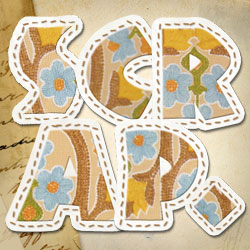
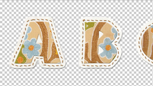
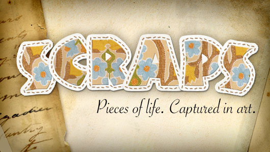
Create A Scrapbook Alphabet
In this Photoshop Text Effect you'll learn to create a simple Scrapbook style text effect that can be used as a stand alone word treatment or converted to individual reusable .png files with a transparent background.Introduction
In this Photoshop Text Effect you’ll learn to create cool Scrapbook style text that can be used as a stand alone word treatment or converted to individual reusable .png files with a transparent background.
READ THIS: If you haven’t already done the Text In Stitches tutorial and you want to add the stitches to your lettering like you see in the preview, I strongly recommend you take a spin through that lesson first. Be sure to download and install the Stitches brush set that’s included in that lesson so you’ve got it and are ready to go.
Step 1 – Setting Up The Photoshop File
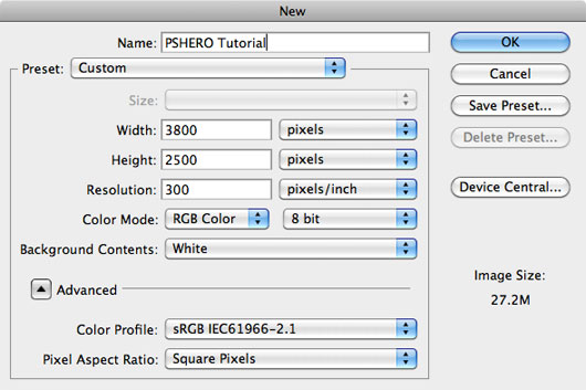
For this tutorial I’m going to be using a huge document size, but for illustration purposes once we get rolling I’ll just show a few of the letters in my screenshots so you can see them at full resolution. Lets create a new document in Photoshop by choosing File > New from the Main Menu. We want this file to be large enough that we can layout all the letters and symbols for our scrapbook alphabet all at once so lets go with something like 3800 x 2400 pixels at 300 pixels/inch.
Step 2 – Create A New Text Layer
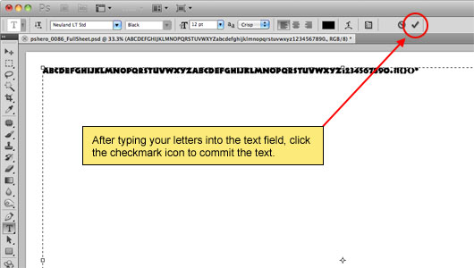
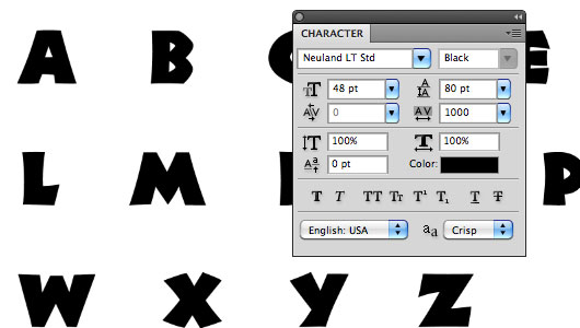
With our big document created the first real step is going to be to type the characters we want to use onto the stage. For this lesson I’m going to be using a font called Neuland LT Std which can be downloaded HERE. I chose this font because it was nice and thick and because I felt it had that scrapbook feel to it that would be useful in a number of different situations. You can choose any font you’d like, but the thicker and heavier the better the effect will be.
With your font selected, switch to the Type tool by pressing the T key and click and drag from the top-right corner of your document to the bottom-left corner to create a text area that fills the entire stage. Next type the whole alphabet (if you’re making a scrapbook lettering set) or the words you’d like to style onto the stage. When you’re done, click the little checkmark icon in the Text Options bar at the top of Photoshop to commit the text.
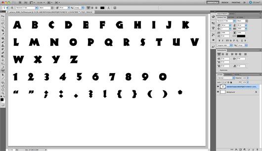
(*note: for scrapbook lettering I suggest you make lowercase as well as uppercase versions of all the letters plus numbers and popular symbols like question marks and quotes. However, the Neuland LT Std font doesn’t have lowercase so we won’t have to worry about that in this case.)
Step 3 – Resize The Text
Now that we’ve got our letting typed out we need to get it to a size that’s going to be more universally usable and to space them on the stage so that we can apply effects and borders without running into other letters. If it’s not already visible, open the Character panel by choosing Window > Character from the main menu and set the font size to around 48 pt, the Leading to 80pt and Tracking to around 1000. This will give us a nice workable around around each letter.
Step 4 – Create Borders
Now that the text is all squared away, lets move on and create a nice thick border which we can add texture and stitches to later. To do this, we’re going to add a Stroke to the text and then expand that Stroke to its own layer.
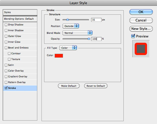
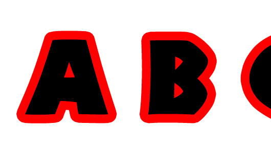
Click on the Add Layer Style icon at the bottom of the Layers palette (it’s the one that looks like a little “fx”) and choose Stroke from the menu. Since our text is black, lets use a red color for the stroke so it’s easy to see (any other color is fine also, except purple… you know how I hate purple.). Make sure the Position of the Stroke is set to Outside and push the Size up to around 35 pixels. Click OK when you’re done to commit the Layer Style.
(*note: You can also access the Layer Styles dialog by double-clicking on the layer or by Command-Clicking (PC: Right-Clicking) on the layer and choosing Blending Options from the menu)
Step 5 – Create A Layer From The Stroke
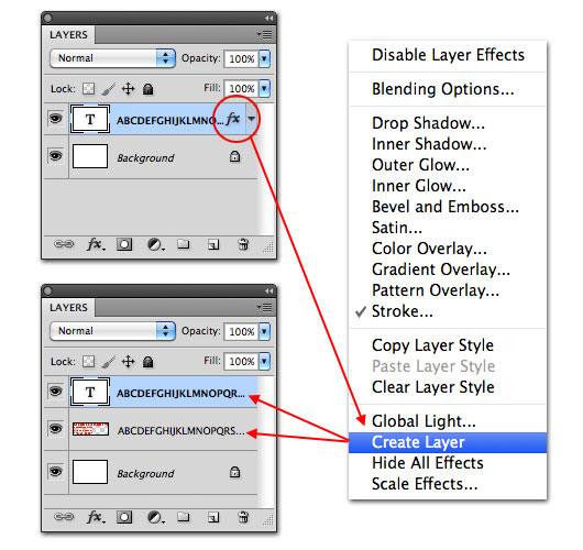
Now, lets move that Stroke Layer Style to it’s own layer where we’ll be able to add textures and styles to it directly. Command-Click (PC: Right-Click) on the Layer Style in the Alphabet Layer of the Layers palette and choose Create Layer. You’ll notice that the Layer Style icon disappears from the Alphabet layer and that a new layer below the Alphabet layer is created from the Stroke.
(*note: Incase you were wondering: I use the Stroke-to-Layer method rather than creating a selection of the text and then using Select > Expand because it produces substantially smoother edges than an expanded selection.)
Step 6 – Adding Texture To The Borders.
To keep my document easy to read, I’m going to name my two layers Alphabet and Border respectively. Although our file won’t have more than half a dozen or so layers, having good naming practices is a good thing to make a part of your routine. From here on out, I’ll only be showing the first few letters in my screenshots so you can see what’s going on at the full size.
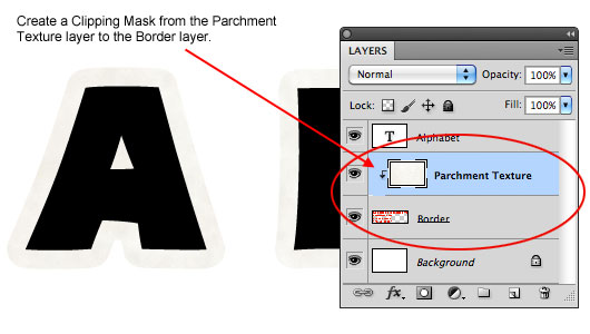
In this step we’re going to venture out to the internet to find a nice subtle texture for the border layer. I wanted the border to have texture but not distract from the actual letter texture, so I found a great Parchment Paper texture at Photos-Public-Domain.com. On that webpage, click on the parchment image to open the full size version, Command-Click (PC: Right-Click) the image and choose Copy, then switch back to your Photoshop document, make sure the Border layer is selected and choose Edit > Paste from the Main Menu (or just use the keyboard shortcut Command-V (PC: Ctrl-V)) to paste the image into your document. A new layer will automatically be created above the Border layer.
Now simply Command-Click (PC: Right-Click) on the new texture layer which I’ll call Parchment Texture and choose Create Clipping Mask. This will use the Border layer as a mask for the Parchment Texture layer as shown below.
Step 7 – Layer Styles For The Border Layer
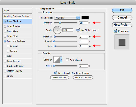
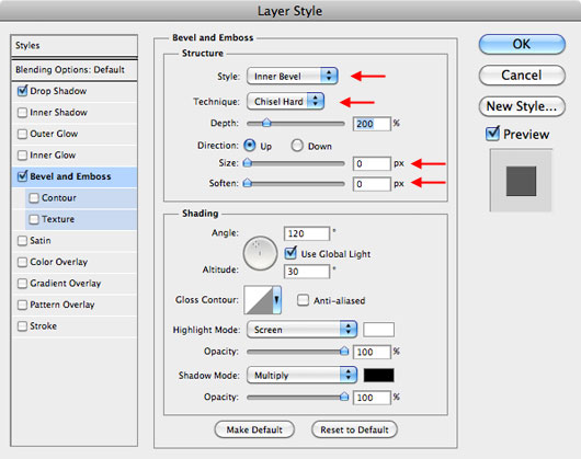
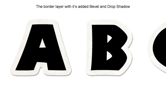
We obviously need to make the Border stand out a little bit more from the background, so let’s make sure that the Border layer is selected in the Layers palette and then Command-Click (PC: Right-Click) on the Border layer and choose Blending Options to open the Layer Styles dialog. Add the following Drop Shadow and Bevel & Emboss Layer Styles and click OK.
Step 8 – Texture For The Alphabet Layer
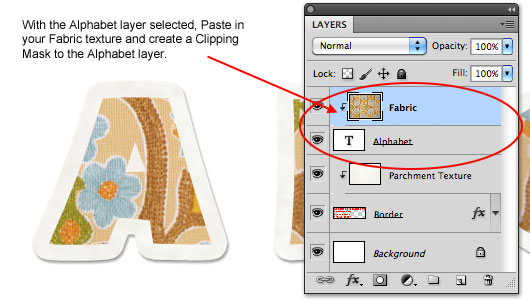
In much the same fashion we’ll now add some texture to the Alphabet layer. Since we’re working in the scrapbook text effect genre, lets go back to the internet and find ourselves a nice piece of fabric that we can use for the main letter texture. Doing a Google search for “vintage fabric” returns some great results. I find that for the best results a piece of fabric with quite a good pattern variation works best so each letter doesn’t come out looking exactly the same.
Just like in Step 6, we’re going to choose our texture swatch, copy it to the clipboard and then with the Alphabet layer selected in the Layers palette, go ahead and Paste the swatch into the file and create a Clipping Mask to the Alphabet layer.
(*note: depending on the size of your fabric swatch, you may have to add multiple copies of your fabric to the stage and move them around to get them in the right place for each letter. Use Edit > Free Transform to rotate, size and reposition your fabric as needed.)
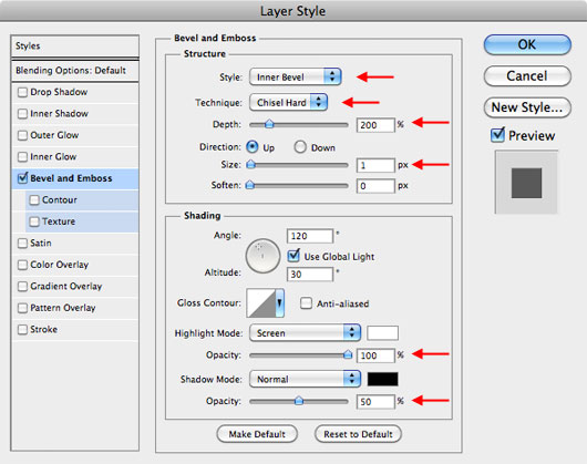
Step 9 – Add A Slight Bevel & Emboss
Make sure the Alphabet layer is selected in the Layers palette and add the following Bevel & Emboss layer style and click OK. This little bit of style will add just enough dimension to make our letters stand off the border slightly. Don’t go overboard, because we don’t want the effect to be distracting when we add our stitches to the mix in the next few steps.
Step 10 – Preparing To Add The Stitches
No scrapbook asset is complete without some sort of embellishment or cute detail, and for that, we’re going to reach back into our bag of tricks and use something we learned in the Text In Stitches tutorial. If you haven’t been through that lesson, the next few steps might seem a little rushed, so you might want to pop on over and go through that one first to make sure you’re up to speed and that you’ve already downloaded and installed the Stitches brush set that I’ll be using here.
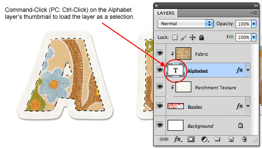
The first thing we’re going to need to get our stitches going is a Path for the stitches to follow. To do this, lets first load the Alphabet layer as a selection. While holding the Command (PC: Ctrl) key, click on the layer thumbnail for the Alphabet layer in the Layers palette. This will load the alphabet as a selection.
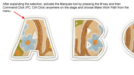
Step 11 – Expand The Selection And Convert To Path
With the selection made, choose Select > Modify > Expand from the Main menu. Expand the selection by 6 pixels and clic OK.
Now we need to convert this selection to a Path and to do that we’ll need to have the Marquee tool active. Simply press the M key to switch to the Marquee tool and then Command-Click (PC: Ctrl-Click) anywhere on the stage and choose Make Work Path from the menu. When the Tolerance dialog box pops up, set it to 2.0 pixels and click OK.
Step 12 – Select And Setup The Stitches Brush
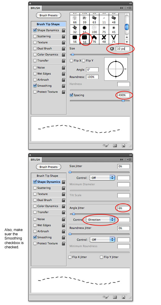
As I mentioned before, you should have the Stitches brush set loaded into your Brushes palette already so lets press the B key to switch to the Brush tool and then if the Brushes palette isn’t already open choose Window > Brushes from the Main menu to bring it up.
I’m going to choose the brush labeled “stitching2” which is an inline stitch with a little bit of an angle jitter between stitches. Then in the Brush palette make the following adjustments to the brush.
Step 13 – Set Brush Color And Stroke The Path
At the bottom of the Tools palette, click the Foreground color swatch to bring up the Color Picker and choose a nice color for your stitches. I used the Eyedropper (which is active by default at this point) to choose a nice brown from my fabric swatch.
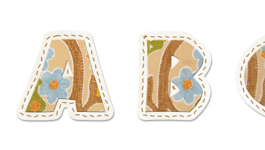
Create a new layer at the top of the Layer stack in the Layers palette called Stitches then switch to the Pen tool by pressing the P key. To stroke the path with the brush we’ve just selected simply Command-Click (PC: Right-Click) anywhere on the stage, choose Stroke Path from the menu and then when the Stroke Path dialog appears choose Brush and make sure that the Simulate Pressure checkbox is NOT checked. Click OK to stroke your path with stitches. If you have rouge stitches (like inside my A and B) you can grab the eraser and remove those stitches as you see fit.
(*note: you’re now done with the Paths we created earlier, so you can simply press Command-H (PC: Ctrl-H) to hide them, or jump over to the Paths palette and delete them there.)
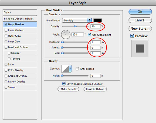
Step 14 – One Last Layer Style
To complete the stitches, lets add the slightest hint of a Drop Shadow as shown below. Depending on how large you’re making your letters, you may also want to experiment with a Bevel & Emboss to give the stitches a little more dimension, but even at the large size of the letters in this tutorial, the effect wasn’t visible.

Step 15 – Why .PNG Files?
One thing I know about scrapbookers is that they like to have digital pieces they can reuse. That’s why we created an entire alphabet in the first place right?… So how do we get all those letters into individual .PNG files that we can selectively use over and over or share with other scrapbookers? Read on my friend.
The reason scrapbookers love .PNG files so much is that the .PNG file format allows for a transparent background but unlike the .GIF file format which theoretically also allows for transparency, a .PNG file is cleaner, allows for a greater number of colors and allows for partial transparency (like gradual shadows) that .GIF does not.
So the first step to creating our set of .PNG letters is to hide our Background layer. In the Layers palette, simply click on the little eye icon to the left of the layer thumbnail to temporarily hide the layer. You should now see the classic Photoshop checkerboard behind your letters indicating that there is no background behind them.
Step 16 – Saving The Letters As Individual .PNG Files (part 1)
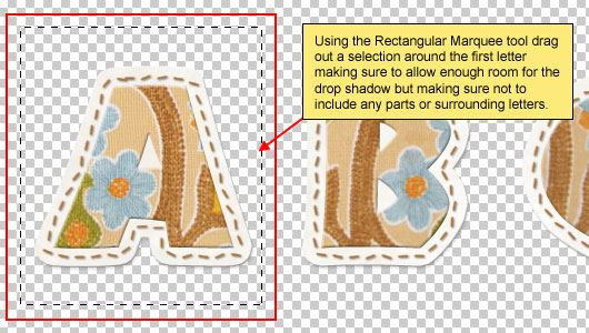
With the background out of the way, lets switch to the Rectangular Marquee tool by pressing the M key and the click and drag a selection around our first letter. This selection doesn’t need to be exact, but just make sure you’re not selecting any of the other letters.
Step 17 – Saving The Letters As Individual .PNG Files (part 2)
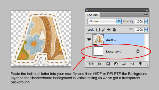
Now, make sure that you have an active layer selected in the Layers palette (not the hidden Background layer). Choose Edit > Copy Merged from the Main Menu and then open a new Photoshop file by pressing Command-N (PC: Ctrl-N). By default, Photoshop will set the file size of the new file in the New dialog box to the size of the selected area you just copied, so just click OK without changing anything.
Now simply press Command-V (PC: Ctrl-V) to Paste the copied letter into the new file. The letter should appear in the center of the new file with no extra space around it and will include the soft edges where the Drop Shadow lives. In the Layers palette, go ahead and delete the default white Background layer so you’re left with your letter over the checkerboard background.
Step 18 – Saving The Letters As Individual .PNG Files (part 3)
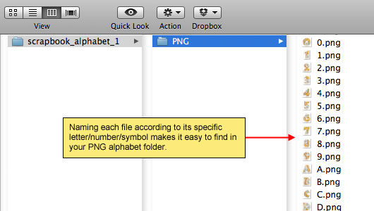
All that’s left to do is save our letter as a .PNG file. Choose File > Save As from the Main Menu, choose where you’d like to save the file, give it a name, and be sure to choose PNG from the Format drop-down menu. Click Save and when the PNG Options dialog pops up, make sure that the None checkbox is selected. Click OK to save and move on to your next letter!
(*note: I recommend saving the letter A as A.png, or the letter x as x.png so that they’ll be organized and easy to find in your alphabet folder.
Conclusion
Along with a simple and easy text effect, it’s a snap to create a library of .PNG letters, numbers and symbols that can be used in scrapbooking and graphic design projects. Thanks for following along. I hope you learned a little something new along the way.
Lesson Files + Additional Resources
Download the .PSD file for this lesson Right Here.
Download the complete letter set along with the full alphabet .PSD file Over Here.
Tell Your Friends
More in Text Effects


14 Responses to Create A Scrapbook Alphabet
Arvin
February 17th, 2011 at 12:24 am
Wow this article was just full of stuff that I had no idea to even imagine of doing… especially the “create layer” from the stroke layer style! So useful! Now I gotta do my est to remember to use it next time I’m in Photoshop :)
Claudya
February 18th, 2011 at 7:31 am
Wow!!!!!! Great, write more of scrapbook please and ty.
emily
February 22nd, 2011 at 1:04 pm
Thanks so much for this wonderful tutorial!!
Lindsay
February 25th, 2011 at 3:52 am
This is so much fun and easy to follow. I’m new to Photoshop (just upgraded from paint shop pro 7 – yeah big jump). I didn’t do an alphabet, I made a cute little cupcake, I sort of bumbled through using paths to create my shapes. Anyway the result is amazing, everyone who’s seen it loves it.
Thank you so much for all your tutorials,
Lindsay.
Arnold
March 10th, 2011 at 11:48 am
My Hero is Back, Thanks so much for this tutorial, you are the Best.
Arnold
jarlck
March 15th, 2011 at 9:01 am
this is another awesome tutorial, thx hero
Binti
April 9th, 2011 at 6:25 pm
Thanks for the awesome tutorial. Glad to see a new one. They have all been a great help.
cheryl
June 4th, 2011 at 9:19 pm
Thanks for the super helpful and really well written tutorial. I have been playing with this for hours now! Extra thanks for all the tips about shortcuts–extremely useful especially when saving all those png files en masse!
socreative
June 19th, 2011 at 8:53 am
Awesome tutorial, thanks for sharing
graphic design gallery
July 30th, 2011 at 2:13 am
Awesome! I think I’m going to let my sister check your blog. She loves doing crafty stuff for her scrapbook. Thanks for sharing.
Jen
August 6th, 2011 at 9:07 am
I loved doing this tutorial and have learnt so many new things and shortcuts. Thank You. There’s a typo in step 3 the point size should be 48. It kinda threw me for a while LOL. Thanks for this tutorial.
HERO
August 11th, 2011 at 11:44 am
Good catch Jen, I’ve fixed step 3.
Clip Tv
August 13th, 2011 at 2:23 pm
good tutorial.thank you very much
Anna
October 4th, 2011 at 4:35 pm
Fantastic Tutorial! I do a heap of work for crafty stuff. This is going to be so useful. All easy to understand as well.
Thank you!