


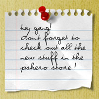
A Scrap Of Notebook Paper
In this Photoshop tutorial we'll be creating a scrap of notepad paper like the ones you've probably seen used in popular websites and blogs. Throughout the lesson I'll also be discussing the things I take into consideration when preparing a graphic like this for the web.Step 1
Lets begin by opening a new document in Photoshop by selecting File>New from the Main Menu. My file size is 540x300px at 72ppi for those of you following along at home. Because our notepad paper will be white, lets begin by changing the document’s background color.
With the new document open, click on the foreground swatch in the Tools palette to bring up the color picker. Pick a background color that you like and that will be easy to see the white paper against (I chose #e9dfb8, which you can type in the box at the bottom of the color picker). Now simply press Option-Delete (PC: Alt-Backspace) to fill the Background layer with this new color.

Step 2
Lets go ahead and assume that we’re going to use this scrap paper to hold a note to our readers in the sidebar of our imaginary blog. The most important thing we’ll need to know is the actual width of the sidebar in question. Since I’m a fan of running ads in my sidebar and my ad size of choice is 250px wide, and lets say that we want to have 10px on each side of that ad worth of padding, our sidebar width is going to be a total of 270px. Lets also say that we’re going to want to add a nice little drop shadow to our paper that will be a maximum of 5px… this means that our actual paper will need to be 265px wide. Whew… math lesson complete.
Create a new layer by clicking the Create New Layer icon at the bottom of your layers palette. (If the Layers palette isn’t visible, choose Window>Layers from the Main Menu.) Then double-click on the new layer’s name in the Layers palette and rename it Paper.

Step 3
Now it’s time to create the initial shape of the paper. If your Info palette isn’t visible, bring it up now by choosing Window>Info from the main menu (we’ll be using this in just a second)
Choose the Rectangular Marquee tool from the Tools palette by pressing the M key, then drag out a rectangular selection onto the stage. Watch the Info palette we just opened as you create the selection to make sure your selection is exactly 265px wide. The height of the selection just needs to be tall enough for the note, so make your own decision here (mine is 250px tall).

Step 4
Press the D key to reset the foreground and background colors to black and white respectively, then simply press Command-Delete (PC: Ctrl-Backspace) to fill the selection with the background color (white). Press Command-D (PC: Ctrl-D) to deselect.

Step 5
Now we’re going to create the holes and tear-lines at the top of the paper using a combination of a circular and rectangular selection at the same time. I’ll try to go slowly here so even the noobs will get this.
You should still have the Rectangular Marquee tool selected, but we want to start by creating a circle, not a square, so you can either click and hold your mouse on the Rectangular Marquee tool to reveal the fly out menu where you can choose the Elliptical Marquee tool, or you can simply press the keyboard shortcut Shift-M (this shortcut toggles between the Rectangular and Elliptical Marquee tools when you have the Marquee tool selected in the Tools bar).

Step 6
Again watching the Info palette to make sure your selection size is correct, click and drag a 12x12px selection onto the stage. Remember that by holding down the Shift key while you drag will constrain the proportions to a perfect circle. Once the selection is made, drag it into position where you think the line of holes should live on the top of your paper. As a rough guide, it should be about as far from the edge as it is around (approximately 12 px from the edge).
At this point in the process it may will help to zoom in on your selection by pressing Command-+ (PC: Ctrl-+).

Step 7
Now that you’ve got the hole selection made, it’s time to add a rectangular selection to the top of it to represent the line where the paper tore through at the edge.
Switch back to the Rectangular Marquee tool (remember Shift-M), hold down the Shift key (this lets Photoshop know you wish to add to the current selection) and click and drag a tall narrow selection from the top of the circle upward.
If you need to move your rectangle around after you begin to create it, simply press down the space bar which will allow you to move the selection around while you’ve still got your mouse button pressed.

Step 8
All that’s left now is to remove the area inside the selection, move it to the right a few spaces and do it again.
Start by pressing the Delete (PC: Backspace) key to delete the white area inside the selection, then move the selection to the right 20px by holding down the Shift key and pressing the Right Arrow key twice. Holding the shift key allows you to move the selection 10px at a time instead of just 1. Press Delete (PC: Backspace) again, and repeat the process until all the holes are made, then press Command-D (PC: Ctrl-D) to deselect.

Step 9
Before we go any further, lets add a small shadow to the paper to give the document a bit of depth. Control-Click (PC: Right-Click) on the Paper layer in the Layers palette and choose Blending Options from the menu to bring up the Layer Styles dialog box.
From the list of styles on the left, click on the words Drop Shadow (be sure to click on the words and not just the checkbox, otherwise you won’t see the options for the Drop Shadow layer style, it will just apply the default settings). Set the Drop Shadow to match my example below and click OK to commit the style to the layer.


Step 10
Now we’re ready to add some lines to the paper. Create a new layer (just like we did in Step 2) and name it Blue Lines. Click on the foreground color swatch in the Tools palette and change the color to a nice blue like #97c7df.
From the Rectangular Marquee tool fly out menu, choose the Single Row Marquee tool (the one that looks like a 1px horizontal selection). Click anywhere on the stage to create a full width 1px horizontal selection, use your up and down arrow keys to get it into position for the top line and press Option-Delete (PC: Alt-Backspace) to fill it with blue. Hold down the Shift key (again so we can move the selection 10px at a time) and press the Down Arrow 3 times to move the selection down 30px then fill it with blue again and repeat until you get to the bottom of the paper. Press Command-D (PC: Ctrl-D) to deselect.

Step 11
Instead of selecting and deleting the lines that extend past the edge of the paper, we’re going to create a clipping mask that will mask the Blue Lines layer to the Paper layer.
Control-Click (PC: Right-Click) on the Blue Lines layer and choose Create Clipping Mask from the menu. You’ll know that the layer is clipped to the one below because it will now be indented with a little down-pointing arrow on it.

Step 12
Many notebooks also include a set of red lines on the left of each page, so lets add those as well. Create a new layer called Red Lines. This time we’ll be grabbing the Single Column Marquee tool from the Marquee tool fly out menu. Change your foreground color to #c74f4f and just like we did before, click on the stage to create a selection, move it into place and press Option-Delete (PC: Alt-Backspace) to fill the selection with red. Using the arrow keys (without Shift this time) move the selection 3 pixels to the left and fill it with red again, then deselect.
And just like we did with the blue lines, create a Clipping Mask for this layer as well (this will clip the layer with the Blue Lines layer to the Paper layer). Lets also lower the layer’s Opacity to around 30% to make the lines fit in a little better.

Step 13
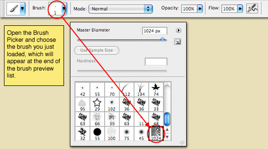
Next we’re going to add some wrinkled paper texture to our paper by using the Brush tool. I have included the brush I’m using in the download at the end of the lesson, so if you’re playing along at home you might want to go ahead and download that now. The brush set is called WrinkledPaper.abr and once you’ve downloaded and unzipped the lesson you’ll need to install the brush by doing the following:
1) Press the B key to switch to the Brush Tool.
2) Click on the Brush thumbnail in the options bar at the top of Photoshop to open the Brushes Picker.
3) Click the little arrow at the top of the Brush Picker and choose Load Brushes from the menu.
4) Navigate to wherever you put the unzipped lesson download and select the WrinkledPaper.abr file.
5) Click OK to load the selected brush set into the brushes palette.
6) When the add/replace dialog box pops up, choose Append.
That’s it. The wrinkled paper brush is now loaded into your brushes palette and is ready to use, so continue to Step 14.

Step 14
Create a new layer in the Layers palette called Texture and add a Clipping mask to the Paper layer just like we did with the Red and Blue Lines layers.
Click on the Brush thumbnail in the Brush Options bar at the top of Photoshop (just like you did in Step 13), but this time scroll to the bottom of the brushes window and choose the last brush (which should look like a tiny rectangular piece of wrinkled paper).
Step 15
Make sure your foreground color is set to black by pressing the D key, then align the brush over the paper so that the upper left corner of the brush covers the paper as shown below.

Step 16
Click the mouse once to paint the texture onto the paper. Obviously we don’t want to see the full weight of the brush on the paper because it looks like a big black mess, so lets lower the Texture layer’s Fill opacity to 10%.

Step 17
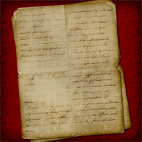
Things are starting to look pretty nice, and we could just leave things the way they are, but lets go a little further and distress our paper even further.
Click on the Paper layer in the Layers palette to make it the working layer, then add a Layer Mask to the layer by clicking the Add Layer Mask icon at the bottom of the Layers palette (it’s the one that looks like a little circle inside a gray rectangle). By adding this layer mask, it will allow us to distress the Paper layer without actually erasing any of it’s pixels. If you’re not familiar with Layer Masks, you’ll see what I mean as we go along.
Notice that the Layer Mask is selected by default on the Paper layer (denoted by the small black brackets around it).

Step 18
You should still have the Brush tool selected, so lets go back to the Brush Picker and choose the one called Chalk 60px. Make sure you’re foreground color is still set to black. By painting on the mask with black, we can effectively hide areas of the layer without actually deleting them, which is great if you screw up because all you have to do is paint over those areas with white to bring them back.
Paint a jaggy edge along the bottom of the paper to make it look like it’s been torn. Notice that you can see the black area you painted appear in the Layer Mask thumbnail.

Step 19
You may also want to paint away little chunks of the top edge to make it look like they were torn off when the page was removed from the notebook. You can increase or decrease the size of your brush using the bracket keys [ and ]. You may want to switch to another brush if this one doesn’t suit your needs.

Step 20
The last bit of distressing we’ll do is to add a little depth to the bottom edge with a little white paint. Create a new layer at the top of the layer stack called Torn White Edges and clip it to the rest of the layers attached to the Paper layer.
Press the X key to switch white to the foreground color and using the same Chalk 60px brush, lightly brush along the bottom torn edge of the paper to give the torn edge a little more flavor. A little goes a long way here so don’t overdo it.

Step 21
Now, if I wanted to put this paper into my sidebar and use HTML to add the text, I’d simply write my CSS with a line height of 30px (since that’s how far apart the lines on the paper are), and I’d have a nice dynamic note in my sidebar. But since we’re playing with Photoshop, and since this isn’t a CSS tutorial website, lets go ahead and add some text right here in Photoshop using the Type tool.
Click on the Red Lines layer in the Layers palette so that the new text layer will appear just above it in the layer stack and it will by default be clipped with the other layers to the Paper layer. Press the T key to switch to the type tool and in the Characters palette (Window>Characters from the main menu), choose a font that you like. I chose a font called Violation which you can download for free from DaFont.com. By setting the Leading (line spacing) to 30px, the font is placed on each of the little blue lines perfectly.
Click on the canvas to set the start point for your text (don’t worry if the placement isn’t exact, you can adjust it with the Move tool when you’re done typing if needed). I also lowered the opacity of my text layer to around 75% which seemed to make it fit a little better.

Step 22
We’ve come to the end of the lesson. I hope you learned something useful along the way.
For my final image, I also added a lifted edge and custom shadow effect, you can learn how do to each of those here to!
To learn how to pull the corner off the paper, visit my Sticker Edge Peel tutorial.
To learn how to create custom shadows that add depth to your images check out the Adding Depth With Shadows tutorial.

Lesson Files + Additional Resources
Download the free .PSD file and other lesson files Right Here.
Tell Your Friends
More in Graphic Design


106 Responses to A Scrap Of Notebook Paper
Abdul Momen
December 29th, 2010 at 10:40 pm
My friends were surprised watching my project, which is made by inspiring this tutorial. Thanks a lot….
Ray
December 30th, 2010 at 12:35 pm
I’ve been following your excellent tutorials as I learn CS5 but as a former Paint Shop Pro user (which has great vector and bitmap support) I was wondering, for the sake of easier future editing if it would make sense to create some items as vectors? Eg: in this example, the paper background, holes and lines. Is that a good thing as a general rule, or is it not really necessary in Photoshop?
Anyway, keep up the good work!
Tiph
January 24th, 2011 at 9:27 pm
anyone else have trouble filling in the blue lines?
Mahira
March 10th, 2011 at 8:37 am
very nice..keep it up!
stepcat
June 19th, 2011 at 1:58 am
Thank you for your tutorials.
I am from Japan and just began to touch ps.
But you make me believe I can do more to creative something by ps.
Thanks a lot. I will continue to follow your charming tutorials.
Craig
October 9th, 2011 at 6:37 pm
Easy and effective. Thanks for the step by step tutorial.