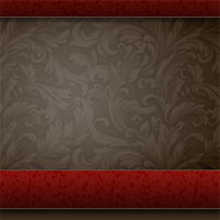
Hero Header Part I
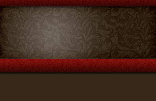
I've had quite a few requests for a tutorial on how I created the previous pshero.com site header, so this tutorial will cover creating the background and red bars of the project.Introduction
I’m stoked to have a nice list of requests to work from this week. I’ve had several folks ask about how I created the header background seen in the previous site header, so today we’re going to explore the wonderful world of Pattern Overlays, Gradient Overlays, Noise and a few other nifty little tricks that you may find useful.
This tutorial will cover creating the background and red bars of the header.
A very special thanks to Mr. Diggles and Brian from dbClay.com. You boys know why.
Step 1
Lets open a new document and get rolling. Because I’m working in this limited space I’m going to use a document width of 540px, but if you’re building an actual header, you’ll probably want to make your wider and 350px high will be plenty.
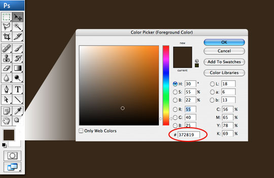
Click on the foreground swatch in your Tools bar and enter the RGB code #372819 in the field at the bottom of the Color Picker to change the color to a nice brown. Now simply hit Command-Delete (PC: Alt-Backspace) which is the keyboard shortcut to fill the stage (or a selection) with the foreground color.
Step 2
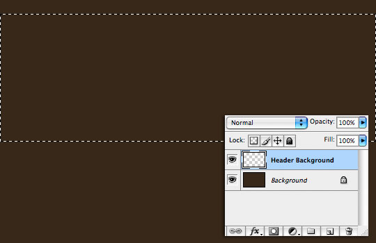
Create a new layer by clicking the New Layer icon at the bottom of the Layers palette. If your layers palette isn’t visible, open it by choosing Window>Layers from the main menu. Double click on the layers name and rename it Header Background.
When you create a new layer, it will automatically be selected as your working layer. Press the M key to choose the Rectangular Marquee tool and drag a selection across the stage which will be used to create the background area of the header that contains all those pretty swirls. The height of my selection is 185px.
(*note: If you choose Window>Info from the main menu, the Info palette will open up and you can see exactly what size selection you are creating as you go.)
Step 3
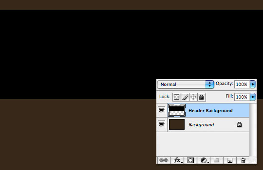
Press the D key to reset the foreground color to black, then fill the selection by pressing Command-Delete (PC: Ctrl-Backspace) just like we did in Step 1. Then press Command-D (PC: Ctrl-D) to deselect.
Step 4
For this step you’re going to need to download a new Photoshop Pattern file. I’ve included this file in the download at the end of the lesson or you can download it by itself here. Once you’ve downloaded the pattern, you’ll need to place it in the Applications>Photoshop>Presets>Patterns folder on Mac, and the PC path should be quite similar.
Now we are going to load and apply this style to our layer. Either double-click to the right of this layer’s name in the layers palette or Control-Click (PC: Right-Click) on the layer and choose Blending Options to bring up the Layer Styles dialog box. Choose Pattern Overlay from the Styles list on the right. Click on the pattern swatch to open the Pattern Picker, then click the little circle with the arrow in the upper right hand corner. Now you can see all the options available for the Pattern Picker, choose Load Pattern. Now simply navigate to where you placed the pattern at the beginning of this step and click OK. This will load the pattern into your Pattern Picker (right at the end). Now just choose it and the Pattern Picker will close.
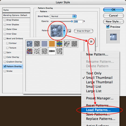
Step 5
You’ll see that the pattern you chose is now active in the Pattern window. Change the Blend mode to Luminosity.
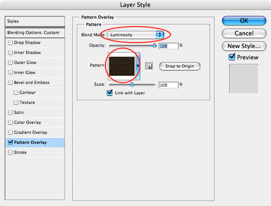
Step 6
Select Blending Options from the Style list at the left and move the Fill slider all the way to the left to reduce the layer’s Fill Opacity to 0%.
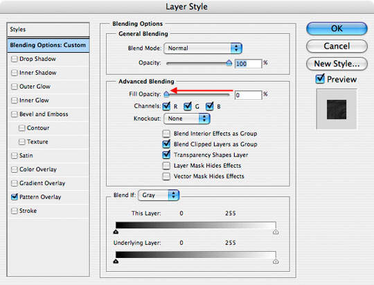
Step 7
Next select the Inner Glow style and add the following settings. This is what adds the nice edge burn effect you see in the header. When you’re done, click OK to commit the layer style and return to the document.
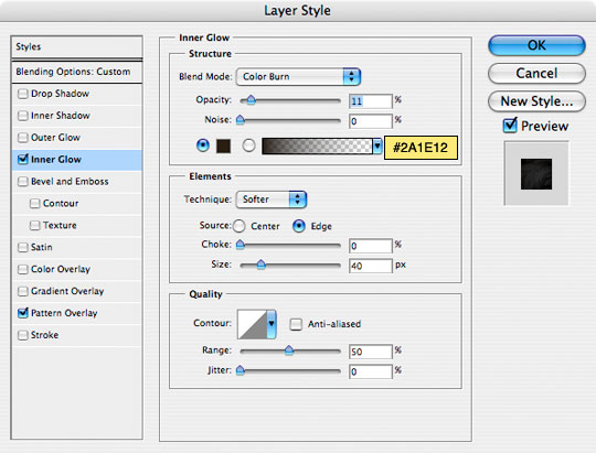
Step 8
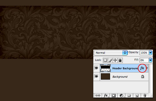
You’ll notice that the Header Background layer now has a Layer Style icon. Your header should now look something like the one below.
Step 9
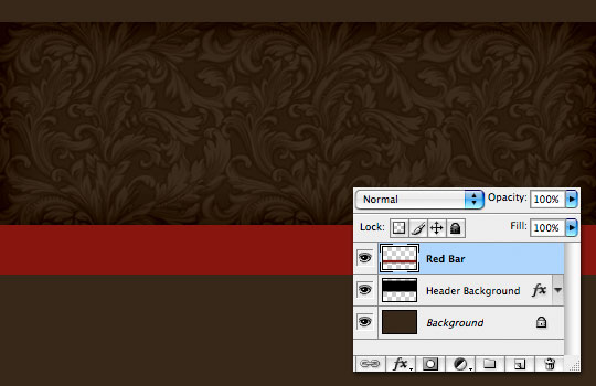
Create a new layer and call it Red Bar. With the Rectangular Marquee tool draw out a nice selection below the Header Background (mine is 45px high), fill it with #88160F, and press Command-D (PC: Ctrl-D) to deselect.
Step 10
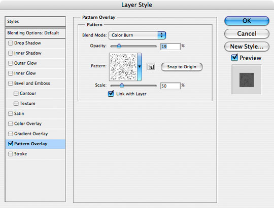
Next, open the Layer Styles dialog box just like we did in Step 4, choose Pattern Overlay. Just like we did in our earlier step, we’re going to load a pattern set into the Pattern Picker. This time though, we’re going to use a stock pattern set called Texture Fill 2 which you’ll find in the drop down menu where we loaded our pattern in Step 4. You can either Append (put these patterns at the end of the pattern picker) or you can click OK to replace all the current patterns with the new one. Either is fine.
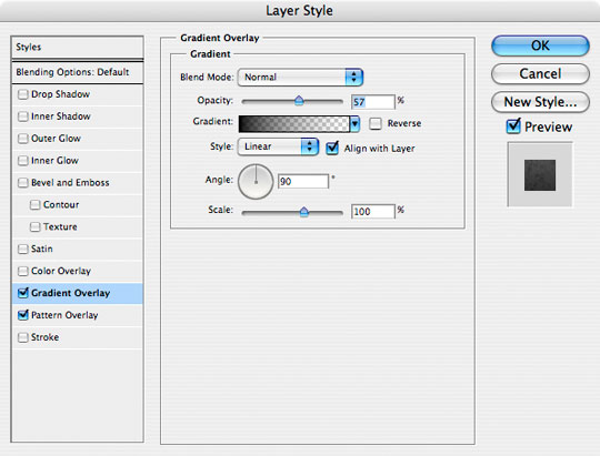
Find and select the pattern called Sparse Basic Noise by holding your mouse over each pattern until it’s name appears. And use the following settings. Then set a Gradient Overlay using the settings that follow.
Step 11
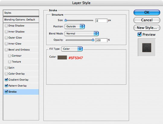
Lastly, add the following 1 pixel Stroke and click OK.
(*note: in my header I used a double outline created by using the Single Row marquee tool available in the Rectangular Marquee tool’s expanded menu with a 1 pixel gap between them.)
Step 12
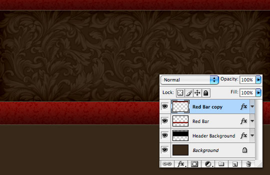
Now lets duplicate our Red Bar layer by pressing Command-J (PC: Ctrl-J). This will create a new layer directly above the Red Bar layer called Red Bar copy.
Press the V key to switch to the move tool then click and drag this new red bar to the top of the header until it looks like the one below.
Step 13
Now lets add a shadow below the bottom Red Bar layer. Click on the Header Background layer and then add a new layer above it by clicking the Add New Layer icon at the bottom of the Layers palette. Rename the layer Red Bar Shadow.
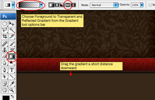
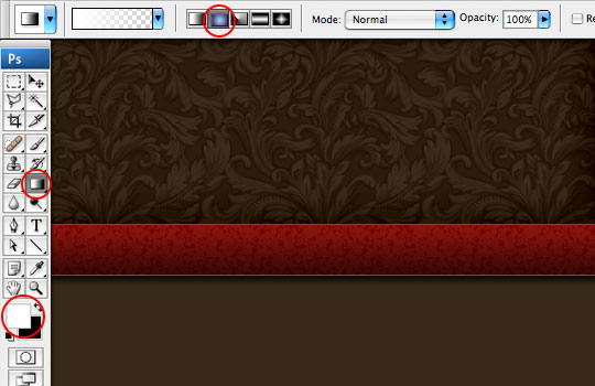
Switch to the Gradient tool by pressing the G key and make sure the foreground color is set to black by simply pressing the D key. In the Gradient tool options that appear across the top of the screen, make sure that Foreground to Transparent is selected as well as Reflected Gradient. On the stage drag a short vertical line from the bottom of the Red Bar downward to create the gradient shadow.
Step 14
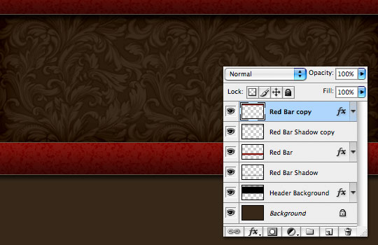
Lets put the same shadow below the top bar by repeating the process then drop the opacity of both shadow layers to 80% in the layers palette. You can do this by duplicating the layer and moving the gradient up, or by creating a new layer and a new gradient.
Step 15
The last thing we are going to do is place a radial gradient into the header to create the glow behind the logo area.
Create a new layer above the Header Background layer and name it Header Glow. Press the X key to switch the foreground and background colors, now making white the foreground color. Choose the Gradient tool again by pressing the G key and this time make sure that Radial Gradient is selected from the Gradient Options.
Step 16
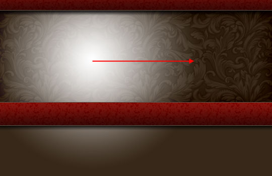
Click and drag a nice radial gradient onto the stage where you think the glow should live. Don’t worry that it extends beyond the Header Background, we’ll fix that in the next step.
Step 17
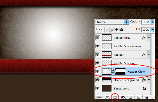
Ok, now listen very carefully. We are going to create a layer mask on the Header Glow layer by loading the Header Background layer as a selection so follow along.
To load the selection, hold down the Command (PC: Ctrl) key and click on the thumbnail for the Header Background layer. Cool right?
Ok, now make sure that the Header Glow layer is your active layer (it will be highlighted). Then click the Add Layer Mask button at the bottom of the layers palette (it’s the one that looks like a circle inside a rectangle). Your selection will be converted to a layer mask and the layer mask icon will appear on the Header Glow layer.
Step 18
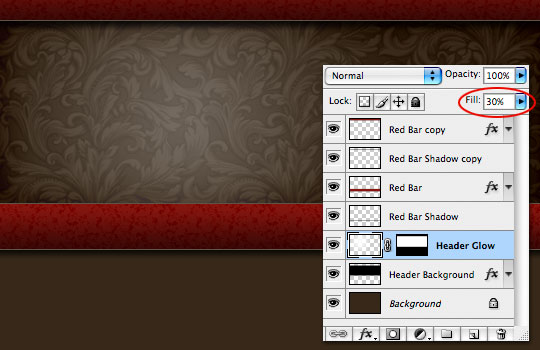
Obviously this white gradient is much too bright, so the last step is to simply drop the Header Glow layer’s Fill opacity down to around 30%.
Step 19
Great work! Click here for Hero Header Part II where I’ll show you how I created the old paper and logo star that complete the header graphic!
Lesson Files + Additional Resources
Download the free .PSD file and other lesson files Right Here.





59 Responses to Hero Header Part I
HERO
March 19th, 2010 at 4:09 pm
MEL, You’re going to have to do your expansion in a few steps. Expand the whole path, then go back and re-adjust the areas that don’t match. The expansion shown here with the star will only work with completely geometric shapes, and even then there are exceptions. It would sure be nice if you could expand a path the same way you’d expand a selection huh!
Hmut
May 21st, 2010 at 1:57 pm
You are the creator
^^
Texture plus
May 29th, 2010 at 7:34 pm
Wow! thanks alot that what i nead to learn about! Great tutorial!
rvfrndz619
August 1st, 2010 at 11:31 am
Nice tutorial! Pls more tutorial!
Penang Web Design
August 2nd, 2010 at 3:29 am
Wow!!!thanks for sharing….
Hector Neil
December 16th, 2010 at 11:24 pm
Thank you. this can be helpful to me
Antony K.
December 17th, 2010 at 6:30 pm
Thank you so much for this tutorial.
It’s my fist time ever with Photoshop and it has been so much fun thanks to these detailed instructions.
Arni
December 24th, 2010 at 11:15 am
very good tutorial for a webdesign, thanks
suchetan
August 15th, 2011 at 1:19 am
thank you buddy for this grate tutorial…….