


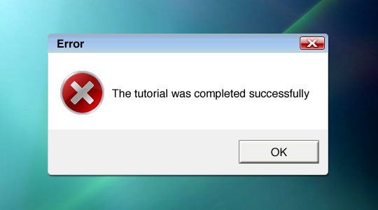
Vista Error Icon
In this Photoshop tutorial I'll show you how to create Windows Vista icons using a few basic layers, creative layer styles and some web 2.0 gradients.Step 1
Lets first take a look at a few Vista icons. The icon we’ll be working towards is the Error icon on the left, however by simply changing the color in the Layer Style you’ll be able to easily adapt this icon to many others and perhaps even come up with some on your own.

Step 2
If I were actually going to be creating an icon for either Windows Vista or Mac OSX I’d be starting with a document size of 256×256 with a transparent background, so if you actually want to turn your file into a usable icon I’d suggest starting with that document size. Since this is just an illustration of technique, I’m going to use my standard 540×300 tutorial image size. I’ll also drag my example error icon down to the corner of the stage so I can refer to it as I work. Using reference is always recommended when you’re trying to mimic an object that already exists.
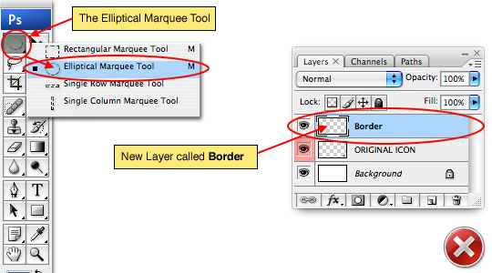
Lets get started by creating a new layer by clicking on the Create New Layer icon at the bottom of the layers palette. As always, I suggest you name your layers upon creating them and I’m going to call this one Border.
Press the M key to invoke the Marquee tool and choose the Elliptical Marquee tool from the fly-out menu in the tools bar (since we’ll be creating a circular icon).
Step 3
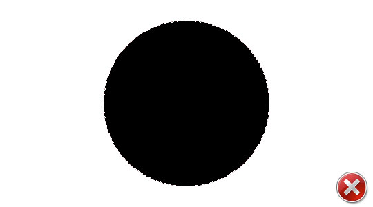
Holding the Shift key to constrain our selection to a perfect circle, click and drag a nice size round selection. If you are creating an icon in the 256×256 file size, you’ll probably want to use up nearly all of that space with your circle so lets make our selection 240×240 pixels. If you want to be exact here you can either watch the Info palette (accessed by choosing Window>Info from the main menu) or you can use the Fixed Size style option that appears in the Options bar at the top of Photoshop when the Marquee tool is selected.
(*note: As a side note, you can switch between the Rectangular Marquee and the Elliptical Marquee tool once you’ve got the tool selected is by pressing Shift-M.)
Press the D key to set the foreground color to black and then fill the selection by pressing Option-Delete (PC: Alt-Backspace).
Step 4
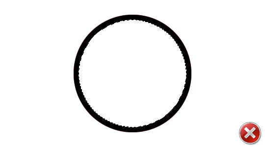
Now that we’ve got the selection filled, we want to shrink the selection and delete the middle leaving only the outer ring as the border for our icon. From the main menu choose Select>Modify>Contract which will bring up a dialog asking how many pixels you wish to contract the selection by, set the size to 10 pixels and click OK. Now just press Delete (PC: Backspace) to remove the black inside the newly reduced selection.
I know you’ll have the overwhelming urge to release your selection right now… but don’t do it!
Step 5
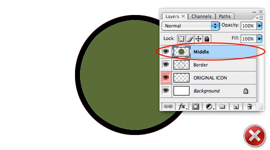
Before releasing the selection lets create a new layer called Middle and with the new layer selected fill the selection with a different color, any color will be fine so pick something you like, maybe something that looks like split pea soup.
Now it’s ok to press Command-D (PC: Ctrl-D) to release the selection.
Step 6
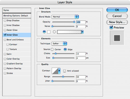
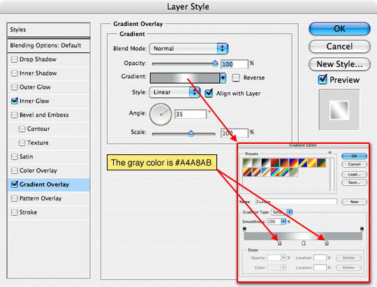
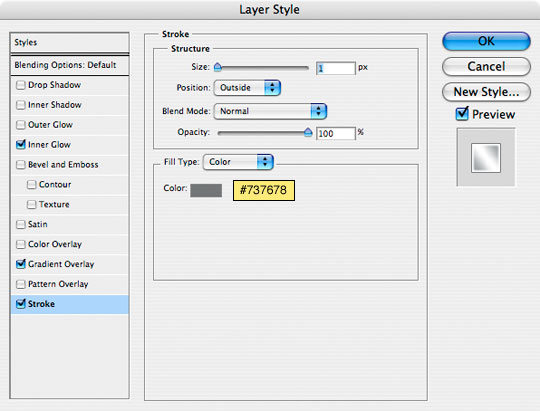
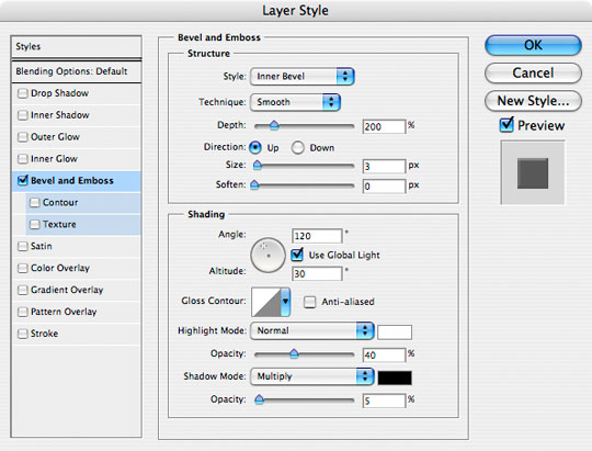
Now we’re ready to start adding some layer styles. Click back to the Border layer to make it the active working layer and by Control-Clicking (PC: Right-Clicking) on the layer choose Blending Options from the menu to bring up the Layer Styles window. Using layer styles we are going to create the nice reflective chrome effect for the border on our icon.
(*note: You can also bring up the Layer Styles window by simply double clicking to the right of the layers name in the Layers palette.)
Add the following 3 layer styles and click OK. Be careful to check each setting here.
Step 7
This is where you should be so far. If you’re having a hard time following along with the layer styles dialogues feel free to jump to the end of the tutorial and download the .PSD lesson file so you can follow along as we go. By double clicking on the layer style icon in each of my layers you can bring the Layer Styles dialog box for that layer back up and see every setting for yourself.
Step 8
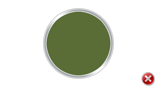
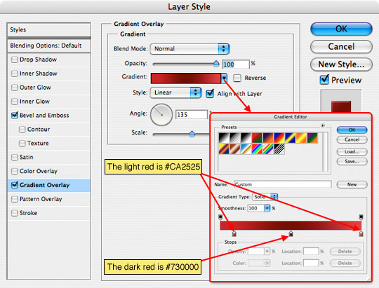
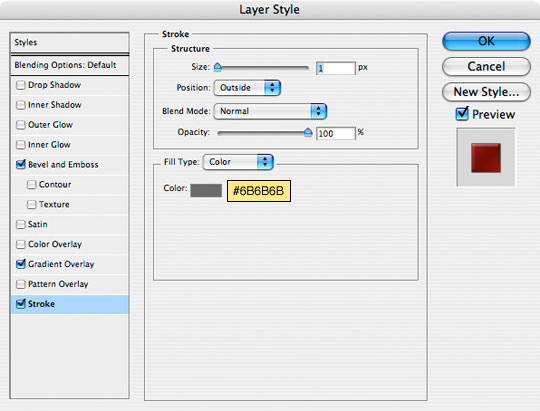
Ok, now lets click up to the Middle layer in the layers palette and give it a few Layer Styles of it’s own. Just like you did back in Step 6, open the Layer Styles window for this layer and apply the following styles.
Notice in the Gradient Overlay area we choose some nice red tones that completely mask the lovely split pea soup green we had going on before (this is why I said color doesn’t matter). Because the only area in these icons that holds actual "color" is the center, if you ever want to switch the color of your icon, all you need to do is change the values inside this particular layer style.
Step 9
Now the icon is starting to take on the look we’re going for. Here’s what mine looks like to this point.
Step 10
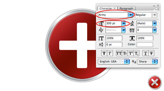
It’s time to add the little X to our error icon. For this you can either find a font that works or you can draw it by hand. The X that microsoft uses is an equal sided one with slightly rounded corners. Since all sides are equal and look more like a plus sign than an actual X I typed a plus sign (+) onto the stage and scrolled through my fonts list until I found one that looked right. In this case the font that worked best for me is called Army and it’s available in the lesson download at the end of the tutorial or you can download it for from at DaFont.com by clicking HERE. I’m using Army Regular with a size of 300 pt.
(*note: If you’re using Mac OSX and try to install this font, your Font Book program may try and tell you there are problems with the font, but it’s actually fine as far as I can tell.)
Step 11
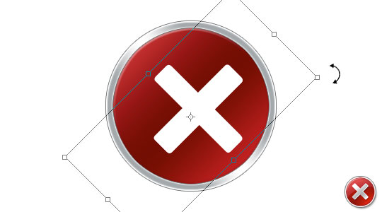
Obviously we need to rotate the plus sign 45° so it looks like an X so lets do that next. Press Command-T (PC: Ctrl-T) to invoke the Free Transform tool, hold the Shift key to constrain the rotation and rotate the selection by holding your mouse over one of the corners until the pointer turns into a little arc with arrows on each end and then clicking and dragging the selection until it’s in the X position. Hit Enter (PC: Return) to commit the transformation when you’re done and center it using the Move tool (keyboard shortcut V) or by using the arrow keys on your keyboard.
Step 12
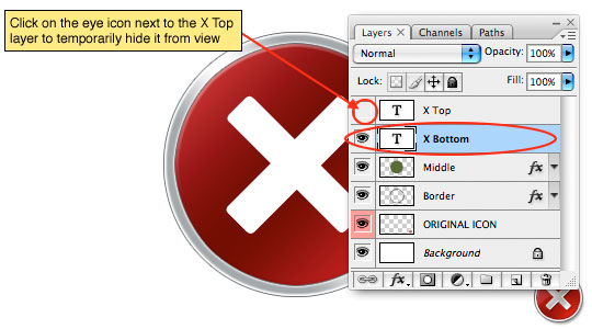
Before we go any further we’re going to need an additional copy of this X layer so press Command-J (PC: Ctrl-J) to duplicate the layer. I’m going to call these two layers X Top and X Bottom respectively.
We’re going to work on the X Bottom layer first, so lets click on it in the Layers palette to select it and lets also click the little eye icon next to the X Top layer to temporarily hide that layer.
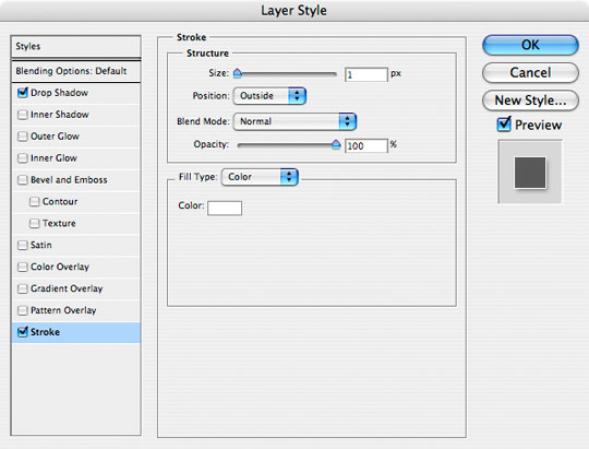
Step 13
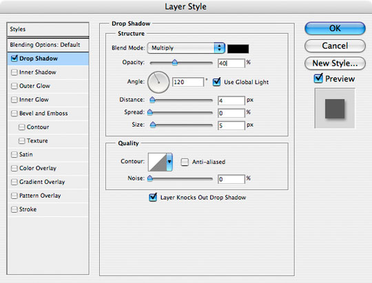
The X Bottom layer is going to be our 3D edge and shadow, so lets add a 1 pixel white Stroke to make this X just a touch bigger than the one above it and a Drop Shadow. Pull up the Layer Styles window for this layer and add the following two styles.
Step 14
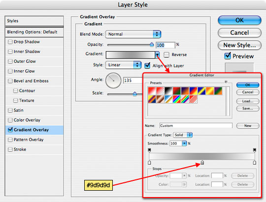
Now lets go to work on the X Top layer by clicking on it in the Layers palette and making it visible again by clicking in the empty box to the left of the layer thumbnail in the Layers palette (where the eye icon was before we turned it off).
This layer needs the same sort of metallic feel that we gave to the Border layer so lets give it a Layer Styles of it’s own. This one will be easy, just a simple Gradient Overlay
Step 15
The last step to get the X to look just right is to switch to the Move tool by pressing the V key and then simply press the Left Arrow key on your keyboard one time to shift the X Top layer 1 pixel the the left. This will expose a wedge of our X Bottom layer underneath creating a nice little 3D edge effect.

Step 16
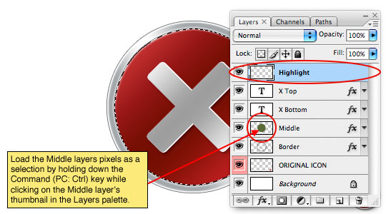
The final step in the process will be to add a Web 2.0 style gradient to the icon. In Microsoft’s error icon’s case however the "gradient" isn’t officially a gradient since the effect isn’t heavier at the top than at the bottom, which makes our job here even easier.
Create a new layer called Highlight above the X Top layer. With the new Highlight layer selected as the working layer hold down the Command (PC: Ctrl) key and click on the layer icon next to the Middle layer to load it as a selection. This will create a nice round selection exactly over the middle area of our icon.
Step 17
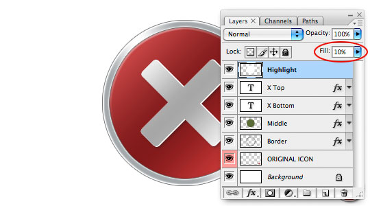
Press the D key to reset the foreground and background colors to black and white, then fill the selection with white by pressing Command-Delete (PC: Ctrl-Delete).
Obviously we can’t have the middle of our icon covered with a solid white blob so lets drop the Highlight layer’s Fill opacity down to about 10%. The effect will now just look like it’s dulled our colors a little bit, but hang on to your hats, we’ve got one more step to go!
Step 18
Last but not least, lets hit the M key to switch back to the Marquee tool. The Elliptical Marquee tool should still be active since it’s what we chose the last time we used the Marquee tool.
Drag out a nice big round selection and position it over the icon as shown below. Press Delete (PC: Backspace) to remove the highlight within the selection area and press Command-D (PC: Ctrl-D) to release the selection. And there’s your Web 2.0 style highlight!

Step 19
Here’s what my icon looks like after Step 18. See, you can do this! Those guys at Microsoft aren’t really that smart after all.

Step 20
Throw your sexy new icon into a clever little Vista error window and you’ve got a great little effect.
Yes Yes, I did actually include the .PSD for my final image in the tutorial download as well as the Army font and the main tutorial file. Enjoy!
Lesson Files + Additional Resources
Download the free .PSD file and other lesson files Right Here.
Tell Your Friends
More in Graphic Design


47 Responses to Vista Error Icon
Casey L. Jones
May 16th, 2008 at 12:29 pm
Nice tutorial… too bad I’ve yet to see an error message with Vista. I guess it likes me, or I treat it good. ;-)
Jason
May 16th, 2008 at 2:45 pm
Great tutorial! This was great and helped me figure out how to reproduce the highlight you did on the faux Adobe icons.
Slip
May 17th, 2008 at 7:49 am
Very nice, a lot more realistic than some of the others I’ve seen around.
Top marks (Y).
Barci
May 18th, 2008 at 4:04 am
Thx again, your tutorials are great!
EDG322
May 18th, 2008 at 10:51 am
Step four you have: “Now that we?¢‚Ǩ‚Ñ¢ve got the selection filled… From the main menu choose Select>Modify>Contract”
How do you select just the circle? It doesn’t select for me, I do not have the ‘Modify’ option available in the Select menu for me. I have no idea how to select just the cirle. It always wants to select the whole rectangle box. Any idea? Thanks!
tct2
May 18th, 2008 at 8:59 pm
First of all, thanks for another brilliant tut; I have learned so much from you! Your tuts are clearly written and superior to most others on the ‘net. Why, I must be using a couple of hundred dollars worth of Photoshop by now!
You have disappointed me, though. You have bought into the Microsoft-bashing that Apple sells as part of their elitist marketing campaign. Don’t be an Apple fanboy; you are way more intelligent that to fall for that. I can get my fill of the A/M flame wars on the gadget blogs.
Thanks for the tuts and keep up the good work!
HERO
May 19th, 2008 at 9:41 am
TCT2,
I’ve been a Mac guy since the 80’s… before OSX, before iPod, before Photoshop, before the internet even existed and long before Apple was cool. Forgive me for having a little fun on my own website. I’ll try to keep things here in HERO-land a little more sterile and void of personality from now on. LOL
HERO
May 19th, 2008 at 9:44 am
EDGE322,
If you created the circular selection to fill it with color, then you already have the selection made and you don’t need to create a new selection, you have to simply modify the current selection. Read and follow the steps carefully and I’m sure you’ll figure it out.
Anthony Ettinger
June 13th, 2008 at 1:21 pm
Great tutorial — works like a charm if you use shape layer with only one effects layer applied.
Have to play with the inner/outer glow and drop shadows to get the same effect, but more re-usable.
Graphic Designer
June 14th, 2008 at 3:39 am
It looks real vista icon
Michael
June 14th, 2008 at 4:47 am
These look lovely, well done!
MM
June 18th, 2008 at 8:37 pm
Great tutorial, I feel like I learned a lot. But be careful about starting these Apple vs. Microsoft things.
Anyways, keep up the good work!
HERO
June 18th, 2008 at 10:42 pm
MM,
For the record, I wasn’t starting any Apple Vs. MS things… just trying to teach people a little Photoshop with some humor mixed in.
Dave Wilkinson
June 27th, 2008 at 3:58 am
Good tut. Being too lazy to download the Army font, I used Trebuchet 350px. It worked perfectly, although the edges of the cross were a little squarer than I wanted.
The final result was great though. Keep ’em coming.
Gzkz
July 9th, 2008 at 6:54 pm
step 17 “Press the X key to reset the foreground and background colors to black and white”
as far I read harly what u written, it’s D i guess :)
HERO
July 9th, 2008 at 7:04 pm
GZKZ,
Thanks for catching that, I’ve made the correction!
KelpyKrad
September 20th, 2008 at 2:19 pm
Thanks you! :3
Oliver
October 15th, 2008 at 6:50 am
Very great tutorial. This is great and helped me to figure the same icon for my site…
Seo Beratung
November 11th, 2008 at 6:29 pm
This tutorial helped me a lot. Thanks for sharing this information…
Rick
December 23rd, 2008 at 2:29 pm
Very nice tutorial. Much better results than I?¢‚Ǩ‚Ñ¢ve seen through others.
Keep the tuts coming!
Nick
February 1st, 2009 at 8:16 pm
Really great tutorial, starting with your selection of content (so many tutorials are of images or art that simply aren’t that interesting). I also really like how you make a point of calling out the keyboard shortcuts. I learned a couple new ones I didn’t know. I’ve added you to delicious. Looking forward to more!
Many thanks!
n
harmonsmith
February 4th, 2009 at 10:14 pm
Thanks for such an informative and great tutorial
sphynxylynxy
February 25th, 2009 at 9:02 am
Well Maestro, looks as though I?¢‚Ǩ‚Ñ¢m onto a good thing and this makes me smile?¢‚Ǩ¬
justin
March 18th, 2009 at 12:47 pm
i havnt got an error message either.. oh wait, i have a mac, i dont get error messages! hahaha!!! lol. great tut! fast and simple… did it in about 15 minutes…
Arti
March 22nd, 2009 at 5:11 pm
Very cool! Thanks! I’ve always wanted to learn how to do the web 2.0 effect, and your tutorials are so well written and easy to follow along even though I’m using Photoshop Elements.
Ashley
April 11th, 2009 at 6:57 pm
Interesting, I managed to create my own custom one out of your tutorial, thank you! Very creative :)
Nestor Sulu
June 2nd, 2009 at 7:05 am
Awesome! congratulations for your diligency to have this explained to deepest details.
Bhavani
June 16th, 2009 at 7:28 am
Thanks for the great Tutorial and for the pains to explain it in such detail. Helps a lot for beginners like me.
lei
June 17th, 2009 at 7:04 am
thank you, this effect good!
Mohammed
June 28th, 2009 at 1:14 am
I realy want to thank you so mutch, this is realy a verry verry good photoshop tutorial.
thank you so much. Good luck ?
marcel
June 29th, 2009 at 8:52 am
Yet to see an error report that does something successfully, but thanx for the tut. IT’S GRAET!!! :-)
velu
September 25th, 2009 at 6:44 am
nice tutorial, i enjoyed to do this icon, nice and cool
Pam
September 28th, 2009 at 6:19 pm
Thank you for sharing. It is great to have a step by step.
venoth
October 25th, 2009 at 7:07 am
Thank you so much.It’s look so nice!!!!!!
leo
October 26th, 2009 at 12:18 am
nice tutorial,thanks
graffiti vectors
February 8th, 2010 at 11:36 am
great tutorial and nice error buton thanks
Alekz
March 5th, 2010 at 6:00 am
Superb tutorial :)
syed
March 10th, 2010 at 9:12 am
its very good tutorials.
I like it.
thanks
Assistenza portatile
March 16th, 2010 at 1:47 am
I’m a technical man but I found this tutorial so easy to follow and do. I’ll try to start learn photoshop.
wianvadou
May 11th, 2010 at 7:18 am
http://www.flickr.com/photos/wianvadou/4598000679/sizes/o/
thanks for sharing, mine looks like the one above!!
Ian.J.Gough
May 11th, 2010 at 4:50 pm
Great Tutorial and VERY easy to follow the clearest and easiest i’ve seen to date.
Thanks for sharing.
Ian
nwa
May 20th, 2010 at 3:08 pm
Very nice tutorials
Dave Brown
August 3rd, 2010 at 12:45 pm
Nice job. I would suggest the MS font “Calibri” (I think it comes with Office or maybe even Windows itself.) Need to bump up the font size a bit to get the same effect, but it has the same sort of rounded-stroke, equal-sided “+”.
khoa
August 6th, 2010 at 3:53 am
Thanks!
batoru
November 2nd, 2010 at 9:43 am
Hello!Firstly, I want to thank you for this tutorial. It is explained very well. I want to know how I can make a rectangle with rounded corners. Google-ing this issue isn’t helpful at all.
Thank you.
HERO
November 9th, 2010 at 10:29 pm
BATORU, If you select the Custom Shape tool from the tools bar (keyboard shortcut U) you can find a rounded corner rectangle option in the Options Bar at the top of Photoshop, once selected you can set the corner radius you want.
Eturnl
November 30th, 2010 at 6:22 pm
I wouldn’t let the sensitive ones around here tell you what to say. I to have been on the macs since the (early) 80’s and a little humor makes life fun. ( And I’m with ya when you’re right) ; )