


Adding Depth With Shadows
In this Photoshop tutorial you'll learn to add depth to a two dimensional layout using simple shadows and highlights.Step 1
Lets jump right in and open a new document (mine is 540×540 pixels at 72ppi).
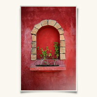
Obviously we’ll need a photo to work with so open up your photo press Command-A (PC: Ctrl-A) to Select All, then copy the photo by pressing Command-C (PC: Ctrl-C) then close the photo file to return to your newly created working document.
Press Command-V (PC: Ctrl-V) to Past the photo we just copied into the document and resize the photo if needed by pressing Command-T (PC: Ctrl-T) to invoke the Free Transform tool. Remember to hold down the shift key when resizing to constrain the proportions of your photo.
Step 2
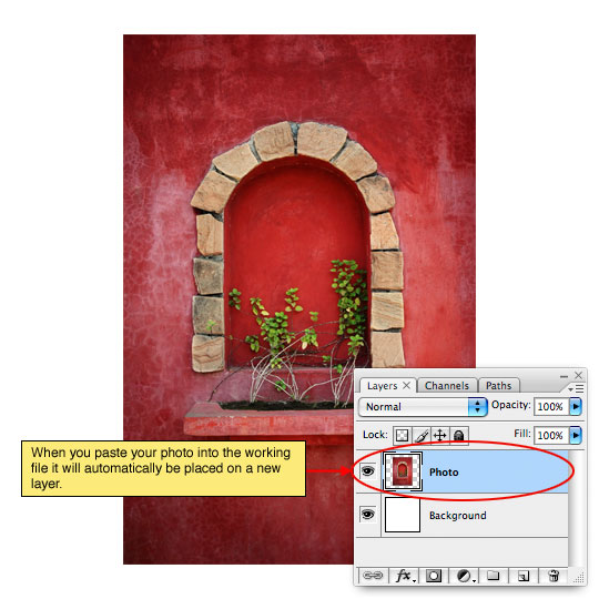
This effect looks best when the image has a border of some kind and for this exercise we’ll use a Stroke layer style to create the border. Control-Click (PC: Right-Click) on the Photo layer and choose Blending Options from the menu to bring up the Layer Styles dialog box. Choose Stroke from the list on the left and enter the following settings. Click OK when you’re finished to commit the Layer Style.
(*note: Notice that I’ve switched the placement of the Stroke to "Inside", by doing this we avoid the rounded corner effect created by leaving the Stroke on the outside of the photo thus retaining the crisp sharp corners.)
Step 3
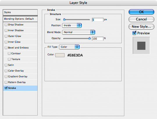
With the border in place it’s time to add a highlight to the photo. Command-Click (PC: Ctrl-Click) on the Photo layer’s thumbnail in the Layers palette to load the photo as a selection. Create a new layer by clicking the Add New Layer icon at the bottom of the Layers palette (I named this layer Highlight).
Press the G key to switch to the Gradient tool. Press the D key to reset the foreground and background colors to black and white, then press the X key to switch white to the foreground color in the Tools palette. From the Gradient Options bar that appears at the top of Photoshop choose the Foreground to Transparent swatch from the Gradient Picker and make sure that the Linear Gradient style is selected.
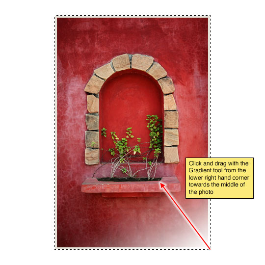
Step 4
Now lets create the highlight by clicking and dragging a the gradient from the lower right hand corner towards the center of the photo as shown below. Drop the Fill opacity of this Highlight layer to around 50%.
Don’t deselect just yet, we’ll be using this selection for a few more steps.
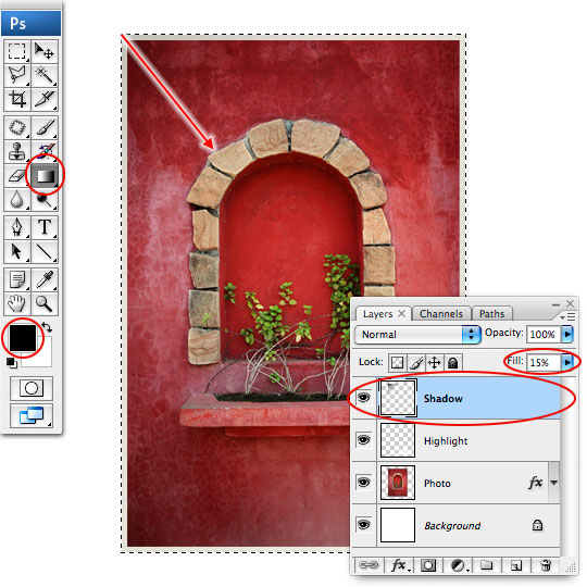
Step 5
Create a new layer above the Highlight layer called Shadow. With the gradient tool still selected press the X key to switch black to the foreground color and click and drag from the upper left corner of the photo towards the center to create the shadow as shown below. Lower the layers Fill opacity to around 15%.
Nope, don’t deselect yet!
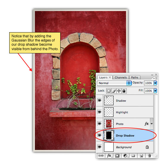
Step 6
Now we’re going to create the drop shadow for our photo that will give it that "jumping off the page" effect.
Start by creating a new layer below the Photo layer called Drop Shadow. Press Option-Delte (PC: Alt-Backspace) to fill the selection with black. Of course this black rectangle won’t be visible because it’s behind the photo but we’ll take care of that in a minute.
To soften the edges of the shadow we’re going to use a Gaussian Blur. Press Command-D (PC: Ctrl-D) to deselect and then choose Filter>Blur>Gaussian Blur from the main menu. For my example I’ll use a setting of 4 pixels, then click OK to commit the blur.
Step 7
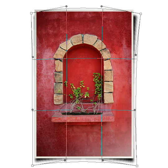
All that’s left is to reshape the shadow to create the right look. We will be using the Warp feature of the Free Transform tool to accomplish this so choose Edit>Transform>Warp from the main menu to invoke the Warp function. Unlike Free Transform, the Warp function allows us to transform in all sorts of cool ways by dragging end points or any spot inside the bounding box.
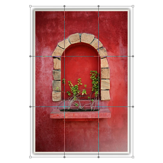
Step 8
Go from corner to corner dragging the points into position and then drag the sides of the bounding box to their appropriate spots to create a look like the one below.
Step 9
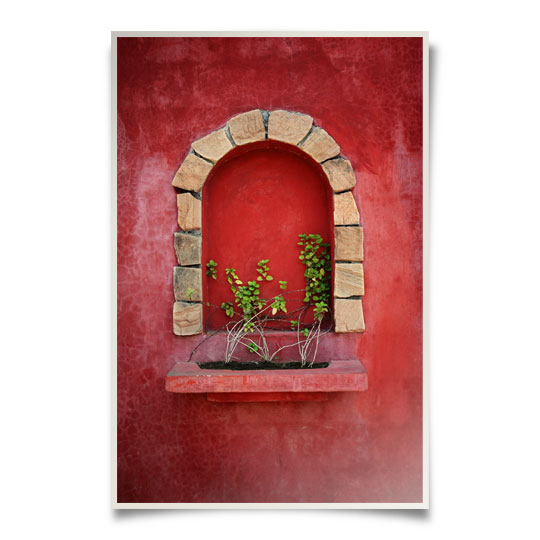
Drop the fill opacity of this Drop Shadow layer to around 50% to finish off the effect.
Step 10
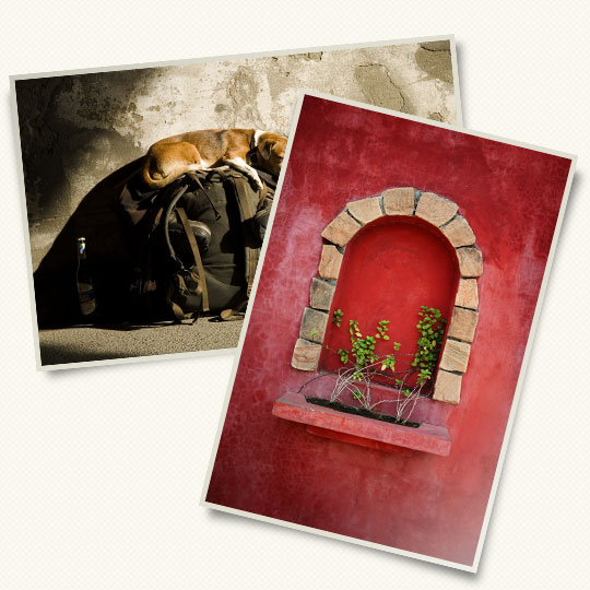
Add a subtle background, rotate the photo, add another… have some fun. Remember that any rotation of the photos will change the way the shadow is cast as well as the highlight and shadow layers above the photo. Keep your effect believable by being consistent in your lighting.
Lesson Files + Additional Resources
Download the free .PSD file and other lesson files Right Here.
Tell Your Friends
More in Graphic Design


33 Responses to Adding Depth With Shadows
DanOhh
June 16th, 2008 at 2:36 pm
Me Like-y! Nice punch to photos or even side notes.
Derek
June 16th, 2008 at 10:27 pm
Really nice shadow effect. I’ve got a web site coming up that is really going to benefit from this. Keep up the good work.
Aaron
June 17th, 2008 at 1:56 am
Nice tutorial. Thanks!
Hattan
June 17th, 2008 at 3:37 am
Thx man 4 all ur efforts to bring us a cool and pro tutorials keep it up man , waiting 4 all ur new tutorials ..
SAT
June 17th, 2008 at 10:25 am
Oh ! Once again You made it Sound… and keep us surprising !
Jordan
June 18th, 2008 at 10:35 am
This is great, I’ve been looking for a way to help my Photo Layouts, Thank-You
Drupal Museum
June 18th, 2008 at 2:23 pm
Thanks for the great tut!
darrel
June 23rd, 2008 at 3:27 pm
Thanks, your tutorials rock. I always learn something new :)
Zephyr
June 27th, 2008 at 9:32 am
Hero, i need to talk with you bro..
Can you send me a e-mail with your MSN (If you have one) ?
Thanks,
Zephyr.
moorgs
June 30th, 2008 at 2:18 pm
awesomest tutorial, really helped me when i was in a design bind!
Mothership
July 1st, 2008 at 12:23 pm
Excellent tutorial.
The technique is simple, and the effect brilliant. Sometimes it is the small things.
digitaljail
July 2nd, 2008 at 5:33 am
ultra simple fast way!
I’v done other tutorial on about the same effect but I’v to tell you this one is the best easies way!
Pravin Potdar
July 3rd, 2008 at 11:23 am
Nice Idea!!
Phased Reality
July 7th, 2008 at 3:25 pm
Cracking tutorial! Have used a similar effect myself on a recent webdesign project but wasn’t nearly as effective as this! Think I’m gonna have to go back and redo it now… ho hum :)
LinkTree
July 9th, 2008 at 8:59 pm
Thank you again, for a stunning tutorial with even more stunning result.
you are doing a wonderful thing teaching everyone to design.
Here are the results of me:
http://img213.imageshack.us/img213/6832/photodl3.jpg
http://img210.imageshack.us/img210/300/twophotoshf9.jpg
nile
July 24th, 2008 at 9:46 pm
Hello Hero,
I am Using Photoshop 8.0 There are no edit->free transform ->wrap option? are you using any other verson?
HERO
July 24th, 2008 at 11:00 pm
NILE,
Since Photoshop 8 was released in 2003 the good folks at Adobe have graced us with PS9, CS, CS2 and now CS3. You?¢‚Ǩ‚Ñ¢re using a version that?¢‚Ǩ‚Ñ¢s 5 generations old?¢‚Ǩ¬¶ which is why you’re having trouble following along. Perhaps it?¢‚Ǩ‚Ñ¢s time for an upgrade?
?ß‚Äò?æ
July 27th, 2008 at 8:31 am
really nice,I like your work,I learn many tec, thank you very much.
charley
July 30th, 2008 at 9:51 pm
Nice, with simple skill but nice effect.
Kat
August 5th, 2008 at 10:00 am
this is my first tutorial here and it was amazing! The effect is so realistic. Thanks so much for sharing all of this. I do have one question, when you say fill/opacity, what is the difference between the fill slider and the opacity slider? I can’t seem to tell what each one does differently….
HERO
August 7th, 2008 at 8:08 am
KAT,
The difference between Opacity and Fill is this – The Opacity slider controls the overall opacity of the entire layer including it’s layer styles, the Fill slider only controls the pixels present on the layer. In other words if you drop the Fill opacity it allows the layer styles to exist at their original opacity but if you use the Opacity slider everything will be adjusted together.
Jehu
August 13th, 2008 at 10:40 am
I like the optical illusion created by the warped shadow layer.
Even though the corners of the image are still square, they appear to have a slight ‘page curl’ to them.
gennoske
September 19th, 2008 at 7:54 pm
I love it the tuts, big help for those fanatics in photoshop.. Thumb ups!!! Thank you so much…
Eva
October 24th, 2008 at 1:43 pm
Thank you for this!!! I used to just use the “drop shadow” effect but this just makes it look so real… Your technique is simple enough but I never would’ve thought of it myself. Thanks a bunch!
S.M.Riyaz
November 4th, 2008 at 1:54 am
Excellent tutorial. I’ve done this kind of shadow effect previously with the warp tool. But this one seems to be perfect. Well done hero. Wish you all the best.
K Callison
January 25th, 2009 at 9:43 pm
This is the BEST Photoshop tutorial I have ever followed! Your techniques were explained PERFECTLY and resulted in EXCELLENT results! Thank you so very much for sharing, K Callison
Caleb
June 3rd, 2009 at 10:39 am
Thanks for the great tut! I have followed many of yours and have nothing but positive things to say about them. Keep it up!!
Oyunlar
July 5th, 2009 at 9:55 pm
Nice effect. Thanks.
Lorraine
January 24th, 2010 at 9:52 pm
nice there hero:)
i’ve been following your great tutorials
keep it up
and more power:)
Diane Bourque
April 22nd, 2010 at 12:52 pm
Thanks so much for this wonderful tutorial. I’d been looking for this one for some time and you explanations were great and easy to follow. Keep up the good work. Diane
Carol Schott
August 3rd, 2010 at 1:34 pm
Nice tutorial. I got all the way to the last step, but no WARP function on my Transform drop down box. Bummer! I live in ancient times.
cz
November 1st, 2010 at 2:01 am
nice,hero
oyun
January 22nd, 2011 at 8:43 am
nice there hero:)
i’ve been following your great tutorials
keep it up
and more power:)