


Modern 3D Text Effect
In this Photoshop tutorial we're going to step outside my usual Photoshop Only philosophy and use the 3D rendering power of Adobe Illustrator to create a cool little 3D text effect. Don't worry noobs, you don't need to know anything about Illustrator, as usual I'll coach you through the whole process.Introduction
In this Photoshop tutorial we’re going to step outside my usual Photoshop Only philosophy and use the 3D rendering power of Adobe Illustrator to create a cool little 3D text effect. Don’t worry noobs, you don’t need to know anything about Illustrator, as usual I’ll coach you through the whole process, but you do need to have it installed on your computer. (*note: If you don’t have Illustrator, you can jump over to Adobe.com and download a 30 day trial version to play around with.)
Step 1 – Setting Up The Photoshop File
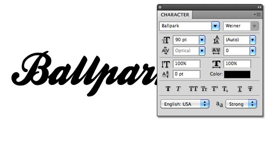
Lets get started by opening a new Photoshop document by choosing File > New from the Main Menu or by using the keyboard shortcut Command-N (PC: Ctrl-N). I’m using my usual 540px by 300px size at 72 pixels/inch and a background color of White. When your new document opens, switch over to the Text tool by pressing the T key and type your text onto the canvas (this will create a new layer above the Background layer named after your text). I’m using the Ballpark font which can be downloaded from daFont.com for free. At this point color doesn’t make any difference, but font-size does… I’m using 90pt text.
Step 2 – Convert Text To Paths
With the Text tool still active, Command-Click (PC: Right-Click) on your text and choose Create Work Path. You may only notice a small change on the stage if you’re using black text, so lets switch over to the Path Selection tool by pressing the A key and then click and drag a selection around your text. This will select the paths we just created and make them much easier to see.
Step 3 – Hop Skip And Jump To Illustrator
With our paths selected, lets first make sure that our lettering all stays together as one single unit by going up to the options bar across the top of Photoshop and clicking the Combine button (if you don’t see a combine button, chances are good that you don’t have the Path Selection tool active). With the paths combined you can now copy the selected paths by pressing Command-C (PC: Ctrl-C). This will effectively copy the vector paths into your computer’s memory so that we can switch over to Illustrator and use them there. Now, I know some smart-ass is going to leave me a snooty note about how you could have created this text in Illustrator and saved some trouble, but then you wouldn’t have just learned how to convert your text to a path would you?… And this is after all primarily a Photoshop site, so just know that you could have typed your text in Illustrator too. Both ways are equally correct.
So now that we’ve nipped that in the bud, lets move on and open Adobe Illustrator.
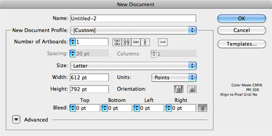
With Illustrator open, lets use the same keyboard shortcut to create a new document over there: Command-N (PC: Ctrl-N). In this instance our canvas size doesn’t matter one bit, so I’ll just leave it at it’s default Letter size and click OK.
Step 4 – Paste The Paths Into Illustrator
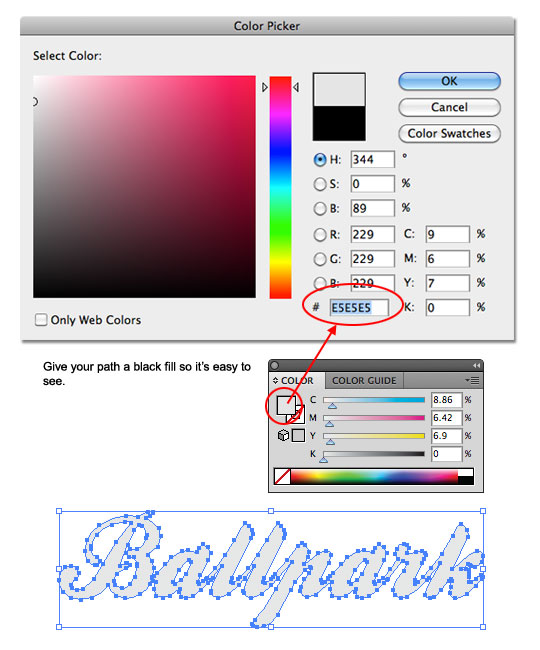
Remember those paths we copied to our invisible Clipboard? Lets go ahead and paste those right into our Illustrator document by pressing Command-V (PC: Ctrl-V). If the Paste Options dialog appears, choose Compound Shape and click OK. We’re not worried about where they are on the document or anything but if you’re Obsessive Compulsive feel free to move them to wherever makes you feel warm and fuzzy.
By default your paths won’t be filled with any color, which isn’t good since we won’t be able to see them if they become deselected, so lets use the Color palette to change the fill color to a nice light gray (#E5E5E5). If you don’t see the Color palette, choose Window > Color from the Main Menu. Double-Click on the Foreground color swatch and enter the color code into the box as indicated below and click OK to set the color.
Step 5 – Making The Text 3D
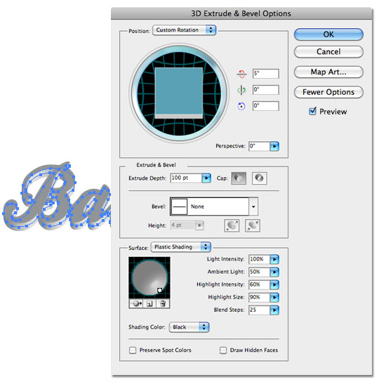
Now comes the fun part! With the path still selected on the stage, choose Effect > 3D > Extrude & Bevel from the Main Menu to bring up the 3D Extrude & Bevel Options window. If the More Options button is visible in the right sidebar, click it to expand the dialog box completely and change your settings to match mine below. Notice that I’m using a zero (0) setting in the Y and Z Axis settings because I only want to push the lettering back a little while keeping all other aspects the same. It’s also important to notice that I’ve moved my light source to the lower left hand corner of the shading ball in the Surface Shading area. Make sure the Preview box is checked if you want to see what’s going on with your text as you work. Once all your settings are complete, click OK to commit your 3D transformation.
Our 3D edges are currently not in a form that Photoshop will understand, so lets quickly fix that before moving back to Photoshop to complete the process. From Illustrator’s Main Menu choose Object > Expand Appearance. This will convert the 3D edges into their own paths, making them Photoshop compatible.
Step 6 – Moving Back To Photoshop
(*note: We’ll be switching programs in a second, but don’t close this Illustrator file just yet, we’ll need it one more time)
With our object still selected in Illustrator, lets copy it back to the Clipboard by pressing Command-C (PC: Ctrl-C) to copy and then click over to your Photoshop document and press Command-V (PC: Ctrl-V) to paste it onto the canvas. You will now be asked how you want to Paste, and if you’re using Photoshop CS4 or higher, choose Smart Object so that we can retain the editing capabilities of our object should we need it later and then click Return (PC: Enter) to commit the paste to the canvas (DO NOT RESIZE WHEN YOU PASTE! If you wish to resize, I’ll let you know when to do it later). (*note: If you’re using a version of Photoshop older than CS4, select Pixels when you Paste)
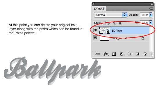
You can no go ahead and delete your original text layer and paths if you’d like as well as rename your new 3D text layer.
Step 7 – Back To Illustrator One More Time
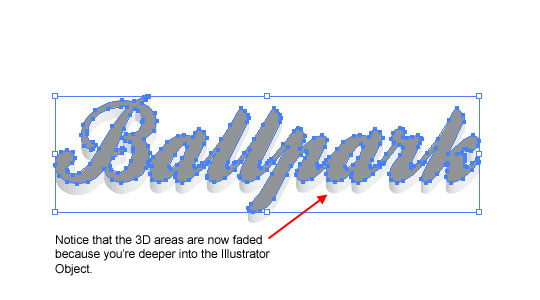
Ok, like I said, we’re going to make a quick run back to Illustrator to get another set of paths, but this time we only want to copy the original flat text on top of our 3D rendering because it’s perspective has changed since we originally brought it into Illustrator and we’re going to need it isolated for later.
Now, to isolate our top layer of text, we’re going to need to click down into the object, so I want you to double-click on the dark top text 3 times in a row, then click it once to select it. Confusing, I know, but if you followed my instructions right, your document should look like mine below. Notice that the 3D areas are now faded out because you’re deeper into the object.
!! OPTION B !!If you’re having trouble try this alternate method:
Double click on the stage (outside of the object) to ensure you’re at the top level of your document in Illustrator, then select your text object by clicking and dragging a selection around it with the Selection tool. Now, choose Window > Appearance from the Main Menu to bring up the Appearance palette and inside that palette click on the Extrude & Bevel link to reopen the 3D Extrude & Bevel Options palette. Next simply change the Extrude Depth to 0pt and click OK to commit the change. You can now continue to Step 8.
Step 8 – Copy And Paste Back Into Photoshop
Just like the title says, we’re going to repeat our Copy and Paste process by pressing Command-C (PC: Ctrl-C), switching back to Photoshop and Pasting just like we did before with Command-V (PC: Ctrl-V). And yes, again CS4 and newer will use Smart Object while older versions will use the Pixels option when pasting.
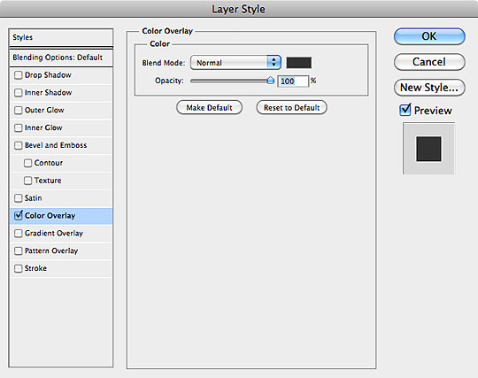
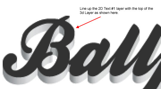
It’s going to be hard to see this new version pasted over the original, so lets change the color by using a Layer Style. In the Layers palette, Command-Click (PC: Right-Click) on the new layer which should appear at the top of the Layers palette and which I’ve conveniently named 2D Text #1 and choose Blending Options to bring up the Layer Styles dialog box. Click on the Color Overlay option in the left hand list and change the color (click on the swatch) to #323232 and click OK to add the style to the layer. And now that you can tell the 2D layer from the 3D layer, use the Move tool (or your arrow keys) to position the 2D layer over the top of the 3D layer where it belongs. It may help to zoom in to get it perfect by using the Command + and Command – (PC: Ctrl + and Ctrl -).
Step 9 – Making The Top Pop
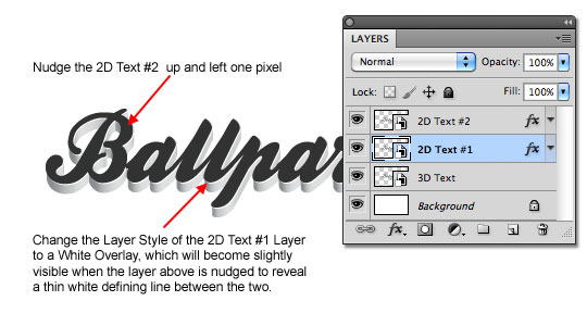
In this step we’re going to do a few things to make the top layer stand off of the 3D sides a little bit. Lets start by duplicating the 2D Text #1 layer by selecting it in the Layers palette and then pressing Command-J (PC: Ctrl-J) to duplicate the layer. Rename this new top layer 2D Text #2. Press the V key to make sure that the Move tool is active and then using the arrow keys on your keyboard press Up and Left each one time to offset the layer slightly from the one below.
Now lets edit the Color Overlay layer style of the 2D Text #1 layer. To do this, simply double click on the little FX icon on that layer (alternately you can Command-Click (PC: Right-Click) on the layer and choose Blending Options) to bring back the Layer Styles dialog. Click on Color Overlay in the left hand column and change the color of the overlay to White and then click OK to commit the change.
Step 10 – Adding The First Shadow
If you’re using CS4 or newer with Smart Objects, this is the point where you’d want to resize your text if needed. Be sure to select all 3 text layers and transform them together
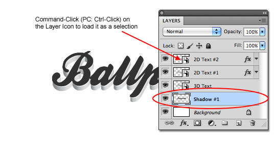
Next we’re going to add a tiny shadow immediately below our 3D Text layer to really make it pop off the background a little more. Command-Click (PC: Ctrl-Click) on the thumbnail of the 2D Text #2 (or #1) layer to load the layer as a selection. Press the D key to reset the foreground and background colors and return the foreground to black, then create a new layer below the 3D Text layer and fill the selection with foreground color by pressing Option-Delete (PC: Alt-Backspace). You won’t be able to see anything yet, but that’s ok, rename this new layer Shadow #1 and continue to the next step
Step 11 – Blur And Move The Shadow Into Place
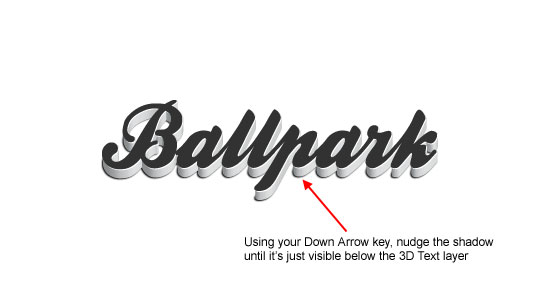
Now we’re going to dull the edges of our shadow just a little bit, so from the Main Menu choose Filter > Blur > Gaussian Blur and when the dialog pops up set the Radius to 0.5 pixels and click OK. And now press your Down Arrow key on your keyboard until the shadow becomes visible at the bottom of the 3D Text layer. We only want a pixel or two showing, just enough to give us a nice tight shadow below the text. (I only dropped it 1px below the 3D text)
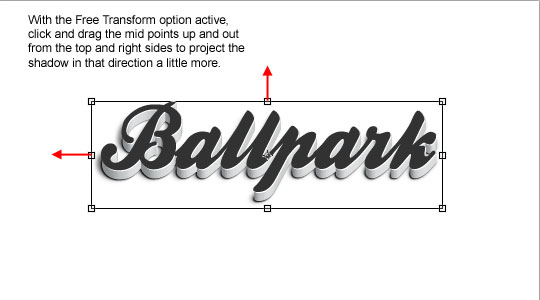
Step 11 – Create The Final Shadow
With our first shadow in place, creating the 2nd will be easy. Duplicate the Shadow #1 layer by pressing Command-J (PC: Ctrl-J) and call it Shadow #2. Go back to the Gaussian Blur filter (Filter > Blur > Gaussian Blur) and this time use a radius of 2px and click OK.
Because our light source for our 3D objects was coming from the lower left hand corner of the text, lets make a small modification here to make the effect a little more convincing. While still on the Shadow #2 layer, press Command-T (PC: Ctrl-T) to invoke the Free Transform tool, and pull out the left and top center points just slightly to pull the shadow away from the text in those directions as shown below. You don’t need to go too far, just enough to pull the shadow slightly. Click Return (PC: Enter) to commit your transformation when you’re done.
Conclusion
For my final image I pulled the Shadow #2 Layer’s Opacity down to around 60% just to soften up the effect a little bit and then added a slight gradient to the background. There are a lot of great instances where you’ll be able to use 3D text, you can use this same process with any object made from a path… logos, custom shapes and all kinds of stuff. So play around, and have a little fun with it.

Lesson Files + Additional Resources
Download the .PSD file for this lesson Right Here.
Get the Ballpark font from DaFont.com Here
Check out another way to create 3D text in the Transformer Text Effect tutorial.
Tell Your Friends
More in Text Effects


39 Responses to Modern 3D Text Effect
joddy street
May 30th, 2010 at 11:53 pm
really cool effect there, everything fits together nicely.
launched a tute after long time though.
Felix
May 31st, 2010 at 6:09 am
Hi! I have a small problem with Step 7 – It only selects one letter of the object. I am however using a different font and copying the text from Photoshop CS5 to Illustrator CS3. What am I doing wrong?
develop
May 31st, 2010 at 10:23 am
Awesome – I’ll have a play with this later…
Nice one PSHero – where have you been?
HERO
May 31st, 2010 at 4:42 pm
FELIX, Make sure that you drag a selection around ALL your text with the Path Selection tool. If you just click on one of the paths, that’s the only one that will be included when you copy. Hope that helps.
jaka
May 31st, 2010 at 6:10 pm
waw,,,
great tutorial..
but, now i can’t make it, because I haven’t PS Cs 5
HERO
May 31st, 2010 at 8:58 pm
JAKA, 3D in illustrator has been available since CS, so unless you’re working in the stone age, if you’ve got Illustrator you should be good to go.
Richie
May 31st, 2010 at 9:12 pm
Excellent. I love the final result and you made me fall in love with Illustrator again :D
Rob
June 1st, 2010 at 2:02 am
Great to see a new tutorial. Thanks for this. I might try it out on my blog logo
heathenx
June 1st, 2010 at 5:20 am
Rather elegant. Looks great. :)
mutuma
June 2nd, 2010 at 8:15 am
great to see you back, its been a long time coming. Amazing touch always.
Page Gardens
June 2nd, 2010 at 11:08 am
Not bad. Works much better than how I was doing it previously.
Jeprie
July 29th, 2010 at 1:35 am
Very nice. Some people just paste the 3D text from illustrator to Photoshop and add some shadows. That doesn’t realistic, and this tutorial really beats them.
Legal news articles
August 12th, 2010 at 4:43 am
Thats a very good effect. I’m pretty new to Illustrator so using it alongside photoshop is quite useful> I’ll be looking to use this effect sometime in the near future. Thanks
Steven
August 25th, 2010 at 3:11 am
Thanks for the great tutorial, I really enjoyed following it and it worked out perfect!
Photoshop is just TOO cool ;-))) Have a nice day!
marcs
August 27th, 2010 at 11:01 am
Nice. I’ll try this one. Could metallic theme will work with these?! Hmmm
HERO
September 2nd, 2010 at 2:41 pm
MARCS, I don’t see why not. Give it a shot!
Juang
September 7th, 2010 at 9:24 pm
thnx,,very-very great…
George Rudd
October 5th, 2010 at 12:22 am
Can this be done with an action?
HERO
October 5th, 2010 at 2:28 pm
GEORGE, Unfortunately as cool as this would be in an action, because of the use of 2 programs and the custom bending of the shadows etc this can’t be turned into an action. It may be possible with Repose to get a very similar result that could be mostly programmed as an action though… experiment!
peter
October 8th, 2010 at 11:03 pm
beautiful i must admit
hjemmeside
October 9th, 2010 at 4:08 am
A little hard, but super result.
Thanks for the tutorial.
PXL Technologies
October 20th, 2010 at 7:13 am
Very sharp effect, tricky for sure (when it comes to grabbing the vector lines after and all). My workaround was to go back into illustrator and adjust the 3D Bevel/Extrude back to a depth of 0 from 100.
Sergio - videos de bodas
October 25th, 2010 at 8:12 pm
I finally found a step by step tutorial to help me make some 3D text!
I acknowledge that some fear when you talked about Illustrator, since I had never used this program.
Do you have a youtube channel? I wonder if you have more of these interesting things there. :-)
Greetings!
Sergio Vergara
Gentle Media
October 30th, 2010 at 1:57 pm
Nice tut, Hero! Switching between Photoshop and Illustrator when working on a web design is a common thing for me. They’re both powerful tools, but some things I want to achieve I can do better and quicker in Illustrator and with other things Photoshop is my main tool.
Bruno
January 4th, 2011 at 6:37 am
Very nice effect!
sunjo
January 20th, 2011 at 3:31 pm
Loved the humor in this tut!! Thank you for writing it – Good to have fun learning something new ! :D
behnam
February 8th, 2011 at 5:06 am
i have problem with step 7 i really cant do it please help me
HERO
February 8th, 2011 at 6:20 pm
BEHNAM, Can you tell me what the problem is exactly?
aniket
February 11th, 2011 at 12:38 pm
very useful guide. It can be helpful to design 3D logos
Learning Ps
February 17th, 2011 at 1:02 pm
Ps hero If i try to do the Same technique with different letters, it doesn’t work in AI , I have the text : i like. the dots on the letter ”i” don’t copy on the same moment as the word: ”like” am I right here or is there a solution>?
hope to hear from yah!
HERO
February 17th, 2011 at 2:21 pm
LEARNING PS, Yes, you just need to hold down your Shift key and click on the other paths that don’t get selected. Adding the Shift to your clicking makes the selection cumulative. Hope that helps.
Jad
February 21st, 2011 at 5:53 pm
Hi, this is a great tutorial! I’m just having a problem with step 7. Using the selection tool (V), I double click on the dark top text 3 times, then click once, but it is not working the way it should.
HERO
February 22nd, 2011 at 9:17 am
JAD, I’ve posted an Option B in Step 7 now which should solve your problem.
Chuck
March 12th, 2011 at 4:22 pm
Very nice! Love the effect, great job!
Mahad
May 20th, 2011 at 2:15 pm
Verry nice….Tahanks
Adam
May 22nd, 2011 at 3:18 pm
I hope you’re a teacher, because you’re really good at it. Great tutorial and great explanation, thank you!
marieluka
May 25th, 2011 at 4:52 am
Thanks a lot, your explanations are so presize.
sXe
August 9th, 2011 at 3:55 am
Wooooooow. Excellent. I Love Your Tutorials ;)
Lisa
September 26th, 2011 at 1:24 pm
Thanks so much! Brilliant!