

The Wheels Text Effect
I probably get 2-3 spam emails a week from some company wanting to sell me new wheels for my car. It's getting a little annoying, so to strike back, I'm going to show you how to duplicate the text effect in their ad... It's a bit of a noobish effect, but it'll make me feel better so I'm doing it anyway.Step 1
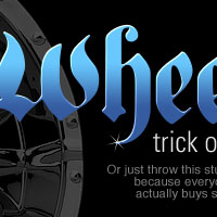
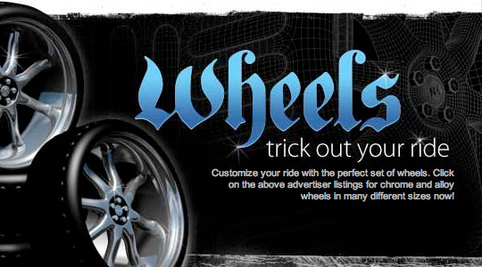
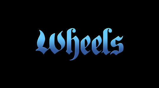
Lets start by taking a look at the original ad below. From the start we can see that they’ve used a few basic Layer Styles like Gradient Overlay and Bevel and Emboss to do most of the work. After a little trial and error I even found the exact font used here called PlainGermanica which you can download for free at from AbstractFonts.com.
Step 2
Open up a new Photoshop file by choosing File>New from Photoshop’s main menu or by using the keyboard shortcut Command-N (PC: Ctrl-N). My new document is 540×300 pixels at 72ppi. If you want your layer styles to turn out exactly like mine, it’s important to at least keep the ppi setting the same.
Fill the background layer with black by pressing the D key to reset your foreground color to Black and then simply press Option-Delete (PC: Alt-Backspace) to fill the layer with color.
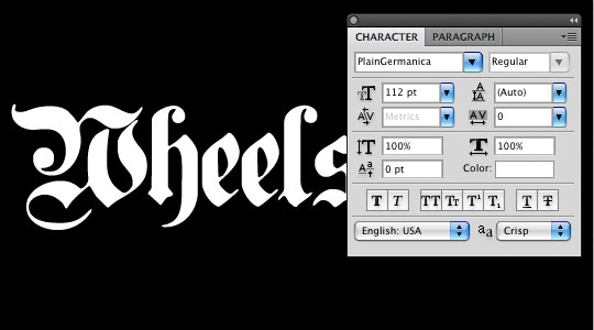
Choose the Text tool from the Tools bar or by pressing the T key, then in the Character palette choose the PlainGermanica font, any color is ok, and the font size that matched the ad exactly came out to be 112pt.
Step 3
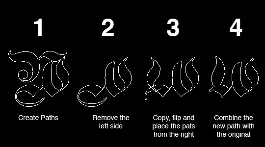
The first thing you should notice here is that the "W" doesn’t match with the ad font. At first I assumed this was maybe a modified lower case letter or upside down "M", but no, the ad guy actually went to the trouble of modifying the letter manually, which I have to admit was a bit impressive.
For the noobs, you probably want to skip right over this part as it involves a bit of Pen tool and Path work that you might not be ready for yet, but since you’re probably not actually going to use this effect on the word "Wheels", it’s probably fine anyway. I’ll rush through this for those of you who can keep up.
To modify the text, I’ll right click on it and choose Create Work Path from the menu. (at this point I usually turn off the text layer and create a new layer above it which I’ll name Text"). Then, switching to the Path Selection Tool by pressing the A key, I’ll right-click on the path and choose Create Vector Mask, and now I’ll remove the left side of the "W", copy the right side paths, flip them horizontally and connect the copy back onto the left side. How’s that for a rushed explanation.
(*note: For this tutorial I’ll compress the layer down to get rid of the vector mask, but in the real world, I’d probably keep the Vector Mask.)
Step 4
Ok noobs, you can pick things back up here and lets get on to the text effect.
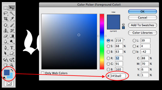
Before we get into the layer styles, we need to setup our foreground and background colors. At the bottom of the Tools palette, click on the foreground color swatch and enter this color into the Color Picker that pops up #345ba0, then click OK and do the same for the background color #69c8fe.
Step 5
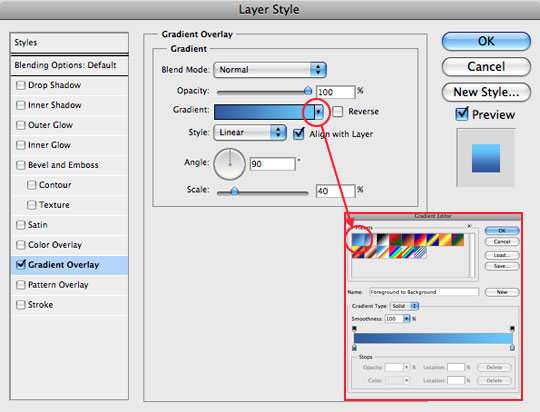
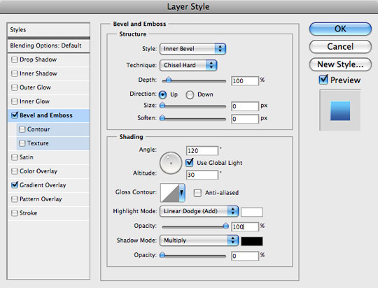
Alright, lets jump in and add some Layer Styles. Right click on your text layer in the Layers palette and choose Blending Options to open the Layer Styles dialog box. Add the following Gradient Overlay and Bevel and Emboss styles (be careful to check each setting against mine) and then click OK to apply them. You’ll now notice that your layer has a little Layer Style icon on it in the Layers Palette.
Step 6
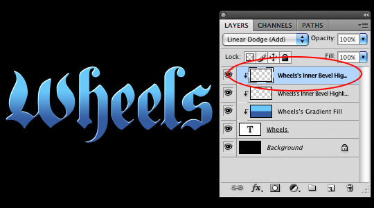
Things are looking pretty good, but I feel like the highlight from our Bevel and Emboss effect isn’t strong enough, so I’m going to show you a little trick. Right-Click on that little Layer Style icon that’s now on your text layer and choose Create Layers way down at the bottom of the list. This will break the effect that’s been applied to our layer into it’s own set of layers, with one effect on each layer. You will also notice that these two new layers have been "clipped" to our text layer. This will enable us to mess with them as we see fit.
The top layer should now contain the highlight from the Bevel and Emboss effect. Click on it to select it in the Layers palette and then press Command-J (PC: Ctrl-J) to duplicate the layer. The duplicate will appear above the original and you will notice that things look a little funny because it’s been placed outside the clipping (ie. it’s not clipped to the text layer like the other two). Since the new layer is already selected, simply press Command-Option-G (PC: Ctrl-Alt-G) to add this layer to the clipping as well. Notice how the edge highlights have been amplified.
Step 7
Now lets add those cheeky little sparkles to our text.
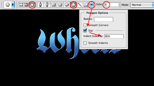
Create a new layer at the top of the Layers stack by clicking the Create New Layer icon at the bottom of the Layers palette or by hitting the keyboard shortcut Command-Option-Shift-N (PC: Ctrl-Alt-Shift-N) … and yes, I realize it’s a bit of a complicated shortcut, but once your fingers get used to it you’ll love it. I’ll call this layer Sparkles.
Press the U key to switch to the Custom Shape tool and then in the Options bar across the top, adjust the following settings.
Step 8
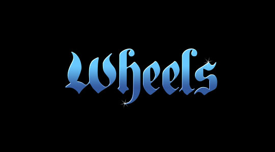
Reset your foreground and background colors by pressing the D key, then press X to switch white to the foreground.
Now simply hold down the Shift key and click-and-drag yourself a few little stars onto the canvas. A little goes a long way here, and you don’t want your letters looking like something from a Barbie commercial now do you?
If your Sparkles look a little too bright, try lowering the layer opacity to around 80%.
Step 9
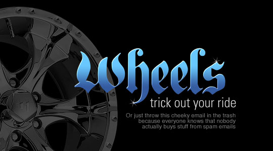
To round out the final image, I grabbed a rim photo from the internet, put it at the bottom of the layer stack and dropped it’s opacity to 30% and then add a little more goofy text, maybe grab a white brush and add some grunge across the top… I dunno. Go nuts.
Lesson Files + Additional Resources
Download the free .PSD file and other lesson files Right Here.
Tell Your Friends
More in Text Effects


16 Responses to The Wheels Text Effect
Arvin Motion Design
August 13th, 2009 at 8:47 pm
This tutorial is a lot simpler than many I’ve seen on here (not complaining), but as a result you’re gonna be subjected to a related but noobish question:
What’s your preferred method for getting a chromed look to the text? Would you just use a more complex black/white gradient?
Sondra Myers
August 13th, 2009 at 9:24 pm
That is GREAT! I love it. Have to ask….did it make you feel better?
Russ G
August 13th, 2009 at 11:05 pm
Good thing I’m not on your bad side! Hate to see what you’d do to me… Hey, wait a minute! You already did a post sharing the bottle effect. Should have known this was how you really felt. LOL.
HERO
August 14th, 2009 at 9:28 am
SONDRA, yes I do feel a little better. ;)
HERO
August 14th, 2009 at 9:30 am
ARVIN, Chrome has far more complex implications since it’s so reflective. I’d likely begin with a complex B/W gradient as you suggest, but over the top of that you’ve got to add warped reflections of the world around the chrome which is where things get sticky. You’d probably want to create the highlights and shadows of the chrome first and save a map for use with the distortion filter as well. I’ll put this on my list of things to do in future lessons.
How to Business Cards
August 14th, 2009 at 10:21 am
Good tutorial, short and simple. Nice!
A Filipino Here
August 14th, 2009 at 8:29 pm
by the way.. im looking forward to your next great tutorials, Hero
-Max Buwaya
Denver Commercial Photographer
September 2nd, 2009 at 10:08 pm
I love your design style. I really like the way that your design stuff comes out.
Ben Rama
September 3rd, 2009 at 9:37 am
goog stuff like fhe effect didnt know people liked wheels that much ;)
Mohammed
September 11th, 2009 at 6:38 am
As everytime.. your are the best Mr Pshero.
i hope u realy the best chance in ur life.
don’t seeing us from your manifique tuto.
Good luck Pshero.
evilkitty75
November 21st, 2009 at 6:41 pm
wow sweets i did not know u could do this with text… alter it i mean i see some that r almost perfect… now i can work on em thxxxx Herooooo!!!
Motorhome Rentals in South Africa - Jimmy
November 26th, 2009 at 3:07 pm
Awesum tutorial m8.
Deb Lein
January 1st, 2010 at 7:18 pm
Thanks for catering to us noobies, and no, I won’t inundate you with noobish questions, because you always do a great job explaining what needs to be done!
Web & Graphic Designer
February 16th, 2010 at 5:58 am
Aha, that’ll show ’em!
bkeily
May 8th, 2010 at 8:47 pm
Great tutorial! I really like the final effect. Will have to give it a try!
web development jalandhar
February 16th, 2011 at 1:42 am
You have used a perfect font. Thanks for this tut Hero :)