


Lyric Culture Logo
They say that imitation is the greatest form of flattery, but I say it can also be a valuable learning tool. Whether you're a novice guitarist attempting to play along with your favorite Hendrix tune, or an developing designer with aspirations as lofty, imitation can be a valuable way to hone your skills.Introduction
Often when learning design, imitation can be the best form of education. I recently had an email from a regular reader asking if I could show her how to create an effect she’d seen on the music inspired clothing line website LyricCulture.com. The clothing line features designs created using lyrics from legendary songs from the 60’s and 70’s and each item in the collection reflects the personality, style and flare of the artist and song through its design. Quite a cool concept and the site has a few great elements that really take advantage of texture and shading.
They say that imitation is the greatest form of flattery, but I say it can also be a valuable learning tool. Whether you’re a novice guitarist attempting to play along with your favorite Hendrix tune, or an developing designer with aspirations as lofty, imitation can be a valuable way to hone your skills.
In an effort to improve my skills when I first began my Photoshop journey some 10 years ago, I used to find designers and websites that I liked, take a screenshot of the site or design, paste it into Photoshop and attempt to mimic the design over the top of itself. This allowed me to learn from my favorite designers and develop important Photoshop skills at the same time, and that’s exactly what we’re going to do today.
(*note: This is an intermediate tutorial and as such assumes you already know how to create layers, add layer styles, use the pen tool and basically know your way around the PS interface.)
Step 1
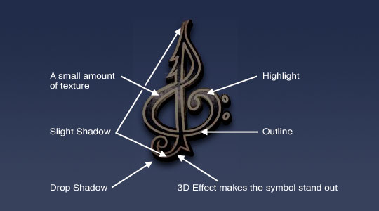
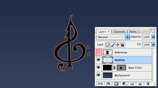
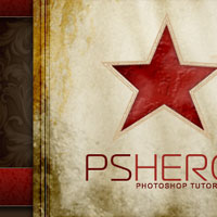
Lets first take a close look at the original artwork. By visiting the website my reader mentioned and taking a screenshot of the requested element (in this case a stylized treble clef symbol) we can develop a basic plan of attack. We’ll keep the screenshot artwork at the top of the layers palette as we work and will turn in on and off as we go for reference.
Step 2
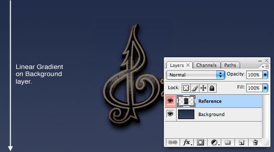
Lets start by laying down a linear gradient from top (#29304c) to bottom (#3c435e) on the Background layer. I’ve also cut down all the edges of my reference image so that just the symbol exists on the Reference layer.
Step 3
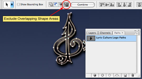
Grab the Pen tool and trace the outline of the treble clef symbol including the inside sections. Make sure you’ve got the Exclude Overlapping Shape Areas icon checked in the Pen tool options bar, this will allow the inner areas to be subtracted from the overall shape creating the negative space. Be sure to name your path in the Paths palette.
Step 4
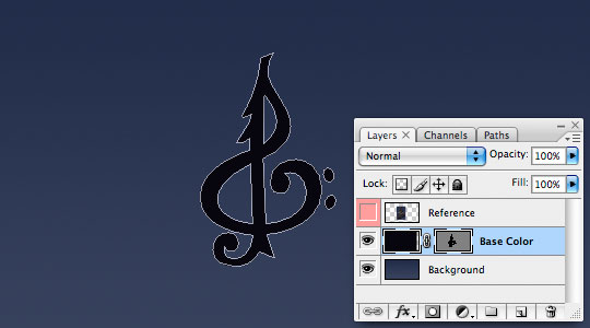
For now lets go ahead and turn off the visibility of
the Reference layer by clicking the little eye icon to the left of the layer’s thumbnail in the Layers palette.
Create a new layer above the Background layer called Base Color and fill it with #100d16. With the pen tool still selected Command-Click (PC: Right-Click) on the path and choose Create Vector Mask.
Step 5
Before you do anything else, let me show you a cool little trick. Anytime you have a path visible on the stage you can instantly convert that path to a selection by pressing Command-Return (PC: Ctrl-Enter). Go ahead and convert the path to a selection and lets create a new layer above the Base Color layer called Outline. Fill the selection with #6d605a. Now before you get ahead of yourself and go deselecting lets choose Select>Modify>Contract from the main menu, set the contraction to 3 pixels and click OK then press Delete (PC: Backspace) to remove the area inside the outline. With the outline completed you can go ahead and deselect by pressing Command-D (PC: Ctrl-D).
Ordinarily I would have used a Stroke layer style to create this outline, but because we need to add texture to the outline (and a Stroke will always lay on top of a Pattern Overlay as a layer style) I create it as a layer rather than a style.
Step 6
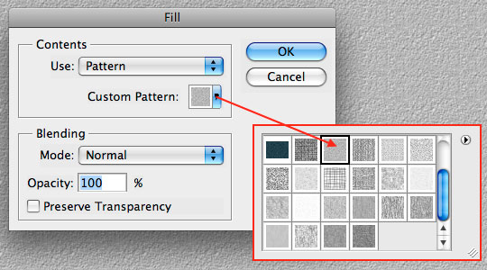
Speaking of texture, lets go ahead and create a new layer above the Outline layer called Outline Texture. Next we’re going to fill the entire layer with a pattern by choosing Edit>Fill from the main menu. In the Contents box choose Pattern from the drop-down menu, then from the Custom Pattern picker load the Artists Surfaces pattern set and choose the swatch labeled Stone (80 x 80 pixels, grayscale) then click OK leaving the blending mode set to Normal and 100%.
Step 7
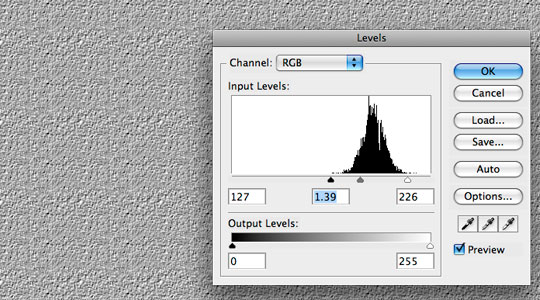
We need to emphasize the darks in our pattern so lets press Command-L (PC: Ctrl-L) to bring up the Levels dialog and make the following adjustments.
Step 8
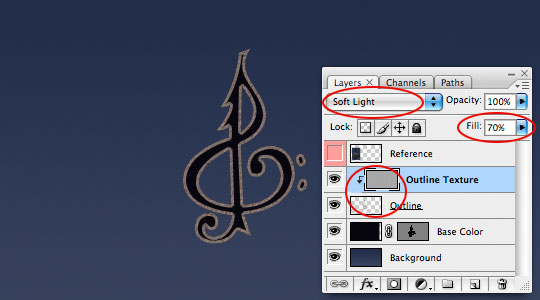
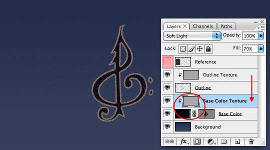
Change the blend mode of this Outline Texture layer to Soft Light, lower the Fill opacity to around 70% and create a clipping mask down to the Outline layer below.
Step 9
We also need this same texture applied to the Base Color layer so lets press Command-J (PC: Ctrl-J) to duplicate the layer. Rename this new layer Base Color Texture, drag it down to sit above the Base Color layer and create a clipping mask just like we did in Step 8. The texture over the blue won’t be all that noticeable just yet, but once we add the highlight it will show up nicely.
Step 10
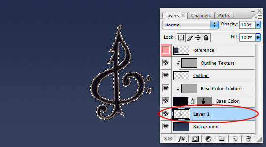
It’s time to create the 3D effect behind the symbol. For this lets start by creating a new layer below the Base Color layer. Don’t worry about naming this layer yet because we’re going to create multiple duplicates and merge them first.
Command-Click (PC: Ctrl-Click) on the Base Color layer’s Vector Mask to once again load the path as a selection. Press the D key to reset the foreground color to black and then fill the selection with black by pressing Option-Delete (PC: Alt-Backspace). You won’t be able to see what you’ve done because the area you just filled is exactly behind the layer above.
Step 11
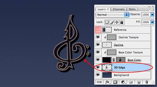
Go ahead and press Command-D (PC: Ctrl-D) to deselect. Now we’re going to press Command-J (PC: Ctrl-J) to duplicate the layer, now switch to the Move tool by pressing the V key and shift the layer to the right and down 1 pixel by pressing the down arrow and the right arrow keys on your keyboard each one time.
Repeat this Duplicate and Move process a total of 6 times (giving you 7 layers to comprise the 3D edge). Notice how with each duplication the 3D edge takes shape. Select all 7 layers and press Command-E (PC: Ctrl-E) to merge the selected layers and rename the merged layer 3D Edge.
Step 12
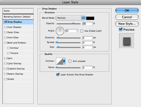
Now add the following Drop Shadow layer style to the 3D Edge layer.
Step 13
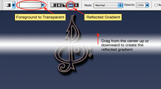
Lets now add the highlight that runs across the middle of the symbol. Create a new layer at the top of the document called Highlight and with the Gradient tool set to Linear Gradient and Foreground to Transparent (with the foreground color set to white of course) drag a nice highlight into the middle of the image.
Step 14
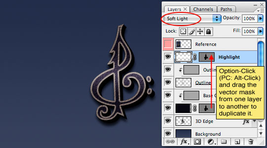
Obviously we can’t have this highlight streaking across our page like this so lets copy the Vector Mask from the Base Color layer onto our Highlight layer by holding down the Option (PC: Alt) key and clicking and dragging the mask from one layer to the other effectively duplicating the mask onto the Highlight layer. Lets also take this opportunity to change the layer’s blend mode to Soft Light.
Step 15
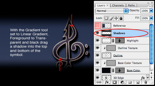
The last thing we’ll do here is to add slight shadows to both the top and bottom of the symbol. On a new layer above the Highlight layer called Shadows place a black Linear gradient (also set to Foreground to Transparent but with the foreground color set to black).
Step 16
Just like we did for the Highlight layer duplicate the Vector Mask onto the Shadows layer and change it’s blend mode to Soft Light.
That’s it baby, effect complete. Hopefully you’ve picked up something useful along the way like how to duplicate Vector Masks from layer to layer or that great little trick: pressing Command-Return (PC: Ctrl-Enter) to convert an active path into a selection.

Step 17
If it were me I’d add a nice little background texture along with some an accent light burst and edge vignette to complete the effect for my final image and yes, these layers are included in the download at the end of the lesson.

Lesson Files + Additional Resources
Download the free .PSD file and other lesson files Right Here.
Tell Your Friends
More in Graphic Design


11 Responses to Lyric Culture Logo
Paulo Sales
June 29th, 2008 at 11:51 pm
welcome back !
nice effect as usual and great use of clippings.
Soft light layers…like overlay is a great way to add or subtract light.
congrats!
Dedra
June 30th, 2008 at 2:55 am
Thank you for this great tutorial.
mr. diggles
June 30th, 2008 at 5:10 pm
w00t!
you just made my brain bigger… yet again.
HERO
June 30th, 2008 at 6:45 pm
Oh DIGGLES… like your brain can get any bigger!
Drupal Museum
June 30th, 2008 at 10:47 pm
Very cool tut. Thanks for posting!
dilirum
July 1st, 2008 at 2:01 pm
Great work. Thanks for adding some skills to my PS arsenal.
Bassofia
July 5th, 2008 at 4:59 pm
Do not worry man, with everything that you give us every day, it’s the least we can do.
Thank you for everything.
Gzkz
July 9th, 2008 at 5:19 pm
Io Pshero
Haha, nice to have 10 years of photoshop behind you <3
Concerning this great tuto, I didn’t arrived to duplicate the vector mask from the layer base color onto highlighy layer & final shadows…
It simply doesn’t work when i use alt+drag. It makes a small icone which looks like 2 small circlets.
Ty for the tuto
HERO
July 9th, 2008 at 5:47 pm
GZKZ,
You’re Alt-Clicking between the layers if you’re getting the 2 small circles (which by the way is the easy way to create a clipping mask). You need to Alt-Click directly on the Layer Mask of the Base Color layer. Try that and it should work out fine.
You could also Ctrl-Click on the Base Layer mask to load it as a selection then click on the Highlight layer to select it and click the Add Layer Mask icon at the bottom of the layers palette.
DARKS
July 9th, 2008 at 9:26 pm
Awesome display, yet again. I’ve been watching your website for a while now and it just keeps getting better. I’ve been itching to ask you a question on a photoshop style I’ve run across, is there a way to contact you?
HERO
July 9th, 2008 at 10:05 pm
DARKS,
Sure thing! You can contact me via email as always at: hero [at] pshero [.] com.