


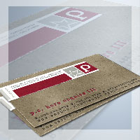
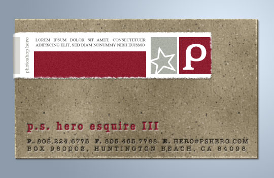
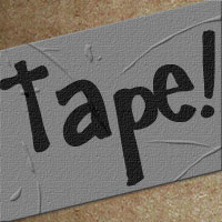
Cardboard And Torn Paper Business Card
In this Advanced Photoshop tutorial we'll create a nice cardboard effect and play with a neat torn edge effect.Please note that this is an advanced tutorial and certain assumptions have been made about your ability to get around inside the Photoshop interface.
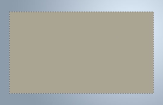
Step 1
Start with a new document, mine is 540×350 at 72ppi. If your document is a different size or DPI some of the filters may need to be adjusted accordingly to get the desired result.
Standard business card size is 2.25" x 3.75", so I’m going to constrain my Rectangular Marquee tool to 3.75px and 2.25px, then I’ll drag out a nice sized selection and fill it with my foreground color which is #AAA494. Take this time to set the background color to #685b48 as well.
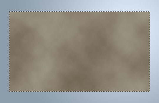
Step 2
Add some tonal variation to the card while the selection is still made by selecting Filter>Render>Clouds.
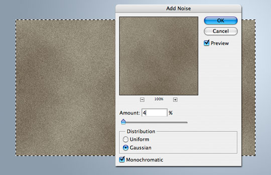
Step 3
Now lets add some texture with noise by choosing Filter>Noise>Add Noise with the settings of 4/Gaussian/Monochromatic as shown below.
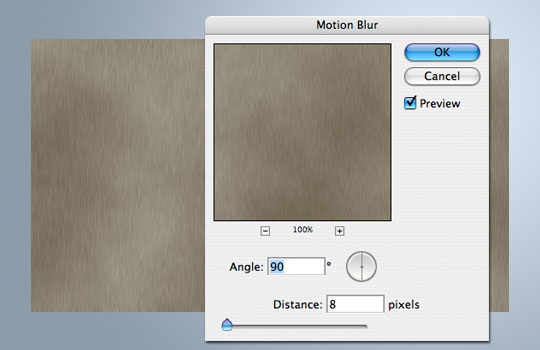
Step 4
Due to the the production process of cardboard, typically fibers are aligned horizontally or vertically, which is why we added the noise in the first place, so lets go ahead and add this effect by first releasing the selection by pressing Command-D (PC: Ctrl-D), then lock the transparent pixels by checking the Lock Transparent Pixels icon at the top of the Layers palette.
Now choose Filter>Blur>Motion blur with the Angle set at 90 and the Distance at 8.
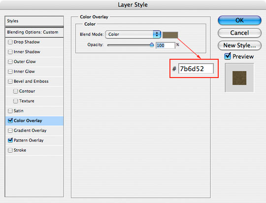
Step 5
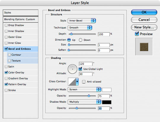
Now that we’ve got a bit of texture and variance in the card, lets add a few layer styles to add another level of effects. Apply the following layer styles to your card layer. The final layer style is a Bevel and Emboss that will help us create the edge effects in the next step.
Step 6
Next I want to create two duplicate layers of the Card layer by pressing Command-J (PC: Ctrl-J) twice. Move the top of these three layers 2 pixels up and 2 pixels left by using your arrow keys, then click on the middle layer and move it up 1 pixel and left 1 pixel. By offsetting the layers we can achieve a sudo 3D effect.
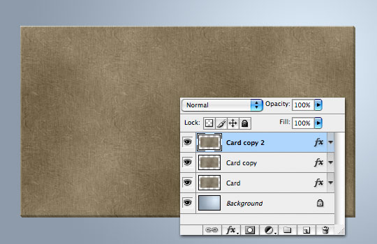
Step 7
The lower two card layers ("Card" and "Card copy") need to be merged since they’re just edge details, so select them both and press Command-E (PC: Ctrl-E) to merge the selected layers. Rename this merged layer "Card Edge".
Open the layer styles for the top "Card copy 2" layer and remove the Bevel and Emboss style and lets go ahead and rename that layer "Card" again.
Step 8
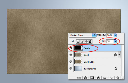
A good look at a piece of cardboard will tell you that the surface has small flecks of dark and lighter fibers, so lets add some of those now.
Command-Click (PC: Ctrl-Click) on the "Card" layer’s icon to create a selection, create a new layer above the "Card" layer called "Spots" and fill the layer with color. Any color is fine here since we’re going to turn the layer’s Fill opacity down to 0 right away.
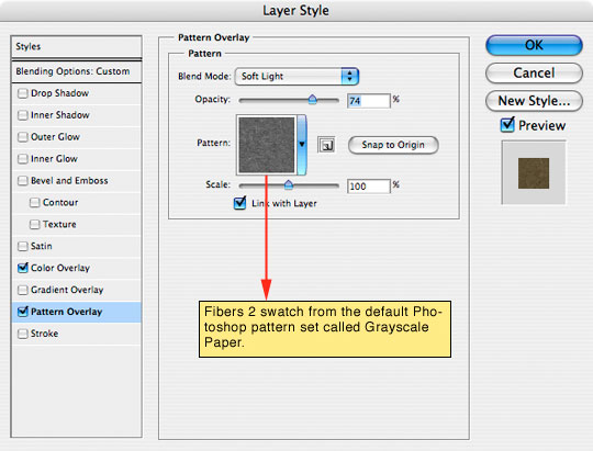
Step 9
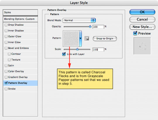
Add the following Pattern Overlay from the Layer Styles dialog.
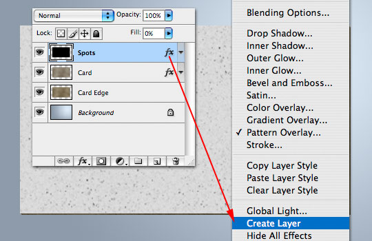
Step 10
Now lets separate the layer style from the layer by Control-Clicking (PC: Right-Click) on the layer style icon and choosing Create Layers from the bottom of the menu. This will pull the layer style from the layer into a separate layer where we can work with it on it’s own.
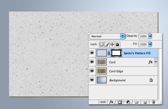
You may now delete the "Spots" layer, leaving the "Spots Pattern Fill" layer to work with. This will fill the screen with the pattern, so go ahead and add a Layer Mask to the layer by selecting the "Card" layer and then clicking the Add Layer Mask icon at the bottom of the Layers palette.
The reason we applied the pattern as a layer style instead of just using the Edit>Fill>Pattern method is that by applying the pattern first as a layer style we are able to scale the pattern prior to applying it.
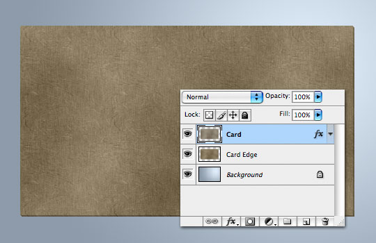
Step 11
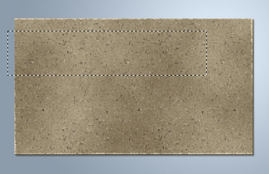
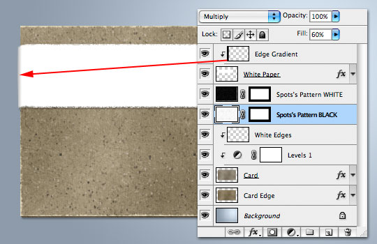
Your document and Layers palette should now look something like this:
Step 12
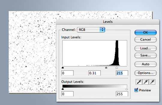
Next we need to separate our spots from the background a little better, so press Command-L (PC: Ctrl-L) to bring up the Levels dialog. Drag the center slider to the right and the right slider left until the background is completely white and the spots really stand out.
Step 13
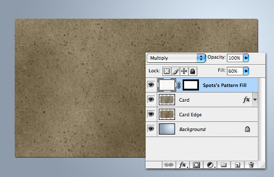
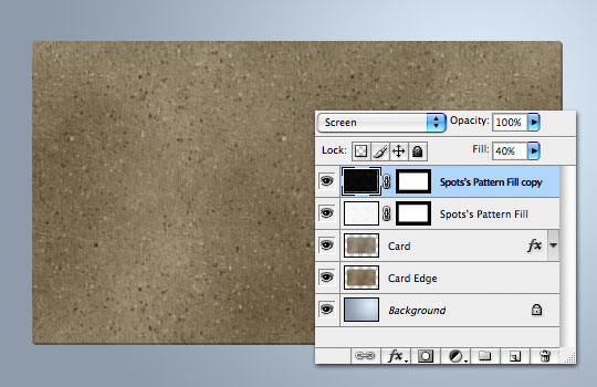
Now lets finish off the Spots by lowering the layer’s Fill opacity to around 60% and changing the layer’s Blend Mode to Multiply.
Step 14
Lets create some white spots now. We’ll use the Spots layer we’ve already created. Press Command-J (PC: Ctrl-J) to duplicate the layer, then choose Edit>Transform>Rotate 180° to flip the spots around. Now invert the colors by choosing Image>Adjustments>Invert and change the layers Blend Mode to Screen and drop the Fill to around 40.
Step 15
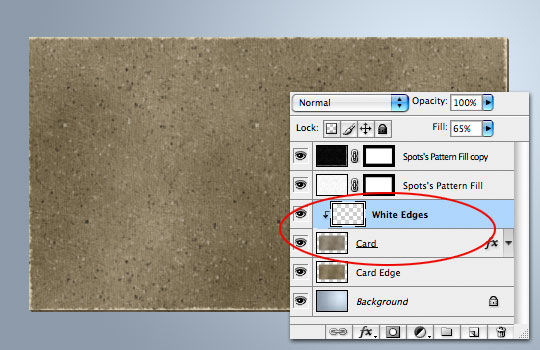
Lets add some worn edges to the card next by creating a layer above the "Card" layer called "White Edges".
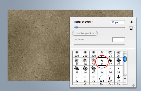
Set the foreground color to white and switch to the Brush tool by pressing the B key. Choose the brush called "Chalk 11px" from the brush options.
Step 16
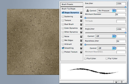
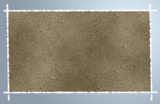
Open up the Brushes palette and change the Brush Shape Dynamics to match the ones below then go ahead and paint around the edges of the card keeping the brush about half way between the card and the background. (*note: by clicking on one corner then holding down the Shift key and clicking on the other you can draw perfectly straight lines with the Brush tool.)
Step 17
I did each side on a separate layer first to get positioning correct before merging the 4 sides together.
Step 18
Now simply create a Clipping Mask down to the Card layer (Control-click (PC: Right-Click) on the layer and choose Create Clipping Mask) and drop the White Edges layer Fill down to around 65% to get a nice roughed up edge effect.
Step 19
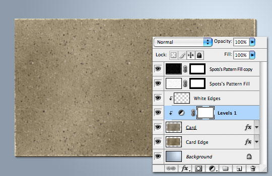
At this point we have a pretty good idea of what our card is going to look like. I decided the cardboard was a little dark for my tastes, so I applied a Levels Adjustment layer to the "Card" layer, and I added a drop shadow to the "Card Edge" layer.
Step 20
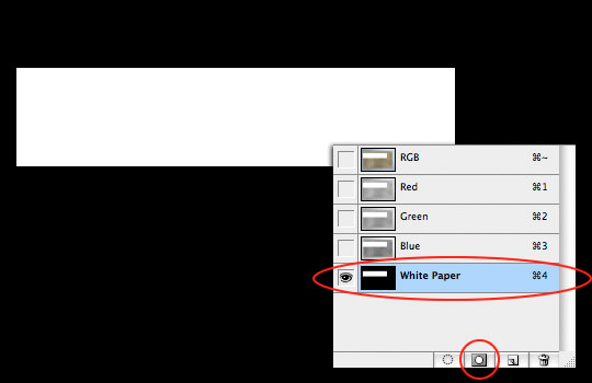
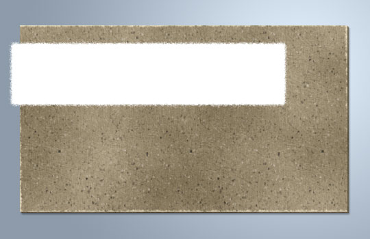
Lets move on to the white strip of paper we’re going to add to the top of the business card. At the top of the Layers palette add a new layer called "White Paper".
Drag out a selection where the white paper is going to live. Be sure to run the selection a little wider than you want to end up with so we can trim off the left side to wrap around the card later. (My selection is 400×90).
Step 21
With the selection made, switch over to the Channels palette and add a new Alpha Channel for the selection by pressing the New Alpha Channel icon at the bottom of the Channels palette. With the new channel created, press Command-D (PC: Ctrl-D) to deselect.
Step 22
Now lets add a little bit of torn edge effect by choosing Filter>Sketch>Torn Edges from the main menu, apply the settings below and click OK.
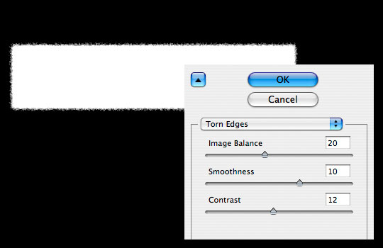
Step 23
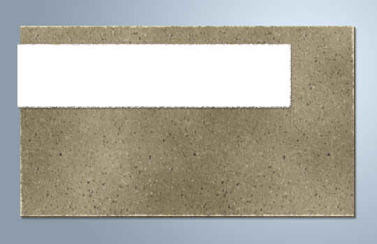
Command-Click (PC: Ctrl-Click) on the layer thumbnail in the Channels palette to load the channel as a selection. Click on the RGB channel to expose all the channels once again then switch back to the Layers palette.
Now simply fill the selection with white and deselect.
Step 24
For my tastes this white paper piece is a little too fuzzy around the edges, so I’m going to go ahead and use my Rectangular Marquee tool to cut down the edges a little, I’m also going to add a little drop shadow to the layer and I’ll cut down the left side of the white paper to just a few pixels past the edge of the card.
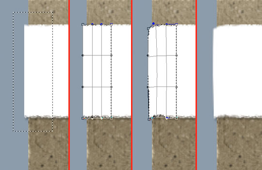
Step 25
Next lets select the left side of the white paper, just the section at the edge so we can bend it around the card a little bit. With the selection made, press Command-T (PC: Ctrl-T) to invoke the Free Transform tool, then using the Warp command, bend the edges until they look right to you.
Step 26
To make the edge wrap a little more convincing, add a slight gradient to the edge of the white paper.
Step 27
All that’s left to do now is decorate. You can find all the additional layers and layer styles in the downloadable lesson files at the end of the tutorial. I’ve used more layers and layer styles to create the graphic decorations on the card, I’ve also used slight amounts of noise in the large color blocks to give a more realistic paper and ink look. I hope you’ve enjoyed the tutorial.
Lesson Files + Additional Resources
Download the free .PSD file and other lesson files Right Here.
Tell Your Friends
More in Graphic Design


30 Responses to Cardboard And Torn Paper Business Card
CHAD
February 25th, 2008 at 1:30 pm
This one’s a little over my head, but a really cool tutorial all the same. The cardboard effect is quite realistic.
Peter
May 15th, 2008 at 8:35 am
Hey I love your design i managed to replicate it with the instructions but i am wondering how you turn your image as you did in the first picture I saw of the card I think it is three cards on top of each other. If I could be helped that would be great.
HERO
May 15th, 2008 at 10:01 am
Peter,
I created a plane using the Vanishing Point filter and then pasted the business card onto the plane giving the effect that they’re laying on a table. I’ll put a Vanishing Point tutorial on my list of things to do.
Peter
May 16th, 2008 at 9:33 am
Thank you i really appreciate it.
Graphic Designer
June 14th, 2008 at 3:58 am
It looks real cardboard!
erik diamond
July 19th, 2008 at 11:45 am
With respect to great tutorial here, does anyone know a printing company that will print your design on actual cardboard paper for business card possible with embossed text print?
Katy
September 2nd, 2008 at 1:48 pm
Wow, cool effect :) I’ve been looking for inspiration for my new business cards and I think I’ll have to give this one a go. Thanks!
Will Knot B Revealed
September 8th, 2008 at 1:45 pm
Inspiring. Many thanks for this and so much more on offer here. Your time is truly appreciated :)
McCracken
October 22nd, 2008 at 8:44 pm
Not only is this an amazing tutorial I think it increased my abilities in Photoshop 200%. What fonts did you use for the printing at the end?
HERO
October 23rd, 2008 at 9:04 am
MCCRACKEN,
Glad to hear that you learned something! The fonts used are American Typewriter, Times and the big “P” is in a font called Amerika. You can always find out what fonts I used by downloading the .PSD file at the end of the lesson and clicking on the text layers in the Layers palette. The font used will be shown in the Characters palette.
mojito
October 31st, 2008 at 5:22 pm
I’ve been to many tutsites on the web throughout last 6 months. And Yours are just tip-top. Lots of sneaky-tricky teknicks ;). Thanks.
rtud
December 5th, 2008 at 2:01 pm
Cheers 4 this! Had a blast doing it. =)
Javier Quijano
June 26th, 2009 at 11:31 pm
Excelente, muy ingenioso.
Gerry
July 10th, 2009 at 6:57 am
I’m having trouble with step 7…
I merge the two layers on the bottom and removed the Bevel and Emboss in the top layer and the edge effect details cannot be seen.
Why is that?
HERO
July 10th, 2009 at 9:18 am
GERRY, Did you remember to shift the layers top 2 layers 2/1 pixels in each direction?
Lorraine
August 29th, 2009 at 12:40 am
This tut is a bit over my head, but best way to learn, this effect looks unreal.
But I’m stuck on step 5. When I add my layer style color overlay, it’s opaque colour, I no longer see the nice texture?
HERO
August 31st, 2009 at 1:12 pm
LORRAINE, I’m guessing you didn’t change the blend mode of the Color Overlay style to Color. If you leave the blend mode as Normal it’ll be opaque as you experienced.
Upile Malenga
October 22nd, 2009 at 2:26 pm
I haven’t tried it yet, just seen it and I must say it looks to be the most challenging tutorial I have ever seen; and the effects I see here are ones I’ve often wondered on how the designer achieved. thank you for you artistic works, I’m loving them!!!
Any advice on how to become a better designer, I’ve been keen for 6 years, started learning Photoshop by just trying things and only started knowing more about custom shapes, tutorials, patterns and the like four months ago
evilkitty75
November 19th, 2009 at 8:34 pm
kool it was so easy to follow n i loved the end result thankyou!!
chris rosepapa
December 13th, 2009 at 7:51 pm
THANKS! Very nice effect. No stock art involved!
Raptor
January 12th, 2010 at 11:56 pm
Amazing work!!!! Thanks
arek
February 19th, 2010 at 3:37 am
“quite realistic” and “realistic” – it’s realy BIG difference ;)
Natasha
February 21st, 2010 at 8:45 pm
This was really cool! Thanks so much for sharing.
güvenlik
April 18th, 2010 at 6:36 pm
Thank you for articles
jose
May 4th, 2010 at 8:47 am
Gracias muchas thank you!!
Syesha
June 22nd, 2010 at 12:39 am
Cool! Thanks for sharing. The texture looks really cool. It actually inspired me to have the idea for my logo design even though this tutorial is for a business card design. Haha. I got my designer from logodesignplanet.com to design it based on this link I gave as I liked how yours look. It came out fantastic! I have to thank you for that! :D Your site is awesome by the way…
pinkograf
January 5th, 2011 at 4:24 am
Here cardboard business cards without photoshop, but printed directly on cardboard. Have a look:
http://picasaweb.google.com/pinkograf.da/OriginalBusinessCardsOnVariousMaterials#5546128041239557554
bonifacio Ferndinand
January 19th, 2011 at 10:16 pm
Thanks a lot, I download the lesson file, and I try to follow step by step to do this great tutorial.. ( my problem its Iam spanish man, and I have problems to translate and have the rights comands in my spanish PS5 ) however, great tutorial.. thanks again
business cards
May 15th, 2011 at 9:00 am
Some very cool cards and a very creative list!
PsdDude
May 27th, 2011 at 9:37 am
beautiful design! I am pshero fan :)