


WWII Airplane
In this tutorial we will use the noise and blur filters to create a brushed metal effect, then a few layer styles to create a cool little airplane graphic.Step 1
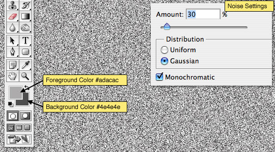
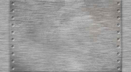
Open a new document 540×300 at 72ppi, set the foreground and background colors to #adacac and #4e4e4e respectively and fill the stage with the foreground color by pressing Option-Delete (PC: Ctrl-Backspace).
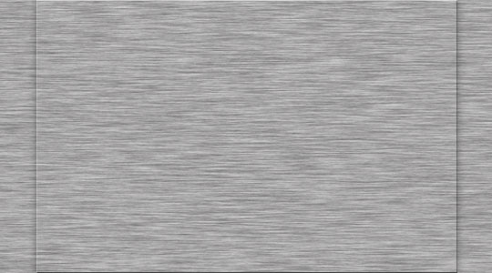
Add noise by choosing Filter>Noise>Add Noise from the main menu with settings of 30% Gaussian and Monochromatic.
Step 2
Next lets blur the noise to create the brushed metal effect by choosing Filter>Blur>Motion Blur from the main menu with an angle of 0° and a distance of 25 pixels. You will notice that because of the motion blur the edges look pretty nasty now, so lets fix that.
Background layers by default in Photoshop are locked, and while locked we can’t do a whole lot to it, so double click on the layer name in the layers palette, rename it Background and click OK to unlock it.
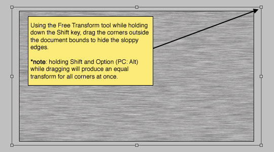
Now press Command-T (PC: Ctrl-T) to invoke the Free Transform tool and while holding down the shift key to constrain the aspect ratio of the layer, drag the corners of the transform box a little past the edges of your document, thus hiding the messy edges. When you’re happy with your transform, press Return (PC: Enter) to commit the change.
Step 3
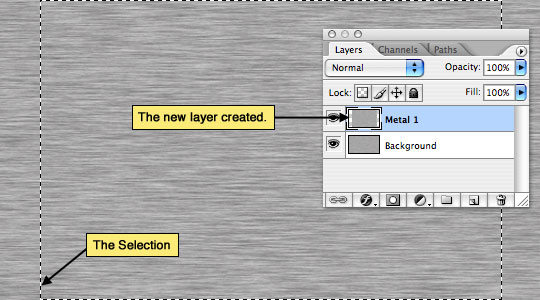
With the brushed metal texture all set, it’s time to create some new pieces of metal which overlap the main area. To do this we will make a simple rectangular selection with the Rectangular Marquee tool (which can be accessed by pressing the M key). Drag out a selection over the top of the Background layer, then simply press Command-J (PC: Ctrl-J) to duplicate the selection onto a new layer. Name this new layer "Metal 1".
It won’t look like any change has happened, but you will see the new layer appear in your layers palette.
Step 4
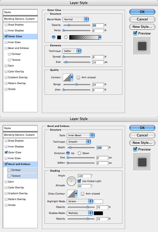
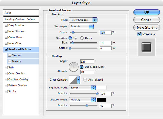
Lets add some layer styles to make the "Metal 1" layer stand out a little. We’ll start with an outer glow but setup to act like a universal drop shadow, then a small Bevel and Emboss to give a subtle edge to the piece.
Step 5
Your file should now look something like this.
Step 6
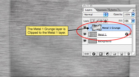
Now I want to add some rust and discoloration to the metal by creating a new layer (call it "Metal 1 Grunge) and painting in some grunge with the Brush tool. I’ve set the layer blend mode to Color Burn in the layers palette and dropped the opacity to 30%. (*note: I am including these grunge brushes in the tutorial .zip file at the end of the lesson. Now might be a good time to download the files so you can see what I’m doing here.)
Create a Clipping Mask to the "Metal 1" layer by right clicking on the "Metal 1 Grunge" layer and selecting Create Clipping Mask.
Grunge up the metal as much as you like. I like to use separate layers for each layer of grunge to give depth. You can also experiment with the Dodge and Burn tools here.
Step 7
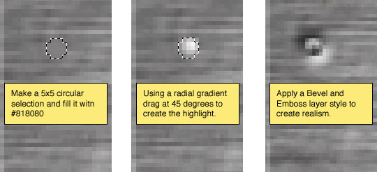
The metal needs to be held together with something, so I’m going to create a series of tiny rivets to line the edges of the "Metal 1" layer.
On a new layer (Call this one Rivet) create a small circular selection with the Elliptical Marquee tool, about 5x5px should do the trick. Fill the selection with #818080 and then with the selection still intact, use the Gradient tool (Set white to transparent) to place a radial gradient from top right to bottom left of the rivet. And finally add a Bevel and Emboss layer style to complete the effect.
Step 8
Duplicate the Rivet layer and move the rivets around until you are happy with the placement.
(*note: After laying out all the rivets I merged my rivet layers together, but first I created a "Rivet Original" copy and hid it so I would have a rivet with all the layer styles intact incase I wanted to add more rivets later.)
Step 9
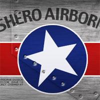
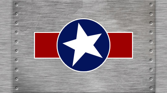
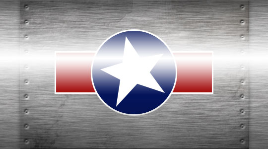
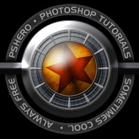
Old fighter planes have cool emblems painted on them, so I’m going to go ahead and create a new layer and draw out an emblem for the side of my plane.
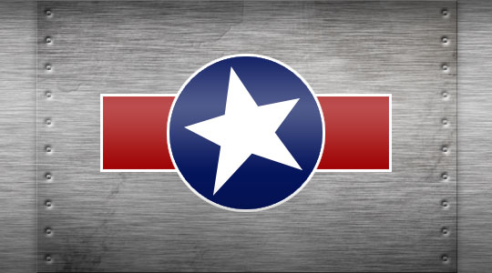
Using the Rectangular Marquee tool I drew a nice rectangle and filled it with red, then on a new layer I drew a circle and filled it with blue. To both these layers I added a Stroke layer style set to inside, white and 3 pixels. Then on yet another new layer I added the PSHERO star to get the following effect.
Step 10
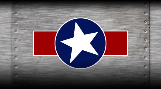
Things are looking better, but the body of our plane needs a little bit more shape, so lets go ahead and add a few more things.
First on a new layer called "Shadows" I’m going to add a linear gradient from the bottom coming up and the top coming down.
Step 11
Drop the opacity of the "Shadows" layer to around 20%, then on a new layer called "Highlights" use a white Reflected Gradient to create a highlight through the middle.
Step 12
Drop the opacity of the "Highlights" layer to around 30%.
Step 13
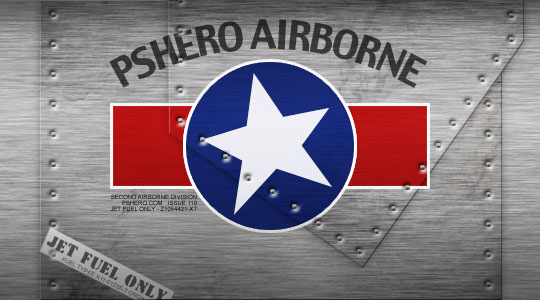
For my final image I added more text, another metal layer, more rivets and a Jet Fuel Only sticker. Do what makes you happy and have fun.
(*note: All my additions and how I accomplished the added effects are contained in the download files at the end of the lesson.)
Lesson Files + Additional Resources
Download the free .PSD file and other lesson files Right Here.
Tell Your Friends
More in Graphic Design


15 Responses to WWII Airplane
Rori
November 19th, 2007 at 1:13 pm
Great tutorial…I think this is my favorite so far!
Theodor
June 24th, 2008 at 6:31 am
Great tutorial, you explain so good!
onyx
August 8th, 2008 at 1:19 pm
Nice!
I Love It and the texture saved me in my last job :)
TKS!!
Drudoo
September 19th, 2008 at 3:47 pm
WOW, love it :)
DW
January 8th, 2009 at 4:04 pm
It was a great tutorial. Very easy to follow.
Stefan Ljungwall
February 9th, 2009 at 11:18 am
Great tut! Thanx a lot! :D
Carter
May 23rd, 2009 at 5:27 am
hello, this I’ve tried excellent tutorial!
How about how to make a Camouflage psd layer?
bulesakit
July 9th, 2009 at 6:47 am
Hero you are a true HERO.You are a maestro of PS.I like when you leave us guessing with your designs.This one is fantastic and I spent a long time to recreate the same effects as your completed project and it was a great learning curve for me,thank you.I am not being sycophantic credit where credit is due.My friends say I should model myself on you, young,good looking and very talented, big problem, I am already 62 years old.Once again thank you.
HERO
July 10th, 2009 at 9:21 am
BULESAKIT, It’s never too late to start being good looking and talented… young however is another story! ;)
Glen
November 11th, 2009 at 6:57 pm
I just discovered your site, and for a beginer like me its really helpful
Oh, and by the way the US didn’t have jets
in WWII
Sam Owles
November 12th, 2009 at 3:24 pm
Fantastic, absolutely brilliant, words escape me
evilkitty75
November 22nd, 2009 at 6:25 am
i made this followin ur lesson but of course changed the logo n the star is urs lol
i loved makin n placing the duplicated rivits!
the guides came in handy … O n THANKYOU so bloody much ii had been askin nemorus ppl how to use the guides n no 1 would help (there r ps snobs out there i know) but u did help in 1 of ur lessons with this n for that i am greatful ^.^
Arsh Kokri
February 16th, 2010 at 1:48 am
It is ammazinnnggggggggg…..Thanks Hero…Carry on……….!!!!
ssk sorgulama
August 11th, 2010 at 4:05 pm
Fantastic, absolutely brilliant, words escape me…
Bobi
August 28th, 2010 at 12:30 pm
This is my favourite tutorial…You are the best :D