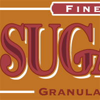
The Sugar Bag Effect
In this tutorial I will show you a neat little text effect using only layer styles and selections.Introduction
I call this the Sugar Bag Effect because I got the idea from an old bag of sugar. Original… I know. It’s a great beginner text effect though and unlike many of the tutorials in this category that are either over the top or simply meant to teach you to use your tools, the Sugar Bag Effect has real world possibilities.
Step 1
Start by opening a new document in Photoshop (mine is 540×300 pixels at 72ppi).
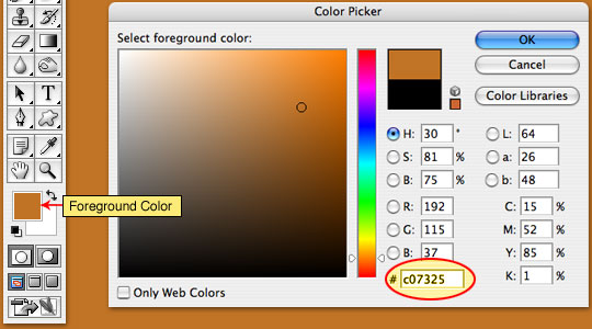
Change the foreground color to #c07325 by clicking on the foreground swatch and entering the number code in the field at the bottom of the dialog as shown below. Click OK and then press Option-Delete (PC: Alt-Backspace) to fill the layer with the foreground color you just set.
Step 2
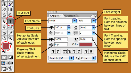
Change the foreground color to #a73e43 (like we just did in Step1) and choose the Type tool from the Tools bar.
If the Character palette isn’t visible choose Window>Character from the main menu to open it and set your font characteristics as shown below. (*note: I am using a font from the Times family, you may use any font you would like although some fonts may be less suited for this effect.) The color in the Character palette is set to the foreground color by default. If for some reason your Character palette swatch is different, simply click on the swatch and enter the same color as we entered in the foreground area.
Step 3
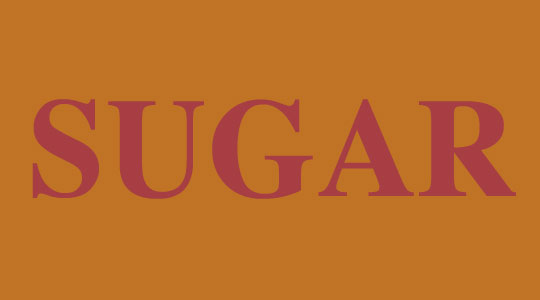
Now that you’ve set your text properties and have selected the Text tool from the Tools palette, click on the stage and type your text.
To commit the type simply choose another tool from the Tools palette or press Command-Return (PC: Ctrl-Enter). (*note: If you are using a keyboard that has a 10 key pad off to the right, you can also just press the Enter key over there.)
Step 4
Now it’s time to apply a few layer styles to our text layer (which should now be named by the text you typed automatically).
Start by right clicking on the new text layer and choosing Blending Options from the menu. This will bring up the Layer Style dialog. (*note: you can also bring up this dialog by double clicking to the right of the layer name.)
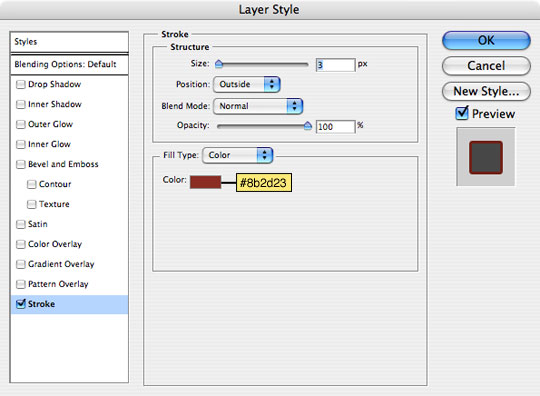
The first layer style we will be applying will be Stroke, so click on the word Stroke at the bottom of the left hand side of the dialog to bring up the Stroke options. A Stroke is an outline around a layer’s contents and has a few key features which we will go over right now.
Size: This is the number of pixels the outline will be.
Position: You can place the stroke on the inside, outside or center of an object.
Blend Mode: Modifies how the stroke is viewed in relation to the layers below it.
Opacity: Obviously adjusts the transparency of the outline.
Fill Type: The outline can be made of a color, gradient or pattern.
Color: Like the colors we have adjusted in previous steps, you can click the swatch to change the color of the stroke.
Step 5
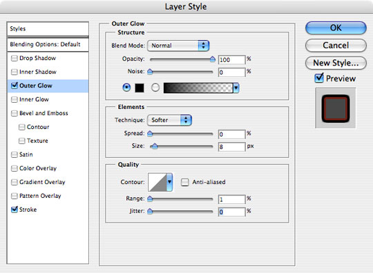
The second layer style we sill apply is Outer Glow, so click it in the left hand column to bring up the Outer Glow options.
Outer Glow works just like it sounds, it adds a glow around the outside of whatever is on the layer, however, we will not be using it for a glow effect, but rather as a sort of secondary outline to separate our lettering from the white highlights behind. This will be more obvious in later steps. Eventually we will be using the background color of the document as the outer glow color, but if we do that now you won’t see the effect of the style, so we’ll use black instead.
We are making a few key adjustments to the default Outer Glow settings here. First change the blend mode to Normal because we don’t want the style interacting with underlying layers. Next we raise the opacity to 100% because we don’t want this style to be transparent at all. Change the color of the swatch to black and adjust the spread and size accordingly (*note: play around with the sliders and watch your document to see how these adjustments change the look of the outer glow). And finally we are going to reduce the range to 1% because we don’t want any visible contour to the style.
Click OK when you have finished with your settings.
Step 6
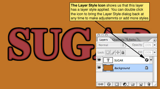
Your document should now look like the one below.
Step 7
Now lets add the dark accents within the text. Hold down the Command (PC: Ctrl) key and click on the layer thumbnail in the layers palette (in this case the layer is text so the icon will be a big T). By doing this we have created a selection from the contents of the layer.

Step 8
To reduce the selection choose Select>Modify>Contract from the main menu, I used a setting of 6 pixels to get my desired effect but feel free to play around with the number of pixels. (*note: If you click OK and decide to change your mind, simply press Command-Z (PC: Ctrl-Z) to undo your last step.)

Step 9
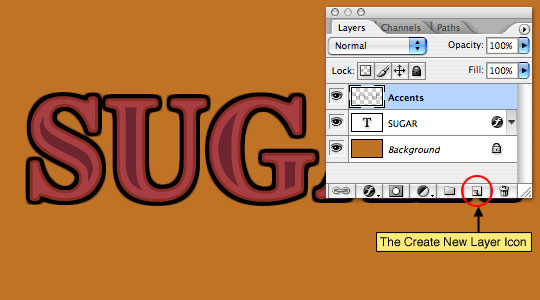
Add a new layer above the text layer by clicking the New Layer icon at the bottom of the layers palette (*note: the new layer icon sits to the left of the trash can icon and looks like a piece of paper with one corner folded back.)
Double click on the layer name of the new layer and change it’s name to Accents then go to the Tools palette and change the foreground color to #6e252e. With the new layer selected in the layers palette and the contracted selection still active on the main stage, fill the layer with the newly set foreground color by pressing Option-Backspace (PC: Alt-Delete). Deselect by pressing Command-D (PC: Ctrl-D).
Step 10
This is where things get a little tricky so pay close attention and follow the steps exactly as prescribed.
Click back to the text layer in the layers palette, mine is called SUGAR as you can see in the previous image. Now duplicate the layer by either right clicking on the layer and selecting Duplicate Layer OR by simply pressing Command-J (PC: Ctrl-J). This will create a new layer above the selected layer called SUGAR copy. As a matter of good file structure, lets go ahead and rename both layers by double clicking on the layer name. I will call the top layer "SUGAR top" and the bottom one "SUGAR bottom".
Step 11
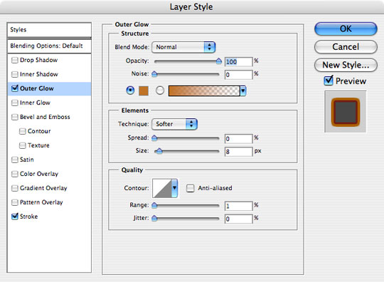
With the "SUGAR top" layer selected, double click on the little layer style icon to the right of the layer name in the layers palette (*note: I pointed this icon out back in the Step 6 image). Remember I said we would modify the Outer Glow settings? Go ahead and select Outer Glow from the menu on the left and change the color to match the background color of our document. An easy way to do this is to move the mouse over the background of the main stage and you will notice that the cursor becomes an eye dropper, this allows you to choose any color from the main stage to use in your layer style. Simply click on the background to set the new Outer Glow color to match. Click OK.
(This will make it look a little weird on the main stage, but not to worry, the next step will clear things up.)
Step 12
Now click on the "SUGAR bottom" layer in the layers palette and remove the layer style from the layer by either grabbing the layer style and dragging it to the little trash can at the bottom of the layers palette, or by right clicking on the layer style icon in the layer and select Clear Layer Style from the menu.
(*note: Clearing a layer style can also be done from the main menu by choosing Layer>Layer Style>Clear Layer Style.)
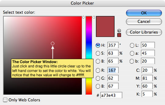
Now lets change the color of the text on this layer (which is now completely hidden by the "SUGAR top" layer) to white by clicking on the red swatch in the Character palette to bring up the Color Picker and then dragging the little circle up to the upper left hand corner where white lives, then click OK.
At this point it won’t look like there’s anything behind the "SUGAR top" layer at all.

Step 13
Ok, now the magical moment where I reveal the method to all this madness!
Choose the Move tool from the Tools bar by pressing the V key, then by using the arrow keys on your keyboard nudge the text on this layer (you should still be on the "SUGAR bottom" layer) to the right and down, each 7-10 pixels until things look right to you.

Step 14
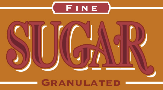
Great work! For my finished product I went overboard and tweaked the text and added some final design touches.
(*note: I’m including both the tutorial .PSD file as well as my final .PSD file in the file download at the bottom of the tutorial.)
UPDATE: I recently received an email from Dan who pointed out that this same effect could be achieved by using a single layer and a set of more complex layer styles. After chatting with Dan and explaining that many of these tutorials are much more about the journey of learning Photoshop than the end result of the lesson, and that if we had gotten this result using only layer styles I wouldn’t have been able to teach about multiple layers or modifying selections, I realized that it might be nice to share the .PSD file Dan sent me illustrating his point. So for those of you who are curious about how to get the same effect using only layer styles, you can download Dan’s file HERE.
Lesson Files + Additional Resources
Download the free .PSD file and other lesson files Right Here.











34 Responses to The Sugar Bag Effect
Kayla
November 16th, 2007 at 7:45 am
Your tutorials rock – thanks so much! Love the site!
Bearius
March 31st, 2008 at 4:36 pm
Awesome site. Concise and clear directions unlike other tutorial sites. Thank you for your time and efforts. Keep up the great work!!!!!
Geoserv
April 25th, 2008 at 7:45 pm
STUMBLED!
Thanks for another great tutorial.
VOTED for this tutorial at NewsDot.com
reyruiz
April 26th, 2008 at 6:09 pm
i don’t know why you had to go such great lengths to do a simple creative process in photoshop that you can easily do in illustrator.
HERO
April 26th, 2008 at 6:25 pm
Reyruiz,
Well, um… forgive me for stating the obvious, but this is a website designed to teach people how to create things in Photoshop. :)
andre
April 28th, 2008 at 3:54 am
GREAT!!
AY
James Schlesselman
May 4th, 2008 at 9:08 pm
Nicely done.
What really interests me is HOW you did the altering of the letters in the final image. Did you use a vector or masks or ???
Care to share that info?
Ali Fuat
May 5th, 2008 at 12:51 pm
I like it! Thank you very much for your tutorial.
HERO
May 9th, 2008 at 2:54 pm
I want to extend a special thanks to Dan for sending me his .PSD file which was included in the final step of this lesson in the UPDATE to the post. It’s fantastic to have readers who want to contribute to the greater good!
Starr
May 10th, 2008 at 3:14 pm
Woo! It IS the sugar bag! love it :D
prelox
May 11th, 2008 at 11:59 am
I like it a lot that I am going to start up photoshop now to create my own sugar bag effect.
geozien
May 14th, 2008 at 7:31 am
nice read, very instructive
jd
May 15th, 2008 at 10:32 am
Nice tutorial!
Alex
May 17th, 2008 at 3:51 pm
I am a beginner with Photoshop and I found this tutotial to be extremely helpful. It explains everything, unlike other tutorials I’ve seen. I doubt I could do it, but I would like to know how you altered the letters in the final step. With the letters like that, it looks GREAT!
PBnJ
October 6th, 2008 at 7:52 am
Very nicely done! Thanks for sharing so many cool tips and tricks for Photoshop!! *hugs*
EP
November 17th, 2008 at 3:21 pm
WOW! I love all your tutorials! They are simple yet effective! I have learned so much just in the few tutorials I have done. Thanks so much for putting them on here!
Vijay
January 1st, 2009 at 10:39 pm
Thanks for explaining things in very simple way. I was really curious how people do it, and you explained it in very clean manner. Very useful, Thanks again.
Josh
January 14th, 2009 at 12:56 am
Thanx! great tutorial!
bern
January 27th, 2009 at 5:41 pm
ALSO IS THERE ANY WAY WHEN CHANGING THE STROKE TO THE BACKGROUND COLOUR TO BE ABLE TO CHANGE IT TO TRANSPARENT INSTEAD, IN ORDER TO ALLOW THE TECHNIQUE TO ALSO WORK WHEN APPLYING THE TEXT TO A PHOTO.
HERO
January 28th, 2009 at 3:55 pm
BERN, You can set the stroke color in the Stroke Layer Style dialog box as well as it’s opacity. To change the text to transparent, simply drop the layer’s Fill value in the Layers palette.
Jet
February 26th, 2009 at 11:04 pm
this is very nice, thanks for sharing.. :)
Decent Banners
June 29th, 2009 at 11:06 am
wow super cool effect :)
I am definitely going to try this tutorial.
Jen_D
July 21st, 2009 at 6:30 pm
You took a very dear amount of time discecting this process, and I love you for it :) Brilliant!!
HUXLY
July 30th, 2009 at 1:07 am
does anyone one know what font the final version is using…I love it.
HERO
July 31st, 2009 at 10:06 am
HUXLY, The final font is actually still Times, but I converted it to paths and modified the forms to make it look just like the Sugar Bag I’d taken the idea from.
Riverhigh22
December 23rd, 2009 at 6:42 am
In one word. Excellent!!!!!
The instructions were clearly written and easy to follow.
babydoll
January 31st, 2010 at 6:45 pm
love it the directions were really easy to follow but I would really like to know how you got that end result
Ajay Kant Sharma
February 23rd, 2010 at 5:50 am
Cool effect. Really nice one.
Wil
March 7th, 2010 at 6:41 am
Just wanted to say thanks for a great tutorial, used it for a narrow boat illustration, as the style of writing is similar.
Hadfield
August 2nd, 2010 at 9:45 am
Got it ! Great website !
Lianz
September 12th, 2010 at 3:39 am
Thank you very much for your tuts. It’s really help me as a beginner. Good Job!
Carlos E. Quevedo
January 20th, 2011 at 12:40 pm
Keep the good job up. I certainly learning with each tutorial.
Thanks
Getu
February 2nd, 2011 at 6:07 am
Wow!!! Nice Tutorial
Matty
February 14th, 2011 at 5:01 pm
Love this idea. Did pretty well but until the end. How did you do all the other things like the word Fine in that cool little box? And how did you do all that with the letters? That looks totally awesome! Great work!