
 Photos – Part 1")


Simple Vector Logo Design
In this tutorial we will explore the idea of creating custom (vector) logos in Photoshop. We will explore the idea of font manipulation as well as adding custom shapes to the mix.In this tutorial we will explore the idea of creating custom (vector) logos in Photoshop. We will explore the idea of font manipulation as well as adding custom shapes to the mix.
(*note: This tutorial assumes you know how to use the Pen tool enough not to make your way around comfortably inside paths.)
Step 1
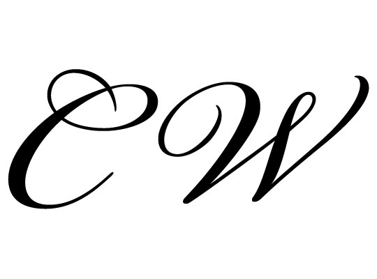
My realtor recently asked me to give some thought to what she might do with her logo. Her initials are CW and one of her big requests was to use the initials in the logo. Typically I’m more of an abstract symbol kinda guy and I don’t typically favor the "use your name as your logo" philosophy (not that there’s anything wrong with it and sometimes it makes good sense, but because I’m a right brain guy who likes graphics more than words), so lets see if we can use this tutorial to use a little bit of both.
I’m starting with a new canvas with a white background for clarity, but any color will do. Then I’m going to grab the Type tool by pressing the T key and with the foreground color set to black type the initials on the stage. I’m using the font Bickham Script Pro and I’ve sized the font nice and big so you can see what I’m doing and to make working easier.
Since we plan to output a vector logo file size doesn’t make any difference here, but it’s always easier to work with big stuff for me.
Step 2
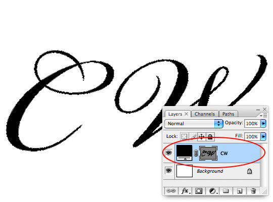
Using a pre built font as a starting point makes consistency and style a little easier, though you could create the whole thing with the Pen tool if you feel so inclined. Since I chose to use a font rather than to create the shapes by hand I need to convert the text into a medium that I can manipulate (ie. paths). So I’ll Command-Click (PC: Right-Click) on the text layer and choose Convert To Shape from the menu. You can see in my layers palette that the text layer has been converted to a Shape Layer.
Step 3
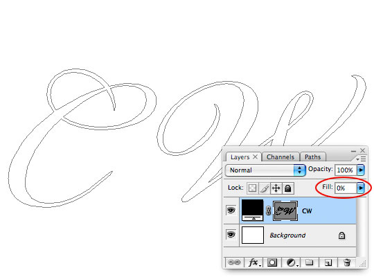
To make things even simpler, lets go ahead and lower the Fill opacity for this layer to 0%. Now we can see that paths we’ve just created clearly.
Step 4
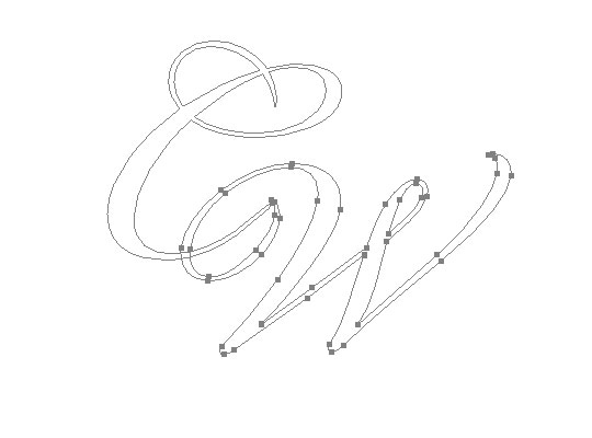
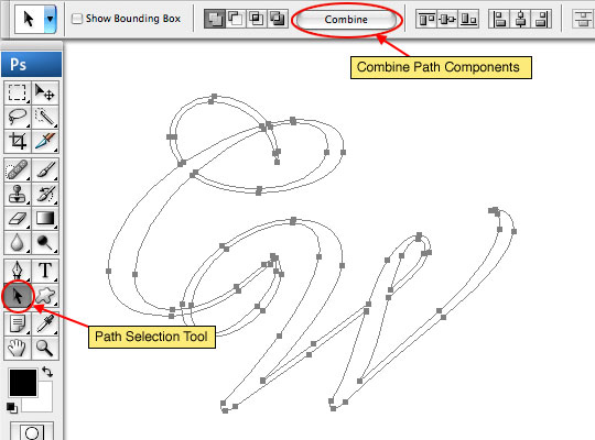
The next step is to get the two letters into a position where I can combine them and begin manipulating the shapes to my liking. Press the A key to bring up the Path Selection tool, click on a letter to select it, then move it into position.
Step 5
Because the paths overlap and I want to be able to edit them as one unit I’m going to press the Combine button in the Path Selection tool options bar at the top of Photoshop. This will effectively merge the paths together and make them much simpler to work with as well as address any overlapping sections that might have previously been a problem.
Step 6
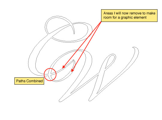
Next I will identify the areas of the text that I want to change. In this case I will be removing the tail of the C letter and part of the beginning of the W to make room for a graphical element between the two.
Step 7
Switch to the Direct Selection tool (which is found by clicking and holding your mouse over the Path Selection tool we were using earlier until the fly out menu appears. (*note: If you already have the Path Selection tool active, you can simply press Shift A to switch to the Direct Selection tool.)
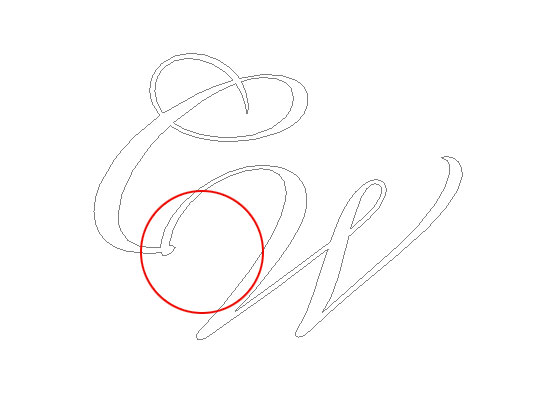
Now all I have to do is click on a segment of the path and press Delete (PC: Backspace) to remove it. You can see here that I’ve removed the two pieces described above and was sure to keep the path closed (the little bubble area where the two letters meet.
Step 8
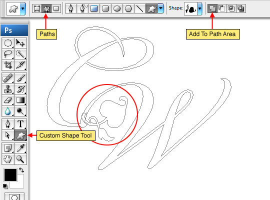
Now lets introduce a custom shape to the logo. Press the U key to switch to the Custom Shape tool. In the Options bar at the top of Photoshop be sure that the tool is set to Paths and Add To Shape Area. I chose this nice little flourish shape which will fit nicely between the letters.
Now simply drag a new shape onto the canvas, adding it to the current shape layer. You will notice that this path is separate from the previous ones and you can move and transform it with the Direct Select and Path Selection tools to get it right where you want it.
Step 9
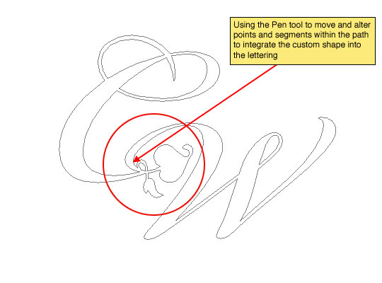
Just like I did in Step 5 I’m going to switch back to the Direct Select tool and using the Combine button I’ll merge the new custom shape with the text from earlier effectively creating one big path from the two parts.
Here’s where your skill with the Pen tool really comes into play. By moving and modifying the points and segments of the path I’m going to integrate the new custom shape into the flow of the lettering as shown below.
Step 10
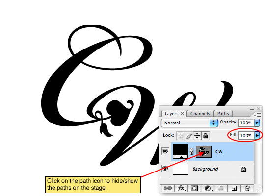
At this point it makes sense to turn the Fill opacity of the layer back to 100% to view the outcome of all that manipulation. By clicking on the shape thumbnail (the one on the right) in the layers palette we can hide the paths so only the fill is shown.
Step 11
There are a few usage options I should point out here. First, if you switch to the Pen tool you can Command-Click (PC: Right-Click) on the path and save it as a custom shape which will make it available at the click of a mouse anytime in the future. Second, the paths can be moved to Illustrator and saved as a vector .AI or .EPS file by simply clicking and dragging from the Photoshop document into an open Illustrator file. And third, the file can be saved as it stands and used anytime in the future as a vector shape layer. I prefer to the first two options more than the third because shape layers (in my point of view) are less convenient to my workflow.
Learn to convert shape layers to .AI and .EPS files in my Creating A True .EPS File Using Vector Masks tutorial.
Learn more about vector layers in the Vector Coffee Cup tutorial.
Step 12
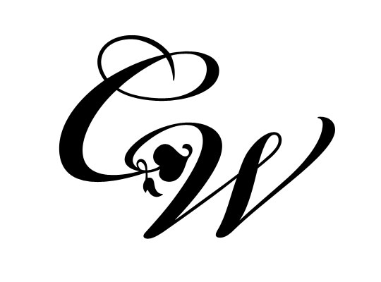
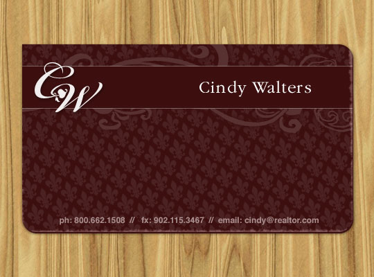
Add it to a business card or a billboard. Our vector logo will shrink and expand perfectly now for any use!
Tell Your Friends
More in Graphic Design


35 Responses to Simple Vector Logo Design
Paulo Sales
April 15th, 2008 at 4:04 pm
brilliant use of paths…another nice tut Hero…congrats..
…and another lovely pattern …also nice spot transformation!
HERO
April 15th, 2008 at 5:17 pm
Thanks Paulo, glad you enjoyed it.
Erika
April 15th, 2008 at 6:22 pm
Love the redesign!
Quick question. Is the combine tool only in CS3?
HERO
April 15th, 2008 at 6:28 pm
Thanks Erika!
And to answer your question, the Combine tool is also available in CS2 but I’m not sure how much further back the option extends. Remember, you need to make sure you’ve got the Direct Select tool active for the option to appear.
sonson
April 16th, 2008 at 12:55 am
I had no idea that combine button was there, that’s pretty cool.
also, the download link is broken fyi
dilirum
April 16th, 2008 at 2:34 am
Impressive as always. Every week I’m amazed … and every week you out-do your previous weeks tuts! Outstanding!
HERO
April 16th, 2008 at 7:07 am
Sonson, thanks for the heads up, not sure what happened but the download link is working now.
Richard
April 16th, 2008 at 8:19 am
Brilliant tutorial, I really enjoy them. keep up the great work.
dilirum
April 16th, 2008 at 3:29 pm
I’m wondering what technique you used to make the swirly designs behind the name and logo on the business card in your finished product. I think I know how to emulate everything else there but that part I’m not sure about… and that really brings your finished product together.
Dedra
April 16th, 2008 at 5:10 pm
Another great one, Hero. The gem this week, as SONSON noted, was the combine tool.
T. Roger Thomas
April 23rd, 2008 at 7:09 pm
Another in your series of excellent tutorials!
I followed this tutorial as an exercise in using the Pen Tool, and created the image that can be seen at: http://ysps.info/Samples
Thank you again for creating such an excellent resource for myself and everyone else that is interested in learning more about using Photoshop effectively.
HERO
April 23rd, 2008 at 9:56 pm
T. Roger Thomas,
Thanks so much for the compliments and for sharing your work! I’m always stoked to see someone benefiting from what I’m doing here! Keep it up!
A. Carback
April 24th, 2008 at 10:48 am
I’m loving this one. Keep up the good work.
Rotten Ron
June 6th, 2008 at 9:21 pm
Wow! Can’t wait to start experimenting with this a bit more.
Mari
July 6th, 2008 at 7:47 pm
Great tutorial — however how does this card reflect her business? i don’t think it’s the best card for a realtor; perhaps a florist or garden designer?
HERO
July 6th, 2008 at 8:41 pm
MARI,
Thanks for your comment, let me ask you a few questions in return:
What does a big M have to do with hamburgers? What does a star have to do with gasoline? And what does a swoosh have to do with shoes? The collective answer is really nothing at all. McDonalds, Texaco and Nike were creating brand recognition which doesn’t have a thing to do with hamburgers, gas or shoes but plenty to do with recognize-ability. My realtor happens to be a lady who likes frilly flowery designs, she also approached me with a design she had created and asked me to keep the leaf element in some way… and Mari, quite simply sometimes as designers we just do what the client asks. My realtor will never be a multi-national corporation who needs a glossy corporate image, but what she will be is pleased each time she gives out a business card with a logo that she really likes, and sometimes that’s just what matters most.
Casey L. Jones
July 19th, 2008 at 11:29 pm
Well said Hero! I agree 150% with what you said to Mari.
I love the tutorial too, very beautiful outcome!
ct
July 24th, 2008 at 9:39 pm
good job.i realy enjoy the tutorial.
Quick question,if i dont like 2 use the shape,where must i get the shape 2 replace? can i dowload the shape n how?
siri
September 29th, 2008 at 10:58 pm
thanks so much for this tutorial. it answered all my questions as they came up!!! a simple and powerful tut. thanks again!
Jesse Vlasveld
October 13th, 2008 at 1:28 am
This is really an awesome and simple way of manipulating paths, with a great result. Thanks alot :)
Hristina
November 18th, 2008 at 6:20 am
I’m just a beginner in vector design and I was able to follow your steps. Thank you for this tutorial. I have a question, I hope not very silly. Why when I zoom the logo it’s not so smooth? Isn’t it have to stay the same. It is a benefit of vector stuff, isn’t it?
HERO
November 18th, 2008 at 2:38 pm
HRISTINA,The problem you’re seeing when you zoom isn’t an issue with the vector, what you’re seeing is the pixels of the document you have open in Photoshop. In other words, if you’ve got a 500×600 document at 72ppi (or even 300ppi), it is still technically made of pixels because it’s a Photoshop document. If you were to drag your vector into a window in Illustrator, you would indeed see that it is indeed vector, and you’d be able to zoom in as close as you want without getting pixelization at the edges, because Illustrator is a vector program and documents in Illustrator aren’t based on pixels like Photoshop is, therefore even though the object is actually a vector by nature, the way it is rendered between the programs is different.
When a vector object is placed into Photoshop and sized, it takes on the pixel ratio of the document, so if you zoom in on it, it will look like everything else. But you can resize the object over and over and you will always get an edge as crisp as the original (which is the advantage of using vectors in PS).
Hristina
November 20th, 2008 at 8:59 am
Thank you for the answer. That explains a lot of problems I had. :)
Lauren
December 12th, 2008 at 10:03 am
I am not able to convert the text to a shape as stated in step 2. My CS3 says it can’t because the type layer uses a faux bold. Any ideas what I am doing wrong?
HERO
December 13th, 2008 at 5:55 pm
LAUREN, Its likely not the faux bold that’s causing the problem. The only time I’ve ever seen this happen myself was when I was using a font that was not a True Type font.
Binti
January 1st, 2009 at 4:33 am
Lauren:
I had the same problem. It turns out I had to disable the faux bold before I could get it to work.
Highlight your text layer and open Character and Paragraph panel. In there, there will be a series of ?¢‚Ǩ?ìT?¢‚Ǩ¬ù letters at the very bottom. The first box, with a ?¢‚Ǩ?ìT?¢‚Ǩ¬ù appearing in bold, is the box that you will want to click to toggle the Faux Bold setting. That’s how I got it to work. Hope this helps.
henry
November 1st, 2009 at 1:59 am
Excellent tutorial – easy to learn!
Logo Design Monster
March 2nd, 2010 at 2:59 pm
The final logo looks really good. I think it was creative thinking to join the letters in this way. Thanks very much for sharing the logo tutorial.
logo templates
October 6th, 2010 at 1:45 am
Great tutorial. The end result is really nice.
Thanks for the post.
DesignMyBox
October 7th, 2010 at 6:53 am
Lovely result. This technique can be used in so many ways. Thank you so much for the tutorial
akeanant
November 19th, 2010 at 4:18 am
Amazing work as usual! Keep it up!
adam
January 31st, 2011 at 1:25 pm
Love the business card design. Simple and elegant :)
Jeewantha
March 15th, 2011 at 10:33 pm
great tutorial hero. Keep it up.
I Learned amazing effects from your great tutorials which I never found any other place.
I definitely Help you in future.
Thanks again.
Sera
September 27th, 2011 at 7:32 am
How would I create a vector logo using two colors using this method? (one font, but wanting two colors in the final design) When I convert the type to shape it all becomes one color.
HERO
October 13th, 2011 at 5:01 pm
SARA, You’d want to duplicate the layer, change the color on the 2nd layer and then removing opposite letters from each layer so that the colors alternate as you require.