


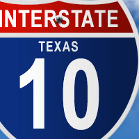
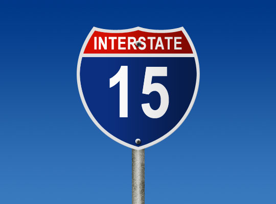
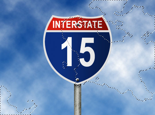
Interstate Road Sign
In this Photoshop tutorial we'll be creating a highway sign and post using custom shapes, selections, layer styles and a little creative gradient work.Introduction
To begin, let me say this tutorial will move a little quicker than some of the previous ones with a little less hand holding. If you’ve been playing along at home you should already know how to create layers, add layer styles, use the Custom Shape, Gradient and Rectangular Marquee tools and be fairly confident moving around the Photoshop workspace.
Step 1
I got an ad in the mail over the weekend with that used a photograph of an interstate road sign and I thought hmmm, who needs a photograph when we can make it in Photoshop! I’m starting with a new document 540px x 400px at 72ppi. The only reason this really matters is that if you decide to work at a larger or higher resolution, the layer style settings will need adjusting. But you already knew that didn’t you!
With the foreground and background colors set to #003888 and #3a7abe lets go ahead and lay down a nice linear gradient from the top to the bottom of the Background layer to give us a little contrast to work with while we design the sign. At the end of the lesson I’ll show you a neat way to come back and add some clouds to the sky to give a deeper effect to the project.

Step 2
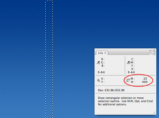
Create a new layer called Post, switch to the Rectangular Marquee tool my pressing the M key and drag out a tall narrow selection. When creating selections like this, I sometimes like to have the Info window open (Window>Info from the main menu) so I can see exactly how large my selection is. In this case I’m keeping the width to 25px.
Step 3
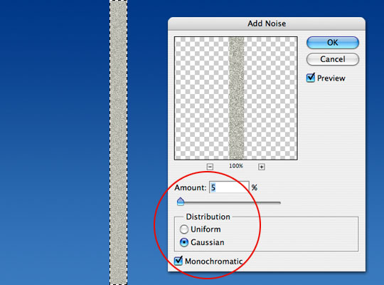
Jump over to the foreground and background swatches again and lets set them to #babab0 and #87877d respectively. Fill the selection with the lighter (foreground) color by pressing Option-Delete (PC: Alt-Backspace) and then add some noise by choosing Filter>Noise>Add Noise from the main menu. For this example 5%, Gaussian and Monochromatic will be the settings for the noise.
Don’t deselect just yet, we’ve got a few more steps to do with the selection before we’re done.
Step 4
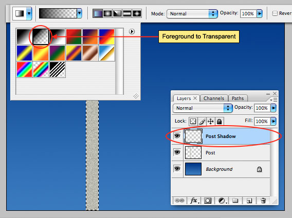
Create a new layer called Post Shadow and press the D key to reset the foreground and background colors to black and white. Press the G key to switch back to the Gradient tool and this time lets switch to the Foreground to Transparent option in the Gradient Options bar (Linear Gradient should still be selected from Step 1).
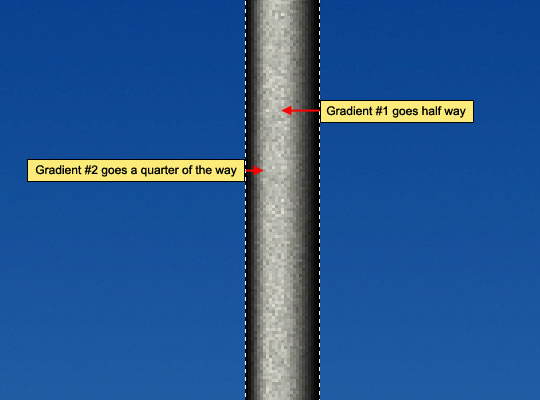
Step 5
From the right edge of the selection, drag a gradient in to the center of the selection. This will be the right side shadow. The left side shadow will be smaller, so drag another selection from the left edge of the selection only about a quart of the way across the post as shown below. (I’ve enlarged the area for easier viewing)
(*note: by holding the Shift key while you click and drag with the Gradient tool, you can keep your gradient in a perfectly straight line.)
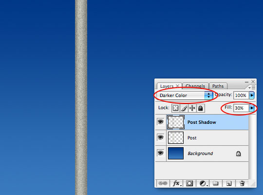
Step 6
Change the Layer Blend Mode of the Post Shadow layer to Darker Color and then lower the Fill opacity to around 30%.
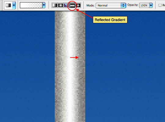
Step 7
Create a new layer called Post Highlight and press the X key to switch the white swatch to the foreground. In the Gradient Options bar, switch from Linear to Reflected Gradient and click and drag a tiny distance from the center of the post outward towards the edge of the selection about half way.
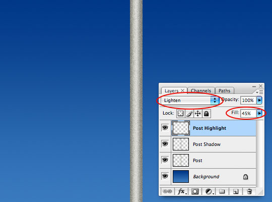
Step 8
Switch the Layer Blend Mode to Lighten and lower the layer’s Fill opacity to 45%.
Step 9
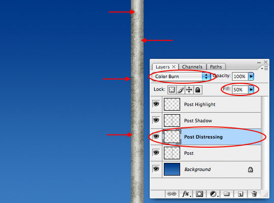
At this point I am going to create a layer just above the Post layer called Post Distressing and with a jagged edged brush (or a grunge brush if you prefer) and the foreground color set back to black, I’m going to paint in some distressing along the pole just to add a little realism to the metal. You can skip this if you’d like a cleaner post. I also changed the Blend Mode to Color Burn and lowered the Fill opacity to 50% to make the discoloration a little more believable.
Notice that I put the distressing below the shadows and highlights so that those layers also effect the discoloration correctly.
Step 10
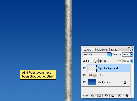
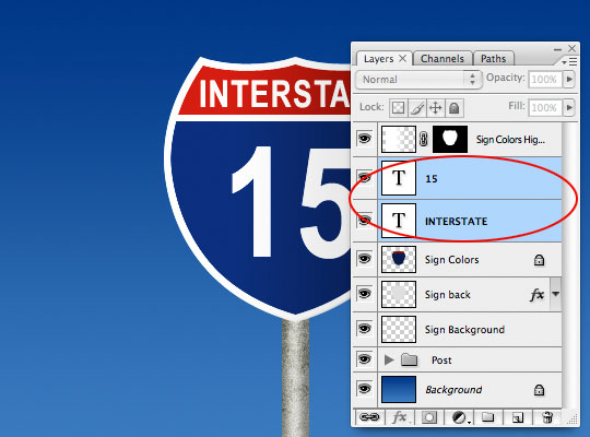
To keep the file a little cleaner since we’re about to go layer crazy, I’m going to select all 4 of the Post layers and press Command-G (PC: Ctrl-G) to group those layers together in a folder called Post.
It’s time to get started on the actual sign, so lets create a new layer called Sign Background. At this point I’m also going to stop showing the Layers palette in the examples unless it’s actually needed.
Step 11
Switch the foreground color to #dfdfdf and choose the Custom Shape tool from the Tools palette by pressing the U key. From the Options bar at the top choose Fill Pixels from the icon set on the left, make sure that the Custom Shape "Blob" is selected so that all the custom shapes will be available from the Custom Shape picker, then choose the Sign 6 custom shape from the default custom shapes.
Click and drag a nice sized sign onto the stage. Remember to hold down the Shift key to constrain it’s proportions, and if you’ve got the Info palette open as I mentioned earlier, you can get my exact size by dragging until the measurement is 240px x 240px.
(*note: If you don’t see the set I’ve shown below, simply click on the little circle with the arrow at the top right corner of the Shape picker and choose Symbols from the drop-down menu to load that custom shape set.)

Step 12
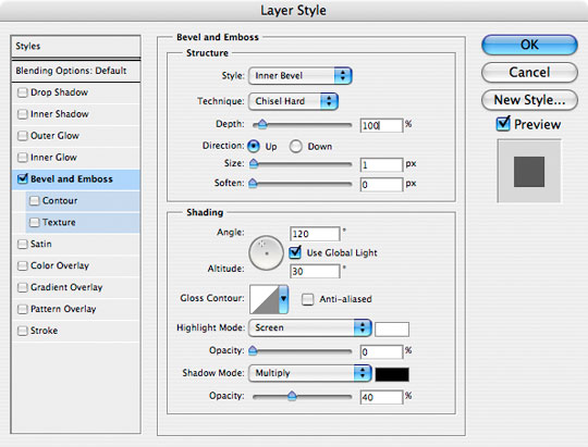
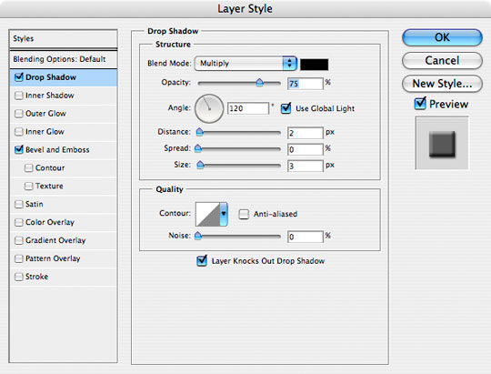
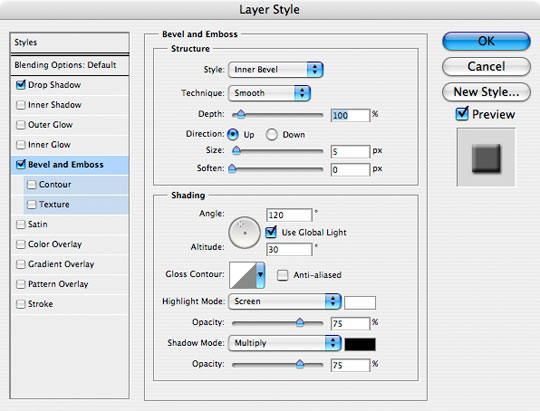
Lets add just a hint of an edge to the sign by using the Bevel and Emboss layer style shown below.
Step 13
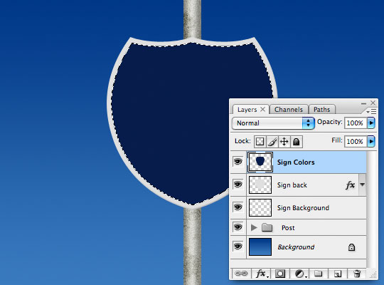
Load the layer as a selection by holding down the Command key while clicking on the layer’s icon in the Layers palette.
Create a new layer called Sign Colors and lets reduce the size of our selection by choosing Select>Modify>Contract from the main menu. I used a setting of 6 pixels. Now lets fill the selection with blue by changing the foreground color to #071c4c and pressing Option-Delete (PC: Alt-Backspace).
When you’re done you can deselect by pressing Command-D (PC: Ctrl-D).
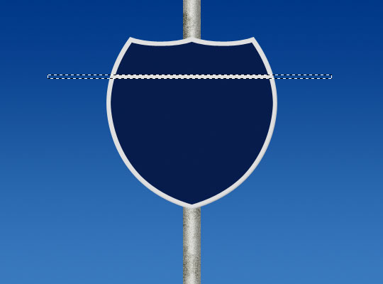
Step 14
Obviously we need to make some slight modifications to this big blue mass since we need the top of the sign to be red right? … So grab the Rectangular Marquee tool and drag out a long narrow selection where the separator line will live. This is another great time to watch the size of the selection represented in the Info palette. Since the distance from the color to the edge of the sign is 6 pixels, it makes sense to make this divider 6 pixels high as well.
With your selection in the right place, go ahead and press Delete (PC: Backspace) to remove that section of the paint.
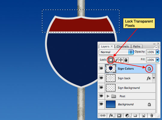
Step 15
In the layers palette lets lock the layers transparent pixels by clicking on the Lock Transparent Pixels icon. This will add a little lock icon to our layer and will allow us to paint on the layer without effecting any pixels other than the ones we already have on the layer.
With the Rectangular Marquee tool drag a selection around just the upper portion of the sign paint, then set the foreground color to #800900 and fill the selection by pressing Option-Delete (PC: Alt-Backspace). Notice that even though you had a large rectangular selection, only the actual pixels locked into the layer were effected. You can deselect when you’re done by pressing what keyboard shortcut? … yep, Command-D (PC: Ctrl-D).
Step 16
That post is starting to get on my nerves sticking out of the top of our sign like that, so I’m going to click on the Post layer set and using my arrow keys shift the post down until I can’t see it coming out the top anymore. Ahhh, much better. Now lets move on and add some highlights to the paint for a little more realism.

Step 17
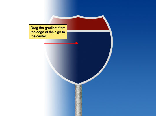
Create a new layer above the Sign Colors layer called Sign Colors Highlight. Grab the Gradient tool again by pressing the G key, make sure your foreground color is set to White and that the Foreground to Transparent and Linear Gradient options are selected in the Options bar.
Now drag a gradient from the edge of the sign to the center (or further depending on how much highlight you prefer) and release your mouse. Yes, I know this looks silly, but keep your shirt on, we’ll fix it in the next step!
Step 18
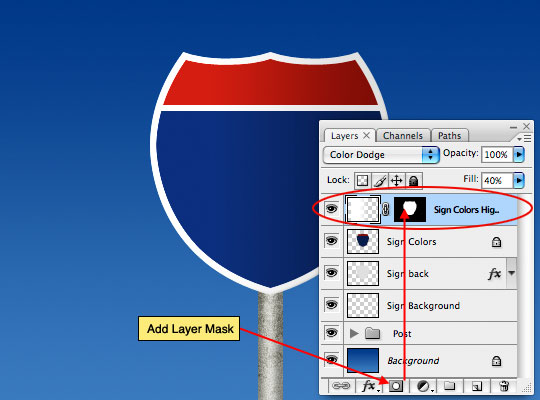
Ok, lets create a layer mask for this highlight so it only shows up where we want it to. Command-Click (PC: Ctrl-Click) on the layer icon for the Sign Colors layer in the layer palette to load it as a selection just like we did before. Notice that the Sign Colors Highlight layer is still the active layer. Now all you have to do is click the Add Layer Mask icon at the bottom of the layers palette (it’s the one that looks like a circle inside a rectangle), change the layer’s Blend Mode to Color Dodge, lower it’s fill Opacity to around 40% and Shazam! the highlight is only shown where it shows through the layer mask!
Step 19
Now lets add some lettering to our sign. First click down to the Sign Colors layer (because we want the text to be above the colors but below the highlight). Since the sign would have been painted omitting the letters, lets switch our foreground color to the same one used for the Sign Background layer, #dfdfdf. Press T to invoke the Text tool and add your text to the sign. I used Arial set to Bold and 34pt for the upper lettering and 140pt for the lower. I also adjusted the tracking of the letters in the Character palette to get the letters spaced a little more pleasing to my eye.
Step 20
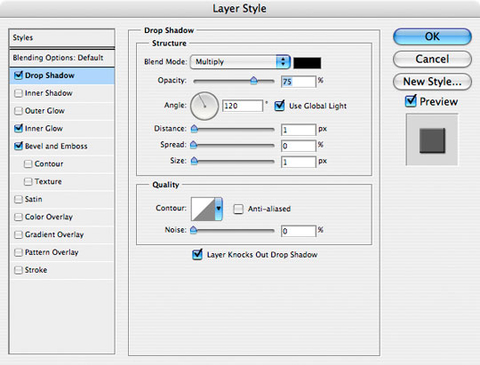
The sign needs to be fixed to the post with some bolts, so lets create those really quickly with a couple of easy selections and layer styles.
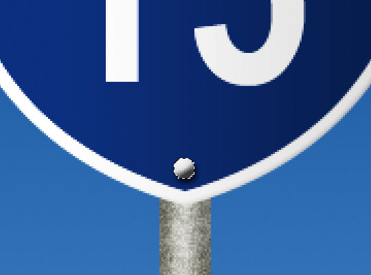
Create a new top layer called Bolt Bottom and with the Elliptical Marquee tool drag a circular selection (by holding down the Shift key while you drag) that’s 10px in diameter. Fill the selection with the light gray color we used in the previous step and add the following layer styles.
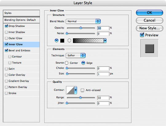
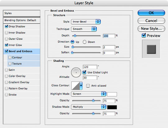
Step 21
Which will give your bolt a little bit of dimension as shown below.
Step 22
Next lets add a new layer called Bolt Top and using the Elliptical Marquee tool again create a 5px selection right in the middle of the bolt, fill it with #9a9a9a which is a darker gray color and add these layer styles.
Step 23
And the bolt should look something like this. Keep in mind that these are only 10px bolts, so going overboard on detail that will go unnoticed doesn’t make any sense.
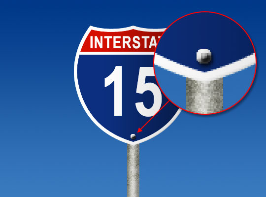
Step 24
Select both the Bolt Bottom and Bolt Top layers in the layers palette and Command-Click (PC: Right-Click) on one of the layers to bring up the layer options menu. Choose Duplicate Layers and just click OK when the window pops up asking you to name the layers (you can name them later if you want). This will create a new set of 2 layers above the original ones and if you switch to the Move tool by pressing the V key, you can drag the new set (while both layers are selected) up the the top where the other bolt belongs. Remember that by holding the Shift key you’ll be able to drag up in a perfectly straight line.
Step 25
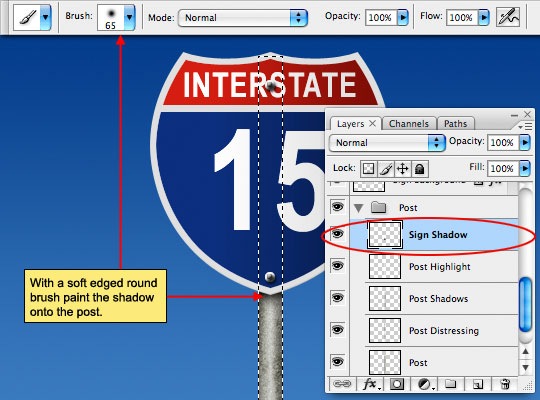
Lets jump down to our Post group and add a little shadow below the sign.
Create a new layer above the 4 existing Post layers and call it Sign Shadow. Command-Click the original Post layer to load it as a selection. Press the D key to set the foreground color to black and then switch to the Brush tool by pressing the B key. Choose a medium sized soft round brush from the Brush Options bar and paint a shadow onto the stage just below the sign where it would be cast onto the post. Deselect when you’re done.
Step 26
Ok, things are looking pretty good now, so lets go add some clouds to the sky.
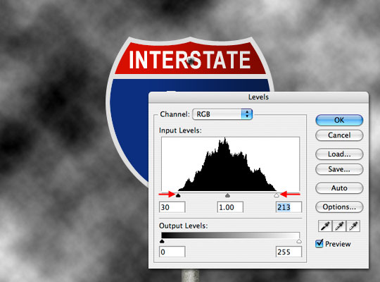
Click on the Background layer and add a new layer above it called Clouds. From the main menu choose Filter>Render>Clouds, which will create a cloud type effect on the stage using the black and white foreground and background colors. Obviously unless your sign is for the Apocalypse the black in the effect won’t work at all so lets do something a little creative here.
First press Command-L (PC: Ctrl-L) to bring up the Levels dialog and drag the endpoints on both the black and white sides in to meet the edges of the histogram giving the clouds more contrast. Click Ok when you’re done.
Step 27
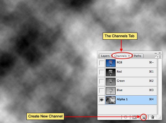
Now press Command-A (PC: Ctrl-A) to Select All, then Command-X (PC: Ctrl-X) to cut everything away. The whole cloud pattern will disappear, but don’t worry, it’s been copied to the clipboard and we’ll put it back in just a second.
Now switch to the Channels tab in your layers palette and click the Create New Channel icon at the bottom of the palette (It’s the one that looks like a piece of paper with the corner folded back). This will add a new blank Alpha Channel to the bottom of the channels palette. Now press Command-V (PC: Ctrl-V) to paste the clouds we cut from our Clouds layer into the new channel. Press Command-D (PC: Ctrl-D) to deselect.
Step 28
Ok, now things are going to get tricky, so pay close attention. Hold down the Command (PC: Ctrl) key and click on the thumbnail for this new channel to load it as a selection. You should get a strange selection that appears to basically select the white in your clouds. The selection encompass even the partially transparent pixels in the clouds so don’t worry that it’s not exact.
Now click up to the RGB channel to display the actual colors for the image, switch back to the Layers tab (and to the Clouds layer we created in Step 26). Press Command-Delete (PC: Ctrl-Backspace) to fill the selection with the background color which should be white. Deselect when you’re done.
Things are looking pretty good, but lets add just a little more depth and color to the clouds. Duplicate the Clouds layer by pressing Command-J (PC: Ctrl-J), change the Blend Mode to Soft Light and lower the Fill opacity to 80%. Pretty cool way to create fake clouds right?
Step 29
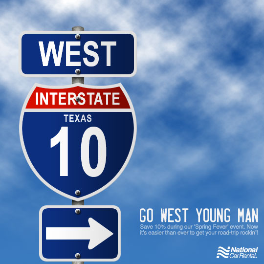
For my final image I added a few more signs using the same steps as the ones we used above and added a little ad slogan to complete the image… nothing too difficult, but sort of a neat effect all the same.
Lesson Files + Additional Resources
Download the free .PSD file and other lesson files Right Here.
Tell Your Friends
More in Graphic Design


27 Responses to Interstate Road Sign
Bill Goodman
April 28th, 2008 at 9:44 am
Once again awesome!
HERO
April 28th, 2008 at 10:09 am
Thanks Bill! I have to say this is probably one of my favorite tutorials so far!
Awesome
April 28th, 2008 at 5:23 pm
Keep up the tutorials, they are all really good
Vitec
April 29th, 2008 at 12:46 pm
Nice! Good work
Gilberto
April 29th, 2008 at 2:36 pm
Wow – you explain it so well, make it easy and it looks so good. Thanks!
Zephyr
April 29th, 2008 at 7:07 pm
AGAIN, NICE TUDO, I LOVED IT =D
Hero, congratulations again ;D
Cya !
Paulo Sales
April 30th, 2008 at 10:58 am
excelent as usual….congrats hero
HERO
April 30th, 2008 at 5:31 pm
Thanks Paulo and Zephyr, it’s great to hear from the regulars!
laura
May 7th, 2008 at 8:19 am
you ARE my hero! awesome tutorial.
Carsten
May 30th, 2008 at 4:01 am
Nice tutorial! Very informative. Keep up your great work!
jose d
June 2nd, 2008 at 2:08 pm
u guys should of had put route 69
HERO
June 2nd, 2008 at 4:34 pm
“should of had put” eh Jose?
Neil
June 14th, 2008 at 8:41 am
Nice!
Aaron
June 16th, 2008 at 3:58 pm
Very fun little tutorial, I’ve been using PS since version 1, 18 years ago, and still am just breaking the surface. Guess I could’ve purchased a book at some point, but it’s more fun learning from other people. So glad you put PCs second!
bhargav
February 6th, 2009 at 11:32 pm
nice signboards tutorial but i am not getting the fake clouds effect
HERO
February 7th, 2009 at 9:45 am
BHARGAV, What seems to be the problem?
Eunique
March 20th, 2009 at 11:35 pm
Great Tutorial! It was explained so clearly!
NoMo
June 21st, 2009 at 5:09 am
Hi Hero,
Your tutorials really are the best on the web, both in terms of the quality of the images produced and the ability to understand your instructions.
Thanks!
Lenny
August 13th, 2009 at 10:17 am
Great Tutorial! But I had a problem. When I was doing the Sign Color Highlight, and adding the layer mask, mine didn’t just brighten up the colors like yours. I got this big white thing? Can you help me?
Oh, and I am using CS
HERO
August 14th, 2009 at 9:32 am
Lenny, Did you change the layer’s blend mode to Color Dodge? (I’ve updated step 18 to be a bit more clear) but when all else fails, take a look at the picture.
jeewantha
October 13th, 2009 at 9:04 am
Thanks A lot. This is the best useful lesson I ever saw. Please send more lessons likes this. Thanks again.
evilkitty75
November 20th, 2009 at 12:27 am
i got stuck but then wen back n everythin worked out cool thx babs ur tuts rule!!
Joel
January 22nd, 2010 at 3:26 pm
really cool!
Charlie
March 25th, 2010 at 8:55 pm
Great article! Thanks for sharing.
Andrés
December 19th, 2010 at 8:51 pm
Muchas Gracias, me fue muy útil, gran trabajo !!
MJP
January 18th, 2011 at 11:06 am
Very nice! Thank you! I would think you would have added a touch of Noise to the Sign Color layer (giving that shiny metallic look like you used on the License Plate tut)
Kwei-Kofi
August 14th, 2011 at 7:05 pm
nice work done.really got me inspired.would love to learn more from you,cos u r a mentor to me.