


Watercolor Text
In this Photoshop tutorial I'll show you how to create a watercolor text effect with a watercolor paper background. You'll learn about a few of the the Brushes palette options and how they can help achieve a realistic watercolor result.Step 1
Watercolor is one of those mediums that can be difficult to replicate digitally, but with a little practice and experimentation I think you’ll find it can be rather fun. This tutorial will be based around creating a text effect, but this technique works just as well when creating paintings in Photoshop.
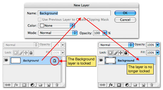
Lets begin with a new document, mine is 540×300 at 72ppi for those of you playing along at home. Since by default Photoshop locks the original Background layer in any new document, lets start by double clicking on the layer to bring up the New Layer dialog. Change the name in the dialog from Layer 0 to Background and click OK. This will effectively unlock the Background layer and make it a normal, workable layer.
Step 2
The reason we had to unlock the Background layer is because we need to add a Layer Style to it, which isn’t possible if the layer is locked. This Background layer is going to be the watercolor paper which we’ll be painting on later in the tutorial.
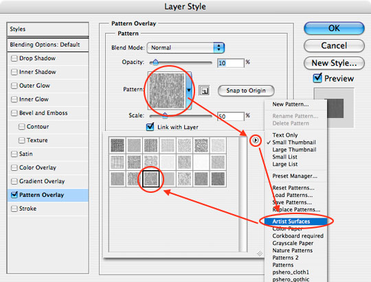
To add the layer style, lets go ahead and double click to the right of the layer’s name in the layers palette to bring up the Layer Styles dialog window (you can also access this dialog by Command-Clicking (PC: Right-Clicking) on the layer and choosing Blending Options from the menu). Inside the Layer Styles dialog box choose the Pattern Overlay option from the list on the left. Be sure to click on the words and not just the checkbox. Just clicking the checkbox will apply default Pattern Overlay settings, but clicking on the text will open the Pattern Overlay options section of the Layer Styles window.
Click on the pattern swatch to bring up the Pattern Picker. We want to load the Artists Surfaces pattern set, so click on the little circle with the arrow in the upper right hand corner of the Pattern Picker and choose Artists Surfaces from the drop down menu. The pattern we’ll be using here is "Wax Crayon on Sketchpad (150×150 pixels, grayscale mode)", if you place your mouse over each swatch, the tool tip will appear to tell you what the swatch is called.
Use an Opacity setting of around 10% and a Scale of 50% then click OK to apply the layer style.
Step 3
The Background layer should now have a slight texture visible. Be careful not to overstate the effect here, watercolor paper has a very subtle texture.

Step 4
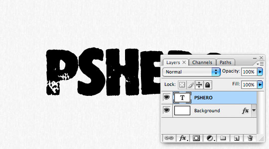
Now lets place some text on the stage. Press the D key to reset the foreground color to black and then press T to invoke the Type tool. Click on the stage and create your lettering. Choose a large bold font so you’ll have the most room to paint within. Using the text tool creates a new layer above the previous layer.
Step 5
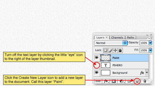
For the moment we’re done with the text layer we just created so lets temporarily turn it off by clicking the little eye icon to the left of the layer thumbnail in the Layers palette.
Next create a new layer by clicking the Create New Layer icon at the bottom of the layers palette. Double click on the new layer’s name and rename it Paint.
Step 6
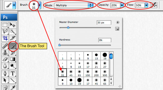
It’s now time to prepare our paint brush to create the watercolor effect. Start by pressing the B key to invoke the Brush tool. From the Brush Options bar at the top of Photoshop choose a brush that you’d like to paint with. For this tutorial I’m going to use a 35 pixel round soft edged brush which I chose from the default brushes in the Brush picker. Set the brushes Blend mode to Multiply, the Opacity to 10-20% and the Flow to 50%.
Step 7
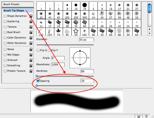
We need to set some additional properties for our brush, so lets open the Brushes palette by choosing Window>Brushes from the main menu. In the Brush Tip area, set the Spacing to 1% (for this brush that seems to be the most cohesive setting, if you’ve chosen a different brush this may vary).
Step 8
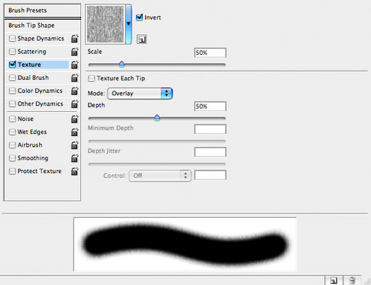
Choose Texture from the list and use the same settings and texture that we used to create our Background layer’s texture.
Step 9
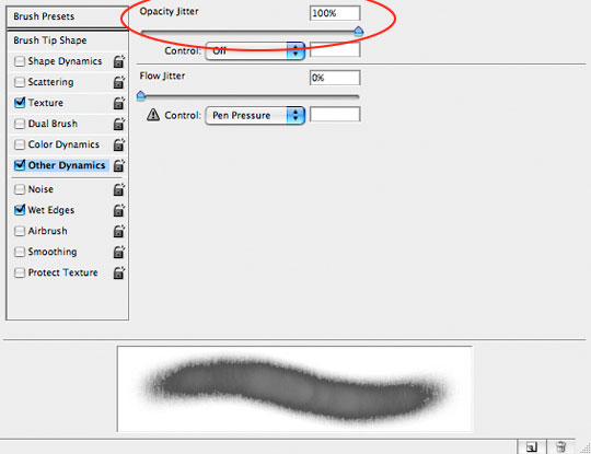
Choose Other Dynamics and set the Opacity Jitter to around 100%, again this one is brush dependant. Then check the Wet Edges option (this option has no additional settings). Now the brush is ready to use and you can close the Brushes palette if you’d like.
Step 10
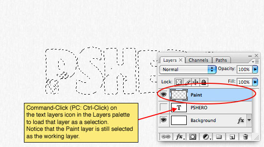
Since we really want to constrain the painting to the lettering we created on the text layer, lets load that layer as a selection by Command-Clicking (PC: Ctrl-Clicking) on the Text layer’s thumbnail in the layers palette. Notice that the Paint layer is still the selected working layer.
Step 11
Pick a nice dark color for your foreground color in the Tools palette and begin painting. Notice that the paint is constrained to the selection and if you release your mouse and begin painting again it will add dimension to the watercolor by showing overlapping brush strokes.
(*note: If the "marching ants" around the selection bother you, simply press Command-H (PC: Ctrl-H) to hide them. The selection will still be active and you can bring it back by pressing the same keyboard shortcut again.)

Step 12
Try switching colors and overlapping your brush strokes until you’re happy with the result. When you’re done, release the selection by pressing Command-D (PC: Ctrl-D) to deselect.

Step 13
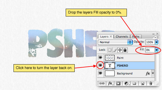
If you’ve ever looked at a watercolor painting up close, you’ve noticed that often the artist will have lightly sketched a basic line drawing directly onto the paper before they began to paint. This little line art makes for a neat effect and it’s the reason we’ve kept our original text layer. Lets click on that original text layer in the layers palette to make it our working layer and click on the little empty box where the eye icon used to be to turn the layer back on.
Obviously we don’t need the black color of the text, so lower the layer’s Fill opacity to 0%.
Step 14
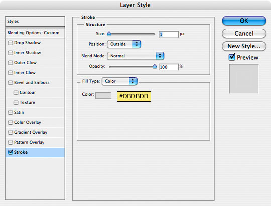
Now lets open the Layer Styles dialog box for this layer (just like we did in Step 2) and this time we’re just going to add a 1 pixel Stroke (outline) to the text as shown below. Once you’ve applied the stroke, click OK to commit the Layer Style.
Step 15
Usually the artist won’t have painted exactly within their pencil lines, so press V to invoke the Move tool and then using the arrow keys on your keyboard (or by dragging with your mouse), move the outline just a touch so that it’s just offset from the painting. If you feel that the outline isn’t dark enough for your tastes, you can always go back and darken it by applying a darker gray in the Stroke layer style.

Step 16
And there you have it, a nice little text effect using watercolors. Like I said in the beginning, this is one of those techniques that requires a little practice to get good at, and by experimenting with different brushes and varied settings, you can get some really great results.
When I got finished I decided that my colors needed a little more pop so I added a Hue/Saturation adjustment layer to the top of the stack. If you download the .PSD file at the end of the lesson you can see exactly how that works.

Lesson Files + Additional Resources
Download the free .PSD file and other lesson files Right Here.
Tell Your Friends
More in Text Effects


37 Responses to Watercolor Text
Signal
May 26th, 2008 at 12:26 pm
great job!
Ghost Boots
May 26th, 2008 at 4:38 pm
Another Great Tutorial… Thanks!
ph15h
May 27th, 2008 at 12:15 am
How much do you pay for all of your awesome fonts? Lol. Another great tutorial. :D
D.A.T.
May 27th, 2008 at 8:34 am
hey, great tutorial. If it makes it easier I have some free paper textures including watercolor paper if anyones interested. http://www.digital-artist-toolbox.com/?p=12
HERO
May 27th, 2008 at 1:58 pm
D.A.T.
Typically I’m not a fan of having links to external files on the site since I have no control over the content, but it looks like you’ve got something nice to offer so I’m going to leave your link active. Thanks for the comment and the contribution.
HERO
May 27th, 2008 at 1:59 pm
PH15H,
Way way too much!
D.A.T.
May 30th, 2008 at 8:17 am
thanks pshero. Keep up the good work here.
crazyhunk
June 5th, 2008 at 3:33 am
really good… I love it…
BTW.. if u do mind would u let me know the name of the font used… :
Thanx
David Leggett
June 9th, 2008 at 7:58 am
This is one of your best tutorials up to date in my opinion! Love the effect mate! Very nice work. I can certainly see myself using this technique a lot in the future =)
Zephyr
June 10th, 2008 at 7:56 pm
Really cool :D
Gz Hero !
Ryan Person
June 16th, 2008 at 9:27 am
Fantastic!
Sosty Pasha
June 25th, 2008 at 7:14 am
^^ What a nice text effect !!
I’m asking U Mr. Hero to take permission for translating this tut to Arabic for the Arab audiance .. So can I ?
HERO
June 25th, 2008 at 9:41 am
SOSTY,
I think that would be fine.
Caffeine
July 13th, 2008 at 9:43 pm
How did you do that background effect? Could you link me to a tutorial of it if you did one?
idk
January 10th, 2009 at 4:45 pm
how do you do the background?
andimiswar
January 22nd, 2009 at 10:17 am
i like it! great job man!
KMR
January 28th, 2009 at 2:50 pm
Wow this is AMAZING!
The font is RubberMaid isn’t it?
Surendra
February 13th, 2009 at 6:37 pm
The font name is Stomper…You can download it from here:: http://new.myfonts.com/fonts/madtype/stomper/
Pedro
April 7th, 2009 at 9:12 am
Another amazing tutorial. Thanks.
Derek
April 11th, 2009 at 4:04 pm
Heey man,
Great tutorial and a superb effect! The only question left: How to do that background?
tim
April 16th, 2009 at 8:46 pm
great tutorial! thx for this effect!!!
photo retouching
May 10th, 2009 at 11:09 am
another great tutorial! Still finding your site really resourceful!
waLton
May 23rd, 2009 at 4:36 am
wooh cool,so nice..
Toughbook Drivers
May 24th, 2009 at 8:13 am
Thank you, very nice job!
zakeira
October 10th, 2009 at 10:38 pm
thanks so much!
Barbra
November 30th, 2009 at 10:03 am
Awesome tutorial! Thank you!!
Joel
January 29th, 2010 at 2:14 pm
This page rocks!
wilber barrera
February 7th, 2010 at 5:18 pm
como hicistes el fondo quisiera saberlo gracias
Kimberly
March 7th, 2010 at 8:38 am
So Cool!
I love the detailed instructions. I did run into a small problem when I went to pain, but I was [somehow] able to figure it out. :)
Victoria Web Design
March 23rd, 2010 at 5:32 pm
Great tutorial, I’ll be adaptiing these techniques for a different look…much appreciated!
T-Shirt Druck
April 19th, 2010 at 2:03 pm
Great Stuff, thanks for the Tut…
Priyank
July 9th, 2010 at 6:36 am
Cool tutorial man…..superb effects especially with the brush settings….needed sumthing just like dis 4 my wrk…..will post the link wen i’m done with it!
Marion
July 14th, 2010 at 4:07 am
Very nice explanations. I have to read it one more time to master it, but I think I can make it.
Denver Photographer
September 7th, 2010 at 3:54 pm
I like the shortcut for hiding the marching ant’s ive never seen that one before. Hopefully I don’t totally forget it by the next time I want to use it.
Sussie
December 12th, 2010 at 2:30 pm
I would love a complete tut on how you did the background especially how it curves around the text :)
Muhammad
May 30th, 2011 at 1:10 pm
Greaaat, daaamn been going through so many tutorial sites for something like this, and the other great thing is the .psd download file you have included, thanks llot man :) keep up the great work!!
denver wedding photography
August 3rd, 2011 at 9:11 am
Great. Now i have another lesson learned. Thanks for sharing.