


Volkswagen Inspired Navigation
It's always fun to get an email from a reader with a very specific request. In this case the request was for a tutorial based on the the car stereo style navigation bar used in Volkswagen's website.Introduction
This tutorial assumes that you know your way around Photoshop enough not to need too much hand-holding. You should know your way around the Layers palette and know how to add Layer Styles, use Custom Shapes and Clipping Masks without much explanation.
(*note: This is a tutorial about creating the navigation of this piece and not about creating the Volkswagen logo. I have however included the layers used to create my final product in the .PSD download at the end of the lesson if you’re curious about how I did it.)
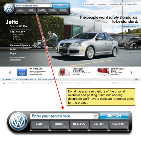
Step 1
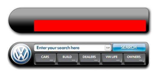
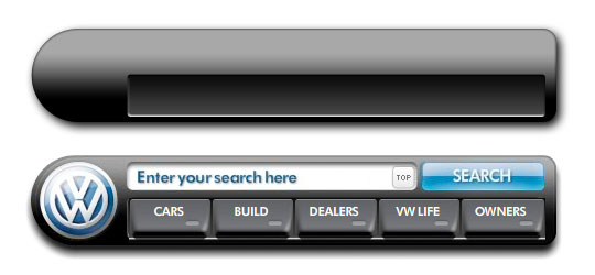
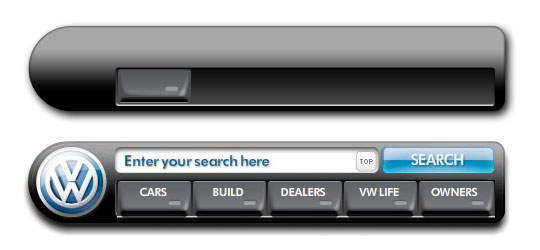
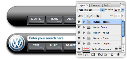
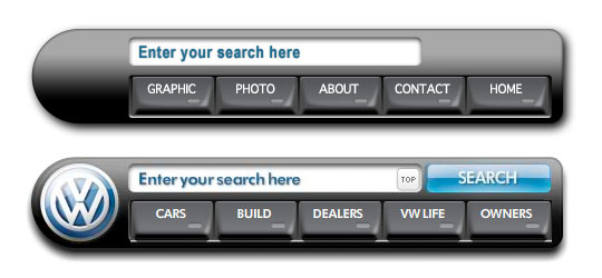
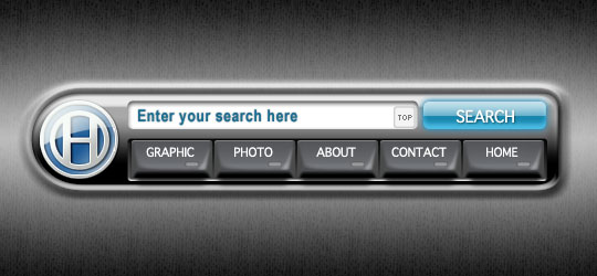
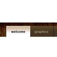
Lets begin by taking a look at the original navigation bar on Volkswagen’s website. At this point I’ll take a screenshot (screen capture) of the navigation and past it into my new working document so that we’ve got a constant reference to work from as we go. My working file is 540×250 pixels at 72ppi, as always if you decide to work at a different resolution you’ll need to adjust your layer styles accordingly.
(*note: As luck would have it, Volkswagen’s website was built in Flash and it loads the navigation before the rest of the page, so with a little lucky timing you can capture the navigation bar before the background image has loaded.)
Step 2
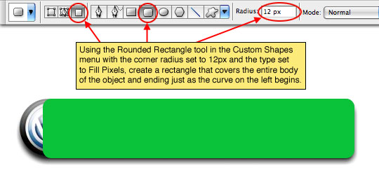
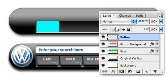
Obviously our first layer will be the one created when we paste the original Volkswagen nav into our document, so lets create a new layer called Base and with the Custom Shape tool set to Rounded Rectangle with a corner radius of 12px and set to Fill Pixels draw a rectangle over the original object ending at the curve on the left side. Use any color you’d like because we’ll be covering it with a layer style a few steps from now.
Step 3
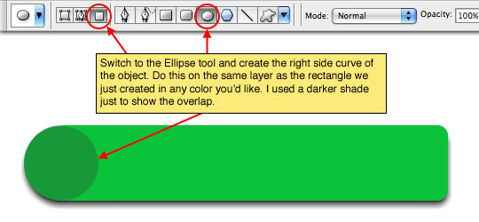
With the Custom Shape tool still selected switch to the Ellipse and draw in the circle on the left side. I’ve used a darker color so you can see the overlap, but again, color makes no difference.
Step 4
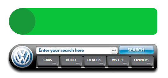
Switch to the Move tool by pressing the V key and drag the new shape upward until both the original and the new Base are visible.
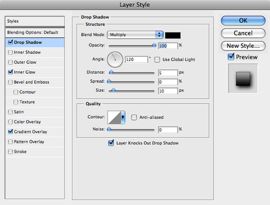
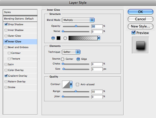
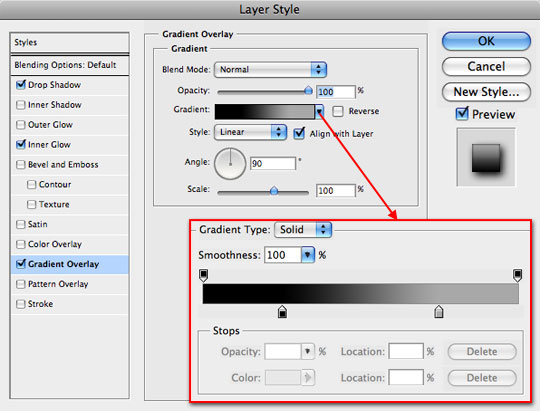
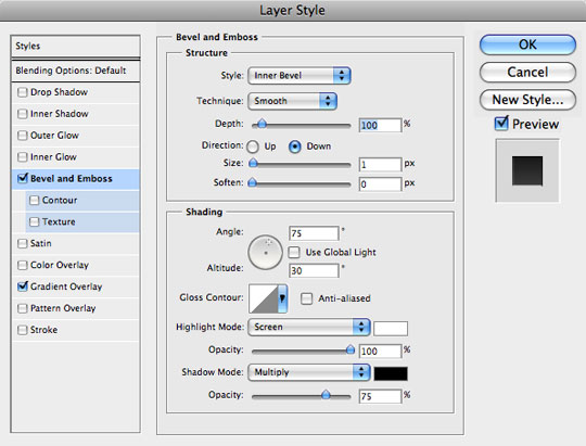
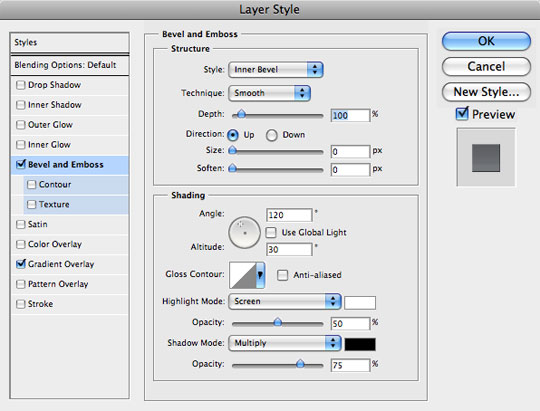
Step 5
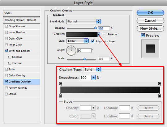
Now lets add some Layer Styles to the Base layer to get it looking like the example. We’ll be using a Gradient Overlay to get the black to gray effect, an Inner Glow to create the outline and a Drop Shadow. Use the colors #000000 and #A8A8A8 in the Gradient Overlay and be sure to pull in the sliders like in my example below.
Step 6
With the Base complete lets move on to the cutout where the buttons live. Create a new layer called Button Background. In the example the corners of the area are slightly rounded so lets grab the Custom Shape tool set to Rounded Rectangle but this time with an edge radius of just 3. If it helps you to get things sized correctly feel free to drag your shape onto the stage directly over the top of the example just like we did before, then move it up into position when you’ve got it right. Again, color here doesn’t matter because we’ll apply another set of Layer Styles in Step 7.
Step 7
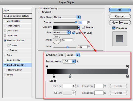
As promised, here are the layer styles for your Button Background layer. Pay special attention as we work through the layer styles in this tutorial because often I’ve unchecked the Global Light setting to achieve a certain effect. The colors for the Gradient Overlay are #484848 and #000000 with the sliders left in their default positions.
Step 8
Your Button Background layer should now look inset into the Base layer as shown below.
Step 9
Now lets get started creating the buttons that will sit inside the Button Background. We will first create one button completely, then we’ll group the layers and duplicate the group to create the other buttons. But first things first, create a new layer called Button and again using the Custom Shape tool drag a Rounded Rectangle with an corner radius of 2px. Again feel free to draw over the original example to get your button just the right size, then drag it into place when you’ve got it right. At the risk of sounding like a broken record… color doesn’t matter this time either.
Step 10
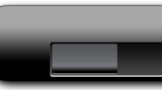
Here are the layer styles for your Button layer. Your Gradient Overlay colors from left to right are #000000, #74767a and #535558. Be sure to pay attention to slider placement. You may also want to work with the midpoint sliders between the color sliders to adjust the transitions to your liking.
Step 11
The Button should now look something like this (I’ve zoomed in so it’s easier to see).
Step 12
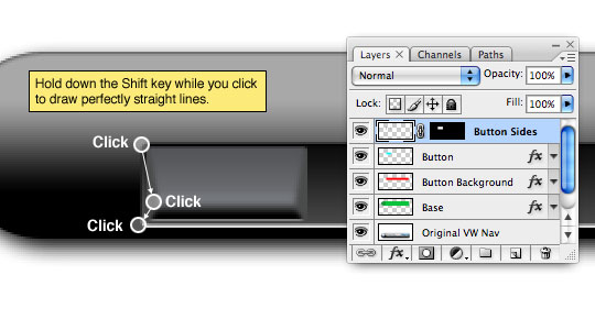
Next we’re going to make a selection of the Button by holding the Command (PC: Ctrl) key and clicking on the Button layer’s thumbnail in the Layers palette. With the selection made, create a new layer called Button Sides and click the Add Layer Mask icon at the bottom of the Layers palette to create a Layer Mask on the new layer using the selection.
We’re going to draw in the right and left sides of the button now. Switch to the Brush tool by pressing the B key and choose a round soft edged brush that’s around 8 pixels in diameter, make sure that the hardness is set to 0%. Set the foreground color to #4A4B4B and then starting at the top left corner click once then holding down the Shift key click a second time at an angle into the button where the black gradient meets the gray, then while shill holding Shift click on the lower left corner. This should create a nice angled edge as shown below. Do the same to the right hand side and fill in any areas that you may have missed at the edges.
Step 13
Create a new layer called Shadow Highlight directly below the Button Sides layer we just worked on. We’re now going to create an area where we can paint in a highlight and shadow without effecting the other areas.
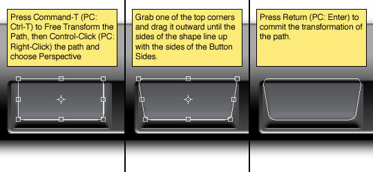
Grab the Custom Shape tool once again by pressing the U key, select the Rounded Rectangle with a corner radius of 4 pixels but this time make sure the Paths option is selected. Click and drag a path onto the stage in the center of the button from one edge of our newly created Button Sides to the other. Press Command-T (PC: Ctrl-T) to Free Transform the path then Command-Click (PC: Right-Click) on the path and choose Perspective from the menu. Grab one of the top corners and drag it outward to expand the top of the shape until the sides line up with the Button Sides as shown below then press Return (PC: Enter) to commit the transformation.
Step 14
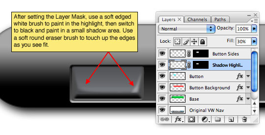
Convert the path to a selection by pressing Command-Return (PC: Ctrl-Enter) and then press the Create Layer Mask icon at the bottom of the Layers palette to create a mask on the Shadow Highlight layer using the selection.
Switch back to the Brush tool by pressing the B key and using a foreground color of white paint a small highlight into the lower right corner of the button. Once the highlight looks right to you, switch the foreground color to black and paint a little shadow into the left hand corner. Adjust the layer’s Fill opacity down to about 30% or as looks best to you.
(*note: I used a round soft edged brush with the Eraser tool to soften the edges a little further once I got the basic highlight and shadow in place.)
Step 15
Create a new layer at the top of the layer stack called Light Off. Set your foreground color to #98999A and using the Custom Shape tool set to Fill Pixels, Rounded Rectangle and 2px create the little light indicator onto the button as shown below.
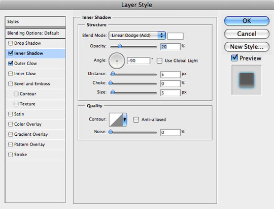
Step 16
Add a slight Inner Shadow to the Light Off layer to add a little depth.

Step 17
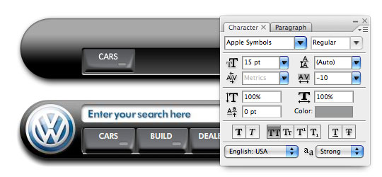
Add your text to the button by switching to the Type tool by pressing the T key and setting up your font and color in the Character palette. I’m using the font Apple Symbols though Arial and Helvetica are pretty decent substitutes. I’ve adjusted the Tracking to -10 to more closely mimic the original.
Step 18
Now that we’ve got the button completed select all the layers that make up the button in the Layers palette and press Command-G (PC: Ctrl-G) to group the layers into their own folder. Then duplicate the folder by Control-Clicking (PC: Right-Clicking) on the group and selecting Duplicate Group from the menu. Slide the duplicate to the left until it sits comfortably in the next button spot and repeat until all 5 buttons are complete. Be sure to name each group and feel free to go change all the button labels.
Step 19
Next lets add the search field above the buttons. Create a new layer at the top of the layers stack called Search Field. Here comes the broken record again… Press U to switch to the Custom Shape tool, choose Rounded Rectangle set to Fill Pixels with a corner radius of 5px, with your foreground color set to white drag the field onto the stage. Oh yeah, and it’s still easier to get the size perfect if you draw over the original example and then move it into place… as if you didn’t already know.
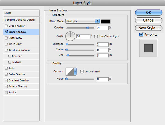
Step 20
A simple little Inner Shadow will give the Search Field the depth it needs. Notice that I’m using a 90° angle for the shadow rather than selecting the Global Light checkbox.
Step 21
Grab the Text tool by pressing T, set the color to #005d86 and put your type inside the search box. I found that Arial Narrow works nicely at 15pt Bold with the Tracking set to 35.
Although it’s not needed, I added a Drop Shadow layer style with the settings in the second image below to add that final touch of depth that makes it look just like the original. I also lowered the layer’s Fill opacity to 90%.
Step 22
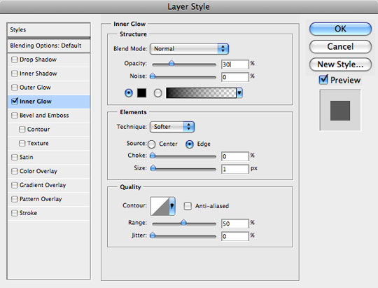
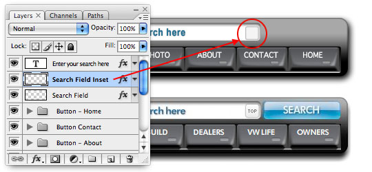
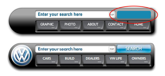
Now lets add the little button that’s inset in the Search Field. Add a new layer just above the Search Field layer called Search Field Inset. Are you ready for the broken record again? … Custom Shape tool … Rounded Rectangle set to Fill Pixels with a corner radius of 2px, foreground color set to #f4f4f4… and don’t forget to hold the Shift key while you drag to constrain it to a perfect square.
Now add this simple Inner Glow layer style to put the shadow around the edges like the original.
Step 23
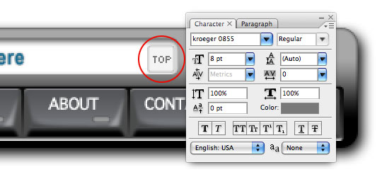
Press the T key to switch back to the Type tool and using a pixel style font like Kroeger 0855 – which is the exact font Volkswagen used and can be downloaded for free at DaFont.com – at a size of 8pt place your text in the box.
Step 24
Lastly lets create the search button itself. Create a new layer at the top of the layer stack called Search Button and… you guessed it DJ, play that record one more time! (Rounded Rectangle, 5px, Fill Pixels, Foreground Color #1988AF)
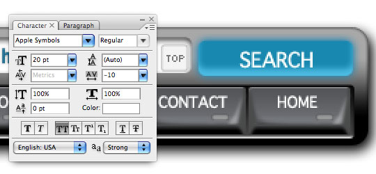
Step 25
Now lets add the text onto the Search Button by switching to the Text tool and using the same font that we used for the text on the buttons (in my case it’s Apple Symbols again) set to 20pt. I also reduced the tracking to -10 to make it match up exactly with the Volkswagen example.
Step 26
Now lets add the slightest hint of a Drop Shadow to the text to add depth and make it look just like the original.
Step 27
The finishing touch to our Search Button will be to add a Web 2.0 style highlight to it. Create a new layer at the top of the layer stack called Search Button Highlight. Load the Search Button layer as a selection by holding down the Command (PC: Ctrl) key and clicking on the Search Button layer’s thumbnail in the Layers palette (*note: you should still have the Search Button Highlight layer selected as the working layer).
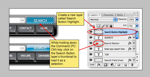
Step 28
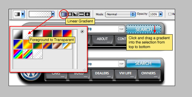
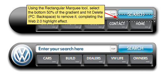
Press D and then X to reset the foreground and background colors to black and white and then to switch white to the foreground. Press G to switch to the Gradient tool and select Foreground to Transparent and Linear from the Gradient Options bar at the top of Photoshop. Then simply click and drag a gradient from the top to the bottom of the selection.
Step 29
Finally switch to the Rectangular Marquee tool by pressing the M key. Drag a selection around the lower half of the gradient and hit Delete (PC: Backspace) to remove the bottom half of the gradient and complete the Web 2.0 highlight.
Step 30
And that my dear friends completes this tutorial. As I said in the introduction, I’m not going to cover the creation of the Volkswagen logo, but if you’d like to see how I built mine check out the .PSD download at the end of the lesson.
I hope you were able to learn something new and useful!
Lesson Files + Additional Resources
Download the free .PSD file and other lesson files Right Here.
Tell Your Friends
More in Graphic Design

61 Responses to Volkswagen Inspired Navigation
Oyun
June 21st, 2010 at 5:53 am
great article very interesting and useful
Sac ekim
June 22nd, 2010 at 2:08 am
great article my friend
oyun oyna
July 9th, 2010 at 8:47 am
Its really great work Thanks
emlak
July 31st, 2010 at 3:20 pm
Nice sharing ,bravoo
mario
August 28th, 2010 at 7:31 am
thank you for the very nice tutorial, super.
dizizle
August 31st, 2010 at 6:41 am
Thank you for inspiration
Hwang
October 18th, 2010 at 6:22 pm
so good~~!!!
thank you~!
Flashspiele
October 25th, 2010 at 4:31 pm
Thank You for the tutorial, it did help me.
pearlie
December 13th, 2010 at 6:14 pm
Excellent tutorial, thanks! One little thing you overlooked, tho, in step 4 – merge the two layers before adding the layer styles to the base shape.
Miguel
April 7th, 2011 at 7:10 am
Thanks for the cool tutorial.
Bettnässen
May 21st, 2011 at 8:04 am
Wow, you’re great