


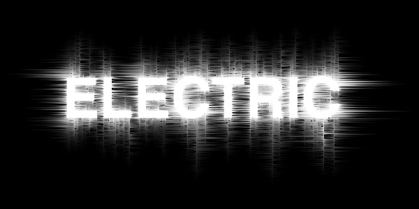
Electrifying Text
In this tutorial we will be using the Wind and Ripple filters along with some tricky rotation to create some truely electrifying text.Step 1
Open a new file 600 x 300 at 72dpi and fill the background with black.
Select the text tool (T) and type the lettering you want to effect on the stage. I’m using Helvetica 80pt Bold in this example. Now right click on this type layer in the layers palette and select Rasterize Text. This turns our text into a graphic (*note: the text will no longer be editable). Rename this layer Wind by double clicking on the name of the layer.

Step 2
Duplicate the Wind layer by pressing Command+J (CTRL+J on PC) and call this new layer Text. (*note: the Text layer should be above the Wind layer in the layers palette.)
Hide the new Text layer by clicking the little eye icon in the box to the left on the layers paette and click back to the Wind layer. Rotate the contents of the layer 90° (Edit>Transform>Rotate 90° CCW). (*note: The Wind filter that we’ll be using next only blows Right or Left, which is why we rotated the layer. Some of your text may be outside the visible area of our stage but not to worry, effects will be applied to those areas as well.)

Step 3
Next we are going to apply the Wind filter to our Wind layer by selecting it from the filters menu (Filter>Stylize>Wind) and choosing the Wind and From The Right options. Click OK and you will see that the wind filter has blown pixels from left to right on our layer. The wind filter is a little weak on the first pass so let’s apply the filter again. This can be done easily by pressing the "Last Filter" quick key Command+F (CTRL+F on PC) . Next lets re-open the Wind Filter dialog box Filter>Stylize>Wind and repeat the process blowing the wind From The Left twice.
Now rotate the layer back to normal (Edit>Transform>Rotate 90° CCW) and repeat the previous steps blowing wind in each direction twice.
Step 4
While still on the Wind layer apply the Ripple filter (Filter>Distort>Ripple). The default 100 and Medium settings are fine so click OK.
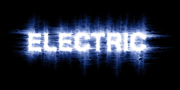
Merge the Wind layer with the black Background layer by pressing Command+E (CTRL+E on PC) and create a new layer above that merged layer by clicking the New Layer icon at the bottom of the layers palette or by pressing Controll+Option+Shift+N (CTLR+ALT+SHIFT+N on PC). Call the new layer Blue.
Click on the foreground color in the tools palette and pick a nice shade of blue, I used #1942aa for this example. Change the blend mode in the layers palette to Color and drop the Fill opacity to around 60 percent.
Step 5
Next click on the Text layer that we hid earlier and un-hide it by clicking the empty box to the left in the layers palette. It’s possible that with our rotating and wind that the layer isn’t directly on top of our Wind layer anymore so go ahead and line them up. This can be done by either selecting the Move Tool (V) and moving the text with your mouse, or by selecting the Move Tool (V) and using the arrows on your keyboard.
Select the contents of this layer by holding down the Command key (CTRL on PC) and clicking on the layers thumbnail in the layers palette. We want to shrink the selection by 2 pixels so go to the Select menu (Select>Modify>Contract), choose 2 pixels and click OK.
Fill this selection with black by clicking on the foreground color in the Tool palette and dragging the selector to black or by simply pressing the (D) key on the keyboard which will reset the foreground/background colors to black and white. Fill the selection by holding the Command key and pressing Delete (CTRL+Delete on PC). Deselect the selection by pressing Command+D (CTRL+D on PC) and we’re finished!

Lesson Files + Additional Resources
Download the free .PSD file and other lesson files Right Here.
Tell Your Friends
More in Text Effects


35 Responses to Electrifying Text
Ron Peeleman
November 4th, 2007 at 2:15 pm
Without question the best Photoshop tutorial web site on the internet!
Full of clear and concise instructions, and what I love the most is that you didn’t fall into the trap that so many tutorial websites do. Instead of telling us to blindly perform this and then that step, you explain WHY the action is required.
This is revolutionary. This is educational and well worth the investment of my time and effort, because I’m…learning.
Kudos. Keep up the great–and I mean great–work.
Ron P.
The Hero
November 4th, 2007 at 2:45 pm
Thanks for the kind words Ron, I’m still finding my feet when it comes to writing technical instruction but I’m glad that so far you are finding it to your liking.
Amit
March 20th, 2008 at 11:57 pm
boss, i’m in love with this site. I want to try every tutorial of this gr8 site. that’s why I am starting from first :). thanks a lot!
Francesca Ngo
March 21st, 2008 at 8:39 pm
Oh I feel so geeky but I love it so much!
HERO
March 21st, 2008 at 9:18 pm
Welcome to my world Francesca!
Fran
May 12th, 2008 at 8:34 am
thankyou for allowing me to get excellent results even though I have no idea what I’m doing. Please keep up the great work. I tried the denim patch (looks pretty good) but I have no idea how to get the star on there, will you be explaining that one day? thanks again
R Tambun
May 12th, 2008 at 9:35 am
I failed to follow 4th step, I couldn’t blue-ing the effect, I clicked blue layer, changed the normal to color, dropped the fill into 60% and nothing happened, perhaps my english is not good enough to understand
geozien
May 12th, 2008 at 4:43 pm
Same of author of the previous comment. The explanation concerning blue layer is false. It doesn’t work !! Otherwise no problem !
HERO
May 12th, 2008 at 10:31 pm
R Tambun and Geozien … are you filling the Blue layer with color? This step works just fine, so if you’re still having problems, please download the .PSD file at the end of the lesson and take a look at the source file. Hopefully that will help.
geozien
May 14th, 2008 at 5:59 am
OK my mistake was in layer blue indeed, i forgot to change mode in the layers palette to Color !
tnx a lot, very nice tutorial by the way ! <3
Celwin
June 26th, 2008 at 8:26 am
I love your tutorials man! You have a great way of describing stuff and they’re very easy to do but look AMAZING!!
Justin
July 3rd, 2008 at 4:18 am
AWESOME with a capital AWE!
Thanks you so much, normally I run around trying to follow other peoples tuts and get so confused i give up. the site has been bookmarked and I am a follower of your teachings. Please more, I have all the time in the world for them. Well thats enough smoke up your ass for one day. Thanks again
Justin
HERO
July 3rd, 2008 at 11:25 am
JUSTIN,
My ass thanks you.
mattches
July 7th, 2008 at 11:22 pm
When i get to step 3 my wind filter is unusable? any suggestions or ideas why that would be the case?
HERO
July 8th, 2008 at 9:53 pm
MATTCHES,
I can think of three reasons this may happen, either your document isn’t in RGB mode (which can render some of the filters unavailable), you don’t have the visible layer selected (perhaps you have the hidden layer selected still as the working layer) or you didn’t rasterize your text. If your layer thumbnail still shows a big T in it, you need to rasterize it before applying the wind. I hope one of those ideas gets you back on track.
onyx
August 11th, 2008 at 1:07 pm
TKS! Again!
Amitai
October 15th, 2008 at 3:33 pm
That is one hell of a tutorial..
carlos
December 3rd, 2008 at 7:12 pm
dude u deserve that nick name “hero” cuz u really are one finally i found a real PS tutorial page w. real comprehensive guides keep it up man i hope more people like you get encourage to make web pages like this one thumbs up :D
Subash Aryal
December 19th, 2008 at 5:01 am
Thank very much 4 the nice text effect :-)
Vijay
January 1st, 2009 at 8:53 pm
Wow!!! Great tutorial. I did it confidently without any problem. Hero you not only showed how to create electric effect but also taught shortcuts, filters and such important thing. Only expert can tell people complicated things in simple manner. Thanks for being here.
Tarun
March 25th, 2009 at 11:45 pm
Hey man, nice to see the great work you’re doing here, keep up. Just as an extra addition, I just worked it out and tried my own thing at the last step. I filled the “Text” layer completely back and set it to Overlay. What I got was also Electric :P
Check it out [font used was WST_Czec] :
http://img104.imageshack.us/my.php?image=electric.png
Greyk50
March 26th, 2009 at 1:54 am
Wow… this is awesome, I mean all of your TUTS are…
Thanks for sharing!!
Mohammed
June 28th, 2009 at 3:33 am
Thank u so much Mr PSHERO, i will never forgot you. thank’s man and good luck.
SirTallGuy
September 28th, 2009 at 11:38 pm
The most comprehensive PS tutorial site, bar none. Absolutely perfect! Thanks you so much for sharing your work.
moises
January 17th, 2010 at 12:27 pm
tnx for new knowledge…it’s awesome..
bill
February 18th, 2010 at 10:51 am
In the instructions you state to turn the backround black, Explain how.
Matt
February 19th, 2010 at 9:27 am
I changed the blend mode to color and the fill to 60%, changing the foreground color to blue beforehand. However, the image is still black and white. Can you explain what Im doing wrong?
HERO
February 19th, 2010 at 11:57 am
MATT, This might sound like a silly question, but you did fill the layer with blue right?
Deb Lein
April 11th, 2010 at 9:41 pm
Love, Love, Love it!
Cyndi
April 19th, 2010 at 7:14 am
Really liked this one :-)
Travis Richey
May 22nd, 2010 at 4:44 pm
Love your work! Very easy to follow for a n00b like me. I’m trying out this particular effect as a possible use for my actor postcards. I love that you’re still getting comments 2.5 years out!
I snagged on some of the same things that others did, too but managed to figure stuff out.
Thanks,
~Trav
Steve
June 11th, 2010 at 5:51 am
Is it possible to do this with a pdf file of an image?
Thank you so much for these tutorials!
HERO
June 11th, 2010 at 11:34 am
STEVE, This could work, depending on the image and how you plan to use it. Give it a try, see what happens!
lester
March 10th, 2011 at 1:06 am
thanks man,,its cool,,it helped so much,,
ANKER
May 18th, 2011 at 4:59 am
Thank very much 4 the nice text effect :-)