

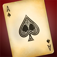
Antique Ace Of Spades
In this tutorial we will be creating an aged ace of spades using multiple layers with various blend modes and a nice overlay trick with a photo from iStockPhoto. This technique also works quite well for creating an aged paper effect.Step 1
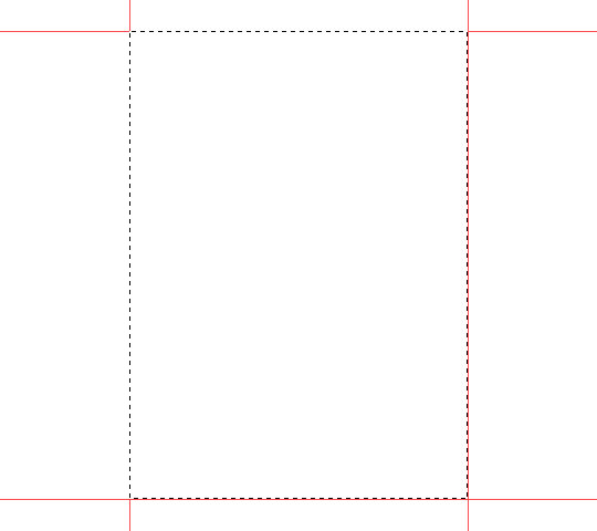
Open a new file 540×480 at 72dpi with a white background.
First we are going to define our playing card size. Standard playing card aspect is 1×1.4, so I’m going to drag out a selection at that aspect, ending up with a selection that is 306×423. I’ll center it on the stage and then set guides to each side.
Step 2
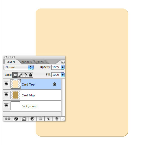
With the card space defined, select the rounded rectangle tool from the custom shape menu with a corner radius of 20, set your foreground color to #c8a762 and draw out a rectangle fit to the guides we laid out in step 1. Name this layer Card Edge.

Step 3
Duplicate the Card Edge layer by pressing Command-J (PC: Ctrl-J), lock the layer’s transparent pixels in the layer palette then fill this new layer with #ffebc6. Rename the layer Card Top. Switch to the Move tool by pressing V, then using the arrow keys move this layer up and left one pixel each. This will allow the Card Edge layer to become the right and bottom edge of the card.
(*note: you may hide your guides now by pressing Command-H (PC: Ctrl-H).
Step 4
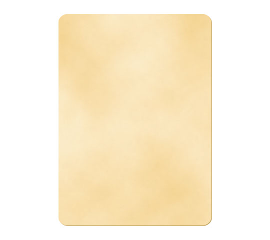
With the new Card Top layer selected (and the transparent pixels still locked), set your foreground color to #ffebc6 and background color to #f4d7a2.
From the main menu choose Filter>Render>Clouds. This will use the foreground and background colors we just set to create a cloud effect on the surface of the card. I like this effect to start because it adds a nice variation of tone to the background.
Again from the main menu choose Filter>Noise>Add Noise with a setting of 2, Gaussian and Monochromatic and click OK. The noise filter adds a little texture and crunch to the surface, but is a little to exaggerated and needs a touch of toning down.
From the main menu choose Filter>Blur>Gaussian Blur with a setting of 2 and click OK.
Step 5
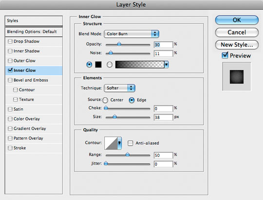
Add the following Inner Glow layer style to the Card Top layer by double clicking to the right of the layer name in the layers palette OR by right clicking on the layer and selecting Blending Options from the drop-down menu.
Step 6
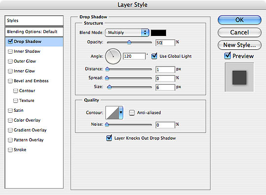
Next add a drop shadow to the Card Edge layer by selecting the layer and then double clicking to the right of the layer name in the layers palette OR by right clicking on the layer and selecting Blending Options from the drop-down menu.
Step 7
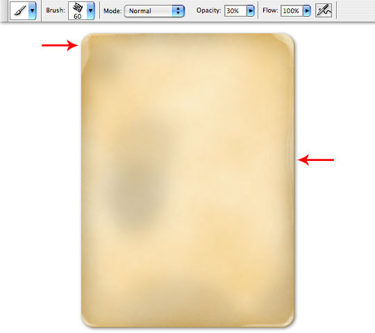
Next, add a layer above the Card Top layer by first selecting the layer and then by clicking on the new layer icon at the bottom of the layers palette OR by pressing Command-Option-Shift-N (PC: Ctrl-Alt-Shift-N). Name this layer Burn and lower the layer’s Fill opacity at the top of the layers palette to 20% and link it to the Card Top layer as a clipping mask by holding the Option (PC: Alt) key while clicking the divider line between the two layers OR by right clicking on the Burn layer and selecting Create Clipping Mask from the menu.
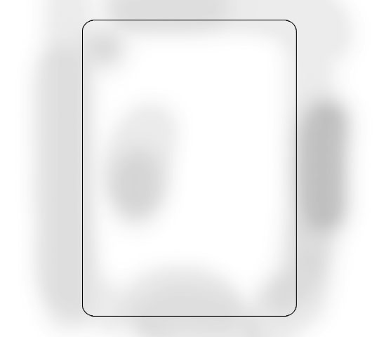
Using a round paintbrush around 70px in diameter with a hardness setting of 0, blend mode of Color Burn and Opacity around 30%, paint in some dark areas of the card. I’ve turned off my Card layers in the photo below to show my burn pattern. I outlined the card so you can see where the burns are in relation to the card.
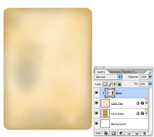
In the following image I’ve turned back on the Card Top and Card Edge layers so you can see the result of the Burn layer.
Step 8
Create a new layer above the Burn layer, name it Dodge and create a clipping mask with this layer as well (*note: now both the Burn and Dodge layers should be linked to the Card Top layer ) and with the Brush tool selected choose the Chalk 60 pixels brush from the brushes menu. The brush should be set to Normal with an opacity of 30%.
With the Chalk brush paint randomly around the edges and especially lightly into the corners of the card. With the opacity set at 30% we you can paint overlaying strokes over small areas to make the paper look worn or even torn a bit. See the setting and edge effects in the example below.
Step 9
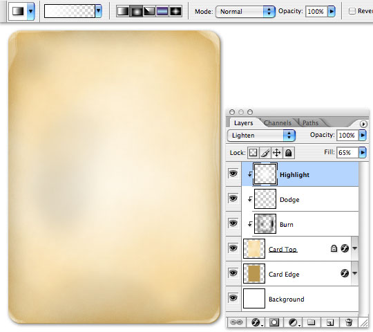
Create a new layer above the Dodge layer, name it Highlight and create a clipping mask (*note: now we have 3 layers clipped to the Card Top layer).
Choose the Gradient tool from the Tools bar, set your foreground color to white and the gradient settings to Foreground-Transparent and Radial Gradient as pictured in the detail below, then clicking on the center of the card, drag the gradient to the top or bottom of the card. This will create a nice center highlight. So far we’ve been burning and antiquing the edges of the card where playing cards see the most use, but the center of playing cards doesn’t get nearly as much abuse so it needs to be a bit lighter.
Step 10
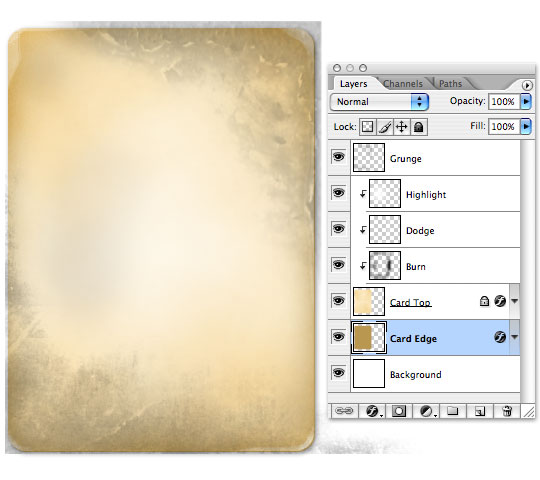
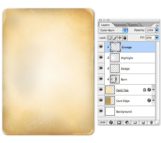
Because I still feel like the card needs more abuse, I’m going to select a few of the grunge brushes that I keep in my pocket for just such an occasion. I’ll add a new layer on top and call it Grunge, add it to our Clipping Mask, change the layer blending mode to Color Burn and drop the opacity to 60. Then with a few of the corner grunge brushes, I’ll hit the corners of the file for extra detail. (*note: the grunge brush set I used is included in the tutorial zip file at the end of the lesson.)
The first example below shows the grunge at 100% opacity and Normal blending, the second shows the layer with the settings above and clipped to it’s sub-layers.
Step 11
Ordinarily at this stage I would have created a vector file for the center spade graphic as well as small spades to go beneath the A’s in the corners, but I thought we would use an image from iStockPhoto instead and work a little blending mode action. I found and downloaded this nice ace of spades photograph, however, it wasn’t shot at exact center, so the perspective was a little off so I isolated the card, created a layer mask to remove the background and a Levels layer to bring the blacks down and the whites up as shown below.
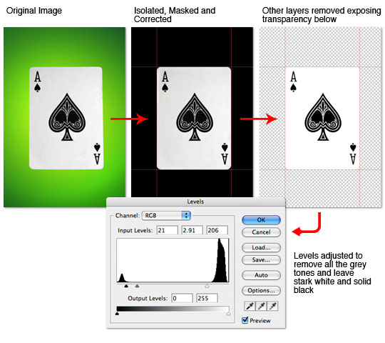
Step 12
Once the graphics were isolated to basic black and white I turned off all the background layers and copied all the visible layers combined by pressing Command-A (PC: Ctrl-A) to Select All, then by pressing Command-Shift-C (PC: Ctrl-Shift-C) I copied all the visible layers and pasted the combined result into my Card document and changed this new layer’s blend mode to Linear Burn in the layers palette. I named the layer Graphics and placed it at the top of the layers palette.
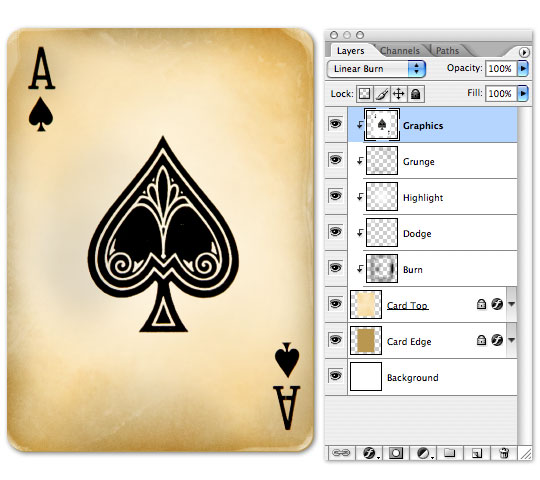
Step 13
Dropping the Opacity of the Graphics layer to 75% makes the effect more believable, but the graphics need to age a bit as well, so I went ahead and created a layer mask and antiqued it a bit to get the final effect.
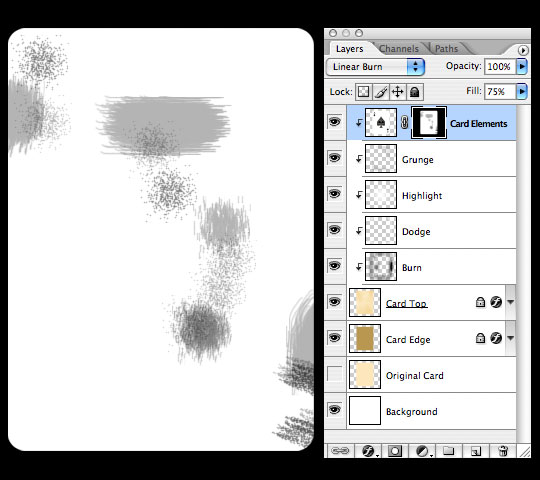
Create a selection of the card by holding the Command (PC: Ctrl) key while clicking on the layer’s thumbnail. This will select ONLY the object on this layer. With the selection made, I pressed the Layer Mask icon at the bottom of the layers palette (it looks like a light rectangle with a dark circle inside) to mask the layer to the selection. With the new layer mask created (and by default selected), I used the Spatter brush set at 33% Opacity to paint black over the sections of the Graphics layer which I wanted to make more worn.
Below (simply for visual reference) I’ve isolated the Layer mask by holding Option (PC: Alt) while clicking on the Layer Mask thumbnail in the layers palette along with a copy of my final layers palette for reference.
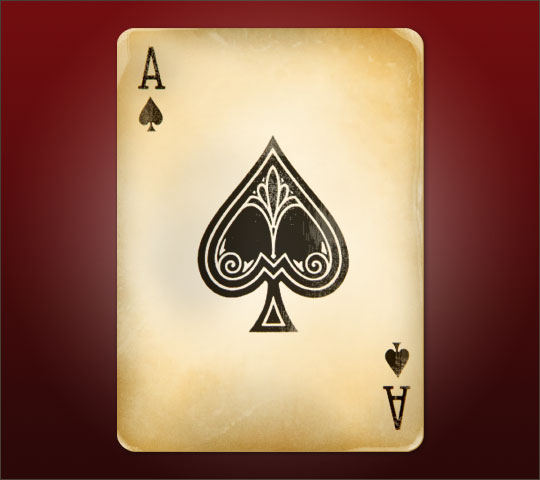
Step 14
And finally the completed card.
Lesson Files + Additional Resources
Download the free .PSD file and other lesson files Right Here.
Tell Your Friends
More in Graphic Design


56 Responses to Antique Ace Of Spades
Ly Pham
January 20th, 2011 at 5:00 am
Very cool! Thanks :)
Kaspersky
January 23rd, 2011 at 4:10 am
Spectacular, top notch. Thanks for sharing this tutorial.
colchones viscoelasticos
February 28th, 2011 at 10:32 am
thanks! Wow,…incredible tutorial. I will give it a try. I am a poker Fan and I will enjoy making this vintage card.
bye.
Ayuda y soluciones a los problemas de pareja
May 12th, 2011 at 10:53 am
I want to lean all about photoshop, it´s the best program that I know. Thanks for this excellent tutorial
santiago - diseño web
June 7th, 2011 at 2:33 pm
I just walked through this tute, and it was fantastic to use! I especially appreciated the little tidbits of informations – the whys and wherefores of certain keyboard shortcuts and tools. I have nil artistic ability, but I’m incredibly happy with the way my ace turned out. Thank you!
Periodistas de Quintana Roo
August 1st, 2011 at 11:40 am
this tutorial is very useful, thanks for sharing.
Carlos.
Cheers!