


Basic Image Adjustment 101
In this tutorial I will cover the four introductory adjustments that go into a good digital photo. We will be using the Levels, Curves, Hue/Saturation and Selective Color Adjustment Layers.Step 1
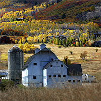
The following photograph was taken by my wife a few years ago of a landmark barn near our home. Shot with an old Nikon D100 in JPEG mode, I dismissed the photo for years feeling that it was too muddy to ever produce a good fine art print. One day while sorting through and organizing photos I decided to give the JPG a little work and was blown with the photograph hiding beneath the mud.
Unlike today’s digital SLR cameras, the D100 wasn’t very good at producing a print quality image straight off the chip, which is why when shooting it I insisted on shooting RAW files so I’d have more to work with. In the early days my wife wasn’t as familiar with the camera and shooting as she is today and made the beginner mistake of shooting a potential fine art shot in JPG. With a few basic adjustments however, we can reveal the beautiful photograph hiding just below the surface.
Step 2
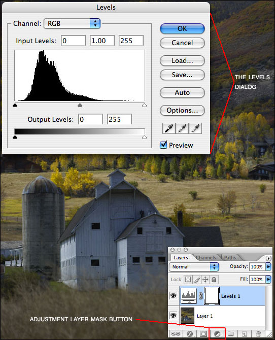
Levels
With the image open in Photoshop start by clicking on the adjustment layer icon at the bottom of the layers palette (*note: if you don’t see the layers palette, open it from the main menu Window>Layers), the icon is a circle that’s half black and half white. When the menu pops up, choose Levels from the menu.
The graph is called a Histogram and it describes the tonal range of the photo starting with the blacks on the left and continuing right to white. An ideal Histogram would taper to each end without going off the edge. If you see a block of the graph that terminates into the right or left wall of the histogram it means that you’ve lost information in your photo. Either you’ve blown out highlights OR you’ve underexposed your shadows and have lost detail there. The histogram for this particular file is actually very good.
If you shoot a camera that offers histogram feedback while you’re out shooting this is a great way to recognize problem images, blown highlights and lost shadow detail while you are still in the field and have the chance to re-shoot them. A feature that with some practice will save you headaches and dissapointment in the future.
Step 3
Levels Part 2
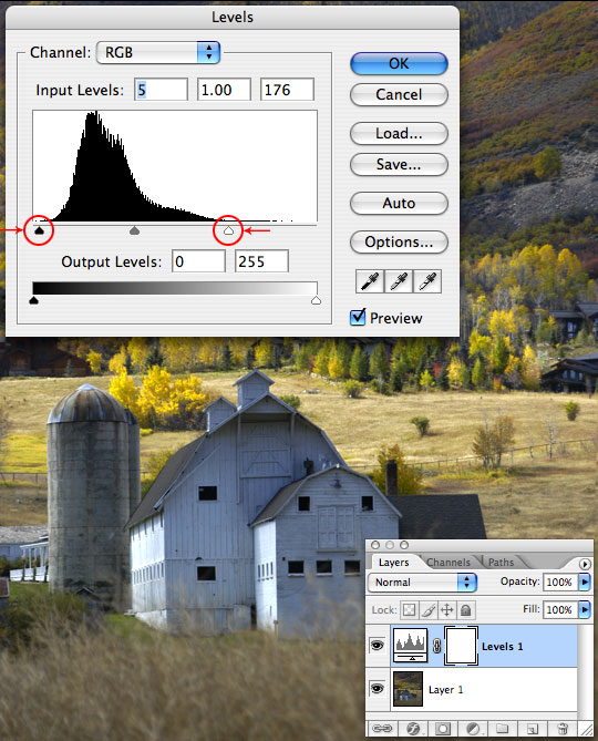
If there are gaps between where the histogram ends and the end of the graph, go ahead and drag the right and left sliders beneath the histogram until they almost touch the edges of the graph. What we’ve essentially done is eliminate all the mud caused by lack of information on either side of the histogram and tightened how the tones are interpreted. Bringing the sliders all the way in to the edges of the histogram doesn’t always get the desired result however, so be sure to watch your photo while you adjust. Because we are making these adjustments on "Adjustment Layers" rather than directly onto the image, we can come back and change our settings at any time or delete them altogether without any damage to our original image. When the image looks right to your eye go ahead and click OK to save the adjustment layer. You will notice that there is a new layer above your image in the layers palette called Levels.
(*note: by moving the endpoints in the Levels dialog the center point will automatically adjust. This midpoint defines the center of the tonal range and most of the time it’s best to leave it where it is. You can slide it right and left between the outside markers however to vary the darkness of your mid tones.
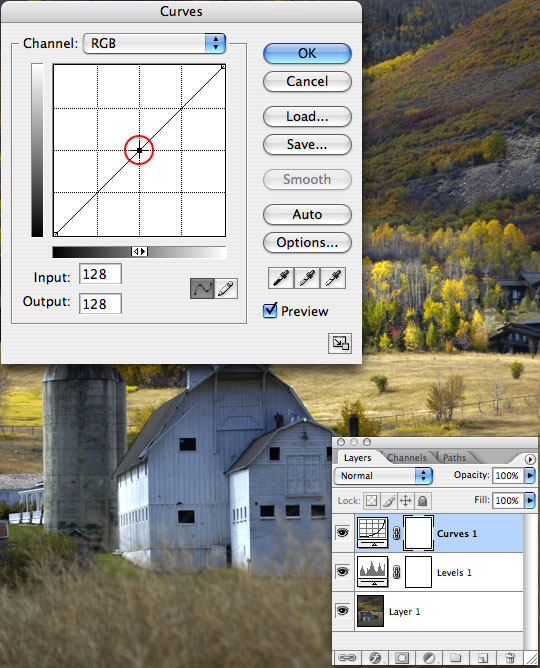
Step 4
Curves
Our next adjustment is Curves. Click on the Adjustment Layer icon at the bottom of the layers palette like we did in step 2 and this time choose Curves.
The first thing we want to do here is lock our mid tones by moving the mouse to the center of the graph (it turns into a cross so it’s very easy to line up), when you’re at the exact center click the mouse and a point will be set in the center of the curves graph.
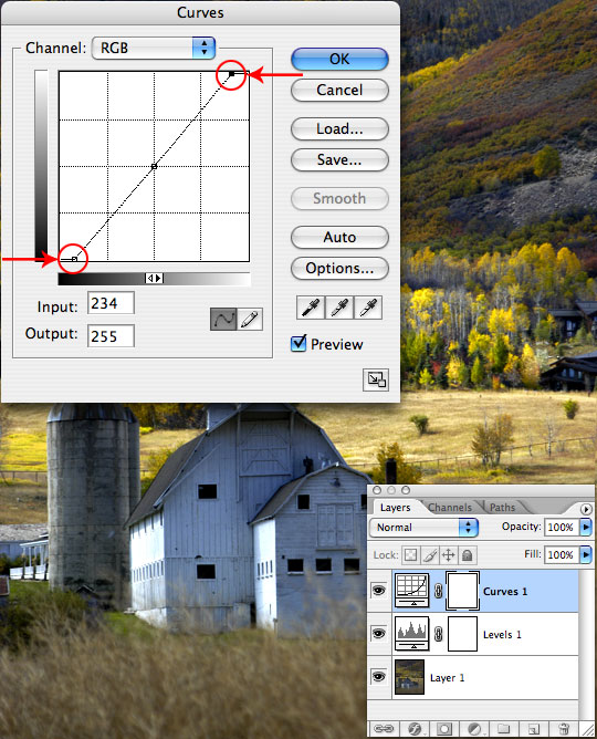
Step 5
Curves Part 2
Much like the Levels adjustment, the curves dialog represents the overall tonal range of the image. For this simple adjustment simply drag the markers in the lower and upper corners along the x-axis 1/3 to 1/2 of the way into the first square like the example below, then go ahead and click ok.
What we’ve essentially done is add contrast to the image by shortening the top and bottom of the spectrum to make our lights lighter and our darks darker.
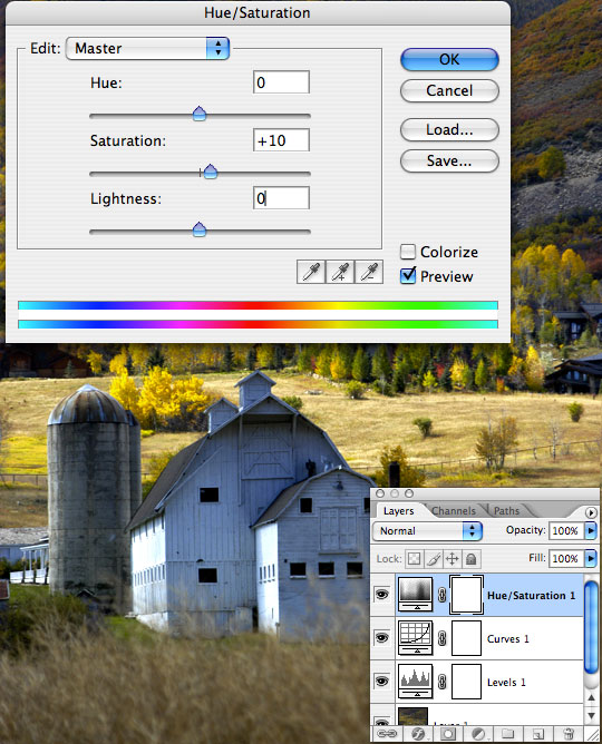
Step 6
Hue / Saturation
With the Levels and Curves out of the way it’s time to add some vibrancy and pop to the colors in the image. Click on the Adjustment Layer icon at the bottom of the layers palette again and select… yes, you guessed it… choose Hue / Saturation.
Every image is different and you will have to develop your eye finding the spots where this adjustment can really work it’s magic. Be careful not to over-saturate however, nothing ruins a beautiful photo quite as easily as an over zealous photographer going overboard with the saturation. Everyone knows that grass is not bright neon green in real life!
I chose a Master saturation adjustment of +10 for this image which resulted in the yellows aspen leaves being much too bright. By clicking on the drop-down menu at the top of the Hue / Saturation box I chose Yellow and lowered the lightness to -10 and the saturation -5. You can adjust the entire spectrum here (in the Master setting) or you can adjust each area individually. Experience will teach you when to use each. Experimentation is often the best teacher.
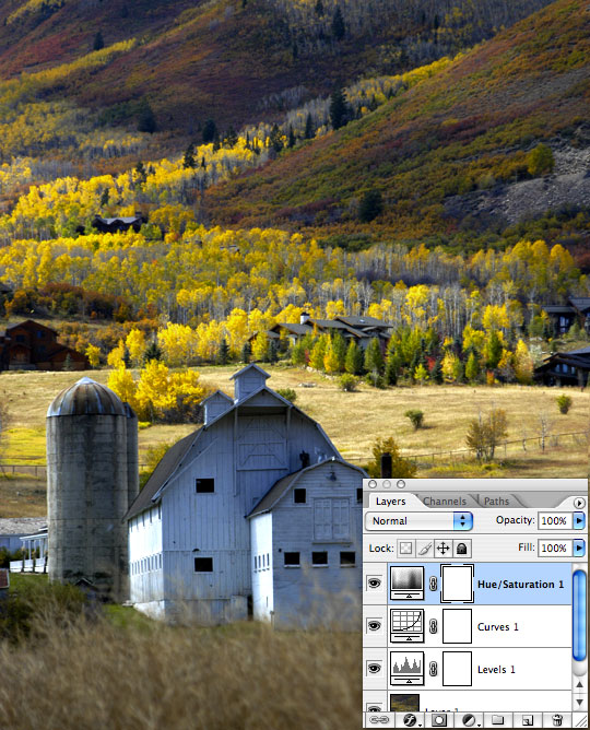
Step 7
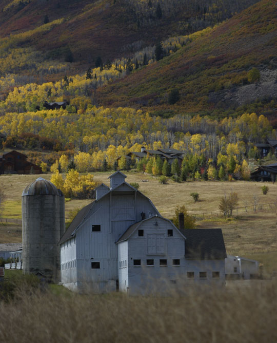
Now the image is starting to look crisper and much more vibrant than the muddy mess we started out with. I would however like to bring up the red tones in the hills in the next step.
Here is the image so far with the layers palette for reference.
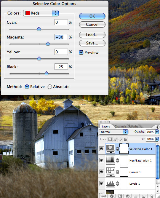
Step 8
I mentioned in Step 7 that I would like to bring the red tones in the hills up a little bit. I attempted this in the Hue / Saturation step while you weren’t looking, but didn’t get the results I’d hoped for, so I’m going to teach you about one more adjustment layer that is often overlooked in photo tutorials, but when used in the right situations has much more pleasing results than Hue / Saturation alone.
Selective Color
Back to the Adjustment Layer button for one last round, this time choose Selective Color from the menu. It’s the Reds that I’m mostly wanting to effect, and Selective Color is one of the few ways we can isolate a single color. Because there is no real red in the barn or foreground of the image (which would make abuse of this tool extremely obvious), I’m going to be quite aggressive with my adjustments.
(*note: the great thing about making adjustments on Adjustment Layers rather than directly to the image is that you can go back and re-adjust each to your hearts content in a non-destructive manner. In this case, once I’d set my Selective Color adjustments, I went back and played with the Red adjustments in the Hue / Saturation dialog. To re-edit any adjustment layer, simply double-click on the layer thumbnail to open it’s dialog box.)
Step 9
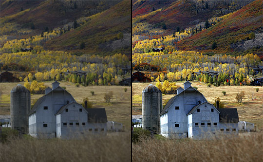
Here is the before and after.
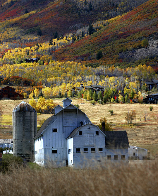
Step 10
And finally the finished product. Pretty nice results with only 4 simple adjustments.
Lesson Files + Additional Resources
Download the free .PSD file and other lesson files Right Here.
Tell Your Friends
More in Photo Effects


25 Responses to Basic Image Adjustment 101
Dave
November 14th, 2007 at 9:55 am
I think people are going to spend some real time on this site. They will have PSHero.com in one window and PS in another and go back and forth as they go thru the lesson, at least that’s what I’ll do. May do it several times to get it down pat. I’m looking forward to take the time go go through them all.
Thanks so much for the effort you have put into this!!!
Alan
March 15th, 2008 at 5:13 pm
As a newbie, I’m painfully aware my technique “could be better”. This sure beats mine-
duplicate layer, auto-adjust colou (ctrl-shift-B),
ditto for levels (ctrl-shift-L), overdo saturation (ctrl-U) then
set layer transparency to about 67% and merge back (ctrl-E).
Gotta try that Selective Colour option…
Bob
March 18th, 2008 at 10:34 am
Nice technique and write up. Tried it out on some recent travel photos that looked a little “flat”. Really punched them up.
Thanks again.
Rob
March 18th, 2008 at 1:12 pm
Great explanations – you really helped me understand some of the step by step adjustments I can make and the reasons for them
Mody
April 19th, 2008 at 9:41 am
Thank you! I just found your website and it is wonderful. I really appreciate the time and effort you put into this. I hope and think that you will be compensated.
I am buying you a dragon now. I will be visiting daily. Good luck and please keep it up.
Donny
May 14th, 2008 at 9:45 pm
I am really glad to have stumbled to your website. Been to many other tutorial sites but none like yours. I hope to see more posts when i come back. Thanks for the effort!
Jane
June 5th, 2008 at 9:23 pm
So I know this is a bit off-topic, but was that photo taken in Park City, Utah?
HERO
June 5th, 2008 at 9:55 pm
Why yes JANE, this shot was taken in Park City, Mrs. HERO and I have a home there. Why do you ask?
Megan Brown
June 13th, 2008 at 3:46 pm
Hey “hero” looks like a great website. I’ll be using it a ton down here in the good ‘ol AZ. We miss Park City.
santosh
August 12th, 2008 at 10:58 am
great explanation… wud be extremely easy for learners as well…
KAMPA
September 29th, 2008 at 1:58 pm
Another thankfull newbie… Thanx!
Subash Aryal
December 19th, 2008 at 5:22 am
Glad to get this tut…
Christopher
February 23rd, 2009 at 10:18 pm
That was a great first tut. I think what i have realized is that your original pic still has to be decent.
photofolio
February 24th, 2009 at 8:32 am
Am I wrong or is your curves adjustment layer just doing the same as your levels adjustment layer? why not make an S-curve to avoid clipping off information? And why using both levels & curves if one of the two can suffice?
HERO
February 24th, 2009 at 11:53 am
PHOTOFOLIO, Actually the Levels and Curves adjustment layers are performing different jobs in this instance. We’re using the Levels dialog to define where the black and white tones begin and Curves to adjust the weight of each in the overall appearance of the photo.
HERO
February 24th, 2009 at 11:56 am
CHRISTOPHER, Absolutely. Photoshop is no substitute for proper technique while photographing. Although it can help rescue a botched shot in many ways, you’ll always be better off if you’ve actually “gotten” the shot to begin with.
Herb B.
May 19th, 2009 at 1:33 pm
As a PS newbie I was greatly impressed with your tut style. Thanx.
Sandra Scott
September 7th, 2009 at 6:53 pm
Such a good teacher you are! For the first time I actually understand levels and hue/saturation. Thanks much.
alain
March 25th, 2010 at 2:37 am
your site is one of the coolest sites i’ve ever encountered. really a big help to hobbyists like me. hope you could include more photo effects like dragan, mann, greenberg effects to name a few. but as it is, it’s already helping a great deal in my hobby. thanks a lot!
Sandra Thompson
April 11th, 2010 at 5:52 am
Amazing – Thank you so much. I have been struggling to understand the basics, now I may be able to move along the learning curve.
Miriam
July 17th, 2010 at 9:17 am
This is amazingly helpful! Thank you so much for taking the time to write it down so clearly and neatly.
Denver Photographer
September 7th, 2010 at 3:52 pm
It’s funny how much difference a little bit of levels can make in the contrast of a shot. By far my favorite way to boost contrast.
Tim
November 18th, 2010 at 10:58 am
Thanks for these great steps, I’ve been playing with some photos using your tips and it makes them much better without too much work.
Stevie
January 23rd, 2011 at 11:02 am
I had to put this out there. I really feel like this tutorial combined with a few others I read on this website spared me a whole 10 week photoshop class. I have always been resistant to PS. I felt like the shots had to be good straight out of the box and PS was a bit of a cheat. Recently I came to understand why this way of thinking was fundamentally wrong (I won’t extrapolate on it here, but basically it’s got a lot to do with moving forward with progress). Being very much self-taught, I also had a bit of a problem with PS, since it is not that easy to start from scratch with a program like that. Well, your tutorial was just what I needed to get me started playing around with the program. It’s clear, easy to understand, complete, and short. Props! I’ll read, and try every single one of your tutorials. Am looking forward to more!
Dawn
February 3rd, 2011 at 12:50 am
Nice site. I have learned a lot. I’m just a beginner at photoshop. I’m not much of a photographer, but I’m doing 3d renderings and I thought photoshop would help me a great deal in my line of work. I’m really thankful for sites like these.