
Wood Inlay Text
In this Photoshop tutorial I'll show you how to create a wood inlay effect using wood textures, layer masks and a few creative selection techniques.Step 1
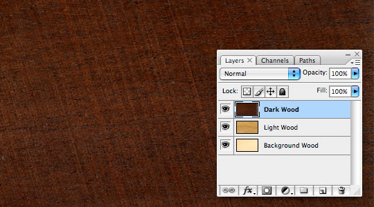
Lets start by setting up a new document, mine is 540×300 pixels at 72ppi but for this tutorial size doesn’t matter at all. There are plenty of good places online to find nice wood textures and I found a great one at defcon-x.de. We’re going to start by creating 3 layers and pasting wood textures in each. Color isn’t as important as the tone of the wood and for this lesson I chose a very light, medium and dark piece to work with. I arranged them from lightest on the bottom to darkest on the top because I want the light wood to comprise the image’s background.
Go ahead and find a few wood swatches and put each on it’s own layer. The textures at defcon-x are very high resolution and you may want to use the Free Transform function to bring them down to the proper size for your project.
Step 2
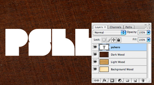
Next we need to select a font to work with. For this effect I prefer a blocky sort of disco style font because the abstract nature of the letters. The font I’m going to use here is called Bifurk and is available for free at dafont.com.
With the top layer of wood texture selected, press the T key to invoke the Type tool and click and type on the stage to add your text.
Step 3
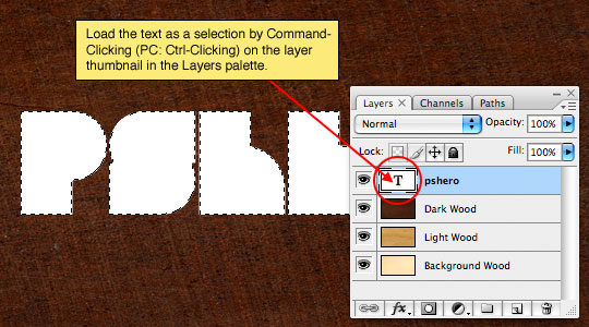
Now lets add a few layer masks to define the texture layers as text. To load our text as a selection Command-Click (PC: Ctrl-Click) on the thumbnail for the text layer in the layers palette (since it’s text, it will just have a big T in the thumbnail box).
Step 4
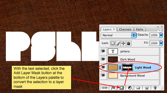
With the text selected, click on the Light Wood layer in the layers palette to select it as the working layer, then press the Add Layer Mask button at the bottom of the Layers palette to convert the selection to a Layer Mask.
Step 5
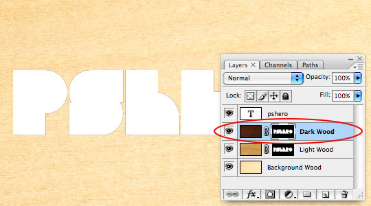
Now do the exact thing to the Dark Wood layer, load the text as a selection and add a layer mask to the Dark Wood layer.
Step 6
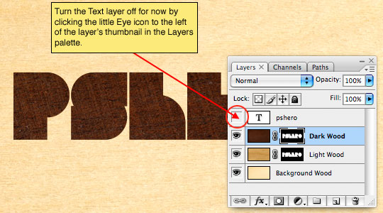
For the moment we’re finished with the Type layer we created at the top of the document, but just to be safe lets not delete it, lets just turn it off by clicking on the little eye icon to the left of the layer thumbnail in the text layer.
Step 7
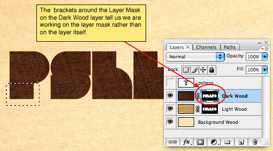
Make sure that the top wood texture layer is selected in the Layers palette as the active layer and then click on the Layer Mask in that layer to insure that what we do next will be applied to the Layer Mask and not to the layer itself. You’ll know the layer mask is selected because the layer mask thumbnail will have small brackets around it in the Layers palette.
What we’re going to do here is select areas of the layer mask to "black out", allowing the underlying layer to show through. Lets do a simple example by pressing the M key to invoke the Rectangular Marquee tool and creating a selection around the lower portion of one of our letters.
Step 8
Press the D key to insure that your foreground color is set to black, then we’re going to press Option-Delete (PC: Alt-Backspace) to fill our selection with black. Since any area on a Layer Mask that is white will show through to the layer below and any area that is black will be masked off, the selection we just filled with black will allow the wood on the lower layer to be visible. Press Command-D (Ctrl-D) when you’ve filled the area of the mask with black to deselect.

Step 9
Next lets try something a little trickier. Create a long narrow selection using the Rectangular Marquee tool.

Step 10
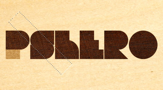
I want this selection to be at a 45° angle, so lets choose Select>Transform Selection from the main menu. Holding the Shift key to constrain the rotation, grab one of the end points of the selection and rotate it. When it’s in the position you want, press the Return (PC: Enter) key to commit the transformation.
Move the selection to the spot you want to mask (just like in the previous step).
Step 11
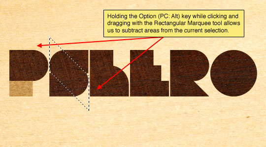
Obviously if I filled that selection with black I would also block out areas of the other letters (not just the S that I’m working on). To avoid this we need to subtract some areas from the selection. While holding down the Option (PC: Alt) key which will add a small minus sign (-) next to the Marquee tool I’ll create selections around the sections of the selection that I don’t want to be there, this will deselect only those areas of the selection that overlaps the other letters.
Step 12
Now we’ll just fill our modified selection with black by pressing Option-Delete (PC: Alt-Backspace) to mask away another piece of the Dark Wood layer from view. When you’re done press Command-D (PC: Ctrl-D) to deselect.

Step 13
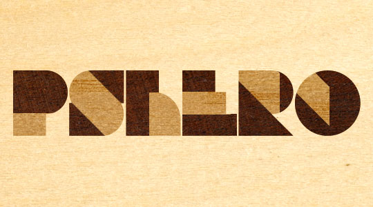
Continue this process through each letter paying attention to the lines of the letters and where the highlight would best be suited.
Step 14
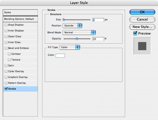
The last thing I might do is add a 1 pixel white outline to each of the two wood lettering layers to represent that small over cut margin around the areas in wood overlay work that’s been filled with glue or wood filler. I’d accomplish this with a Stroke Layer Style with settings like the ones below. Notice that I’ve changed the color, size and opacity.
Step 15
My final text would look something like this.

Step 16
You can use this technique for just about anything, for my final image I added the Hero Star to the text. I hope you’ve learned something about layer masks and using textures to create effects.

Lesson Files + Additional Resources
Download the free .PSD file and other lesson files Right Here.








25 Responses to Wood Inlay Text
T. Roger Thomas
June 3rd, 2008 at 8:41 pm
Yet another fantastic tutorial- great job and please keep up the good work!
liam
June 4th, 2008 at 8:50 am
I have to agree, it’s a very nice tutorial. Looks very nice in my opinion.
S.B.WORKS
June 4th, 2008 at 11:18 am
Another good trick, looking great!
Just one thing to advice. Probably a lot of people here already know this, but there’re a few ways to create wood texture using motion blur and some other filters in Photoshop. It’s just like what PS HERO did with the denim trick. That way, you don’t even need to search on Google to look for the free images LOL. Seriously though, I tried this wood texture trick before, and it looked pretty decent. I’m pretty sure you know that trick, PS HERO, so why don’t you talk about that in the next post?
ps; thanks for the e-mail, PS HERO. that was very kind of you.
Mody
June 8th, 2008 at 10:51 am
Awesome! Thanks.
Aliasger
June 14th, 2008 at 10:07 am
Simple and Effective. Thanks man!
Buster C
July 14th, 2008 at 7:45 pm
I guess your a “Lindstrom & Prins Thomas” fan This looks exactly like their album cover.
HERO
July 14th, 2008 at 8:12 pm
BUSTER C,
I was wondering if anyone would catch on to that Nice work!. I do like a little L&PT on occasion but I am more precisely I’m an album cover fan. There’s so much amazing art work floating around on the front of our music that rarely gets much attention. Browsing the iTunes store is one of my favorite places to go when I’ve got designers block. I love that album cover and it really makes for a great little text effect.
NetOperator Wibby
October 4th, 2008 at 12:07 am
This is a nice andsimple tutorial. I’m looking forward to incorporating it into some of my designs.
Isaac
November 3rd, 2008 at 4:47 pm
Great yet simple tutorial, it has a great turnout yet minimal effort. It was easy enough for me to convert it to Gimp.
dan
November 25th, 2008 at 11:44 pm
great eye for design
joyoge designers' bookmark
January 29th, 2009 at 5:38 pm
Awesome! Thanks.
Ronny
March 15th, 2009 at 2:58 pm
nice nice nice. but i have a little problem, i cant find the Bifurk Letters on the dafont.com site. wen i search there is noting. can sombady help?
hungry hungry hippo
September 4th, 2009 at 2:33 am
just google it; it’s all over the place:
http://www.acidfonts.com/freefonts/bifurk.htm
Alvaroo
October 7th, 2009 at 1:18 pm
Excelentee tutorial amigooo!!!!
kee Dios te bendiga :)
JMB
March 18th, 2010 at 7:51 pm
I can’t get step 14 to work. It shows the settings, but what layer should I be on when I use it? I tried clicking on each of the wood layers and applying those settings but it didn’t work. Does anyone know?
katrina
April 2nd, 2010 at 2:41 am
nice tutorials, it really help me a lot especially for beginners like me
sidescroller
April 2nd, 2010 at 6:28 pm
Very nice Tutorial, worked very well.
pedro espinoza
April 12th, 2010 at 11:11 pm
I think is well explained this tut…the construction of every letter reflects dedication and accuracy en details.
thats my opinion.=)
tb
October 5th, 2010 at 2:05 am
very nice!
Ahmed Ali
December 17th, 2010 at 6:23 pm
Your Explain it very Easy
I Thank You My Friend
The Maldivian
January 6th, 2011 at 3:07 pm
The Maldivian Loves It..!
Sara
January 12th, 2011 at 9:05 pm
Thanks for taking the time to post that! Wish I had learned it ages ago!!
Lee Fuller
February 12th, 2011 at 12:59 pm
Really nice effect and easy to follow tutorial.. Thank you for sharing.
sev
March 7th, 2011 at 4:21 pm
nice! thanks dude you helped alot, ive learned what i wanted! :)
muslim
March 14th, 2011 at 9:19 am
thanks man
your tut>>> and Explain is very easy
but thanks you
goodby