


Virtual Letterman Jacket
Recently I had the opportunity to design the header for a friends blog, he wanted a Lettermans Jacket effect but wanted to be able to control the colors and text so we created the jacket from scratch in Photoshop.Step 1
Open a new file 700 x 300 at 72dpi. The final file will be cropped to 600×200 after the first step, but because the displace filter causes distortion at the edges that would otherwise be visible and unwanted I’ve enlarged the original canvas to accomodate for cropping the excess.
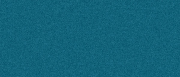
The first step is to create a little texture in the jacket fabric. To do this setup your foreground/background colors to #05536b and #10637b respectivly and fill the background with the lighter background color. Add noise (Filter>Noise>Add Noise) at 7% Gaussian Monocromatic and then use the Gaussian Blur (Filter>Blur>Gaussian Blur) set at 1.0 pixels to soften the noise.
Step 2
Create a new layer above the fabric called Grey and fill it with 50% grey (Edit>Fill and select contents to be 50% grey). We will be using the displacement layer as a filter later and the 50% grey is neutral when the Soft Light layer mode is used.
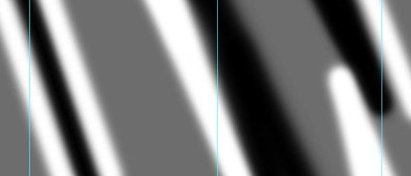
Add a new layer above the Grey layer called Displacement Map. On this layer we will be painting black and white strips representing the various folds in the fabric. At this juncture I threw in a few guides to help me visualize where my content will go at 50, 375 and 650. I want the feel of fabric without really warping my main element too much.
Paint on the canvas with black and white as seen below. (Remember, this is on a new layer ABOVE the Grey layer). I used a round brush with an edge hardness of 0 in 50px and 90px diameters.
Step 3
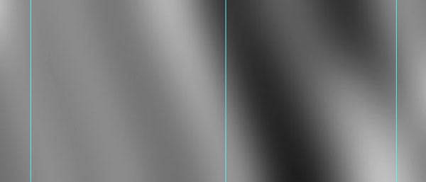
Obviously these lines are much too vivid to create a smooth transition between the folds in our fabric, so I’m going to apply a Gaussian Blur (Filter>Blur>Gaussian Blur) of 40 to really even out the tones.
Merge this layer with the Grey layer below by pressing Command+E (CTRL+E on PC) and re-name the merged layer Displacement Map. The displace filter works from an external file only, so save the file in it’s current state as a .PSD called DisplacementMap.psd to your Desktop or whereve you will be able to find it later.
Step 4
Hide the Displacement Map layer by clicking on the eye next to the layer in the layers palette and select the Background layer.
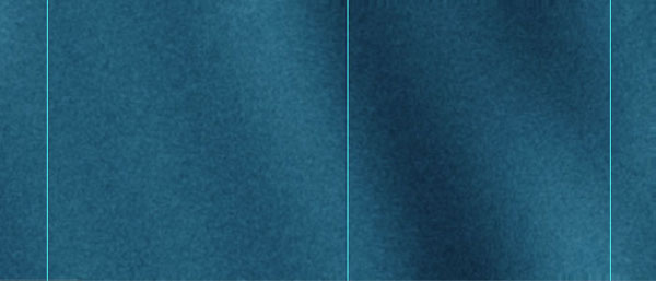
At this point we will apply our first displace filter. If your background is still locked (as is the default) double click on the layer and change it’s name to Background and click enter. This will make the layer a standard workable layer.
Select Filter>Distort>Displace choose 10, 10, Stretch To Fit and Repeat Edges then click OK and navigate to your DisplacementMap.psd file wherever you put it, click Open to apply the filter. The effect will be subtle and you may not immediately be able to see what you’ve done but going back and forth in the history palette will give you some idea.
Select the Displacement layer we created earlier and make it visible by clicking the empty box to the left of it in the layers plaette. Change the blend mode to Soft Light and the Fill to 80%.
Step 5
Becuase my final file needs to be 600×200 I’m going to place vertical guides at 50 and 250 so I know roughly where to place the content. We will be applying the displace filter to the other areas of the file and once we’ve warped these items we won’t be able to move them again because they will be warped to fit their exact location.
Now that we have our basic fabric layed out it’s time to create our letterman jacket letter. I’m using a font called Varsity that is available for free at dafont.com in which the lowercase letters are actually uppercase and the uppercase letters have outlines. I’m using lowercase. Set the foreground/background colors to #d38434 and #b66820 respectively and type the large letter using the foreground color (I used 380pt and selected faux-bold to make it a little meatier.) and then rotated it counter clockwise 15 degrees by pressing Command+T (CTRL+T on PC) to bring up the free transform box and then by holding the shift key while grabbing one of the corners and rotating the text to the first snap.
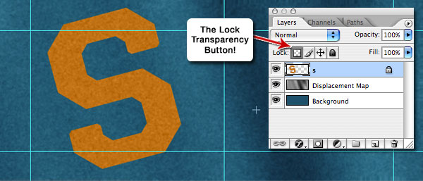
This layer is fabric as well and should mimic our jacket texture so rasterize the type layer by right clicking the layer and selecting Rasterize Type, lock the layer transparency to keep things clean, apply noise just like before Filter>Noise>Add Noise at 7 Gaussian Monochromatic and then add the blur as before Filter>Blur>Gaussian Blur set to 1.
Step 6
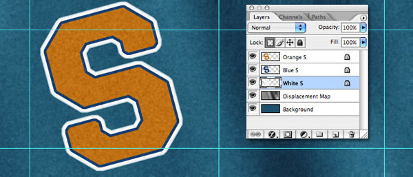
Typically a lettermans letter has 3 layers of fabric, so we need to build two sub-layers that are each a little bigger than this one. Hold down Command (CTRL on PC) while clicking the thumbnail of the current layer to make a selection of it’s contents then choose Select>Modify>Expand 4 pixels.
With the big "S" now selected, create a new layer below by holding the Command (CTRL on PC) and clicking on the new layer icon at the bottom of the layers palette. Set the foreground/background colors to #014d7e and 043c55 and follow the fabric creation steps outlined in step number 1. Then repeat the same process on a lower layer, epanding the selection 6 pixels from the new layer and using colors #ffffff and #e5e5e5 to get the following result.
Step 7
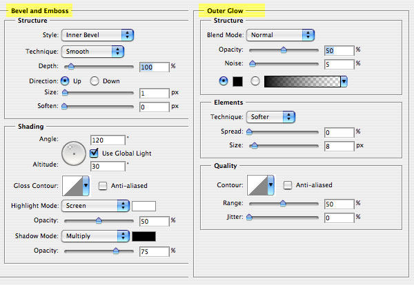
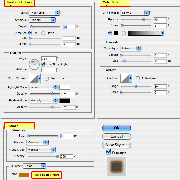
Add the following bevel and emboss layer style to each of the three "S" layers but only add the outer glow layer style to the bottom (white) S layer.
Step 8
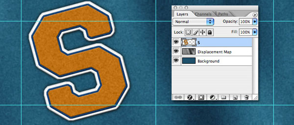
With the layer styles applied merge the three "S" layers by clicking on the top one, holding down the Shift key and clicking on the bottom one. With the three layers selected, simply press Command+E (CTRL+E on PC) to merge the layers. Your file should now look like the one here.
Step 9
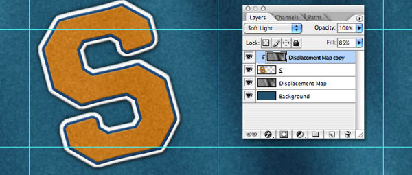
Position the big "S" where you want it to sit exactly then open the displace filter again with this layer selected. Filter>Distort>Displace with the same settings of 10, 10, Stretch To Fit and Repeat Edges then click OK and navigate to the DisplacementMap.psd file that we saved earlier. Click Open. Again, depending on your placement of the waves of your fabric, this effect may be subtle here.
Duplicate the layer called Displacement Map and drag it in the layers palette to rest above the big "S" layer. Once in place, hold down the Option (Alt on PC) button while clicking on the line between these two layers to create a clipping mask (or right click the new Displacement Map copy and select Create Clipping Mask).
Step 10
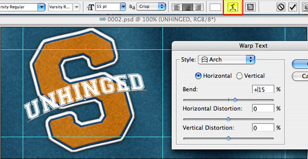
Things are starting to look pretty good, but we’ve got more to do. The name of the site I originally designed this header for was Slightly Unhinged, so in that spirit we’re going to add a new layer at the top of our file and in the same Varsity font, using uppercase this time type UNHINGED (white text about 55pt should do the trick).
Rotate the lettering to match the rotation of the "S" layer by pressing Command+T (CTRL+T) to bring up the free transform box and then by holding Shift while grabbing a corner and rotating 15 degrees counter clockwise. Holding down the shift key while rotating or dragging a transformation constrains the transform, in this case each time it snaps as you rotate you’re getting exactly 15 degrees.
Once you’ve got the text rotated hit the return key to commit the transformation, then double click on the big "T" icon on your new text layer (now called UNHINGED or whatever you just entered into the text field). This will make the text editable and what you want to click is the "T" icon up at the top of Photoshop with the arched line below it which will bring up the following dialog. Change the setting to match, click OK and position the text to your liking.
Step 11
Our new layer needs the fabric effect we repeated earlier with the background "S" colors #ffffff and #e5e5e5 but first we need to rasterize the text by right clicking on the layer and selecting Rasterize Type from the dropdown menu. Lock the layers transparent pixels then add noise and gaussian blur just as we did before.
Add the following layer styles to this layer as shown below. (*note for a little more realism try using a bevel and emboss setting of 0 rather than 1)
Step 12
Just like the other layers, this one is laying on the fabric and deserves a displace filter of it’s own. Filter>Distort>Displace use the setting that we’ve specified before (they shouldn’t have changed in the dialog), browse for the DisplacementMap.psd file and click Open to apply the filter. Copy the Displacement Map layer again, drag it above the UNHINGED layer and Create a Clipping Mask just like we did with the "S" layer.
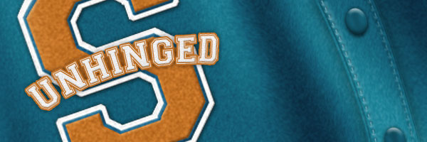
This ends the official tutorial on the Varsity Jacket but I felt it was missing something so I decided I wanted to add the seam down the middle of the jacket with some stitching and buttons I’ll describe this process for those of you who know your way around Photoshop enough to keep up.
I created an arched selection about an inch wide where I wanted the button strip to go with the pen tool then converted my path to a selection and with the background layer selected duplicated the layer to create a new invisible strip above the background. Adding a bevel and emboss with a contour profile and an outer glow in black gave it dimension and it also got it’s own Displacement Mask clipped to it. The stitching was created by typing a dashed line along the path I created for the button strip in the previous step with added bevel and outer glow in black. The buttons are ovals with a little bevel and a drop shadow. That’s pretty much it. I then flattened and cropped the file to 600px x 200px to get the finished result below.
Lesson Files + Additional Resources
Download the free .PSD file and other lesson files Right Here.
Tell Your Friends
More in Graphic Design


17 Responses to Virtual Letterman Jacket
Jonathan Solichin
March 14th, 2008 at 8:45 pm
Dang, That looks pretty realistic. Yes, I’ve been going around your site looking at your brilliant tutorials. I’m sold for your rss feed.
Dave Wilkinson
June 20th, 2008 at 2:43 am
I just followed this tutorial. Well written. My design came out looking just great. This a great resource for anyone wanting to expand their PS know-how. Thanks.
Bob
November 29th, 2008 at 11:28 am
This was a great tut for re-familiarizing myself with PhotoShop. Thanks!
Guillermo
February 23rd, 2009 at 1:43 pm
Thank you very much. I wanted to customize my own letter for a varsity jacket…This is a perfect way to hand it out to the printshop…Thnk u very much…
p.s. I’m a noob @ photoshop and still could understand the whole tut.
Great Job! @ writer
Walter Land
March 13th, 2009 at 10:26 am
This was a great experience! I learned from things I already knew how to use. Great effects & even greater instructions.
Gimme more!
Mira
March 15th, 2009 at 5:02 pm
Thanks, a really nice tutorial. I’ve put it to a first test and it looks nice ;)
Steven from France
March 30th, 2009 at 5:27 am
I just wanna say u a BIG BIG thanks to all your amazinz tutorial ! I’m french, my english is not so good but your stuff are very understandable ! Thank a lot, you R the best guy ! ;-)
Tom
August 10th, 2009 at 5:10 pm
Wow this looks really great, mine didn’t come out quite as good but I learned the Displacement filter so that was a win!
louie
August 16th, 2009 at 5:59 pm
Hi, how can i do step 2 & 3 (displacement map) on a white background? I mean what color should i used. Im trying to create a white jacket. Thanks.
HERO
August 17th, 2009 at 7:24 am
LOUIE, The steps should be the same, but even with a white jacket, you’ve got to make sure you’ve got enough texture (color variation) to make what the displacement map does visible.
Simon
September 16th, 2009 at 8:27 am
wow this is absolutely awesome!
andrii
January 1st, 2010 at 8:56 am
awesome creation!!!
iwansyahmultimedia
January 14th, 2010 at 11:08 am
Very realy !!!!!!!!!!!!
good work !!!!!!!!!!!
LIKE THIS
Afiq
June 1st, 2010 at 1:16 am
Thanks so much to you… Your tutorials are quite easy to digest. In fact, I had combined two this letterman jacket with the political button into one picture… Thanks so much
Nald
July 12th, 2010 at 4:27 am
Very realistic work! You’re awesome and amazing! More tutorial pls! Keep it up and more Power!
Christopher Baker
August 1st, 2010 at 4:09 pm
Love the tutorial! One question, though: why is it necessary to set the background colors? The fill uses the foreground (except in the case of the main background) and (I believe) the filters just use the color of the layer.
HERO
August 4th, 2010 at 11:31 am
CHRISTOPHER, It is important to set the foreground & background colors because those are the colors that the noise filter uses when we create the texture on the fabric.