


The Velvia Effect
In this Photoshop tutorial you will learn how to create look of Fujifilm Velvia film, specifically the slight over saturation that has made Velvia so popular by landscape photographers through the years when film ruled photography.Step 1
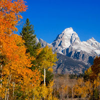
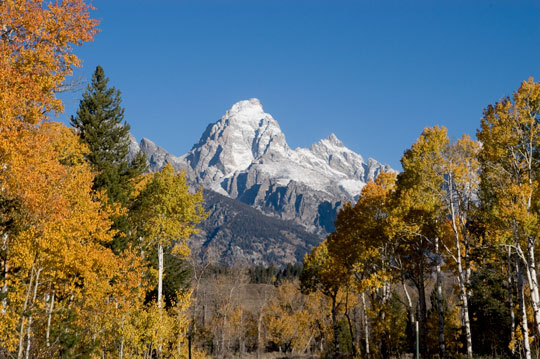
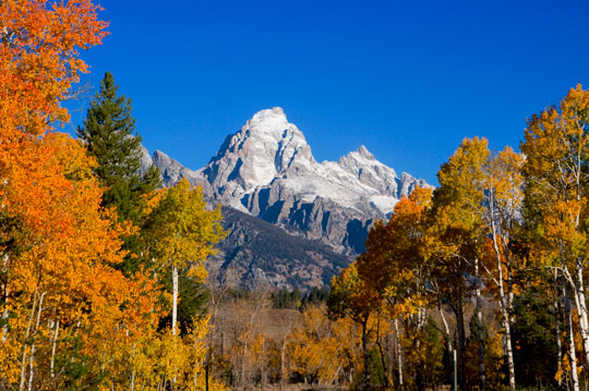
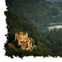
Lets start by opening the image in Photoshop. Velvia is a high saturation film best suited for landscape photography. Because of the high level of saturation produced by this effect, I don’t recommend using portraits or photos with people, unless of course you like that tan-from-a-bottle orange-skin look. This is a photo I took of the Tetons in Jackson Hole, Wyoming. It was shot with an old Nikon D100 which was known for weak color, which makes it a perfect shot for this effect.
Step 2
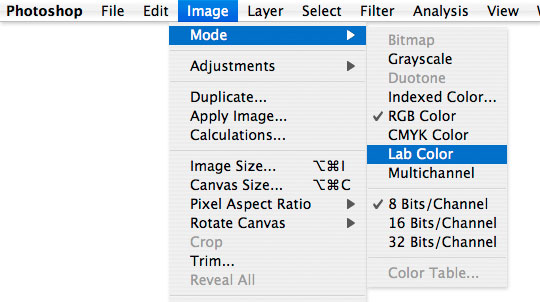
The first item of business is to switch the color space to Lab color. In the main menu choose Image>Mode>Lab Color to make the change.
Step 3
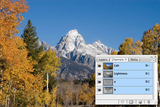
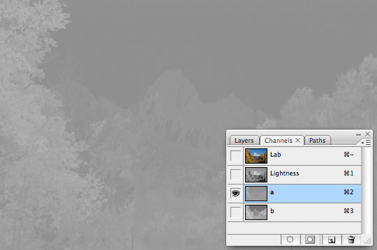
One of the many benefits of Lab color is that this mode actually separates the Luminosity from the actual colors in the image, allowing us to work with the color more directly than if we were stuck in RGB mode.
Open the Layers palette and click on the Channels tab to see what I mean. Notice that instead of having Red, Green and Blue channels like RGB, with Lab Color we have a Lightness channel and two color channels labeled "a" and "b". The Lightness channel holds all the tonal information. This is important because with this adjustment we want to isolate the colors without effecting the overall brightness and contrast of our image.
Step 4
Go ahead and click in the "a" channel to select it. You’ll notice that the entire image turns to a grayscale rendering of this channel (and quite an unattractive version at that).
Step 5
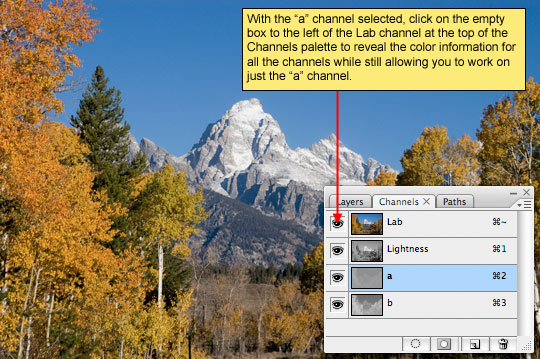
Since we obviously can’t go adjusting color with the image in this condition, I’ll show you the fix. Once you’ve selected your color channel, in this case the "a" channel, go ahead and click on the empty box to the left of the Lab channel at the top of the channels palette, this will turn the other channels back on but will allow us to only adjust the "a" channel.
Step 6
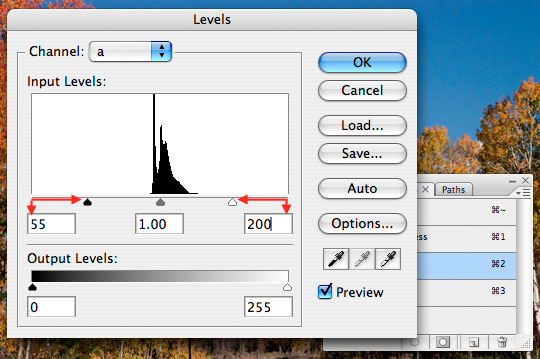
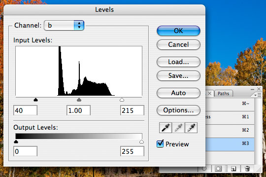
The trick to increasing the contrast in these color channels is to increase the contrast inside the channel. To do this we’re going to use the Levels adjustment. You can call up the levels adjustment easily by pressing Command-L (PC: Ctrl-L) or by choosing Image>Adjustments>Levels from the main menu.
In the Levels dialog box, drag the right and left arrows toward each other until the saturation is satisfactory. While adjusting the first color channel (the "a" channel) the overall color balance in the photo might get a little funky, but don’t worry, it’ll straighten itself out when we adjust the "b" channel. The most important thing in this adjustment however is that we bring in both the right and left sides equally. Trying to do this by touch is quite a trick, but math makes it easy. Notice that in the beginning the fields under the histogram read 0/1.00/255, these numbers represent the position of the markers respectively. Sliding the right marker to the left will make the corresponding number go up, and dragging the right slider to the left will bring it’s corresponding number down. So whatever you add to the left, you must subtract from the right.
Lets make this example simple and I’ll bring the left slider up to where it’s corresponding number is 55. This now means that I must bring the slider on the right down 55, making it’s value an even 200. By doing this we ensure that our center point remains constant and that we don’t skrew things up altogether. Click OK when the saturation in the photo looks good.
Step 7
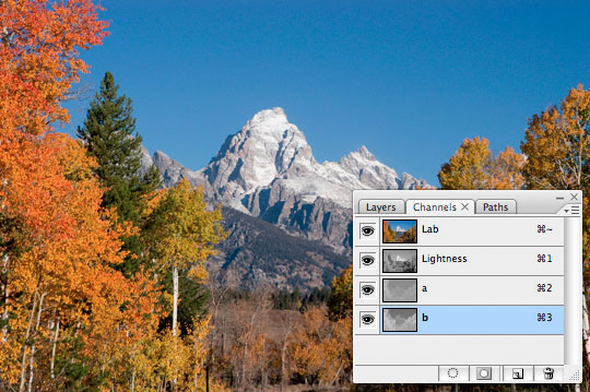
Now we need to repeat the same process for the other channel so that all the colors have the same vivid look. In the channels palette, select the "b" channel. The four eye icons should still be visible but if they aren’t, simply click on the visible option located on the left of the Lab channel and the four eye icons will appear just like we did before.
Step 8
Now repeat the same process with the Levels tool that we did earlier. Press Command-L (PC: Ctrl+L) or choose Image>Adjustments>Levels from the main menu and move the black and white input sliders towards the center to compress the histogram. The settings should be the same as the ones you used earlier as a start. Once you have it set with the same settings as the other channel, you can adjust the sliders to alter the intensity of the colors for this layer. For example, if you don’t want these certain colors to be that vivid, simply move the two input sliders further apart to reduce the compression of the colors. Just like before, make sure the sliders are an equal distance using addition and subtraction in the numeric values corresponding to each slider.
Step 9
The final step is to switch the image back to RGB color mode by choosing Image>Mode>RGB from the main menu.
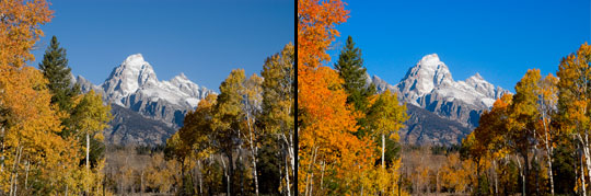
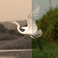
Below you see my before and after the changes.
Step 10
In my final image I used the Selective Color adjustment to increase the level of black in my blue tones, which darkened the sky and gave the image an overall better feel.
This Velvia effect can be incredibly effective on the right photograph and just plain stupid on the wrong one, so be careful. Keep in mind that many film and slide photographers have considered the over saturation produced by using Velvia film to be too much for their tastes, and the results, even from original Velvia slide film often seem a touch unrealistic due to the extreme saturation of some colors.
Lesson Files + Additional Resources
There are no file downloads or additional resources for this Photoshop tutorial
Tell Your Friends
More in Photo Effects


19 Responses to The Velvia Effect
Timmy
March 14th, 2008 at 3:09 pm
Very helpful article, thanks!
Z. C. Brown
March 14th, 2008 at 8:21 pm
I think this is the ultimate color correction tutorial for me…WAY more effective than anything else I’ve been doing. Thank you very much! You make some grand tutorials!
Shanti @ Antishay
March 15th, 2008 at 5:56 pm
This is SO great! Thank you :) I have always considered myself a ‘sortof pro’ at photoshop, but this taught me something I didn’t think about before. Applying it (drastically) to a photo I took last summer, the differences are striking:
and
Anna Feruglio Dal Da
March 15th, 2008 at 7:07 pm
I do the same correction in LAB but adding a Curves layer. I have do admit that I do it on most of my photos these days. It does feel like cheating, a little. :-)
(I just found your blog through Lifehacker, and I love it. I had never really understood how to use the gradient tool until I read your tutorials, and now I feel like I won’t go to bed for the rest of the night applying it left, right and center!)
itakefauxtoes
March 15th, 2008 at 7:52 pm
I also found your blog from Lifehacker, Defiently got another reader here. Keep up the good work.
Just a side note, the adjustment you make with the Levels can also be done by using a adjustment layer and then within the Levels box you can select which channel (Lightness/a/b) to work on.
Saves a few steps there and lets you undo changes at a later date.
— itakefauxtoes
Mike
March 16th, 2008 at 6:22 am
I have just found your site – sent here by one of my readers. I will certainly recommend all to visit. The aim of my blog is to introduce people gently to digital photography and image editing. Your site is straightforward with no messing.
I like it.
Kurtis
March 17th, 2008 at 3:28 am
I found your website via lifehacker and WOW, i am really new to both serious photography and photoshop but I’m going out every day now to find new pictures to take just to use your tutorials! Thanks for all your great advise and the effort you put into these. I’m losing sleep just to keep reading them!
Jo?ɬ£o Espinho
March 18th, 2008 at 3:03 pm
Great! Thanks.
Kin
April 14th, 2008 at 3:35 am
Wow, great tutorial, Thanks very much
NAREK
May 2nd, 2008 at 10:17 pm
GREAT tut.
Will
October 17th, 2008 at 12:27 am
Thanks for the tutorial. Ive never tried adjusting images in Lab mode before – great results!
CHAYADIE
January 28th, 2009 at 10:29 pm
I’m new in photography and just recently bought a DSLR. At first was kinda frustrated with the final result of my images as compared to photos I’ve seen as I didnt do much on the post processing part.
With this tutorial, you have made me all fired up for my next photography outings!
Nader El Tarabishy
February 26th, 2009 at 6:08 am
Great, many thanks
sivas
March 15th, 2009 at 3:54 pm
very good, thanks
photo retouching
April 23rd, 2009 at 8:15 am
This tutorial takes me back to the heady early 90`s and my first camera. I am glad there is a digital alternative to those rich colours achieved with the fuji range of transparecy film
jay
April 23rd, 2009 at 10:36 pm
thanks, this is awesome..!
DaedaLusT
July 4th, 2009 at 9:44 pm
This effect is really AWESOME!
Great tutorial, thanks a million! (:
Vish
November 25th, 2009 at 7:43 am
I think this is ultimate…….Thanks dude
kelvin
April 14th, 2010 at 8:25 pm
This is good stuff :) Simple and gorgeous