

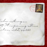
Create An Old Envelope
I've had several requests since posting the Postage Stamp lesson for a follow-up on how to create the envelope used in that tutorial. Well today my Photoshop friends your prayers have been answered. Here's the step by step to creating that cool old envelope.Step 1
Open a new document in Photoshop, mine is 540x340px at 72ppi… however if you plan to use this for anything when you’re done. I’d recommend building it big and at 300ppi, my original example, which was used for a magazine ad measured 2550x3300px.
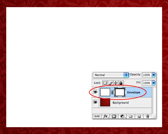
Fill the background of your new file with a color other than white and with the Rectangular Marquee tool drag a nice envelope shaped selection onto the stage. Create a new layer, call it Envelope and fill your selection with white.
Step 2
With the selection still active add a Layer Mask to the layer by clicking the Add Layer Mask icon at the bottom of the layers palette.
Step 3
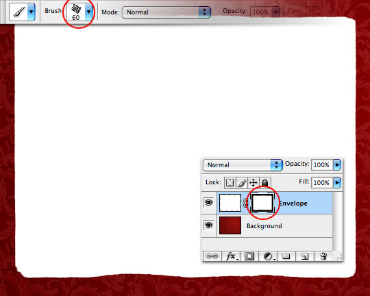
With the Layer Mask selected use a rough edged brush like the Chalk 60 Pixels brush that comes with Photoshop with the foreground color set to black and paint away around the edges until your envelope looks sufficiently aged at the edges. Try taking out curved areas like the one you see at the bottom of my envelope which will give the impression later in the project that the envelope is bent and arching up at that point away from the background.
Step 4
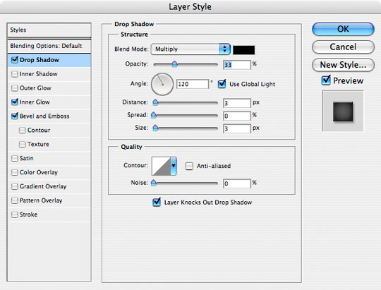
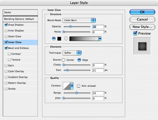
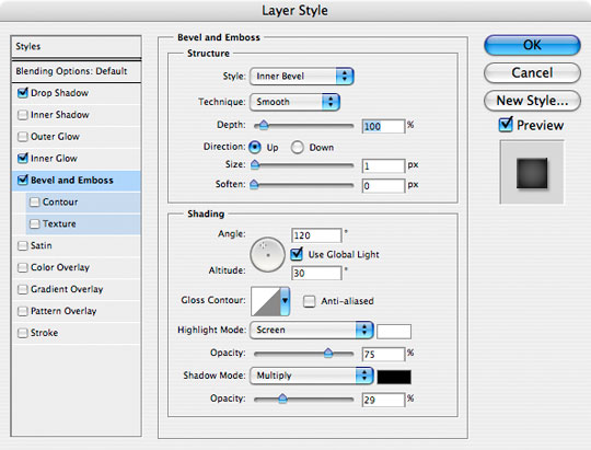
Now lets add a few Layer Styles to the layer as shown below.
Step 5
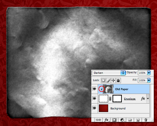
Add a new layer and call it Old Paper. Load the PaperFold.abr brush that I’ve included in the exercise download at the end of the lesson. This brush was created years ago by a girl who went simply by the name Nocturna in the online design community, her site has been down for years now but I managed to rediscover a backup disc of her brush sets I’d made early in my design career.
Rotate the brush tip 90° in the Brush Tip Shape area of the Brushes palette. If you don’t know how to do this, read my tutorial on the subject. Make sure only one of the quarters of the brush covers the entire envelope so there are no major folds on the envelope, then click once with your brush still set to black.
Now simply Create a Clipping Mask to the Envelope layer.
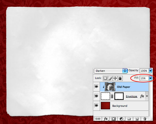
Step 6
Ok, you’re finished! Great Job!
Just kidding. Since the thing looks like total crap, lets hurry and drop the layer’s Fill opacity down to around 15%. Ahh, much better.
Step 7
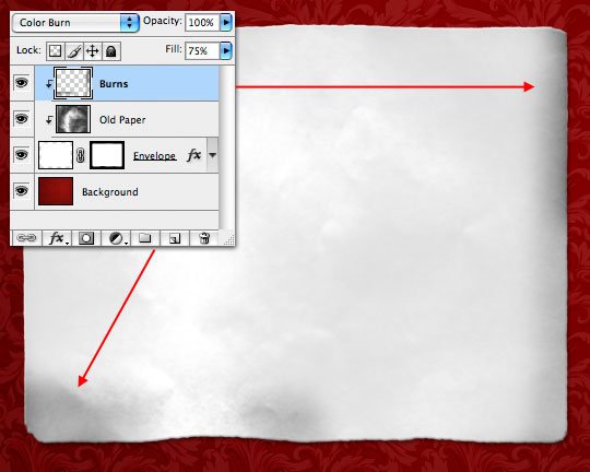
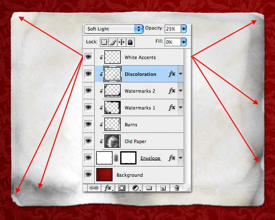
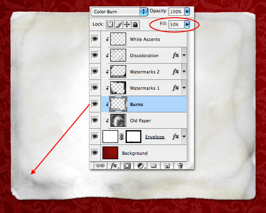
Create a new layer, call it Burns and create a Clipping Mask to the layers below. (We’re going to clip every single layer we add in this tutorial back down to the Envelope layer so get used to it.)
Set the layer’s Blend Mode to Color Burn and drop it’s Fill opacity to 75%. With a nice round brush with a 0% edge hardness paint with black around a few of the edges. (*note: at this point don’t worry too much if your burns look a little heavy, we’re going to add more layers over the top and you can always come back and pull the opacity back if you need to.)
Step 8
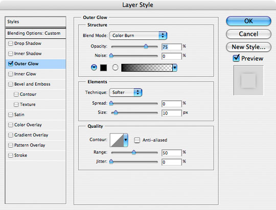
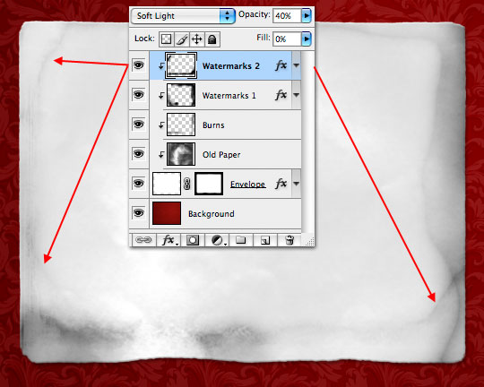
Create a new layer, call it Watermarks 1 and create a Clipping Mask to the layers below.
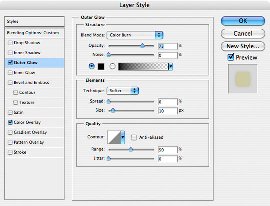
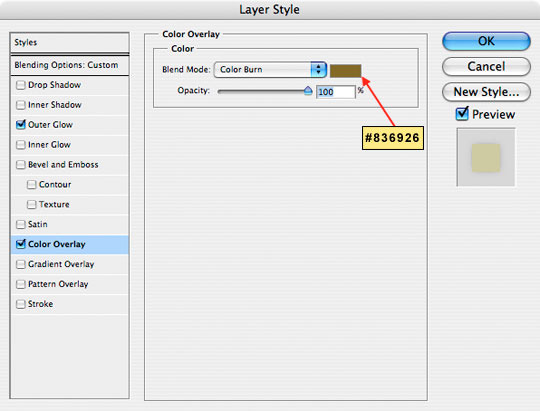
Set the layer’s Blend mode to Soft Light, drop the Fill to 0% and the Opacity to 40% and then add the following Outer Glow layer style to the layer.
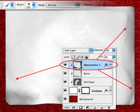
Step 9
Grab the Brush tool by pressing the B key and choose the Soft Round 100px Brush. As you paint around the edges only the outer glow that we specified and a little coloration will occur. These are water marks, so make ’em look like watermarks man!
Step 10
Create a new layer called Watermarks 2 with exactly the same properties as the previous layer and paint in watermarks in different and overlapping areas exactly like before.
Step 11
Now we’re going to add a little yellowing discoloration… because paper goes a little yellow when it’s old of course.
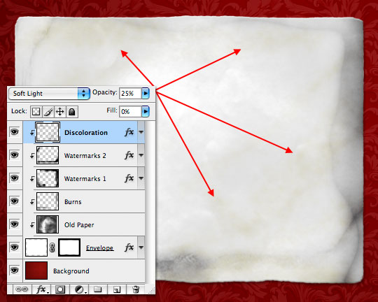
Create a new layer called Discoloration, set the Blend Mode to Soft Light, the Fill to 0% and the Opacity to 25%. As always, clip the layer to those below it and then add the following two layer styles.
Step 12
With the Brush tool selected, choose the Spatter 59 pixels brush and click your way around the envelope adding yellowing where you feel inclined. When you’re done run a 2 pixel Gaussian blur from the Filters menu (Filter>Blur>Gaussian Blur).
(*note: If you’re having a hard time seeing what you’re doing because of the low opacity and layer style we applied in the previous step, simply turn the Opacity and Fill back to 100% while you paint.)
Step 13
Create a new layer called White Accents, leave the Blend Mode as Normal and lower the Opacity to around 48%. Do I need to remind you to clip the layer to the rest? I didn’t think so.
Now grab the Hard Round 1px brush, change your foreground color to white and paint some scratches all over the envelope. Then grab that Spatter 59 pixels brush we used in the last step and paint a few spots around the edges and across the corners of the envelope to create areas where the paper has been roughed up at the edges.
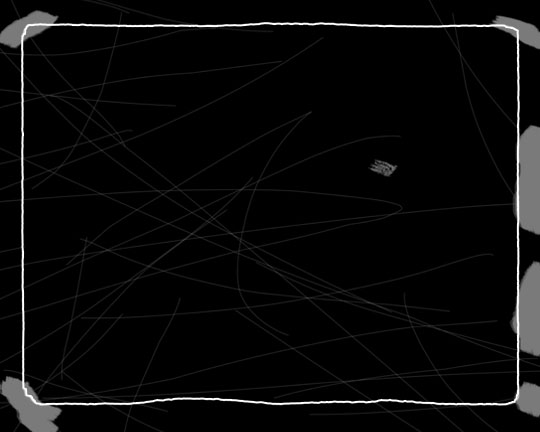
For illustration purposes I’ve blacked out the background and outlined the envelope in the example below to show you where my scratches and edges all live, but don’t do that to your envelope unless you want it to look like a black piece of crap.
Step 14
Here’s the envelope with those white edges and scratches applied.
Step 15
At this point I take a step back and look at the overall picture and I’m thinking that we’ve got a little more black in the corners than we need, so I’ve gone back to the Burns layer and lowered the Fill opacity to 50%.
Step 16
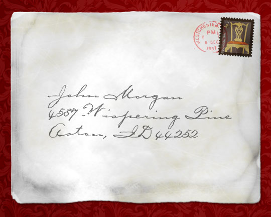
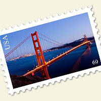
Now all we need is to add an address and a stamp and we’re done. If you want to learn how to make your own postage stamp, check out my Postage Stamp tutorial! I’d recommend placing the stamp at the bottom of the layers stack just above the Envelope layer so that all the effects we added also apply to the stamp.
Lesson Files + Additional Resources
Download the free .PSD file and other lesson files Right Here.
Tell Your Friends
More in Graphic Design


22 Responses to Create An Old Envelope
CHAD
March 13th, 2008 at 12:20 pm
Dude, You Rock!
I love how all the layers sit on top of each other and compound/blend together to get the end result? Do you ever run out of ideas?
SE
March 15th, 2008 at 3:00 am
Hi,
Do you know how and where can I get this kind of website template?
:)
HERO
March 15th, 2008 at 4:59 am
SE,
I built this template by hand using the popular and completely stripped to the bones Sandbox WordPress theme as a starting point. I am however considering a site redesign, and if I go that route I’ll likely make this theme available to the public.
aronil
April 9th, 2008 at 8:15 pm
This is fabulous, i’ve been looking all over for a tutorial like this. Thanks a lot man,
Designer
April 15th, 2008 at 7:03 am
I am learning a great deal about photoshop from your tutorials. Thanks. Designer
Vincent
April 21st, 2008 at 10:57 am
Hi, great tutorial!
How did you do the text?
LivE
May 16th, 2008 at 7:30 am
You are AWESOME! I love your tutorials, love your generosity with sharing your talent and knowledge. You rock! Thanks so much! :)
JK
August 8th, 2008 at 7:16 pm
great tutorial, been looking all over like this!!!
thousands of thxs!!!
Bubble Man
September 29th, 2008 at 3:05 am
Wow thamks for a brill tutorial, it’s so hard trying to find easy to follow tutorials like this. Keep it up.
mojito
October 31st, 2008 at 6:51 pm
it’s like… there are those tutorials on the web, and they show how to do stuff… but suddenly it came to me >> they all suck! I mean… You got it man, i did not chech Your design, portfolio or what You’ve already did, but You know how to teach. Sorry… how to tut.
swank
December 24th, 2008 at 5:30 am
Excellent!!!
Den
January 13th, 2009 at 12:12 am
Nice one…great base for my envelope design idea…Thanks
McAwal
January 15th, 2009 at 8:14 am
interesting love that squeeze
thanx bra
Toughbook Drivers
May 24th, 2009 at 8:35 am
Thanks :D
Silken
October 8th, 2009 at 1:21 pm
Great tut! I enjoyed very much!
Rhode Island DUI lawyer
November 19th, 2009 at 3:09 pm
Not sure when I’d make an envelope, but this is a great design nonetheless. I really like it.
wintherbabe
January 11th, 2010 at 3:44 am
Hey.. I can’t find the PaperFold.abr. Where can i find it?
HERO
January 17th, 2010 at 11:58 am
WINTHERBABE, All the files for the tutorial will be in the .zip download at the end of the lesson.
Jana
February 9th, 2010 at 1:15 am
YOU ARE FANTASTIC. Thank you :)
Elin Fjellheim
March 15th, 2010 at 6:55 pm
WOW! I am completely overwhelmed by your AMAZING tutorials, thank you so much for the effort you put into making these tuts – love them all and you are such a great explainer!!! :-D
Nabh
April 11th, 2011 at 5:28 am
hey firstly thanks a ton for the tut. and where can i find this Font that you have used for the address?
Stretch Wrap
September 12th, 2011 at 3:37 pm
This is a really useful tutorial will come in handy for my sons school project. He is really excited to have a go at reproducing this.