


Calculations And Colorization
In this Photoshop tutorial I'll show you how to create an Alpha Channel using the Calculations dialog and we'll use it to get a really great abstract colorized photo effect.Step 1
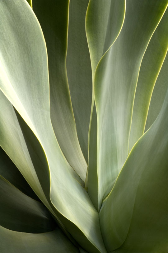
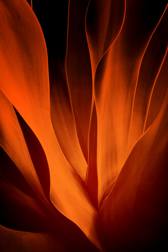
Lets get started by taking a quick look at the photo we’ll be applying this effect to. I shot this close up of a California Succulent and although it makes for a compelling abstract by itself I thought it could make a much bolder statement. The shot is a vertical, so I apologize for the amount of scrolling you’ll have to do in this tutorial due to the image height.
Step 2
We’ll jump right in and have a little discussion about using Calculations to create a Black & White composite. Although many photographers shy away from using Calculations for it’s reputation of being complex and confusing, it’s actually a rather simple and straightforward method. The Calculations dialog basically allows us to combine any two Alpha Channels together using any of Photoshop’s standard blend modes.
The basic method is this:
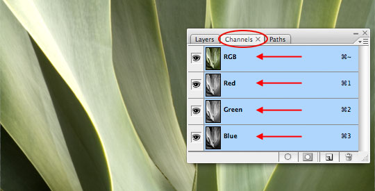
Open the Channels palette by choosing Window>Channels from the main menu (by default it’s a tab in the Layers palette set). In the Channels palette of an ordinary image you have 4 color channels: RGB which is the combined color information for all 3 basic color channels, RED which contains only the information for red, Green witch contains all the information for the green tones in the image and obviously Blue which as you may have guessed contains the blue tonal ranges.
Step 3
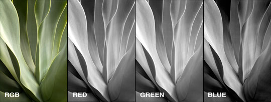
By clicking on each channel individually in the Channels palette we can examine in more detail what information each channel holds. In my image I notice that the Red and Green channels are very similar and that the Blue channel contains quite a bit more contrast and detail. Although we can play with the channel combinations once we open the Calculations dialog, I find it’s very useful to know what’s going on before I get started.
When you’re done examining your channels, click back on the RGB composite channel and switch back to the Layers palette.
Step 4
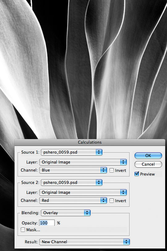
Without further hesitation lets jump right in and open the Calculations dialog by choosing Image>Calculations from the main menu. As soon as the dialog opens, you will notice that your image instantly changes to a black and white version representing the default settings for the Calculations dialog. Although we haven’t (and won’t) done anything to alter the original image the stage is now displaying what the color and blending combination we’ve selected will look like.
I’m going to go ahead and use the Blue channel as my first working channel since I know it holds all the heavy contrast for this image. Although the Red and Green channels are very similar, I do know that I liked the detail in the Red channel a little more than the Green so I’ll go ahead and select Red as my second working channel. Finally I’ll choose the Overlay blend mode at the bottom. The Blend Mode is actually a really cool setting to play around with as it will yield drastically different final results. Make sure the Result is set to New Channel and click OK.
Step 5
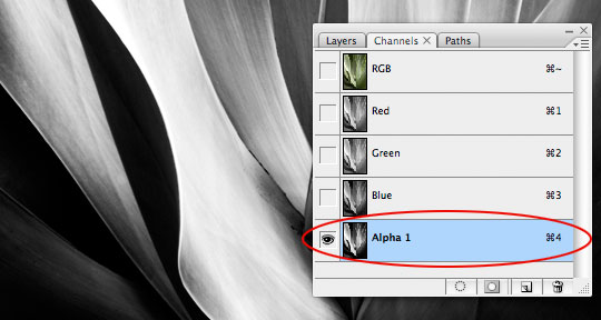
You’ll notice that when you click OK your image doesn’t switch back to the color view, this is because we just created a new Alpha Channel and by default it is automatically selected. Click back over to the Channels Palette for a closer look.
As you can see in the image below a new channel has been created at the bottom of the Channels palette called Alpha 1.
Step 6
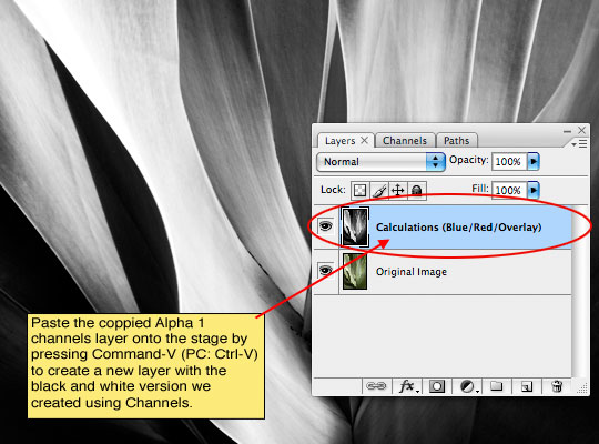
We’re going to copy this channel and paste it on a new layer in the Layers palette so (with the Alpha 1 channel still selected in the Channels palette) start by pressing Command-A (PC: Ctrl-A) to select the entire canvas then press Command-C (PC: Ctrl-C) to copy the contents of the channel. Now click back up to the RGB composite channel to turn all the standard channels back on. Switch over to the Layers palette and press Command-V (PC: Ctrl-V) to paste what we just copied onto the stage. This will automatically create a new layer and place the black and white version we created into it. See, Calculations aren’t so scary!
(*note: I suggest naming the layer based on the Calculations method you used to create it incase you need to know later.)
Step 7
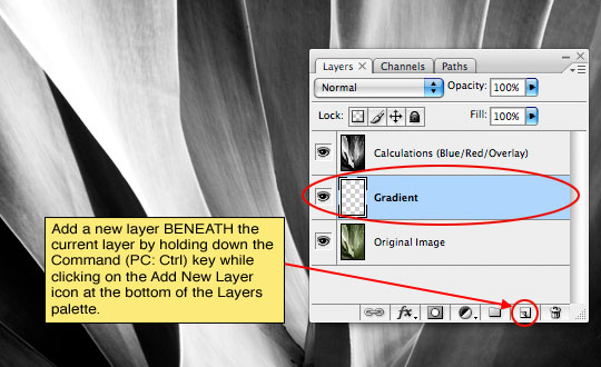
Next we’ll add a layer below the Calculations layer and add a gradient for the layer to interact with. Here’s a neat little trick for you: If you hold down the Command (PC: Ctrl) key when clicking the new layer icon at the bottom of the layers palette the new layer will be added below the current layer. Call this layer Gradient.
Step 8
Lets set our foreground and background colors in preparation for our gradient. Set the foreground color to a nice light color, I’m going to be using a red/orange gradient so my light color will be #c34614 and the background color (the darker color) will be #561800. Press the G key to invoke the Gradient tool and choose Foreground to Background from the gradient picker in the Gradient options bar and make sure that Radial Gradient is selected.
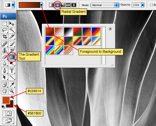
Step 9
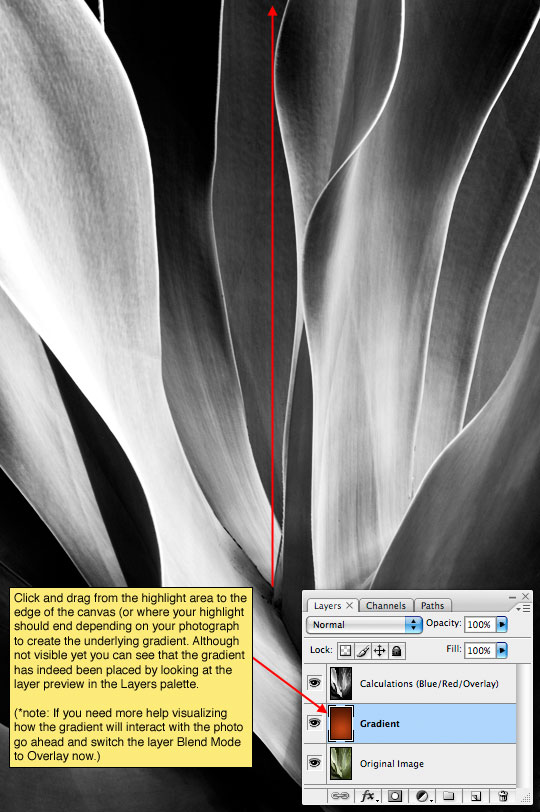
I’m going to now click and drag on the stage to add the radial gradient. Because the lighter color is set as the foreground color, the gradient will naturally go from light to dark so I’ll start at the area I want to highlight and drag away from it to the furthest edge of my image.
Step 10
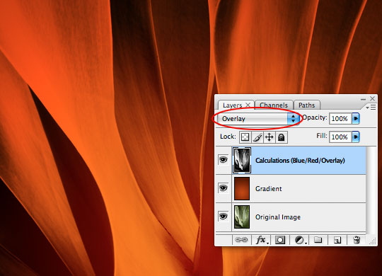
Now lets get these two layers talking to each other by clicking on the Calculations layer and changing it’s Blend Mode to Overlay.
(*note: It may help you to actually perform this step before placing your gradient so you can experiment with different gradients until you figure out what works best for your photo.)
Step 11
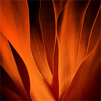
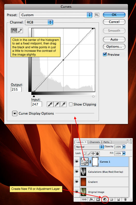
After completing the process you may find that your image needs a little more punch (or maybe not, but mine did), you can achieve this easily by clicking on the Create New Fill or Adjustment Layer icon at the bottom of the Layers palette and adding a Curves Adjustment Layer to the top of the file.
Step 12
Here’s what my final image looks like… Quite a contrast from the mellow photo we began with.
Step 13
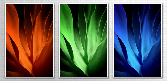
This technique works great for creating multiple versions of the same image in different colors. I hope you’ve learned a little something and that maybe you’ve discovered that the Calculations method of black and white conversion can actually be easy and produce some extremely nice results.
If you’d like to learn more about Calculations and the versatility of Channels in Photoshop you might want to pick up a copy of Scott Kelby’s Channels Book.
Lesson Files + Additional Resources
Download the free .PSD file and other lesson files Right Here.
Tell Your Friends
More in Photo Effects


39 Responses to Calculations And Colorization
Paulo Sales
July 4th, 2008 at 1:42 am
I have the photoshop channel chops book…the channels bible !
Calculations and apply image are 2 of the most ignored photoshop stuff… (sorry about my english)
This is terrific stuff Hero !
E. Nicole
July 4th, 2008 at 1:07 pm
Now, I may need to look into that ^^ book, because I was JUST starting to look into calculations in regards to tuning up photography! I am SOOOO glad that you did this! Damn!
dilirum
July 5th, 2008 at 12:55 pm
I think I highly under estimated the brilliance that can be achieved with channels. To be honest I’ve steered away from them probably because I don’t have a full understanding. Your final image is amazing (all three of them really). Thanks for opening my eyes!
kim
July 7th, 2008 at 3:21 am
WOW! GOOD WORK!
Jerome
July 7th, 2008 at 3:11 pm
Awesome tutorial again!
And the site looks really great too :)
Well done, hero!
ChaosKaizer
July 13th, 2008 at 8:00 pm
I never try the calculation tool before, thanks for sharing.
suckoja
July 21st, 2008 at 2:53 am
Looks great! Thanks a lot!
TuanAnh
July 24th, 2008 at 8:38 pm
nice tutorial!
Very creative :)
?ß‚Äò?æ
July 27th, 2008 at 9:16 am
you’re really a hero in PS,I like your work very much,well done.
Wilson-RJ-BR
August 3rd, 2008 at 3:57 pm
Interesting!!.. But why calculations is not so mentioned in most photoshop books?? I have at least 4 books about this software, but none of them teach how to use this tools.
Shyamali
August 12th, 2008 at 2:02 am
X-cellent..! To be frank I’v gone thru a lots of tutes on the web. But your explanations are supurb, easy to follow & very neat too…. Thanks for the great stuff… Keep it up…!
Jehu
August 14th, 2008 at 10:18 am
I found that you can also just run this w/out the whole colorization steps to bring some *POP* to your photos. Thanks HERO! for bringing this to light.
Jince Thomas
September 8th, 2008 at 10:58 pm
Its really great ….. And im greatful to you..
jopicar
September 25th, 2008 at 12:34 pm
Really It?Ǭ¥s a nice tutorial, thnaks for sharing, good job ;)
Kind regards
massimo romagnoli
December 2nd, 2008 at 5:24 am
Thanks for your lessons; you have a great ability to teach. I’m learning a lot here.
thulasi
December 19th, 2008 at 7:30 am
bagundi good job
Ranacorp
February 4th, 2009 at 7:52 am
Thanks for sharing this great tutorial.
Holly
February 28th, 2009 at 4:15 am
Wow.. Amazing. Can’t wait to use this more!
Ryan Noell
March 1st, 2009 at 6:17 pm
Reminds me of Georgia O’Keeffe’s artwork
sivas
March 19th, 2009 at 4:20 pm
very good, thanks
Marco
May 12th, 2009 at 3:25 pm
So what’s the benefit of using calculations here? Couldn’t the same thing have been achieved by simply desaturating the original layer?
HERO
May 12th, 2009 at 3:44 pm
MARCO, Using Desaturate simply averages the RGB channels and returns a generic colorless image. Using Calculations allows you complete control of your final image using a combination of 2 of the 3 color channels and all available blend modes, so you have complete creative latitude in the final result.
ubaid
May 22nd, 2009 at 10:50 pm
very nice
Amjad Miandad
August 20th, 2009 at 1:55 pm
Very nice tutorial,
thanks.
lei
September 14th, 2009 at 7:20 am
thank you ,very great tutorial,
Mark
September 17th, 2009 at 5:33 am
Thanks for the great tutorial. Extremely well written and explained. You must be very proud of yourself for the great work you are doing for people. Well done keep up the good work. I wish you all the best
Mohammed
October 1st, 2009 at 7:43 am
Verry good tuto mr pshero, thnk u so much for everything.
i hope for u a good luck.
Mike
October 25th, 2009 at 11:12 am
you are the man
K.R.WARAN
March 2nd, 2010 at 12:21 am
very easy way of teaching
güvenlik
April 18th, 2010 at 9:13 pm
Thank you for articles
Designerist
May 16th, 2010 at 2:18 am
Thanks for this great tutorial. I have learned a lot with it and fought my fear of channels and calculation.
Dakshay Sanghvi
May 27th, 2010 at 7:22 am
Thanks men, it is awesome,it really help me a lot in learning something new,
great job…..
Ehab
June 29th, 2010 at 10:05 pm
Excellent learning experience :)
I did have to scroll down quite a lot, more because I zoomed in a bit to read the text.
I don’t really make nature/abstract types, but after reading this.. ;)
sivca4503
September 7th, 2010 at 8:30 am
Really great, i learning something new today
Tq Very Much
gaby
November 8th, 2010 at 2:43 pm
This only works in RGB. I’m trying to use it in CMYK for a printed project but it dull out. Is there a better way?
HERO
November 9th, 2010 at 10:21 pm
Gaby, Switch to RGB, do the work and then switch back to CMYK.
webhosting
January 20th, 2011 at 8:57 am
Great idea I love this
Finja
August 13th, 2011 at 3:25 am
was für ein tolles Tutorial,
werde es gleich einmal versuchen.
LG
Finja
Andy Eaton
May 11th, 2012 at 9:53 am
Awesome tutorial love how the color abstracts turned out.